In the competitive world of eCommerce, even the smallest interface elements can have a big impact on user experience (UX) and sales. One such element is the mini cart, a small, interactive cart preview that shows users what they’ve added to their shopping cart without forcing them to leave the current page. Though often overlooked, the mini cart is a powerful tool for improving conversions, reducing friction, and keeping shoppers engaged.
For beginners looking to optimize their online stores, understanding mini cart UX is crucial. In this guide, we’ll cover everything from the basics of what a mini cart is, to design principles, common mistakes, and practical strategies to create an effective shopping experience. By the end, you’ll have a solid understanding of how to use mini carts to enhance your eCommerce store.

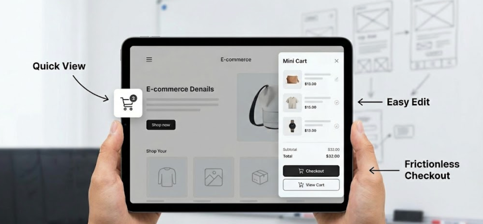
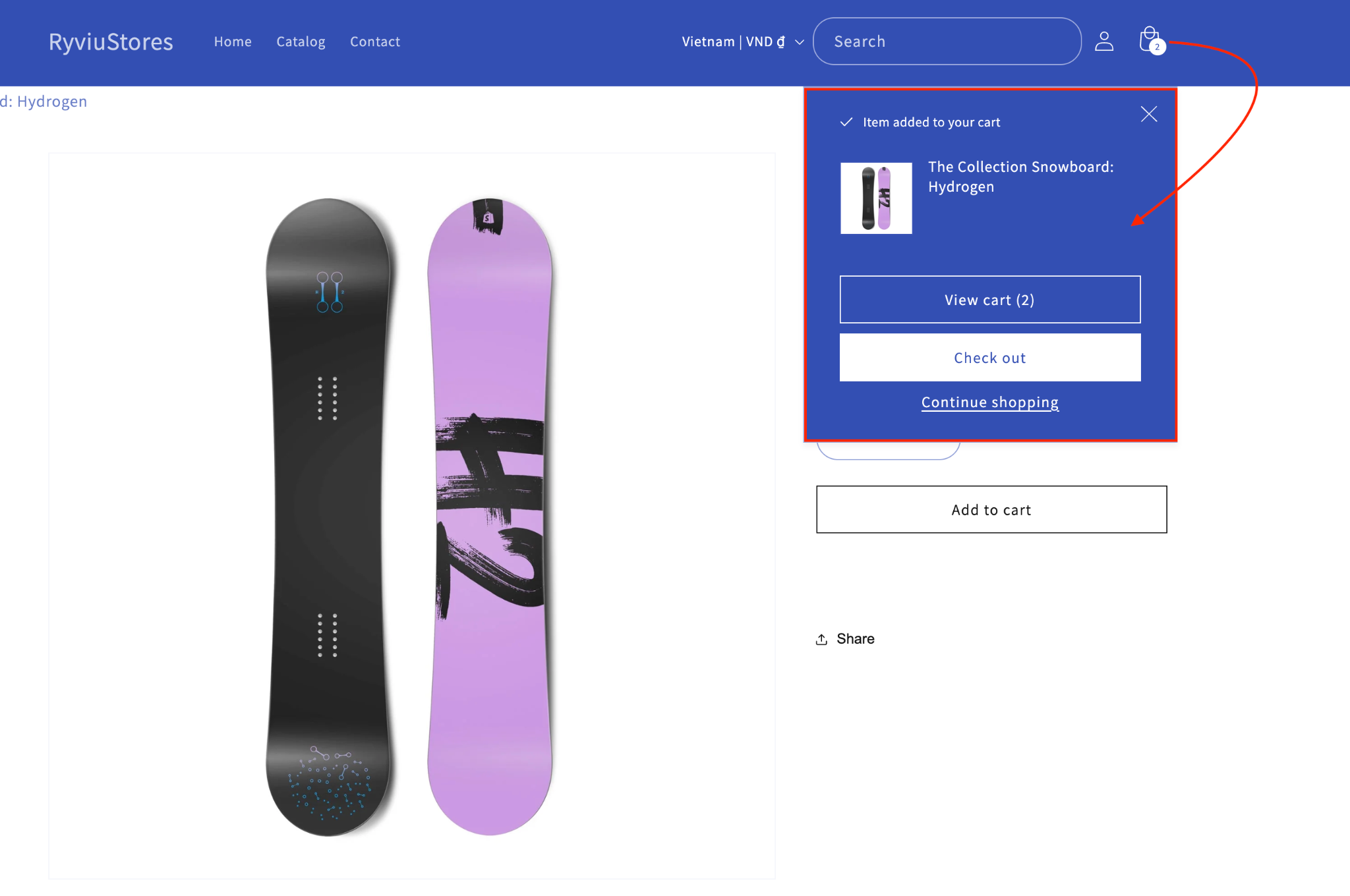
A mini cart is a compact shopping cart interface that typically appears as a dropdown or slide-out panel when users click or hover over the cart icon. Unlike a traditional cart page, mini carts allow shoppers to quickly review, modify, or remove items without leaving their current page. This reduces interruptions in the browsing experience and keeps the user journey smooth.
Mini carts come in several forms, each suited to different types of stores:
Understanding the type that best fits your store depends on your product catalog, target audience, and how much detail you want users to see without leaving the page.
The mini cart may seem like a small component, but it significantly impacts both user experience and conversion rates. Here’s why it matters:
In short, a well-designed mini cart increases confidence, reduces friction, and can drive higher sales, making it an essential part of any eCommerce store.
Designing an effective mini cart is about balancing visibility, functionality, and user convenience. A well-implemented mini cart helps shoppers review, update, and proceed to checkout without leaving the page, creating a smooth shopping experience. Beginners often overlook small details, but focusing on these key practices ensures that your mini cart supports both user satisfaction and conversion goals. Let’s explore the most important strategies you can apply today.
The cart icon should always be visible and easy to find on every page, so users can access their cart instantly. Hiding it or making it inconsistent across pages can cause frustration and slow down the shopping process. A visible cart ensures users feel confident and in control of their purchases.
To achieve this:
Users should be able to see what’s in their cart at a glance. This includes product images, names, quantities, and prices. When information is clear, users can quickly review their selections and make decisions without navigating away from the page.
To implement this effectively:

Shoppers often need to adjust quantities or remove items while reviewing their cart. Forcing users to go to a separate page adds unnecessary friction and can lead to frustration. Providing easy editing tools keeps users in the flow and improves the overall experience.
Key tips:
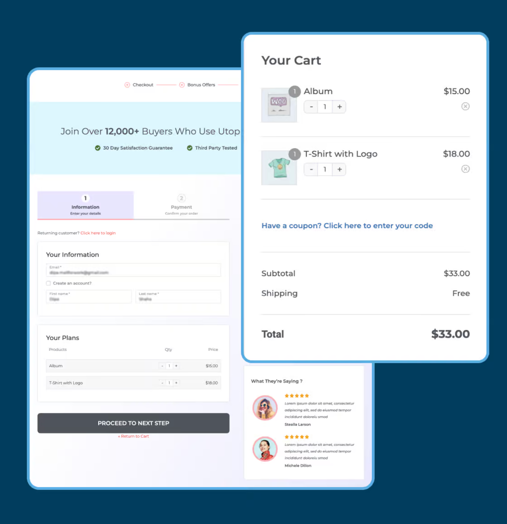
Your mini cart should guide users toward the next step in the checkout process. Ambiguous buttons or hidden links create confusion and may increase abandonment. Clear, visually distinct CTAs help users confidently proceed to the full cart or checkout.
Best practices include:
When users interact with the mini cart, they need immediate confirmation that their actions were successful. Lack of feedback can make users unsure whether an item was added, removed, or updated. Implementing visual cues builds trust and enhances the sense of control.
Ways to provide feedback:
With mobile shopping growing rapidly, mini carts must work seamlessly on smaller screens. Touch gestures, screen size, and limited space must be considered to avoid frustration. A responsive mini cart ensures a smooth, user-friendly experience for all devices.
Mobile optimization tips:

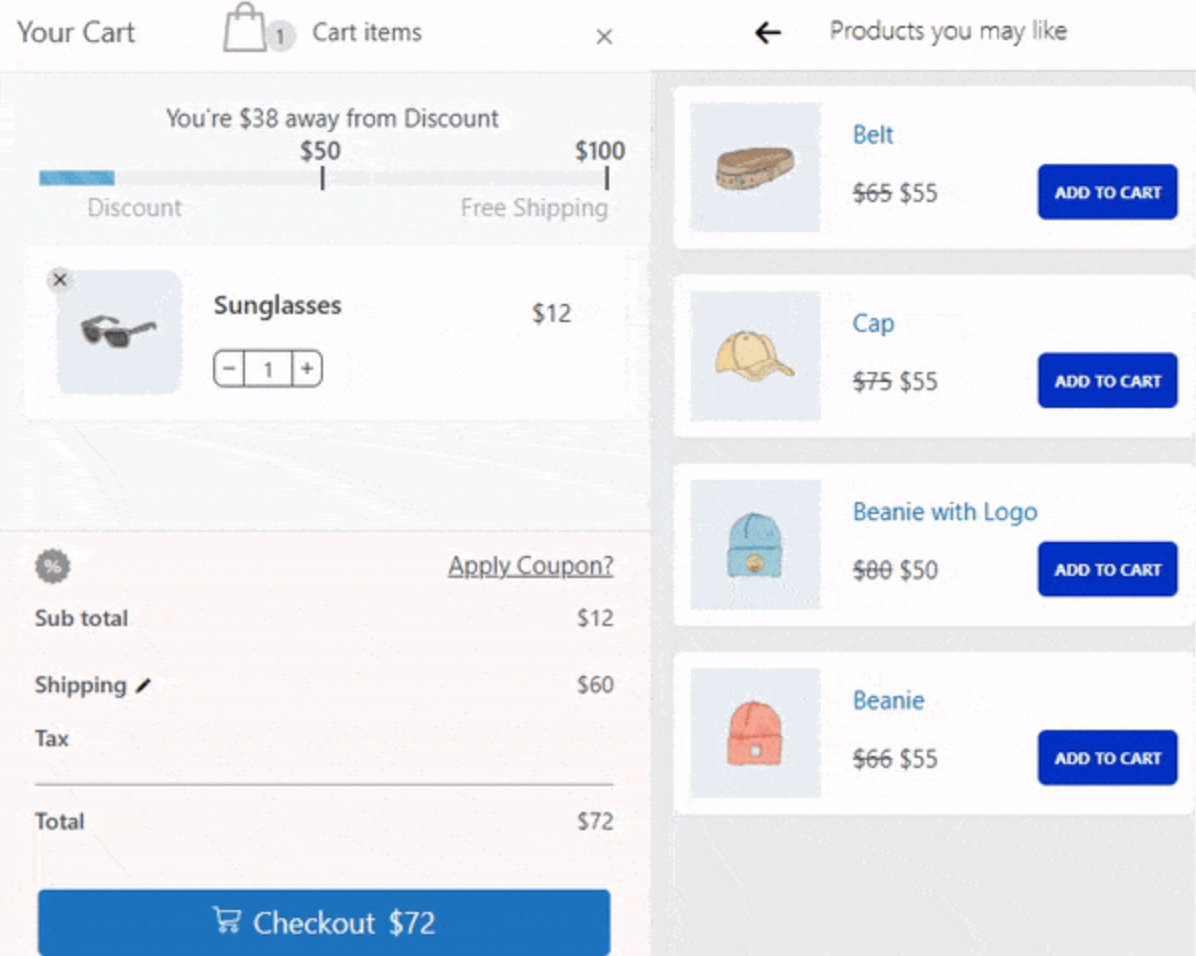
Mini carts can be a place to suggest complementary products, but too many recommendations can overwhelm shoppers. Carefully curated suggestions can increase average order value without distracting from the main purchase. Strategic placement of recommendations enhances the shopping experience and encourages additional purchases.
Implementation ideas:
Even with a mini cart, UX errors can negatively impact conversions:
By avoiding these mistakes, you ensure that your mini cart contributes positively to the overall shopping experience.
The mini cart is a small but powerful component in eCommerce UX. When designed well, it streamlines shopping, builds trust, and encourages additional purchases. Beginners should focus on visibility, clarity, accessibility, and mobile optimization to create a smooth and confident shopping journey.
Investing time in mini cart UX is not just about improving aesthetics, it’s about creating a seamless, stress-free, and satisfying shopping experience. A thoughtfully designed mini cart can make the difference between a casual browser and a loyal customer.


Managing reviews in this context is not just about collecting feedback after delivery; it is about shaping the entire experience from purchase to arrival. Done well, it turns waiting into reassurance rather than frustration.
Customers rely heavily on feedback when making quick purchase decisions during limited windows. If reviews are outdated, irrelevant, or missing, conversions can suffer. Managing reviews effectively in this context means preserving trust, maintaining relevance, and maximizing impact—within a much shorter timeframe.
In this article, we’ll break down when each approach works best, how to execute them effectively, and how tools like the Ryviu review app can help you manage responses at scale without losing authenticity.