Please select the platform to login


Designing product presentation layouts isn’t just about aesthetics, but it directly affects how customers understand your offerings, how easily they can compare products, and ultimately how confidently they convert. Two of the most widely used layouts in modern eCommerce are comparison tables and carousel layouts. While both aim to help users discover products, they fulfill very different roles in the buying journey.
To decide which one converts better, it's important to analyze how each format influences user behavior, supports decision-making, and aligns with your store’s goals. This comprehensive guide breaks down their differences, strengths, weaknesses, and ideal use cases, helping you choose the layout that best drives conversions for your specific product type.
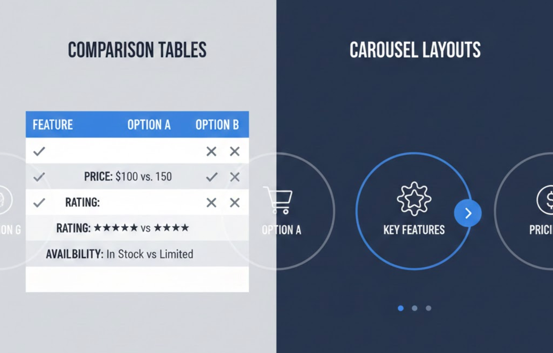
Comparison tables present multiple products, features, or variations side-by-side in a structured grid format. Instead of forcing users to jump between product pages, the table centralizes all essential information in one location.
Why Comparison Tables Work?
Comparison tables work because they reduce the cognitive load customers often experience during online shopping. When customers can see features, prices, and benefits in neatly aligned rows and columns, their brain processes the information faster. This clarity helps them move from confusion to confidence, which builds trust, a key driver for conversions.
Unlike visually driven layouts, comparison tables are especially useful for analytical customers who prefer evaluating details before making a decision. This makes them particularly powerful for industries where specifications matter, such as electronics, software plans, insurance options, mobile devices, or home appliances.
They are also highly effective for shoppers at the bottom of the funnel because these shoppers already know what they want and simply need reassurance before finalizing their purchase.
Carousel layouts display products or images in a horizontally sliding sequence. Users browse by clicking arrows or swiping, especially on mobile devices where carousels feel intuitive and natural.
Why Carousel Layouts Work?
Carousels work because they embrace movement and visual storytelling. Motion draws attention, and a sliding product series encourages users to explore without feeling overwhelmed by too much content at once. Compared to static grids, carousels create a more dynamic and interactive browsing experience.
This layout is especially useful in niches where customers buy based on emotion, aesthetics, or inspiration rather than detailed comparison. Fashion brands, lifestyle stores, beauty products, home décor, and furniture retailers all benefit from showcasing products in a way that mirrors social media browsing, casual, visual, and immersive.
Carousels also help highlight best sellers, seasonal items, or curated collections without requiring extra page space, making them ideal for homepage placement where space is limited but impact matters.
Understanding the advantages and limitations of each layout helps ensure you're using the right one at the right time.
To understand which layout converts better, you must look at how they differ functionally and psychologically. Each format supports different user behaviors and stages of the buying journey.
In essence, tables focus on logic, while carousels focus on emotion.
This difference alone makes one layout better for consideration and the other more suited for discovery.
If your product requires explanation or clarification, tables are more effective. If your product thrives on aesthetic appeal, carousels perform better.
This makes tables far superior whenever customers need to evaluate options simultaneously.
Overall, the comparison table layout is better for bottom-of-funnel conversions, whereas carousels often shine in the top or mid-funnel stages.
The conversion winner depends on your business model and customer journey. Both formats can outperform each other depending on context, but they shine in different scenarios.
Comparison tables minimize friction by placing all details in one place. This directness leads to faster decisions, especially for SaaS plans, electronics, supplements, or service packages.
Carousels shine for discovery-driven shopping. While they may not always push immediate conversions, they are excellent for building desire and nudging users deeper into your catalog.
Both formats serve different purposes and can dramatically affect your conversion rates depending on how they’re used.
By aligning your layout choice with your users’ goals, you naturally increase conversion efficiency.
Many successful brands combine both formats strategically to guide users through the entire buying funnel.
A common high-performing approach is:
This combination satisfies both emotional and logical decision-making behaviors, creating a smoother, more complete shopping journey.
There is no single universal winner. Instead, the right layout depends on what your customers need at that moment in their buying journey.
To maximize conversions, evaluate your product type, audience behavior, and funnel stage. In many cases, using both, each at the right moment, can deliver the strongest results.

