Please select the platform to login


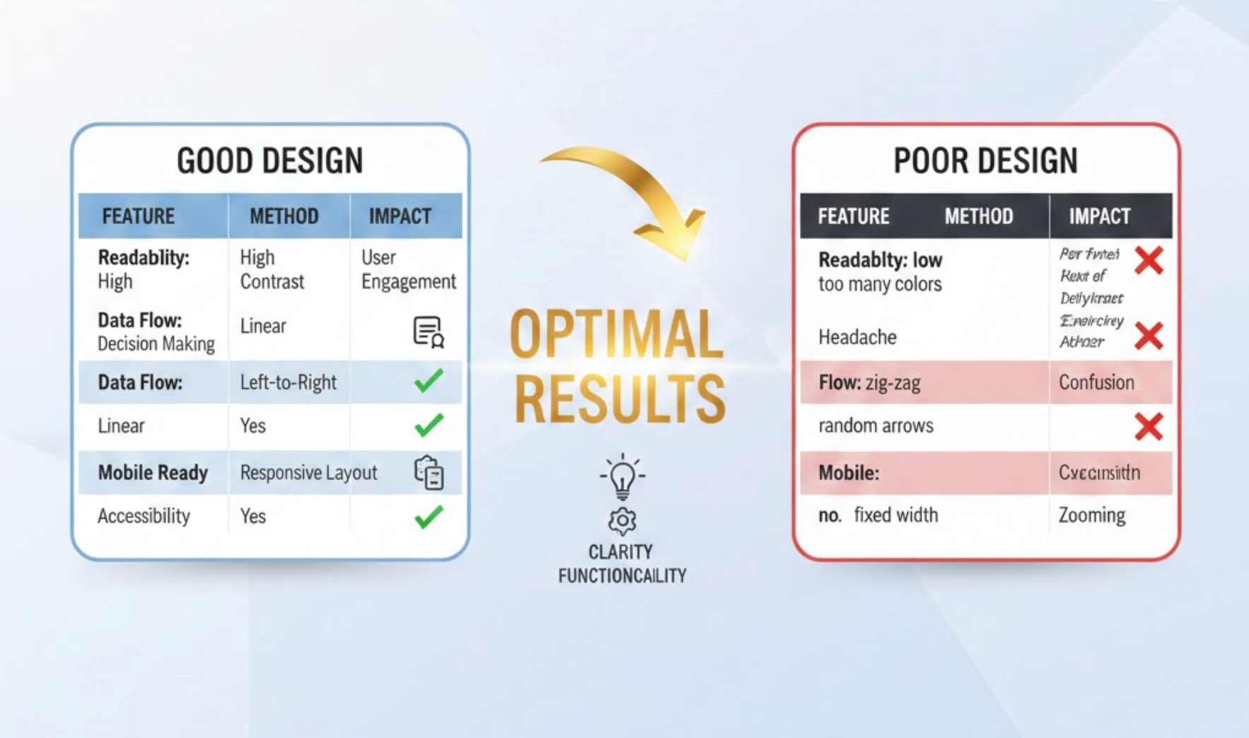
Table comparisons have become one of the most effective ways to help online shoppers, SaaS users, and service buyers make confident decisions. When designed well, they transform complex information into a structure that is instantly understandable, visually appealing, and persuasive. A high-performing comparison table not only highlights the differences between options but also subtly guides users toward the best choice for their needs. With that in mind, understanding how to design comparison tables strategically can dramatically improve conversions, reduce decision fatigue, and elevate user satisfaction.
To help you achieve this, the following tips dive deeper into visual hierarchy, layout psychology, clarity principles, and conversion-focused design patterns. Each idea is expanded with detailed explanations, real-world reasoning, and practical steps you can implement immediately. As you move from one tip to the next, you’ll see how these methods come together to create a comparison experience that feels seamless, intuitive, and incredibly persuasive.
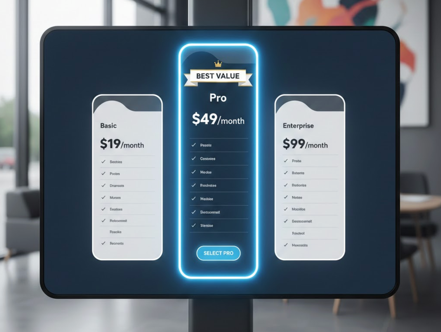
A high-converting table comparison always makes the recommended option instantly noticeable, because users tend to choose the option the design subtly endorses. Clear highlighting helps users save time and reduces the mental effort of evaluating too many choices. Instead of forcing people to analyze every row, a well-visible “best option” draws attention early and boosts confidence. The more effectively you spotlight this option, the easier it becomes for users to accept it as the logical choice.
To keep the momentum flowing smoothly, you can strengthen this approach with consistent visual cues that reinforce the recommendation naturally.
A clean table layout improves comprehension, making sure each feature and difference is easy to scan. Users rely on visual order to feel confident in their decisions, especially when comparing multiple complex features. When the layout is messy or overloaded, users feel overwhelmed and are more likely to postpone the decision. A streamlined, organized structure helps users grasp key differences within seconds and continue exploring with ease.
To ensure the viewing experience remains smooth, support the layout with breathable spacing and predictable alignment.
Short and clear text improves comprehension and reduces cognitive load, allowing users to compare offerings quickly. When text becomes lengthy or overly technical, users often skip important information or make incorrect assumptions. Readable language helps build trust and encourages people to stay engaged with the comparison. A friendly tone paired with high clarity ensures each feature is understood exactly as intended.
To maintain a natural flow throughout the table, pair clarity with consistent phrasing so users know what to expect.

Visual hierarchy is essential because it helps users focus on what matters most in the table. Through color, typography, and spacing, you can guide the eye from the most important elements to the supporting details. By doing so, you reduce decision friction and help users process information with minimal effort. Strong visual hierarchy turns a simple table into a persuasive conversion element.
As you enhance the design flow, let hierarchy help users navigate effortlessly from features to pricing to call-to-action.
Users care most about the features that solve their immediate problems, so these should be placed at the top of the table. Prioritizing helps users understand value instantly instead of scrolling or searching for what matters. When high-priority features appear early, users form quicker positive impressions and gain confidence in their decision. This approach transforms the table into a story that starts with value and ends with commitment.
To keep users moving smoothly through the comparison, order features based on buyer intent and importance.
Icons simplify the comparison experience by helping users identify features instantly without reading every text label. Visual elements break monotony and add personality to an otherwise structured table. Icons also improve memory retention, making it easier for users to revisit the differences between options. By combining text with symbols, your table becomes more intuitive and visually appealing.
To reinforce this visual clarity, choose icons that are universally recognizable and consistent in style.
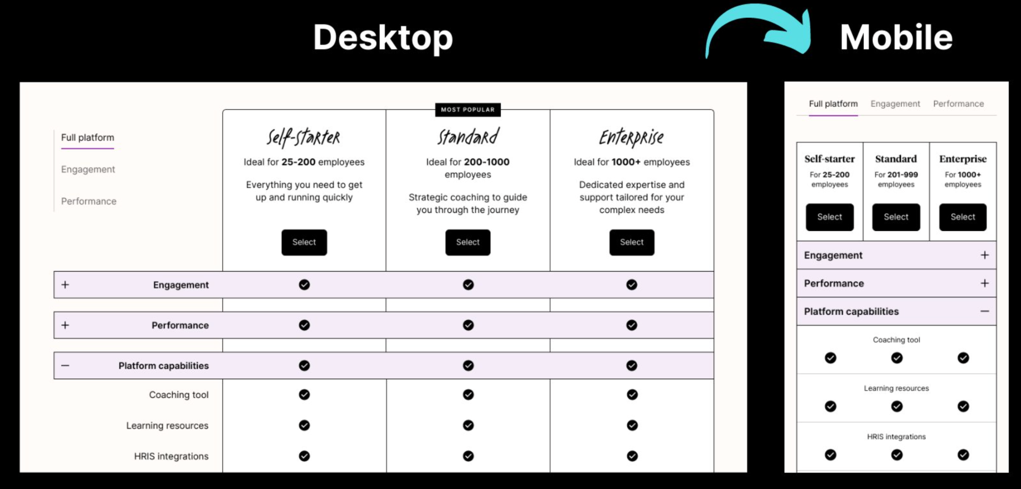
Mobile-friendly comparison tables are crucial because a large portion of users shop or browse from their phones. If your table is hard to scroll, too wide, or difficult to read on mobile, users often give up. A responsive design ensures information remains clear and easy to compare even on small screens. By designing for mobile first, you guarantee that every visitor gets a smooth experience.
To maintain continuity across screen sizes, use adaptive layouts and intuitive interactions.
Color coding enhances clarity by highlighting categories, grouping features, and emphasizing differences. Strategic use of color helps users immediately understand which features belong together or which option is superior. When applied correctly, color reduces mental strain and accelerates decision-making. Subtle color variations can turn a basic table into an organized visual guide.
To make transitions smooth between sections, let color reinforce structure without becoming overwhelming.
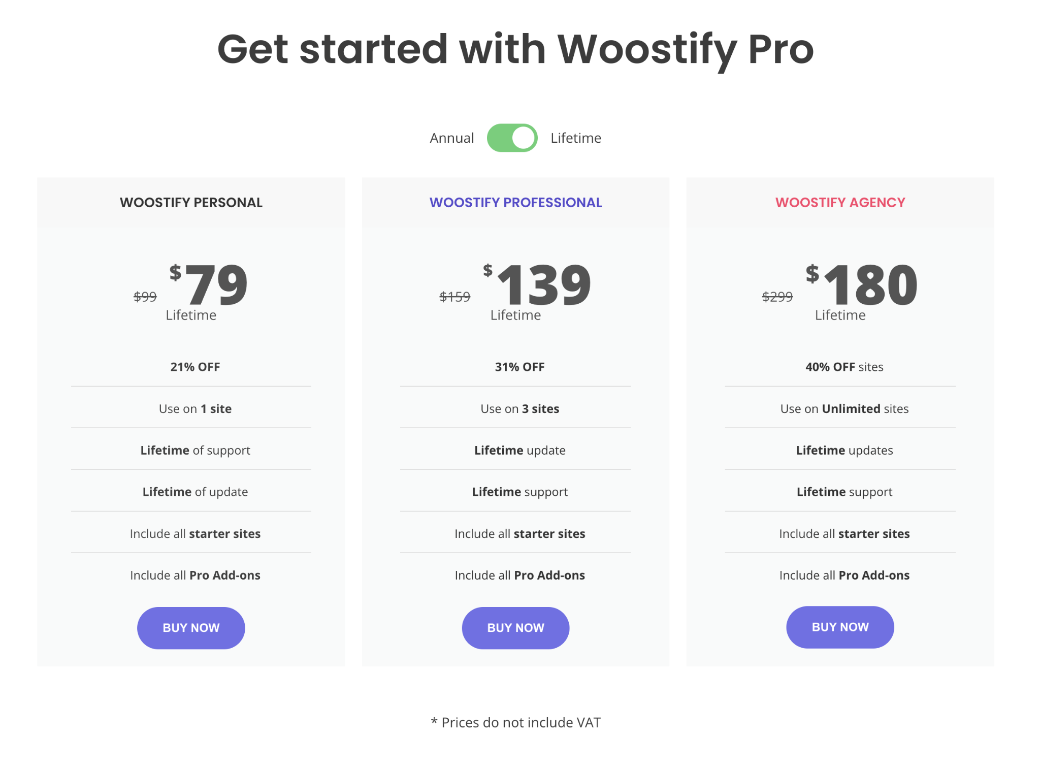
Price is the number-one factor users look at, so it must stand out immediately. Clear pricing helps users avoid confusion and feel confident about what they are paying for. When pricing is complicated or hidden, users tend to distrust the offer. Direct, transparent pricing builds trust while also guiding users toward the option that offers the best value.
To create a smooth pricing experience, present price information in a way that reinforces your conversion goals.
A comparison table should not just inform, it should convert, which means CTAs must be clear and compelling. Strong buttons help users take the next step without hesitation by removing uncertainty and guiding them toward action. When CTAs are weak or poorly placed, users may understand the differences but still fail to move forward. Bold, convincing CTAs ensure your table serves its primary purpose: driving conversions.
To keep the momentum strong, ensure buttons stand out visually and feel connected to the decision process.
Designing a powerful table comparison is both an art and a science. The right visual hierarchy, layout structure, and clarity elements work together to guide users toward confident decisions. By focusing on clarity, prioritizing important features, highlighting the recommended option, and ensuring a smooth mobile experience, you create a comparison system that reduces friction and amplifies conversions. Each tip you’ve explored reinforces the idea that design is a strategic tool that shapes user behavior.
When these principles are combined thoughtfully, your table comparison becomes more than a visual aid; it becomes a persuasive engine that boosts trust, accelerates understanding, and directly impacts revenue. With these practical, detailed, and conversion-driven tips, you are now ready to build comparison tables that not only look clean and professional but also deliver the best possible results.

