Please select the platform to login


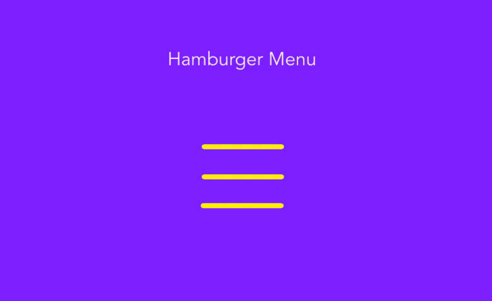
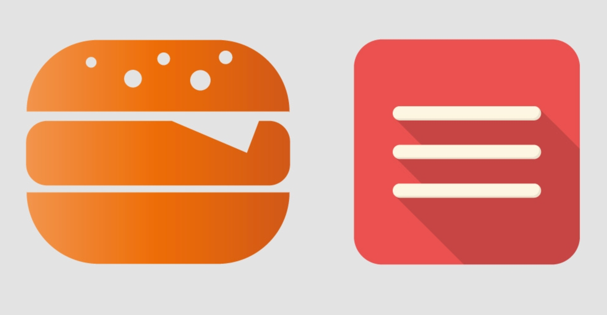
Hamburger menus are one of the most recognizable icons in modern web design. They help websites stay clean and organized, especially on mobile screens where space is limited. But beyond their practical function, hamburger menus also offer room for creativity, animation, and personality. By exploring new design ideas, you can make your navigation both beautiful and highly functional.
Here are 10 creative hamburger menu designs that can inspire your next project.
An animated reveal menu transforms a simple navigation interaction into a memorable experience. Instead of instantly showing the menu, it adds a motion element that makes the process feel dynamic and interactive. This design works well for modern brands that want to feel energetic and visually engaging. To make the animation look seamless, it should blend naturally with the rest of the page transitions. Here are some steps to design it effectively:

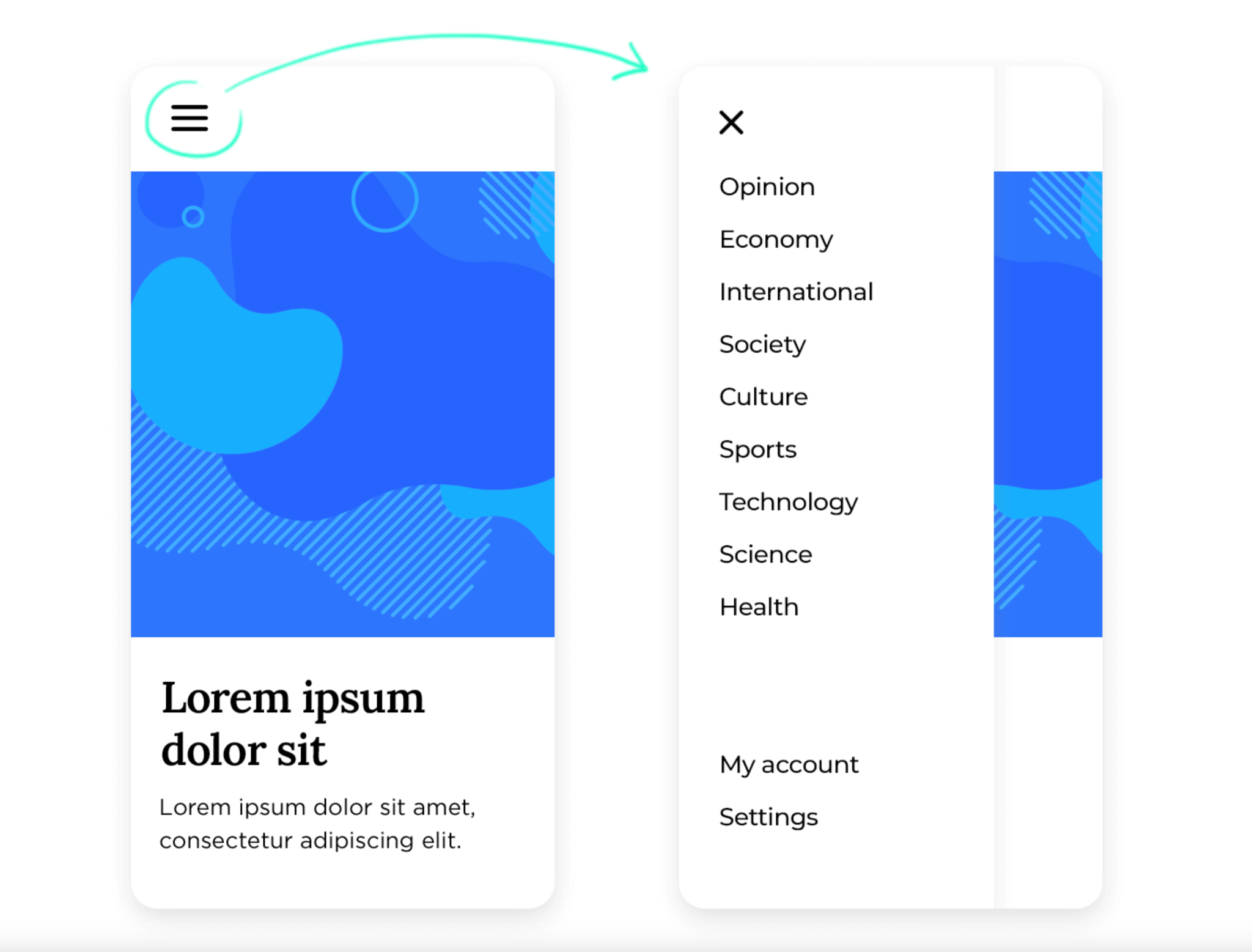
A full-screen overlay menu creates a strong visual statement by covering the entire page when activated. This design immerses users in the navigation experience, letting them focus fully on the menu without distractions. It is ideal for storytelling websites, fashion brands, or creative agencies that want to make an impression. With thoughtful typography and layout, the overlay can feel like a feature rather than a simple tool. To achieve this immersive effect, consider these design practices:
The morphing icon menu turns a regular hamburger icon into something more dynamic and expressive. When clicked, the icon smoothly transforms into another shape, often an X or the brand logo. This movement gives users visual feedback that the menu is active while maintaining a sleek, minimal look. It is both functional and fun, helping the brand stand out with subtle animation. To build an effective morphing icon menu, follow these suggestions:
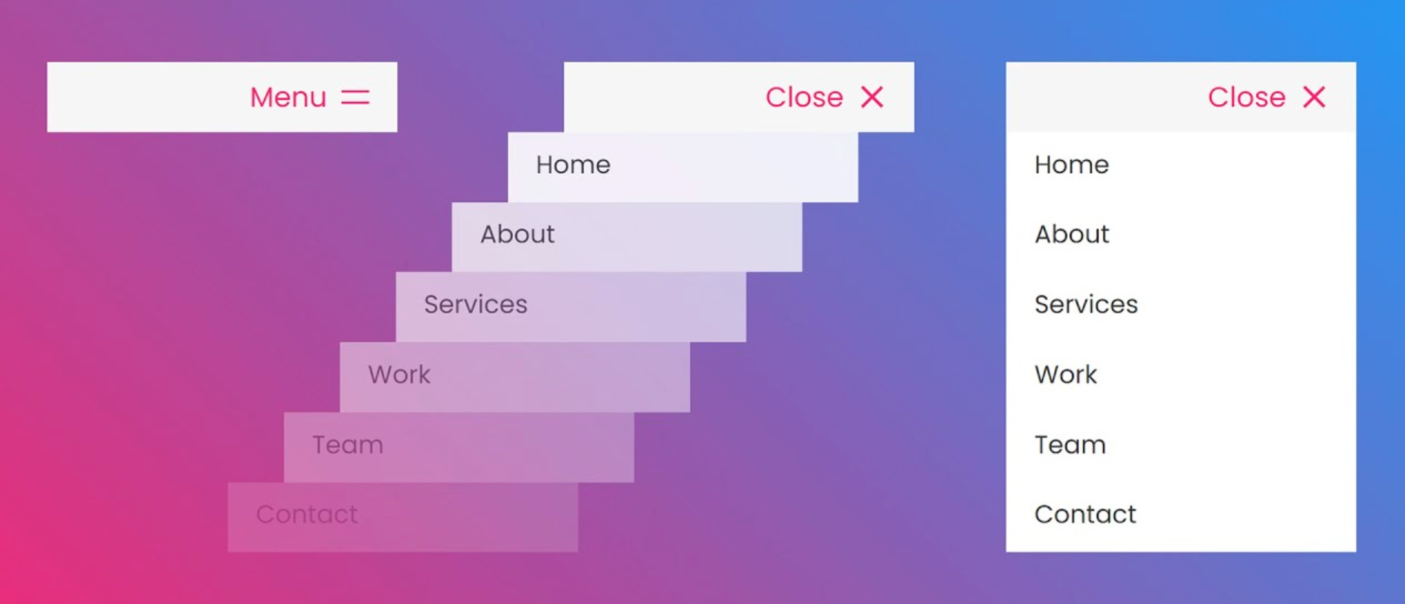
A layered side drawer adds depth and sophistication to the user interface. Instead of a simple slide-in panel, this menu design shifts multiple layers slightly to create a sense of space. The effect makes navigation feel more structured and polished without being distracting. This style is especially suitable for professional websites that value visual balance.
To create this layered experience, you can try the following:

A split-screen hamburger menu divides the interface into two parts when opened. One side typically contains the navigation, while the other showcases visuals such as product photos or videos. This approach creates balance and visual storytelling at the same time. It’s a great way to showcase your brand’s personality right within the navigation.
To design a captivating split-screen layout, consider the following tips:
A center-aligned popout menu feels modern, clean, and focused. Instead of sliding from the side, the menu appears directly in the center, immediately drawing attention to the navigation options. This layout works best for minimalist websites or mobile apps that value simplicity and balance. It reduces clutter and gives users a calm browsing experience. To implement it well, you can follow these guidelines:
Adding icons beside text labels makes navigation more intuitive and visually appealing. It helps users quickly understand what each menu item represents, even at a glance. This approach is especially effective for eCommerce or lifestyle websites that emphasize imagery and visual hierarchy. When used correctly, it improves both usability and aesthetics.
To make your icon-based menu stand out, apply these best practices:

An expandable floating menu is a playful twist on the traditional hamburger design. It usually appears as a floating button that expands outward into several options when clicked. This style saves space, especially on mobile screens, and creates a futuristic interaction. It’s great for modern apps or tech-forward brands that want a clean but interactive experience.
To bring this idea to life, try the following techniques:

A glassmorphism hamburger menu brings a sleek, modern aesthetic through translucent backgrounds and blur effects. This design feels both futuristic and sophisticated, giving the interface a high-end look. It pairs beautifully with minimal layouts and clean typography. The key is to balance transparency and readability so that the text remains legible.
To craft an elegant glassmorphism effect, focus on these points:
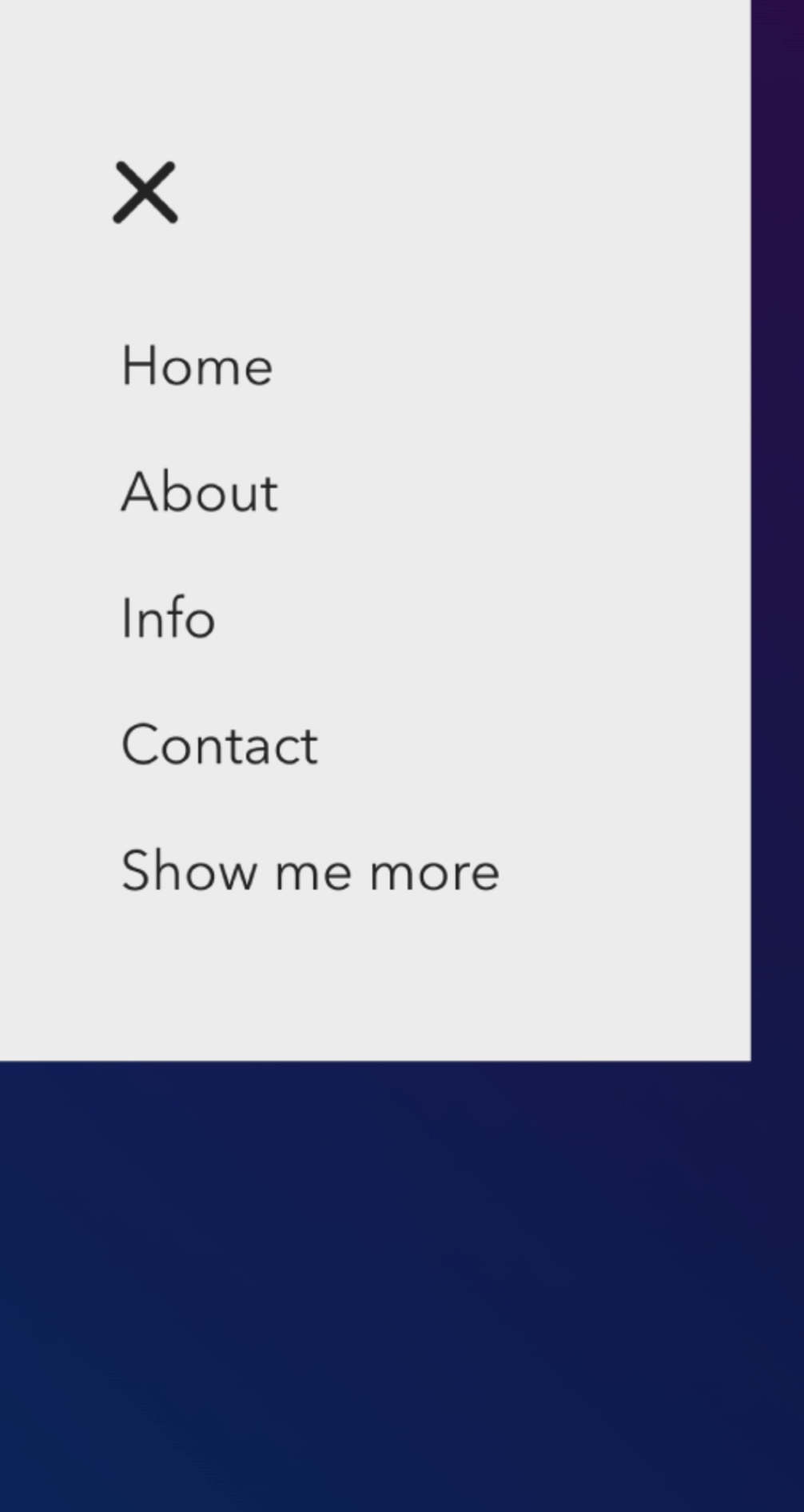
Sometimes, the simplest solution can be the most effective. A text-only hamburger menu replaces the traditional three-line icon with a clear word label like “Menu.” This removes any confusion for users who may not recognize the icon and makes navigation straightforward. It fits perfectly with minimalist or editorial-style websites.
To make this minimal menu work well, keep these in mind:
A hamburger menu does not have to be plain or predictable. With the right combination of motion, layout, and creativity, you can turn a small icon into a key element of your brand experience. The best designs go beyond functionality to create emotion, rhythm, and clarity for users. By experimenting with these creative ideas, your navigation can feel both innovative and intuitive at the same time.

