Please select the platform to login


Reducing bounce rate on a product page often comes down to one simple principle: give users the information they want, exactly where they expect it, without making them scroll endlessly. This is where custom product tabs become a powerful tool. Well-structured tabs organize content, keep the layout clean, and guide visitors through a logical flow of product details that gradually builds confidence. When those tabs are customized with thoughtful design and user behavior in mind, they can dramatically increase engagement and move shoppers closer to purchase.
Below are 10 custom product tab design ideas that improve clarity, enhance usability, and ultimately reduce bounce rate.
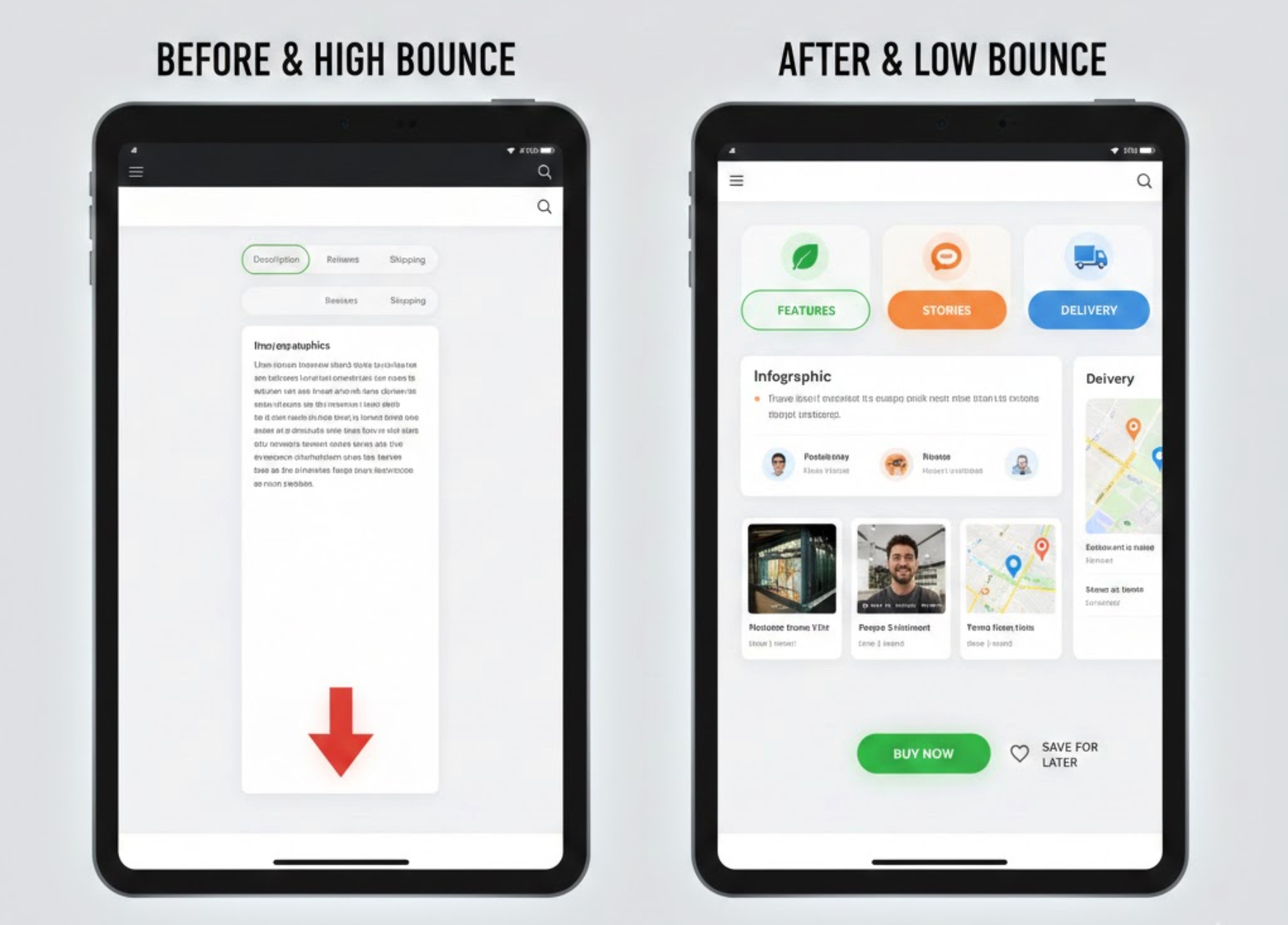
A feature-focused first tab ensures customers instantly see the product’s strongest selling points the moment the page loads. This prevents information overload while making shoppers feel they’re getting a curated highlight of what matters most. Because users decide whether to stay or leave within seconds, leading with clear, scannable features keeps them engaged. This type of tab layout builds trust by answering early-stage questions in a compact and digestible way.
As you transition to deeper details, customers naturally explore further instead of leaving prematurely.
To make this idea actionable for your store, you can structure it in the following ways:
Example:
A store selling a waterproof smartwatch uses a first tab titled “Top Features at a Glance”. The tab lists features like 10-day battery life, 100m water resistance, and AI fitness tracking, each paired with a small icon. Shoppers immediately understand what sets the product apart, reducing confusion and encouraging them to keep browsing. This structured presentation makes the product appear premium and thoughtfully designed.
Visual tabs reduce cognitive load by helping shoppers navigate information using symbols rather than text alone. Icons and badges make each section more intuitive, especially for mobile users who scan quickly. By lowering the effort needed to find details, you help users stay longer on the page and feel more in control. Clear visual signposting also supports accessibility and improves the overall shopping experience.
As shoppers follow these visual cues, they naturally move deeper into the product information flow.
To apply this idea effectively in your product page layout, you can:
Example:
A health supplement store uses tabs with icons: a leaf icon for ingredients, a stopwatch for usage instructions, and a truck for shipping. The intuitive symbols guide shoppers instantly, requiring no guesswork. Users report that navigating the product pages feels easier, leading to longer browsing sessions. The brand experiences lower bounce rates on mobile specifically due to faster comprehension.
Sticky tabs keep the navigation bar fixed at the top of the product page, ensuring easy access as users scroll. This prevents shoppers from feeling lost or needing to scroll back to the top, improving usability. When customers can quickly jump between sections, they’re more likely to stay engaged and explore the page fully. Retaining orientation increases the feeling of control, reducing premature exits.
As visitors scroll effortlessly, they naturally transition into exploring the rest of your product content.
To implement sticky tabs in a smooth and user-friendly way, consider the following:
Example:
A fashion retailer implements sticky tabs on product pages selling jackets. As users scroll past images and sizing charts, the tab bar remains accessible at the top. This allows shoppers to jump quickly to “Fabric & Care” or “Customer Photos” without scrolling back. Session recordings show users spending 20–30% longer interacting with content thanks to frictionless navigation.
A dedicated UGC tab highlights authentic shopper content such as photos, videos, or testimonials. This increases trust by letting prospects see real-world usage and styling ideas. User-generated visuals often outperform studio photos in driving credibility, making customers stay to explore more. When customers feel reassured by social proof, bounce rates naturally drop.
As they engage with the authenticity of other buyers, visitors transition smoothly into evaluating the product more seriously.
To put this idea into action, you can structure your UGC tab like this:
Example:
A sneaker store adds a tab labeled “Real Customer Photos” featuring 25+ images uploaded by buyers. Shoppers see how the shoes look in different lighting, outfits, and body types. This relatability helps hesitant visitors feel confident about colors and sizing. As a result, the product page sees extended dwell time and fewer exits.
A comparison tab helps shoppers instantly see how your product stands against alternatives. This prevents them from leaving your site to research competitors. By presenting advantages objectively and clearly, you reduce hesitation and increase purchase confidence. When users get comparison data without effort, they are more likely to stay on the page longer.
As the comparison clarifies product value, users transition seamlessly into evaluating pricing or reviews.
To create a clear and persuasive comparison experience, you can:
Example:
A store selling ergonomic chairs adds a tab called “Why This Chair Wins”. The table compares lumbar support strength, materials, adjustability, and warranty against two competitors. Shoppers quickly see that this chair has a longer warranty and better materials. They stay longer because they no longer need to open comparison articles elsewhere.
Storytelling helps humanize your product and builds emotional connection. When shoppers understand the inspiration, craftsmanship, or mission behind an item, they’re more likely to stay engaged. This tab reduces bounce rate by adding personality and narrative depth to otherwise technical pages. Emotional resonance is especially powerful for premium or artisanal products.
As shoppers finish the story, they naturally transition to exploring other details.
To create an engaging storytelling tab, you can include elements like:
Example:
A handmade bag brand includes a tab titled “The Story Behind Your Bag”. It explains how artisans from a small Vietnamese village craft each piece by hand using traditional weaving techniques. Customers feel more emotionally connected, and they spend more time exploring images to appreciate the craftsmanship. This emotional pull meaningfully reduces bounce rates for high-priced items.
A well-structured FAQ tab addresses the exact questions that normally cause visitors to leave. By pre-answering objections around shipping, returns, sizing, or compatibility, you remove friction that leads to bounce. This tab acts as a support system that comforts users before doubt sets in. Clear answers build confidence and reduce decision fatigue.
Once concerns are resolved, users smoothly transition toward purchase exploration.
To optimize this FAQ tab for maximum impact, consider the following steps:
Example:
A tech accessories brand’s FAQ tab covers questions like “Will this case fit all iPhone versions?” and “What if it cracks during shipping?”. These answers immediately reassure shoppers who might otherwise leave to check compatibility elsewhere. The brand notices fewer exits on mobile products with many model variations. Bounce rate drops because uncertainty is addressed proactively.
Interactive tabs encourage visitors to stay by engaging them actively, not passively. A size quiz, product calculator, or style selector keeps users clicking and exploring. Engagement increases time on page and lowers the chance of bounce. Interactive features also create a personalized experience that feels tailor-made.
As users complete the interaction, they transition naturally into checkout or further browsing.
To integrate interactive features smoothly, you can:
Example:
A mattress store adds a tab labeled “Find Your Perfect Firmness”, featuring a 6-question sleep quiz. Shoppers input weight, sleep style, and back issues to get a personalized firmness score. This keeps them engaged longer than static text would. By providing tailored recommendations, the tab prevents confusion and keeps users from bouncing.
A video tab gives shoppers a real-time understanding of how the product works. Videos build trust because movement and context clarify details that photos cannot capture. This keeps visitors on the page longer, significantly reducing bounce rate. A high-quality demo also reinforces perceived value.
As customers finish watching, they transition naturally to specifications or reviews.
To use video effectively in your tab design, you can:
Example:
A kitchen appliance brand adds a tab called “See It In Action” showing how quickly their blender pulverizes ice and fruit. The video demonstrates noise level, speed options, and results in real time. Shoppers gain clarity on performance they cannot infer from photos. They stay longer to rewatch or compare other models.
A recommendation tab shows related or complementary products based on user interest. This keeps shoppers browsing instead of leaving the site after viewing only one item. Personalized suggestions increase session depth and reduce bounce. It also gives users a sense of curated guidance rather than randomness.
As visitors explore suggestions, they transition to viewing additional products confidently.
To implement this idea effectively, you can include:
Example:
A beauty store adds a tab named “Perfect Routine Pairings” that recommends toner, serum, and sunscreen for users viewing a moisturizer. Each suggestion includes a mini review snippet and star rating. Shoppers stay longer exploring the full routine instead of bouncing after reading the moisturizer details. The site sees improved engagement and more multi-item carts.
Custom product tabs are more than layout enhancements, butthey’re strategic tools that shape how shoppers perceive your product and interact with your page. When thoughtfully designed, they guide visitors through a seamless flow of information that reduces confusion, builds trust, and prevents premature exits. Whether you use storytelling, visuals, comparison tables, or interactive elements, each design idea contributes to a more engaging and informative experience. By applying the 10 strategies above, you create product pages that not only reduce bounce rate but also convert more visitors into committed buyers.

