Please select the platform to login


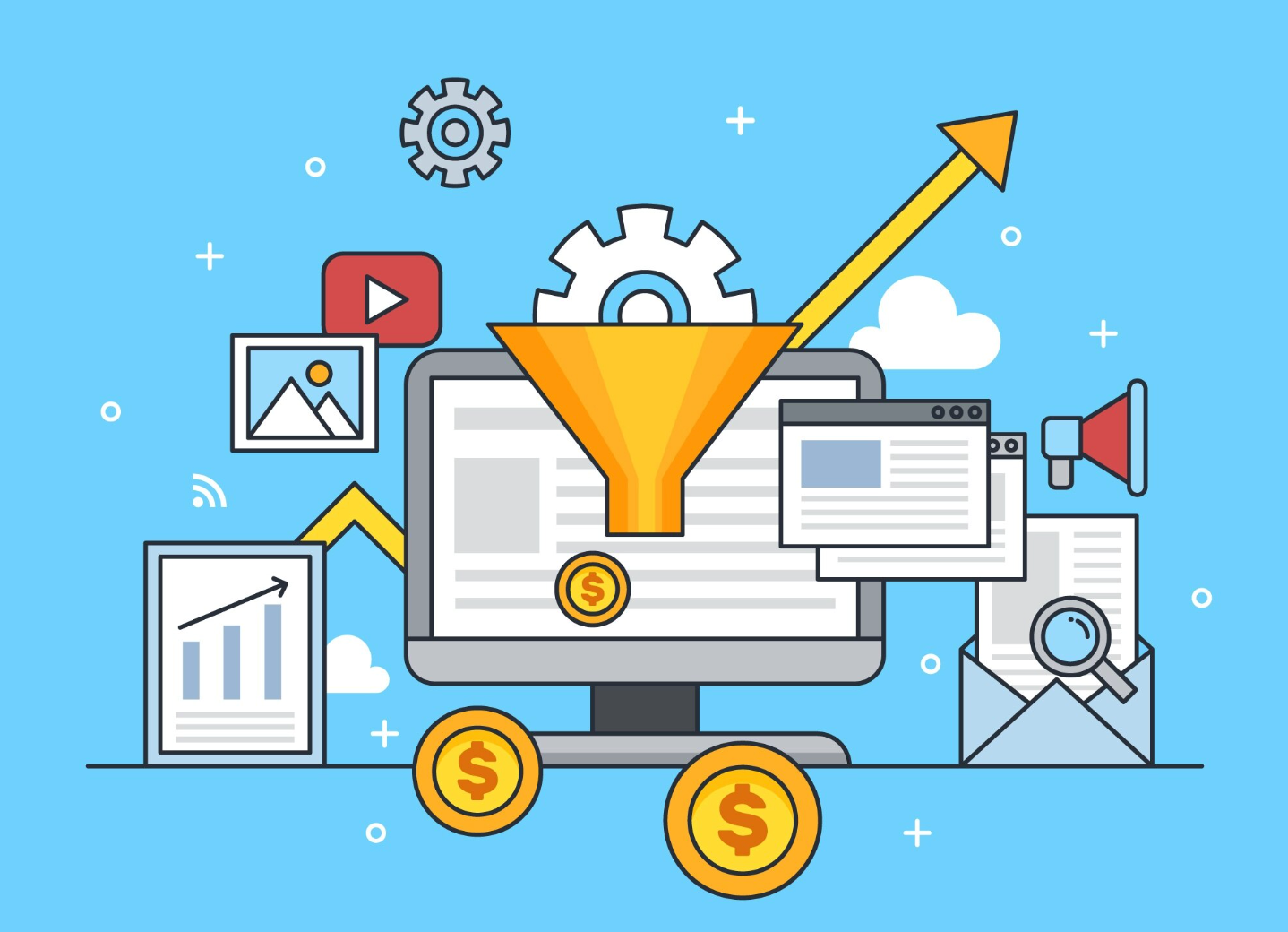
In the competitive world of eCommerce, attracting visitors to your website is only half the battle, the real challenge lies in turning those visitors into paying customers. Your design plays a major role in shaping that outcome. A well-structured, visually appealing site doesn’t just look good; it builds trust, reduces friction, and subtly guides customers toward taking action.
Every detail, from the way your navigation is organized to the size of your buttons or the quality of your images, influences how users behave. Small improvements in design can have a surprisingly large impact on your sales. Below, we’ll explore 10 practical design changes you can make to your online store. Each one focuses on usability, psychology, and presentation, three pillars that drive engagement and help you convert more visitors into loyal customers.
A confusing or cluttered navigation menu can overwhelm visitors and cause them to leave before exploring your products. Simplifying it helps shoppers find what they need quickly and confidently.
What to change:
Why it converts more:
When navigation is clear and focused, customers can explore effortlessly, reducing frustration and increasing the chances of completing a purchase.
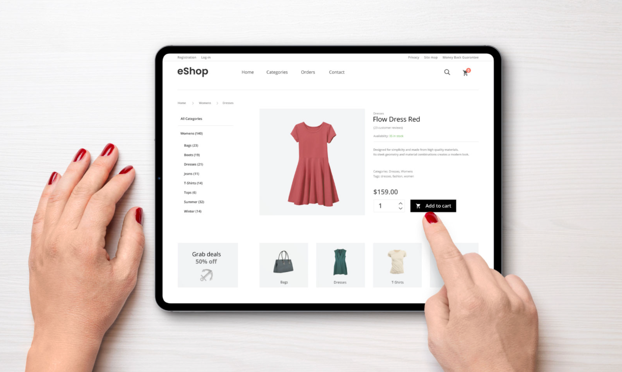
Images are your digital storefront and they shape first impressions instantly. Investing in better visuals can build trust and help customers feel confident about what they’re buying.
What to change:
Why it converts more:
Clear and realistic visuals reduce uncertainty, making shoppers more comfortable clicking “Add to Cart.”
Your CTA buttons are where visitors make the leap from interest to action. Making them more visible and persuasive can significantly boost engagement.
What to change:
Why it converts more:
A strong CTA draws attention and clearly tells users what to do next, improving click-through and purchase rates.
A slow website frustrates users and discourages purchases, especially on mobile devices. Speed optimization ensures visitors stay engaged and don’t abandon your site.
What to change:
Why it converts more:
Fast-loading pages build trust, keep users browsing longer, and improve the overall shopping experience, all leading to higher conversions.

With most online shopping happening on smartphones, mobile optimization is essential. A responsive and touch-friendly layout ensures every visitor can buy easily on any device.
What to change:
Why it converts more:
Mobile-friendly design removes friction for on-the-go shoppers, helping you capture sales that would otherwise be lost to poor usability.
A crowded layout can overwhelm visitors and hide important details. Using white space effectively creates focus and visual balance across your pages.
What to change:
Why it converts more:
White space makes your design more inviting and directs attention to key actions, helping users process information faster and make decisions more easily.

People trust other customers more than brands. Displaying authentic social proof on your site can ease doubts and build credibility instantly.
What to change:
You can make all of these actions easily by using Ryviu which can work well if you are using Shopify or WooCommerce.
Why it converts more:
Social proof builds confidence and reassures new buyers, turning hesitation into action.
Your homepage banner is often the first thing visitors see — it sets the tone for their entire experience. A well-designed hero section can instantly communicate your value and drive clicks.
What to change:
Why it converts more:
A strong hero banner captures attention, builds curiosity, and funnels users directly to your key products or promotions.
A complicated checkout process is one of the top reasons for cart abandonment. Simplifying it creates a frictionless experience that encourages shoppers to complete their purchase.
What to change:
Why it converts more:
The smoother the checkout, the less time users have to hesitate, making it much more likely they’ll finalize the order.
Consistency builds recognition and emotional connection. A cohesive brand experience makes your store look more professional and trustworthy.
What to change:
Why it converts more:
When users feel emotionally connected and confident in your brand identity, they’re far more likely to complete a purchase and return later.
At its core, great design isn’t just about appearance, but it’s about influencing behavior and creating trust. A user-friendly, visually balanced website makes visitors feel comfortable, reduces hesitation, and keeps them focused on completing their goals. Every second you save, every distraction you remove, and every trust signal you add contributes to higher conversion rates.
The beauty of design optimization is that you don’t need to rebuild your site from scratch. Start small — test a new CTA color, simplify your menu, or enhance your product images. Measure results, refine, and continue improving. Over time, these seemingly minor adjustments can work together to transform your site into a conversion powerhouse.

