Please select the platform to login


A well-designed shop page can make or break your eCommerce success. It’s where visitors browse, compare, and decide whether to buy, so every element needs to work toward one goal: conversion. A winning shop page blends design, usability, and persuasion seamlessly to create a smooth shopping experience. Let’s explore what makes a shop page truly “winning” and the 10 essential elements it should include.

A shop page is the heart of your online store. It’s the section where customers view your product listings, explore options, and make purchasing decisions. It typically includes images, titles, prices, filters, and call-to-action buttons that help shoppers discover and evaluate products. In many ways, your shop page acts like a digital storefront that must capture attention, communicate value, and make shopping feel effortless.
A winning shop page, on the other hand, goes beyond simply displaying products. It’s thoughtfully designed to guide visitors smoothly from browsing to buying while reinforcing trust and brand identity. Every element, from layout and navigation to product presentation, works together to reduce friction and encourage engagement. The best shop pages strike a balance between aesthetics and functionality, ensuring that shoppers not only find what they want but also enjoy the journey.
Your product images are the first impression visitors get of your store. Compelling thumbnails help users instantly recognize your brand’s quality and the product’s value. They should showcase your items beautifully while maintaining consistency across your catalog.
Follow the actions below to optimize the product thumbnails:
Product titles and prices act as decision triggers. Clear, concise text helps customers understand what they’re getting, while visible pricing ensures transparency. When both are presented well, shoppers can evaluate products faster and make confident purchase decisions.
Here are the best practices for your product titles and prices:
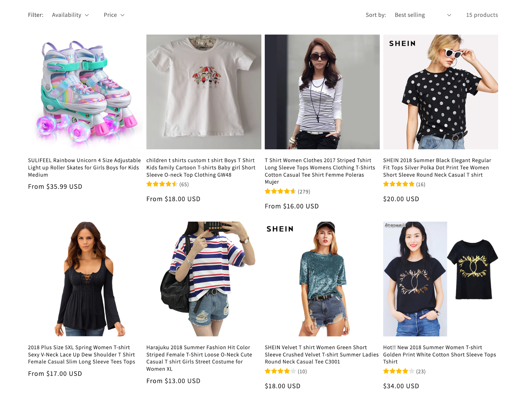
Effective filters and sorting tools transform browsing into a guided, stress-free experience. Shoppers who can narrow down results easily are more likely to stay and purchase. Well-structured filters also make your store look more professional and user-friendly.
Below are some examples of filters and sorting options:

A smart search bar helps shoppers find products in seconds, improving their satisfaction and reducing bounce rates. It’s especially valuable for returning customers who already know what they want. A well-placed, predictive search bar boosts both engagement and conversions.
When creating a smart search bar, you should:
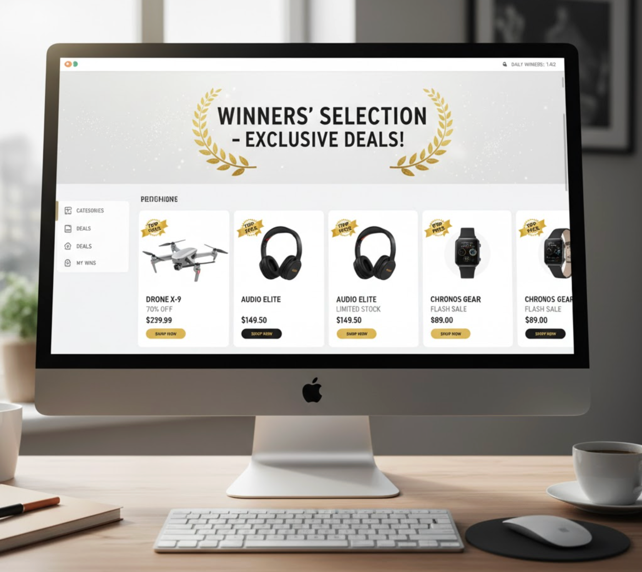
CTAs are the bridges between browsing and buying. They should stand out visually and motivate users to take the next step without hesitation. A well-designed CTA uses contrast, clarity, and emotional appeal to nudge customers toward conversion.
To create aesthetics CTA buttons, you can:
Quick view options allow users to preview product details instantly without disrupting their browsing flow. It’s a convenience feature that makes the shopping experience faster and more enjoyable. For mobile users especially, this feature can significantly improve usability and conversions.
With quick view feature, you can:
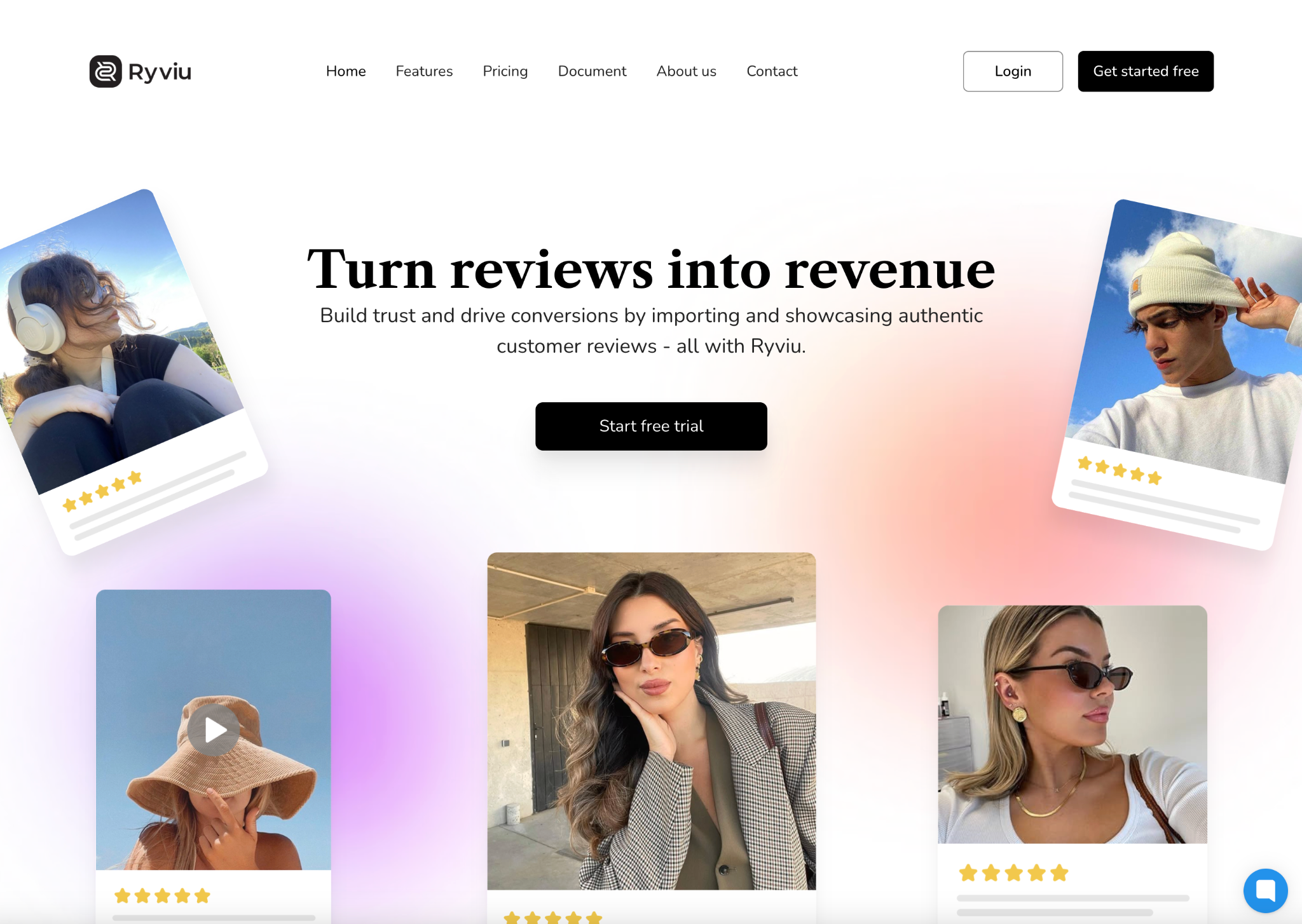
Social proof is one of the strongest motivators in online shopping. By displaying ratings and reviews directly on your shop page, you build trust and credibility at first glance. This transparency helps shoppers feel confident about product quality before they even click.
To leverage testimonials effectively, you should:
To show star ratings and review counts easily, you can use the Ryviu app, which works well on both Shopify and WooCommerce. With Ryviu, you can turn real customer feedback into powerful social proof that drives more confident buying decisions.
A wishlist lets customers save products they love and revisit them later. It’s a simple feature that drives long-term engagement and increases the chance of future purchases. It’s perfect for shoppers who aren’t ready to buy immediately but want to keep track of their favorites.
With wishlist option, you can:
In today’s mobile-first world, a responsive design isn’t optional; it’s essential. Your shop page must adapt beautifully to all devices, offering smooth scrolling, easy navigation, and fast loading times. Mobile optimization ensures you don’t lose customers on smaller screens.
Here are mobile essentials you should focus on:
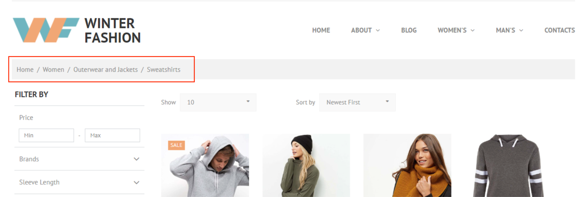
Navigation defines how easily customers can explore your shop. Breadcrumbs and logical menus help users understand where they are, find related products, and move through categories effortlessly. This creates a sense of control and improves overall satisfaction.
Let’s try some following implementation ideas:
A winning shop page seamlessly blends aesthetics, clarity, and strategy to guide visitors toward making a purchase. Every element, from layout and visuals to navigation and usability, contributes to shaping the customer’s experience. When thoughtfully designed, a shop page not only attracts attention but also builds trust, simplifies decisions, and encourages action, turning casual browsers into loyal customers.

