Please select the platform to login


Call-to-action (CTA) buttons are the final bridge between user interest and conversion. No matter how strong your product, copy, or visuals are, conversions depend heavily on how clearly and conveniently users can take action. While many marketers focus on CTA wording and color, CTA behavior and placement are equally influential in shaping user decisions.
Among the most discussed choices in conversion optimization is whether to use floating CTA buttons or static CTA buttons. Each option affects visibility, user experience, intent, and conversion quality in different ways. To make an informed decision, it’s important to compare them across multiple aspects rather than assuming one is universally better.
To better understand which CTA style works best, and when, let’s examine floating and static CTAs in detail, aspect by aspect, with clear verdicts and practical insights.
Before comparing performance, it’s essential to understand how each CTA type functions and what it is designed to achieve.
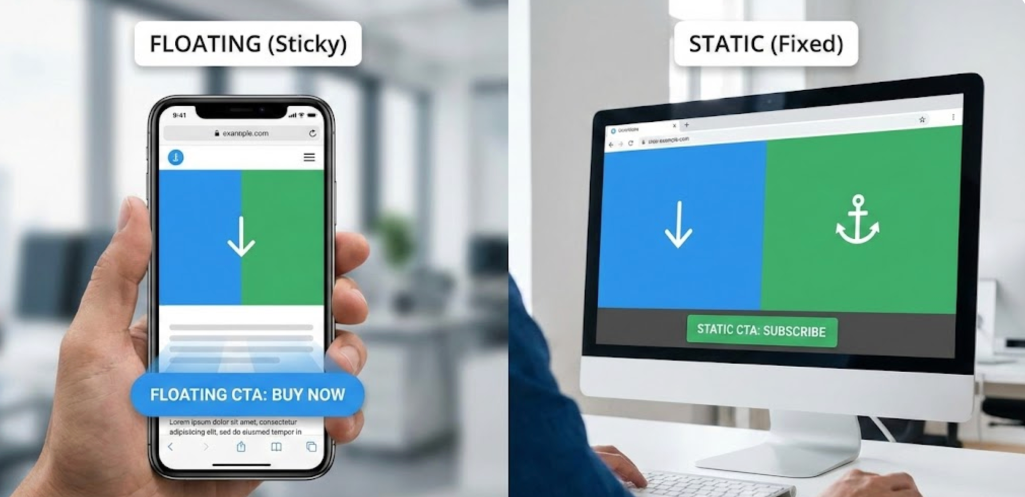
Floating CTA buttons remain visible on the screen as users scroll up or down the page. They are typically fixed to the bottom of the viewport, a corner, or occasionally the side of the screen. This persistent presence ensures the primary action is always within reach, regardless of where the user is on the page.
Because floating CTAs eliminate the need to search for a button, they significantly reduce friction at the moment of decision. This makes them especially effective for users who already know what they want and simply need a quick way to act. As a result, floating CTAs are commonly used on product pages, mobile checkouts, and landing pages with a single conversion goal.
That said, constant visibility also means constant competition for attention. Therefore, floating CTAs must be carefully designed to support, not dominate, the user experience.
Floating CTAs are built for speed, convenience, and high-intent actions.
Static CTA buttons are placed directly within the page layout and remain in a fixed position as users scroll. They usually appear after important content sections, such as product descriptions, benefit lists, testimonials, or pricing information. Rather than demanding attention at all times, static CTAs rely on context and timing.
This approach allows users to absorb information before being asked to take action. As users scroll, they encounter CTAs naturally at points where motivation and confidence are likely to peak. Because of this, static CTAs often feel less intrusive and more aligned with user expectations.
However, since static CTAs are not always visible, their effectiveness depends heavily on placement, spacing, and visual hierarchy. Poor placement can reduce visibility and delay conversions.
Static CTAs are designed for persuasion through context and content flow.
Visibility is one of the most obvious differences between floating and static CTAs, and it has a direct impact on user behavior.
Floating CTAs maintain constant visibility, ensuring users never lose sight of the action. This is particularly valuable on long pages, where scrolling can push static buttons far out of view. With floating CTAs, the opportunity to convert is always present, which helps capture spontaneous decisions.
On the other hand, static CTAs depend on strategic placement to gain attention. When placed immediately after compelling content, they can feel timely and purposeful. However, if users scroll past them too quickly, or never reach that section at all, the CTA may go unnoticed.
As a result, visibility becomes a trade-off between persistence and precision.
Verdict:
While visibility is important, user experience determines whether that visibility feels helpful or annoying.
Floating CTAs improve convenience by keeping actions accessible at all times. However, if they are too large, poorly positioned, or visually aggressive, they can interfere with content consumption, especially on mobile devices. In some cases, users may perceive them as pushy or distracting, which can negatively impact trust.
Static CTAs generally feel more respectful of the browsing experience. Because they appear at logical stopping points, they align with how users naturally consume information. This reduces cognitive load and allows users to remain focused on the content itself.
That said, static CTAs may require more effort from users who are already ready to act, since they might need to scroll back to find the button.
Verdict:
Another critical factor is where users are in their decision-making journey.
Floating CTAs assume a higher level of readiness. They work best when users already understand the offer and simply need an easy way to proceed. This is why floating CTAs perform well on product detail pages, flash sales, and checkout-related screens.
Static CTAs, by contrast, support users who are still evaluating. By appearing after explanatory content, they help guide users from understanding to action. This often results in fewer but more intentional clicks, which can improve downstream conversion quality.
Thus, the choice between floating and static CTAs often reflects whether the page prioritizes immediate action or informed decision-making.
Verdict:
Device type plays a major role in determining CTA effectiveness.
On mobile, floating CTAs often outperform static ones. Smaller screens, frequent scrolling, and thumb-based navigation make persistent CTAs extremely useful. A sticky “Add to Cart” or “Buy Now” button reduces effort and keeps the action within easy reach at all times.
On desktop, users have more screen space and are more accustomed to scanning structured layouts. In this environment, static CTAs placed after key content sections can perform just as well. Floating CTAs may still be effective, but they offer less of a usability advantage than on mobile.
Therefore, device behavior should always influence CTA strategy.
Verdict:
Page flow and storytelling are often overlooked in CTA decisions, yet they strongly influence engagement.
Floating CTAs create a persistent conversion signal that prioritizes action over narrative. While this can be effective for transactional pages, it may disrupt content-heavy experiences where users expect a logical progression.
Static CTAs integrate naturally into content flow. They allow marketers to build a story, introducing problems, presenting solutions, offering proof, and then inviting action at the right moment. This makes them ideal for blog posts, comparison guides, and educational landing pages.
Ultimately, the choice depends on whether the page’s primary goal is conversion speed or content comprehension.
Verdict:
Floating CTAs often generate higher click-through rates simply because they are always visible. However, higher clicks do not always mean better outcomes. Some users may click before fully understanding the offer, leading to drop-offs later.
Static CTAs usually attract fewer clicks, but those clicks tend to come from users who are better informed and more confident. This can lead to higher completion rates, stronger engagement, or higher order values.
As a result, marketers must decide whether they want to optimize for quantity or quality of conversions.
Verdict:
Yes, and in many cases, combining both is the most effective strategy.
Using static CTAs within content allows users to convert when context is strongest, while a single floating CTA supports users who are ready to act immediately. This dual approach accommodates different user behaviors without forcing a one-size-fits-all solution.
For example, a product page can feature static “Add to Cart” buttons after product details and reviews, while also displaying a subtle floating CTA once users scroll past the hero section.
When executed carefully, this combination enhances flexibility without overwhelming the user.
Verdict: Combining floating and static CTAs balances urgency with context.
To avoid clutter and confusion when using both CTA types:
Following these practices ensures clarity while preserving user experience.
There is no universal winner between floating and static CTA buttons. Each serves a distinct purpose within the conversion journey.
The strongest conversion strategies don’t choose one over the other. Instead, they align CTA behavior with user intent, device type, and page purpose. By thoughtfully combining floating and static CTAs, you can create a conversion experience that feels intuitive, supportive, and highly effective.

