Please select the platform to login


The F shaped layout is a proven visual and movement pattern used in both digital and physical environments. It is based on the natural way customers scan spaces: starting from the upper left, moving horizontally across, and then scanning downward before repeating the pattern. This creates an attention path shaped like the letter F. When applied to store design, this pattern helps retailers guide where customers look first, how they move, and which products receive the greatest visibility. Understanding and implementing F shaped layout allows stores to improve navigation, enhance product exposure, and create a more intuitive overall shopping experience.
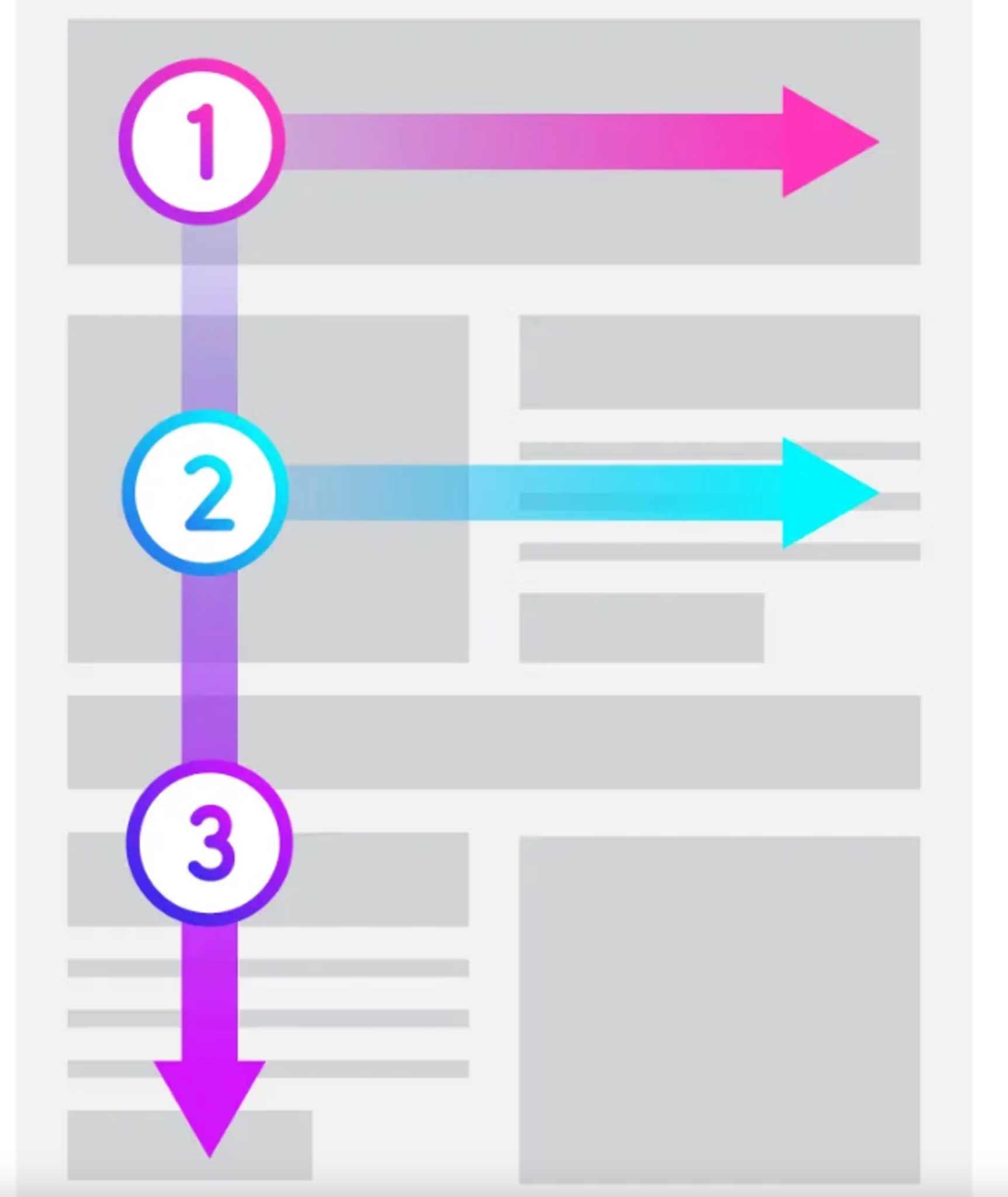
An F shaped layout is a store design strategy that aligns the physical space with the natural viewing behavior of customers. Most people scan from left to right and top to bottom, just like reading text. In a store, this means shoppers tend to focus first on the entrance and left front area, then scan to the right, move downward, and continue scanning. By designing the store around this predictable movement, you can place important products and displays along the natural eye path, ensuring they are noticed without forcing customers to change their habits.
The natural scanning pattern ensures customers notice items placed along the F path, especially in the upper left and mid store sections. This makes it easier to promote new arrivals, featured collections, or high margin products.
The F layout mirrors how customers naturally move and look. This reduces confusion, increases comfort, and encourages shoppers to explore more areas of the store without feeling overwhelmed.
Strategically positioned displays, especially in the top and mid horizontal scan lines, naturally attract attention and encourage interaction. This often leads to increased dwell time and higher likelihood of purchase.
The entrance, front left zone, and main vertical aisle are valuable retail areas. The F layout ensures these spots are used intentionally to highlight the products that matter most.
Without forcing movement, the F shaped structure subtly guides customers deeper into the store. This creates a more controlled shopping journey and increases the chance that customers view multiple product categories.
This is one of the most important zones in your entire store layout. Customers perform their first quick visual sweep as soon as they step inside. Make this area impactful by arranging:
Use vibrant signage or accent lighting to direct attention from the entrance toward this first horizontal line. Think of this area as your “first impression section,” where customers develop their initial perception within seconds.
Once customers have adjusted to your store and scanned the entrance area, they naturally slow down and look again at the mid-store level. This makes it a strategic location for:
Keep this zone highly organized and easy to browse. Use wider tables, large signage, or grouped collections to maintain attention and encourage customers to explore both sides of the middle section.
The vertical line carries shoppers from the front all the way toward the back. This aisle should be your store’s clearest path, helping customers orient themselves instantly. To enhance this vertical flow:
This vertical aisle is where customers truly begin their journey through the deeper parts of your store, so clarity and visual appeal are essential.
The F-shaped layout works best when it guides customers toward the items you most want them to notice. To optimize product impact:
By aligning strategic items with natural visual movement, you maximize visibility without forcing customers to change their browsing habits.
Your merchandising should subtly support the F movement. Use a combination of:
When combined, these elements encourage customers to follow the F path naturally, exploring each priority zone of your store without any verbal guidance.
Finally, ensure that nothing disrupts the natural movement from one section of the F to the next. Avoid placing bulky promotions, overflowing racks, or temporary stands along the scan lines or vertical path. Smooth transitions between the entrance, middle area, and back sections make the journey effortless. Use subtle cues, like flooring changes, lighting shifts, or thematic decorations, to indicate transitions without interrupting the flow.
The entrance acts as the starting point of the first horizontal scan. Keeping it open helps customers adjust to the environment and prevents them from feeling overwhelmed. Minimal but visually impactful displays, a clean layout, and soft lighting can immediately draw attention to the first part of the F path. This welcoming impression helps customers feel comfortable and encourages them to scan further inside.
Because customers first engage with products at eye level, the first and second horizontal scan lines should include the most important items, such as best sellers or trend items. Consider using risers, display tables, and organized shelving to position these items strategically. Clear arrangements and well lit displays help make products instantly noticeable and appealing.
The main vertical aisle serves as the backbone of the F layout. It should be obvious, uncluttered, and comfortable to walk through. Use lighting, flooring patterns, or signage to highlight this aisle. The goal is to make it instantly recognizable so shoppers know where to walk and what direction to follow. A strong vertical stem sets the foundation for a smooth and guided shopping experience.
Lighting plays a major role in directing attention. Start with brighter lighting near the front left area to highlight the first horizontal line, then use accent lighting to draw attention deeper into the store. Ensure lighting along the main aisle is consistent and free of shadows. Balanced lighting helps guide customer eyes along the F path while keeping the atmosphere inviting.
Signage helps customers understand the store layout and navigate effortlessly. Use category labels, directional icons, and simple brand visuals along the F path to guide movement and reduce confusion. When placed at eye level, signage also encourages customers to look toward the next section of the layout. Consistent signage builds trust and makes the shopping experience feel organized.
Clutter can disrupt attention and discourage customers from exploring further. Ensure key movement areas remain open and easy to navigate. The first two horizontal scan lines and the main vertical aisle should never be obstructed by temporary displays or overcrowded racks. A clean and organized layout keeps customers moving smoothly and encourages them to browse with confidence.
Layering displays helps reinforce the F pattern by creating depth and movement. Use a combination of low, medium, and tall fixtures to guide customer attention downward and across the store. Layered displays also make products more visually appealing and help customers discover additional items as they move through each section.
The F shaped layout is one of the most effective store design strategies for guiding attention and improving customer movement. By aligning product placement, lighting, and merchandising with natural scanning behavior, retailers can create a more intuitive and engaging shopping journey. When applied thoughtfully, this layout helps highlight priority products, streamline navigation, and encourage deeper exploration. Whether you run a fashion boutique, electronics store, or home goods shop, the F shaped layout provides a clear structure for maximizing visibility and boosting overall sales performance.

