Please select the platform to login


Language is one of the most powerful tools in eCommerce design, yet it is often underestimated. While visuals guide attention and layout shapes behavior, words are what ultimately explain, reassure, and persuade users to take action. When language is unclear or ambiguous, shoppers hesitate, make mistakes, or abandon the experience entirely. To create interfaces that feel intuitive and trustworthy, eCommerce brands must prioritize clarity, consistency, and user-centered language at every touchpoint.
In this article, we’ll explore why confusing language is so common in eCommerce interfaces and how to systematically avoid it. From product pages and checkout flows to error messages and microcopy, these best practices will help you communicate more clearly and convert with confidence.

Confusing language refers to any wording that makes users stop and think, interpret, or guess what something means before moving forward. This includes vague labels, internal jargon, inconsistent terminology, or overly technical explanations that do not match the user’s mental model.
In eCommerce, confusion is especially costly. Shoppers expect speed, clarity, and reassurance, particularly when they are spending money or sharing personal information. If users feel unsure about what a button does, what a policy means, or what will happen next, they are far more likely to leave than to experiment.
Common signs of confusing language include frequent customer questions, repeated form errors, abandoned carts, and support tickets that ask for basic clarification. These are often language problems disguised as usability issues.
One of the most effective ways to reduce confusion is to write the way your customers think and speak. Plain language prioritizes clarity over cleverness and familiarity over formality, making interfaces easier to scan and understand.
To achieve this, avoid technical terms, marketing buzzwords, or internal company language that users may not recognize. Instead, use simple, direct wording that communicates the action or outcome clearly. This is especially important for buttons, navigation labels, and instructions.
To make interfaces feel intuitive, the wording should mirror how customers naturally talk and think, not how businesses describe things internally.
By lowering the cognitive load of your interface language, you help users move forward without second-guessing themselves.
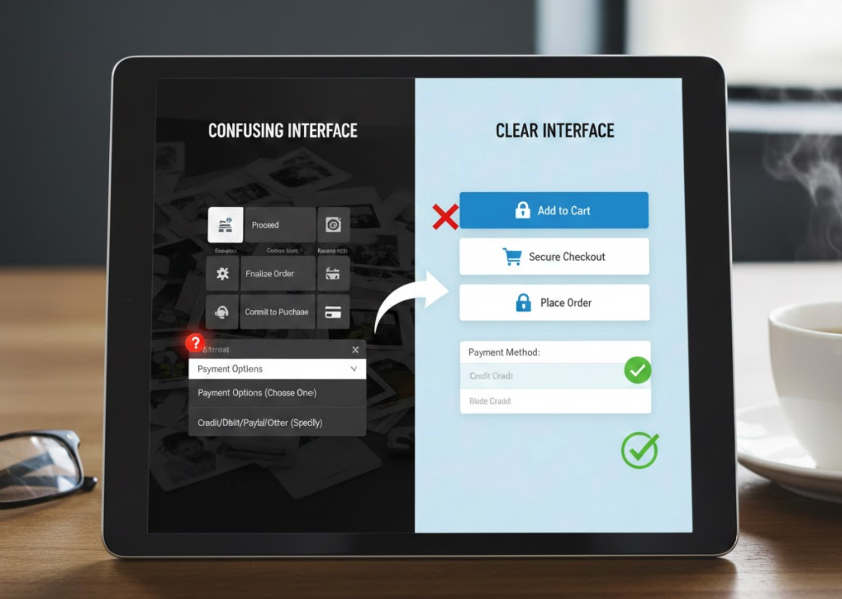
Vague wording is a major source of confusion in eCommerce interfaces. Labels like “Continue,” “Submit,” or “Confirm” often leave users unsure about what will happen next, especially during checkout or account creation.
Clear interfaces anticipate user anxiety and answer unspoken questions through language. When users know exactly what an action will do, they feel more confident taking it. This is particularly important when money, data, or irreversible steps are involved.
Whenever users are asked to click, submit, or move forward, the interface should clearly explain what will happen next so there are no surprises.
Specific language reduces hesitation and builds trust by making the interface feel transparent and predictable.
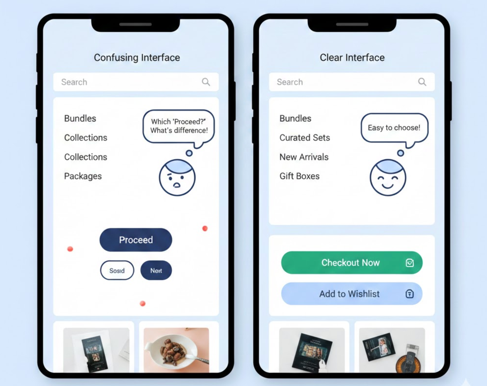
Inconsistent terminology forces users to relearn meanings as they move through the site, increasing mental effort and frustration. For example, switching between “cart,” “bag,” and “basket” may seem minor, but it disrupts the user’s mental model.
Consistency helps users build confidence and move faster because they don’t need to reinterpret language at each step. This applies not only to navigation and buttons, but also to policies, form labels, and system messages.
Using the same words for the same concepts throughout the shopping journey helps users build confidence and move through the site without hesitation.
When users see the same words used in the same way throughout the experience, the interface feels cohesive and easier to trust.
Some words carry multiple meanings depending on context, which can easily confuse users. Terms like “Free,” “Premium,” or “Standard” may sound appealing, but without explanation, they leave too much room for interpretation.
In eCommerce, ambiguity often appears in pricing plans, shipping options, or promotional messaging. If users have to guess what a label includes or excludes, they may assume the worst and abandon the purchase.
Labels should communicate exactly what users are getting, rather than relying on vague or overly broad terms that invite misinterpretation.
Clear labeling helps users compare options accurately and feel confident in their decisions.
Error messages are often overlooked, yet they are one of the most critical moments for clear language. Generic messages like “Invalid input” or “Something went wrong” do nothing to help users recover.
Effective error messages explain what happened, why it happened, and how to fix it, all in calm, human language. Instead of blaming the user, they should act as a guide that helps users get back on track quickly.
When something goes wrong, the language should guide users calmly toward a solution instead of leaving them confused or frustrated.
When errors are easy to understand and resolve, users are far more likely to complete their purchase instead of giving up.

Most eCommerce users scan interfaces rather than reading them word for word. Long paragraphs, dense explanations, or poorly structured text make it harder for users to find what they need quickly.
To support scanning, break information into digestible pieces and place key messages where users expect them. Good structure works hand-in-hand with clear language to reduce confusion.
Because most shoppers skim rather than read carefully, interface copy should be structured to communicate key points at a glance.
When language is structured for quick comprehension, users feel guided rather than overwhelmed.
Even well-written copy can be confusing if it doesn’t align with how users think. Assumptions made by designers or marketers don’t always match real-world understanding, which is why testing is essential.
User testing can reveal misunderstandings, hesitation points, or misinterpretations that analytics alone cannot explain. Observing how users react to language provides invaluable insight into what needs improvement.
The most reliable way to know whether your wording works is to observe how real users interpret and react to it in practice.
Language that works in theory should always be validated in practice.
Clear language is not only a copywriting concern, but it is also a core component of eCommerce usability and conversion. When words are simple, specific, and consistent, users feel confident navigating the interface and completing their purchases.
By avoiding jargon, clarifying actions, maintaining consistency, and writing helpful microcopy, eCommerce teams can eliminate unnecessary confusion and friction. Over time, these small language improvements add up to smoother journeys, fewer support issues, and higher customer trust.
In eCommerce, every word matters. The clearer your language, the easier it becomes for users to say “yes.”

