Please select the platform to login


Website navigation is the backbone of every eCommerce experience. It determines how quickly shoppers find what they want, explore new products, and move toward purchase. In modern eCommerce, navigation design is evolving toward simplicity, interactivity, and personalization, all aimed at boosting conversions and engagement. Below are eight navigation design trends shaping modern online stores, along with practical ways to apply each one effectively.
Modern eCommerce navigation focuses on simplicity. Clean menus remove unnecessary clutter, keeping only essential links like “Shop,” “New Arrivals,” and “Contact.” A minimalist layout paired with clear typography and generous spacing gives users a calm and frictionless experience.
Why it works: It reduces confusion, improves readability, and helps customers focus on core actions.
To make the most of minimalist navigation, follow these proven techniques:

Sticky headers keep the main menu, cart, and search bar visible as users scroll. This approach improves accessibility and reduces the need to scroll back to the top, especially on long product pages. It is particularly useful for mobile users who rely on quick, thumb-friendly interactions.
Why it works: It maintains constant access to key actions, improving conversion rates.
To ensure sticky navigation works seamlessly, consider these recommendations:
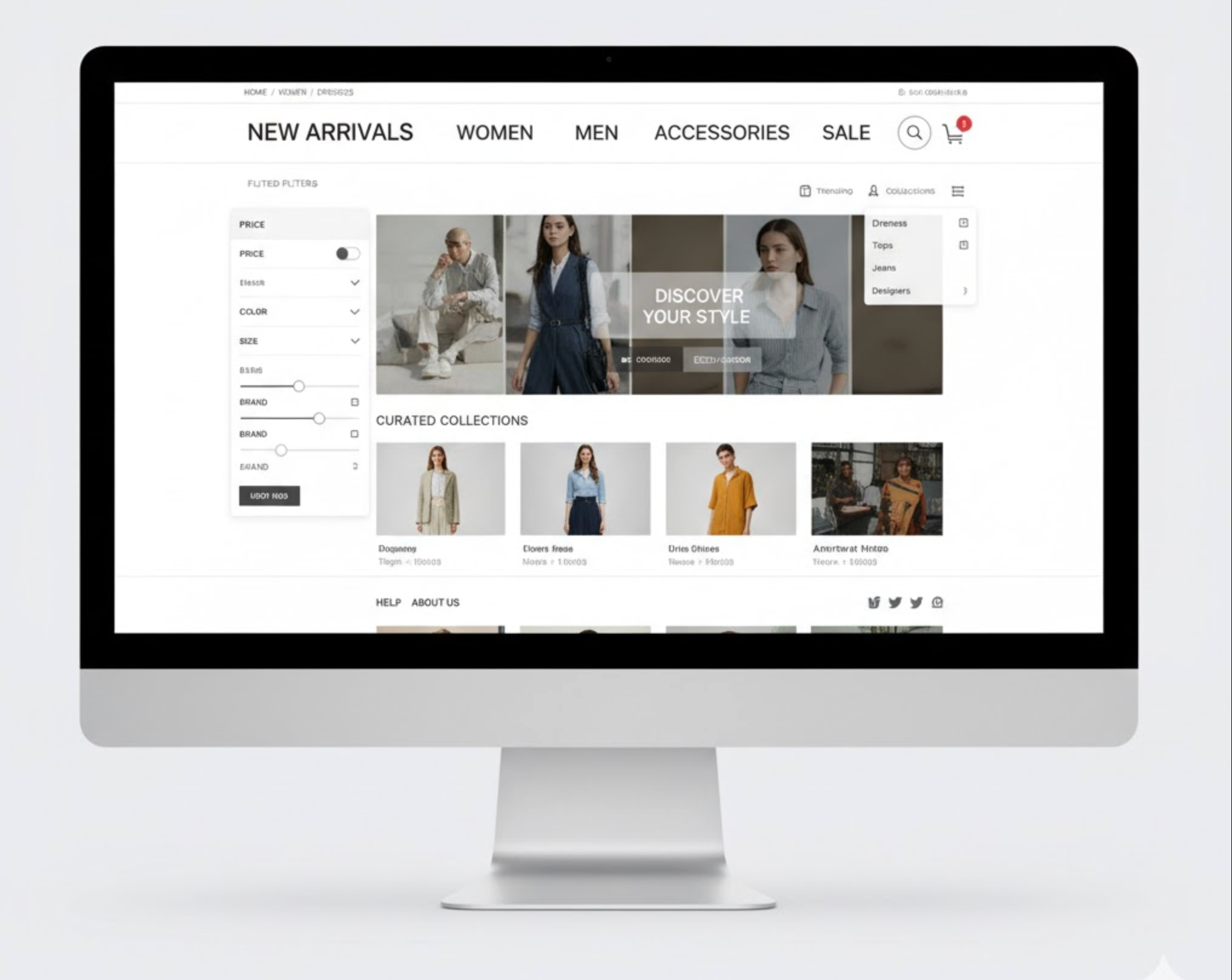
Mega menus display a wide panel of options, allowing users to view categories, featured items, and promotions at once. When combined with images, icons, or banners, they turn navigation into a visually engaging discovery tool.
Why it works: It simplifies browsing large catalogs and highlights top-selling or new products.
To design effective and user-friendly mega menus, you should:
Personalized navigation adapts to each visitor’s preferences by highlighting relevant products, categories, or promotions. Using data such as browsing history, purchase patterns, or location, it dynamically tailors the menu to each user.
Why it works: It creates a sense of relevance and reduces the time it takes to find desired items.
To successfully implement personalized navigation, apply these strategies:

With mobile shopping now dominating eCommerce, hamburger menus have evolved to enhance usability. Instead of hiding too many links, modern designs prioritize top categories and display icons for quick navigation. Animated slide-out panels provide an app-like experience that feels modern and intuitive.
Why it works: It saves screen space while ensuring easy access on smaller devices.
To create a smooth mobile navigation experience, remember to:
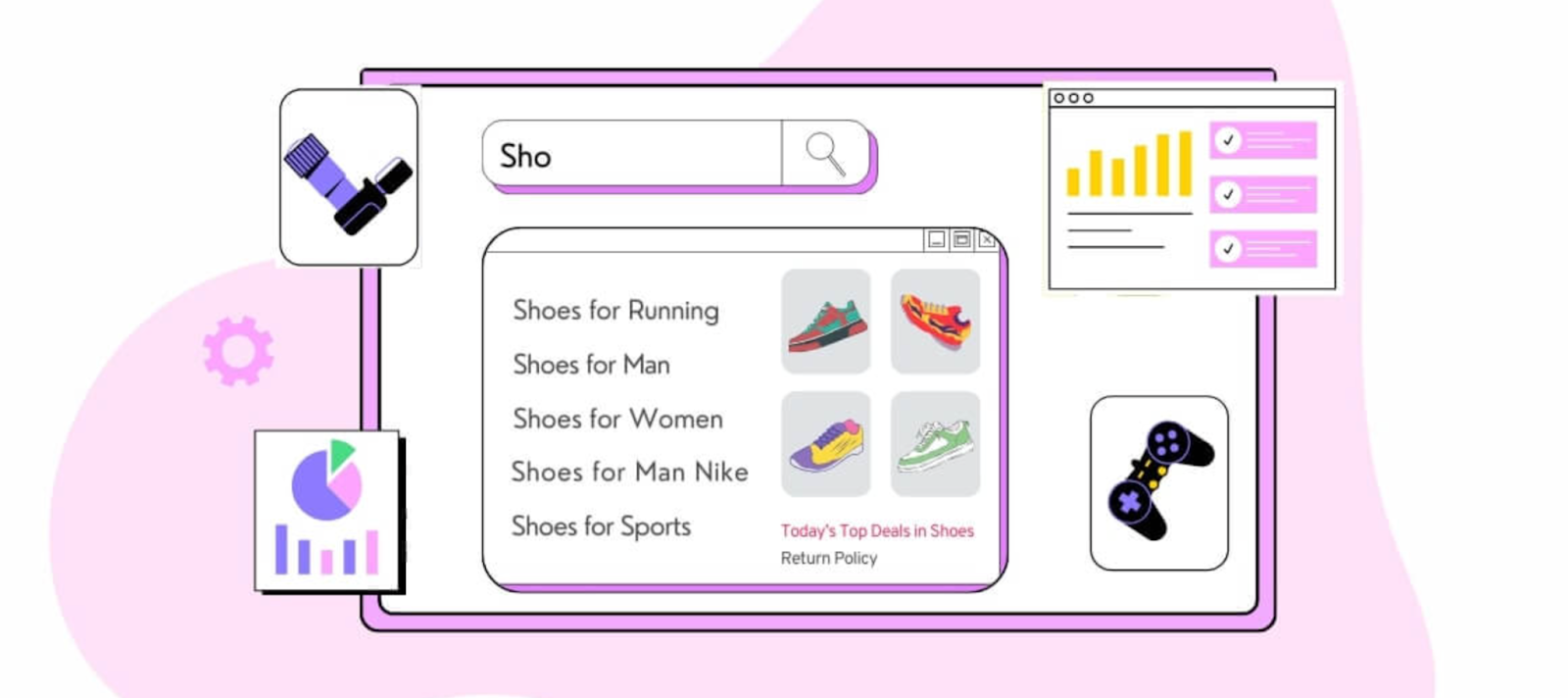
Search is now a major navigation tool. Predictive search suggests products, brands, or categories as users type, reducing the effort needed to find items. Some advanced designs integrate filters directly into search results, making discovery faster and more intelligent.
Why it works: It anticipates user intent, accelerates decision-making, and increases engagement.
To optimize predictive search for your store, keep these points in mind:
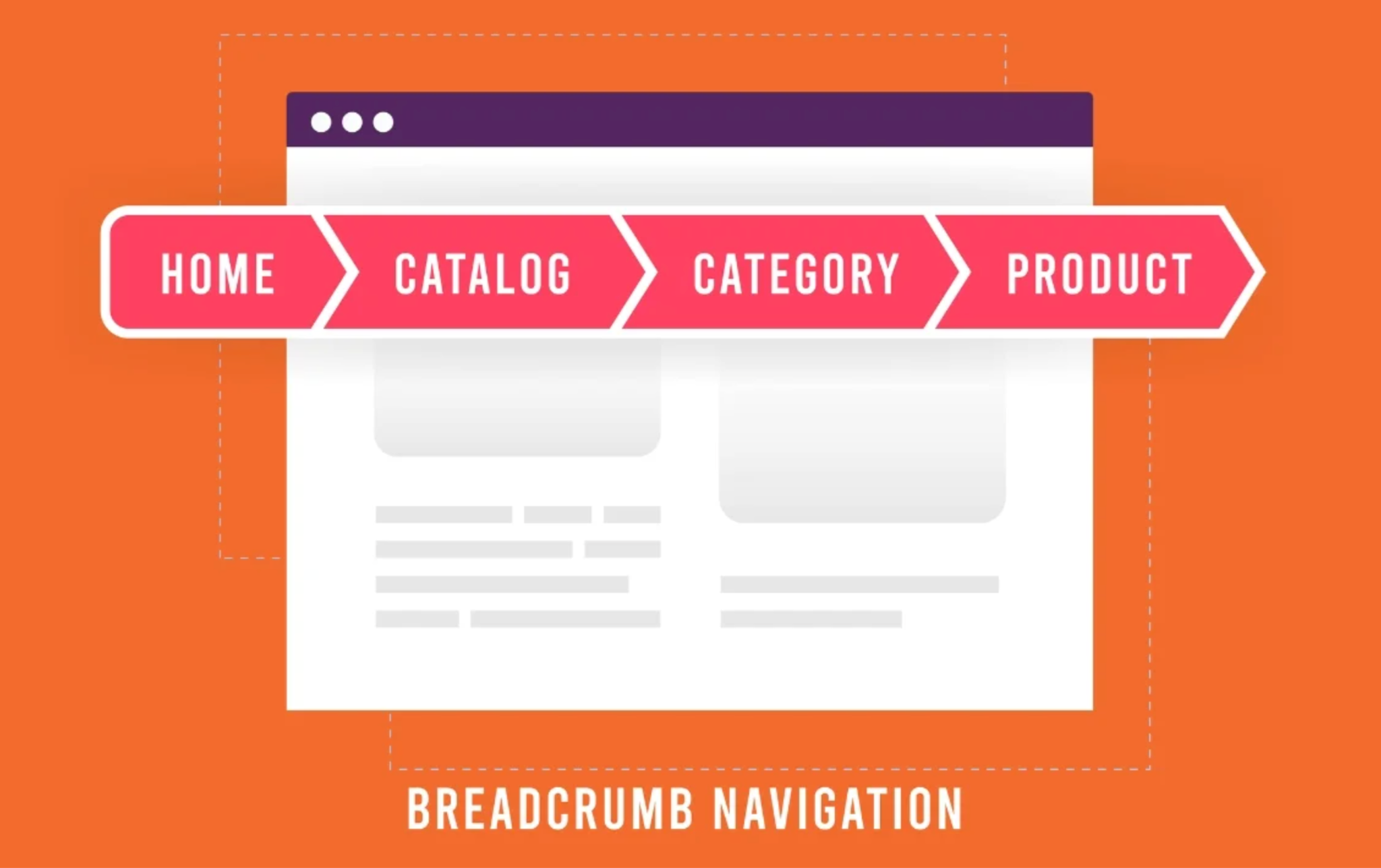
Breadcrumb navigation helps users understand their current position and move easily through categories. In modern stores, breadcrumbs often include icons or dropdown filters to enhance usability and product exploration.
Why it works: It improves orientation, reduces frustration, and strengthens SEO by creating better internal linking.
To make breadcrumb navigation more effective and intuitive:

Subtle animations like hover highlights, fade-ins, or dropdown transitions make navigation more engaging and intuitive. When used strategically, these microinteractions guide attention and give users visual feedback that enhances trust.
Why it works: It adds delight and clarity, turning simple actions into memorable interactions.
To apply micro-animations effectively without overwhelming users:
Modern eCommerce navigation is all about guiding customers effortlessly from exploration to purchase. Trends like clean menus, sticky bars, and predictive search show how design and functionality can merge to boost conversions. By applying these practical tips, you can create navigation that feels intuitive, responsive, and engaging, helping users stay longer and shop more confidently.
Smooth navigation is not just a design feature, but it is your store’s silent salesperson.

