Please select the platform to login


In the world of eCommerce, first impressions matter, especially on mobile devices. With over 70% of online shopping now happening via smartphones, your mobile homepage is often the first touchpoint between your brand and potential customers. A slow, cluttered, or unresponsive homepage can drive visitors away in seconds, potentially losing not only immediate sales but long-term customer loyalty.
Optimizing for speed isn’t just about aesthetics; it directly impacts conversions, SEO rankings, and overall user experience. Every element, from images to scripts, affects the perceived speed and usability. In this article, we’ll guide you through strategies to build a high-speed mobile homepage that not only loads quickly but also keeps your customers engaged and encourages purchases.
Mobile users are inherently impatient. Research consistently shows that if a page takes longer than three seconds to load, over half of visitors will abandon it, often switching to a competitor’s website. Page speed affects multiple aspects of your business:
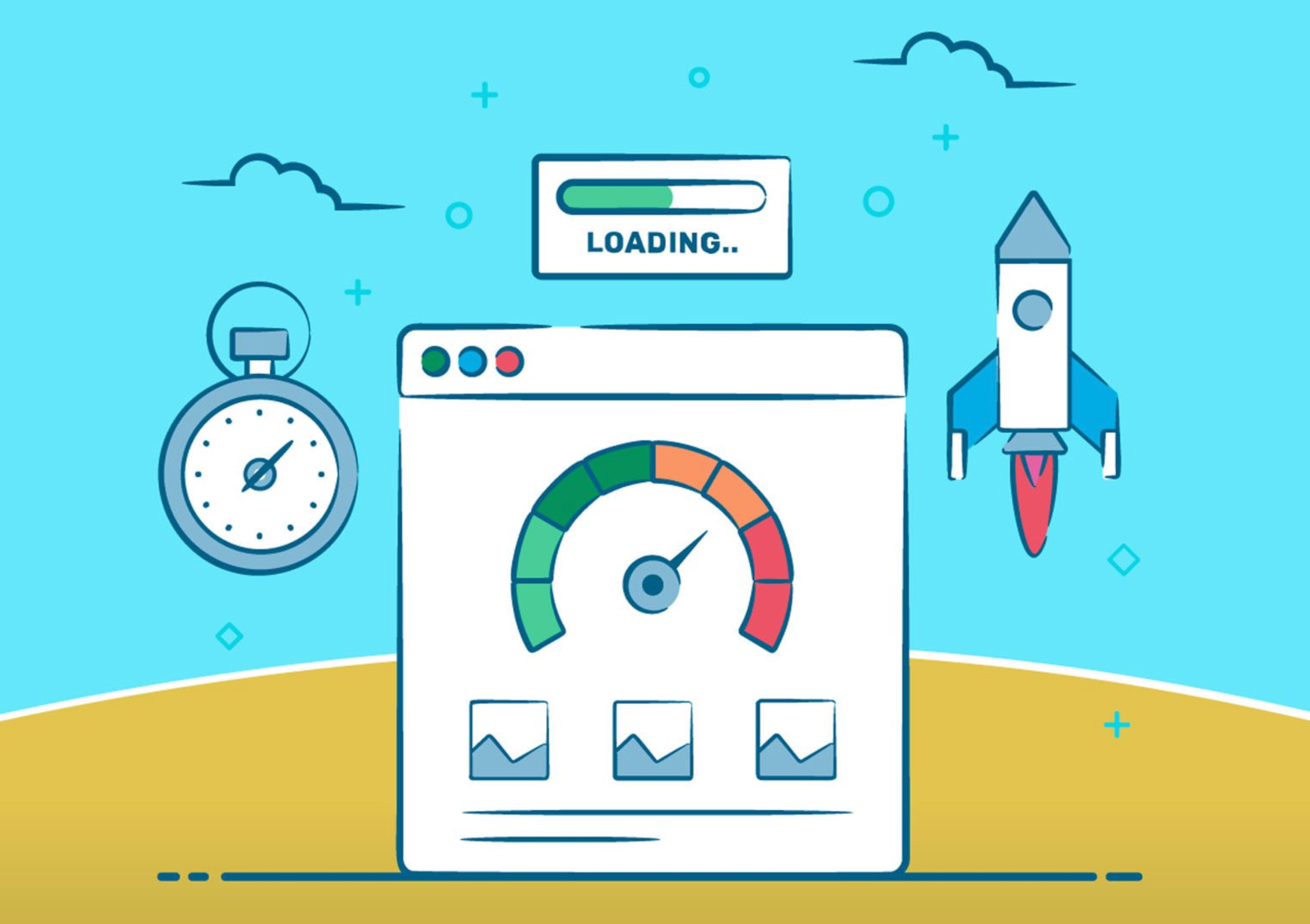
Start by auditing your current mobile homepage. Tools like Google PageSpeed Insights, GTmetrix, or Lighthouse provide detailed metrics, highlighting bottlenecks such as oversized images, render-blocking scripts, or slow server response times. Understanding the current performance baseline allows you to prioritize improvements effectively.
A high-speed homepage begins with a lean, purposeful design. Every element should serve a functional purpose, guiding users toward your primary objectives, whether that’s showcasing products, highlighting promotions, or encouraging sign-ups.
A clean and purposeful design doesn’t just improve speed, it also guides visitors naturally toward conversion actions, reducing friction and improving overall usability.

Images and videos are often the heaviest elements on mobile homepages. Optimizing media can dramatically reduce load times while maintaining visual appeal:
Even minor improvements in image optimization can shave seconds off load times, making your site feel snappier and more responsive, which is essential for retaining mobile visitors.
Beyond design and media, several technical strategies can greatly enhance mobile page speed:
Implementing these techniques not only improves perceived speed but also enhances actual performance, allowing users to interact with your homepage almost instantly.
Mobile devices are typically less powerful than desktops and often rely on slower network connections. Optimizing specifically for mobile ensures a smooth and responsive experience:
Mobile optimization is not just about smaller screens, but it’s about creating a seamless experience that feels fast and intuitive, even on slower connections.
Building a high-speed mobile homepage is an ongoing process. Websites evolve over time, and new plugins, content, or design changes can impact performance. Regular testing ensures your homepage remains fast and effective:
Continuous iteration keeps your mobile homepage optimized, ensuring a consistent, fast, and user-friendly shopping experience over time.
A high-speed mobile homepage is no longer optional, it’s critical for eCommerce success. By combining streamlined design, optimized media, mobile-focused performance techniques, and continuous testing, you can create a homepage that engages users immediately, reduces bounce rates, and drives conversions.
Every second counts: the faster your homepage loads, the more likely visitors are to stay, explore, and make a purchase. Investing in mobile speed is investing in your brand’s growth, customer satisfaction, and long-term success.

