Please select the platform to login


Your hero banner is the very first thing your visitors see when they land on your online store. It’s not just a decorative section, it’s your store’s handshake, your brand’s opening statement, and your best opportunity to make a lasting impression. A well-designed hero banner can instantly draw attention, communicate your brand’s personality, and persuade visitors to explore your products further. In a world where online shoppers decide within seconds whether to stay or leave, your hero banner has the power to make or break that decision.
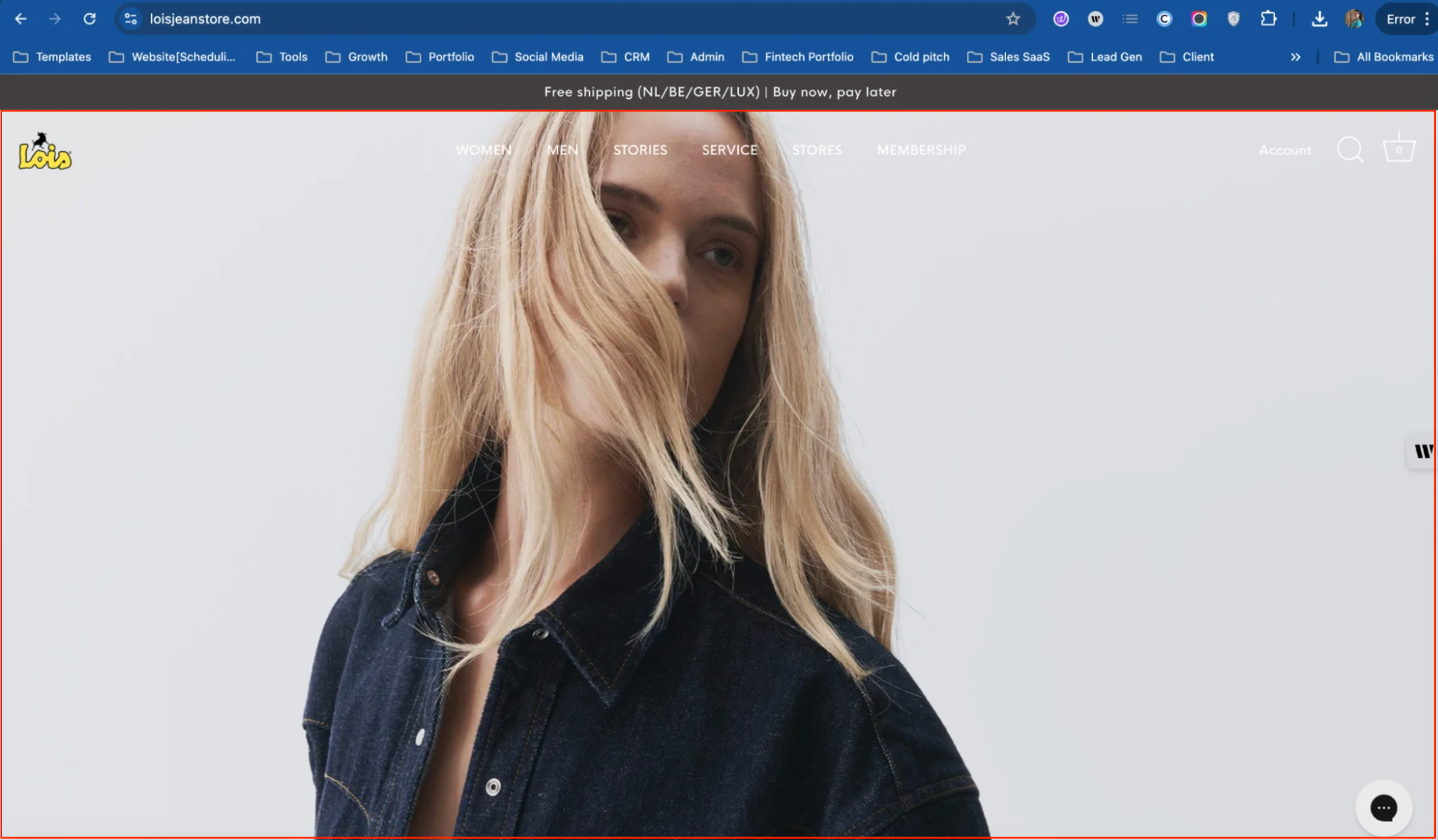
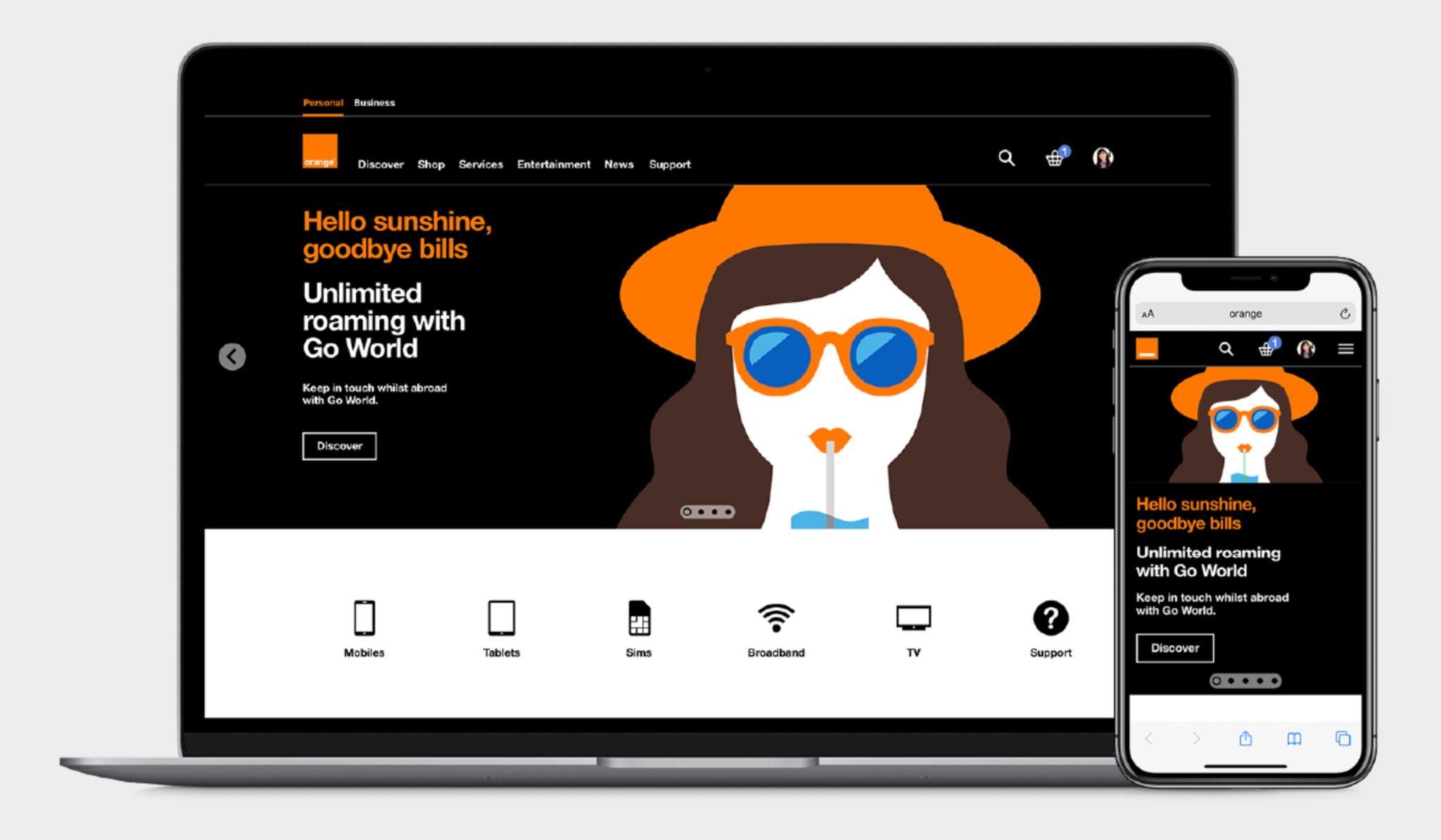
A hero banner (or hero section) is the large, visually dominant area at the top of a webpage. It usually includes a background image or video, a headline, supporting text, and a call-to-action (CTA) button. This section is often the most valuable real estate on your homepage, it tells your audience what your brand stands for and what you offer at a glance.
An effective hero banner doesn’t just show a pretty picture; it tells a story. Whether it’s showcasing a product, a lifestyle, or a promotional message, every element should work together to convey a single, clear message. For example, a skincare brand might feature a close-up shot of fresh, glowing skin paired with the line “Your Glow Starts Here,” while a tech brand could highlight sleek product shots with a bold message like “Innovation That Inspires.”
Think of your hero banner as the digital equivalent of a store window display. In a physical store, a beautifully arranged window can stop people in their tracks. Online, your hero banner serves that same purpose, it’s what determines whether visitors scroll further or bounce away.
Here’s why it’s so important:
In essence, a thoughtfully designed hero banner transforms casual browsers into engaged shoppers by instantly showing them why they should care about your brand.
Designing a hero banner that truly stands out does not only involve picking a pretty image, but it’s also about crafting a cohesive, strategic visual story that draws your visitors in and guides them toward action. Every element should be intentional and work together to communicate your brand’s message clearly. Follow these steps to create an eye-catching hero banner that converts.
Start with a high-quality image or short looping video that instantly captures attention. Your visual should reflect your brand’s identity and mood, elegant, playful, bold, or minimalist. The image should also support your message rather than distract from it.
If you sell products, use imagery that shows them in context or being used by real people. Lifestyle photos often perform better than product-only images because they help customers imagine themselves using the item. For videos, keep them short (under 10 seconds), visually engaging, and optimized for quick loading.
Avoid cluttered visuals. Simplicity and clarity create focus, allowing your key message to shine through.
Your headline is your hook, the one sentence that must convince visitors to pay attention. Keep it short, bold, and emotionally resonant. Focus on the benefit your customers get, not just the product you sell.
For example:
Use a tone that matches your brand personality. A luxury store might use elegant, understated language, while a streetwear brand could go for something energetic and edgy. The key is clarity and connection, your audience should immediately know why your brand matters to them.
The subheadline or supporting text helps explain your offer in a little more detail. This is your chance to highlight your value proposition or what sets you apart, craftsmanship, sustainability, affordability, or innovation.
Keep it to one or two concise sentences. For instance:
“Made from 100% recycled materials — because your style shouldn’t cost the planet.”
This type of message deepens your emotional appeal and encourages visitors to explore further.
Think of it as the friendly explanation that follows your headline, clear, meaningful, and authentic.
Your Call-to-Action (CTA) is where curiosity turns into action. It tells visitors what to do next, shop, explore, or learn more. The best CTAs are short, action-oriented, and easy to spot.
Try phrases like:
Use contrasting colors and bold typography to make your CTA stand out visually. Position it above the fold so it’s visible without scrolling. And most importantly, focus on one main CTA, too many buttons can dilute attention and reduce conversions.

A great hero banner isn’t just about visuals, it’s also about composition. Align your text and visuals in a way that feels natural and balanced. Follow a clear visual hierarchy: the headline should grab attention first, then the subheadline, followed by the CTA.
Choose fonts that are readable and consistent with your brand identity. Avoid using more than two font families. Combine a bold display font for headlines with a clean, simple font for body text.
Maintain generous spacing around text and images. White space gives your design room to breathe and helps users focus on what’s most important.
Every element of your hero banner should feel like it belongs to your brand. Stick to your signature color palette, tone of voice, and image style. Consistency creates trust and makes your store instantly recognizable.
If your brand uses warm, earthy tones and natural textures, your hero banner should mirror that aesthetic. If your identity is sleek and modern, stick to minimal layouts and high-contrast visuals.
Consistency also means aligning your banner with current marketing campaigns, from social media ads to email headers, so your messaging feels seamless across channels.
Even the best designs benefit from iteration. Track engagement metrics like click-through rates and scroll depth to see how your banner performs. A/B test different headlines, CTAs, or visuals to find what resonates most with your audience.
Update your banner seasonally or during major campaigns to keep it fresh and relevant. A dynamic, regularly refreshed banner signals that your brand is active and evolving, not static or outdated.
By following these steps, you’ll create a hero banner that’s not only visually stunning but also strategically designed to engage visitors and drive results. The best hero banners tell a story, guide action, and make your brand unforgettable from the very first second.
Creating a stunning hero banner goes beyond the basics. Small design choices can make a huge difference in how engaging and effective your banner feels.
Contrast draws attention to what matters most. By pairing dark overlays with light text (or vice versa), you can make your message easier to read while adding depth to your design. Don’t be afraid to experiment with opacity or gradient overlays, they can make your image pop while keeping the focus on your text and button.
Even the most beautiful hero banner won’t convert if it slows down your site. Compress and optimize your images to maintain quality without increasing file size. Consider using modern image formats like WebP for faster loading.
Shoppers are impatient, if your banner takes too long to load, you risk losing them before they even see your content.
More than half of online shopping happens on mobile devices, so your hero banner must be fully responsive. Ensure that text remains legible and CTAs stay centered on smaller screens.
You can try the actions below to test your hero banner responsiveness:
A static hero banner can make your store feel outdated. Keep your site fresh by updating your banner to reflect current campaigns, sales events, or seasonal themes.
For example, feature cozy lifestyle imagery and warm tones during winter promotions or bright, sunlit visuals for summer collections. Regular updates not only keep your homepage engaging but also signal to customers that your store is active and thriving.
An eye-catching hero banner is much more than just a design feature, it’s your store’s storytelling canvas and conversion driver. When crafted with intention, it captures attention, conveys your message, and inspires visitors to take action.
Start with a strong visual that speaks to your brand, add a clear and compelling message, and guide your audience with a purposeful CTA. Keep testing, refining, and refreshing your banner to keep it aligned with your goals and audience.

