Please select the platform to login


As eCommerce continues to expand across borders, address forms have become one of the most critical yet underestimated elements of the checkout experience. A poorly designed address field can confuse international shoppers, trigger validation errors, and ultimately cause cart abandonment. What feels intuitive in one country may feel restrictive or broken in another, making global address design a true UX challenge.
To reduce friction and build trust with international customers, eCommerce brands must design address fields that are flexible, adaptive, and inclusive. Below are practical best practices to help you create address forms that work smoothly for users around the world.
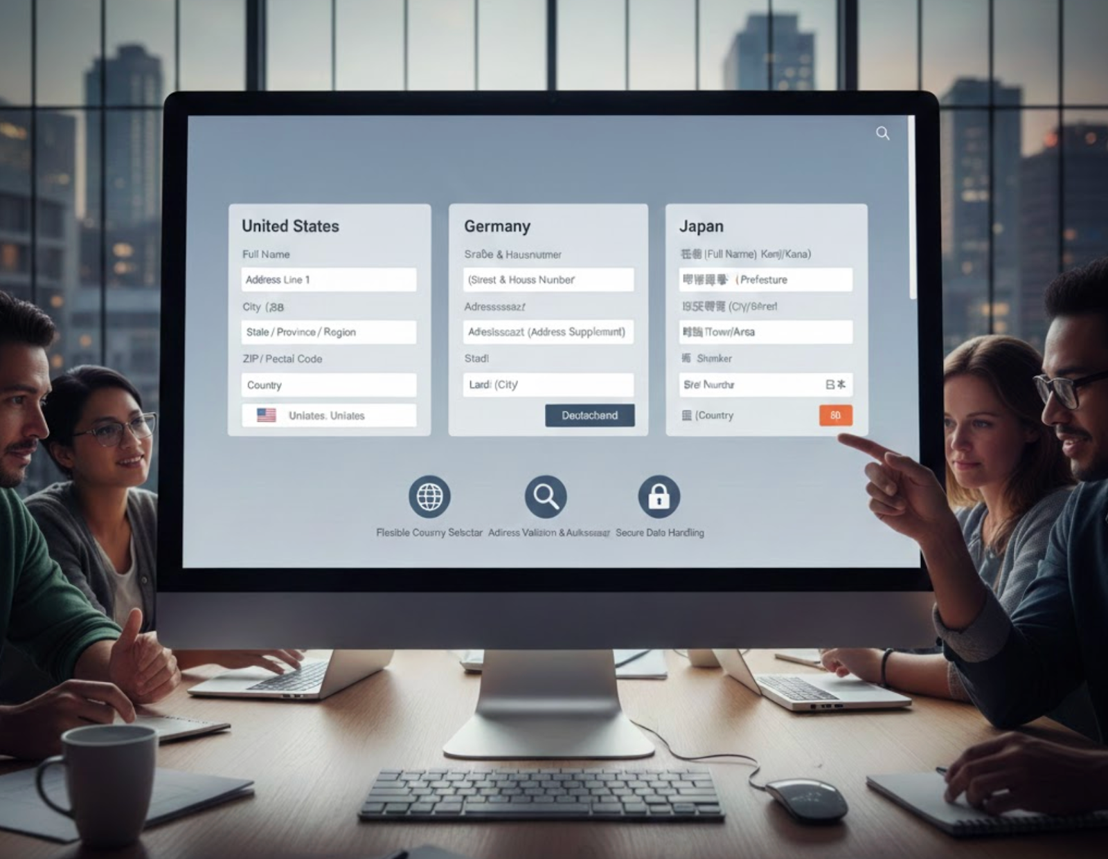
Addresses differ significantly from country to country in structure, length, and required components. Some regions depend heavily on postal codes, while others emphasize administrative areas, landmarks, or building names. Designing a single rigid address format often results in confusion and incorrect entries.
To handle this complexity effectively, your address form should be designed with flexibility in mind rather than rigid assumptions.

A global address form should respond intelligently once a user selects their country. Showing only relevant fields reduces cognitive load and helps customers understand exactly what information is required. This dynamic behavior reassures users that the form is designed for their location.
Once the country is selected, the form should respond intelligently to reflect local address expectations.
While validation is essential for data quality, overly strict rules often create more problems than they solve. International addresses frequently contain variations, special characters, or unconventional formats that rigid validation systems fail to accept.
Instead of relying on strict rules, validation should focus on helping users move forward rather than blocking progress.
Many eCommerce forms restrict users to one or two tightly controlled address lines, which may not be sufficient for global users. Customers may need extra space to include apartment numbers, districts, landmarks, or delivery instructions to ensure accurate fulfillment.
Giving users enough space to describe their address properly leads to fewer delivery issues and a smoother checkout.
Clear, familiar language plays a major role in helping users complete address forms confidently. When labels feel unfamiliar or ambiguous, users may hesitate or enter incorrect information, especially in a second language.
Using familiar language makes address forms easier to understand and reduces hesitation during checkout.

Address autocomplete and lookup tools can significantly reduce typing effort, especially on mobile devices. When implemented correctly, they speed up checkout and improve data accuracy for shipping and fulfillment.
When used thoughtfully, autocomplete can simplify address entry without taking control away from the user.
Unclear field requirements can slow users down and cause unnecessary errors. This is particularly problematic for international shoppers who may not know which details are essential for successful delivery.
Clear expectations help users complete address forms quickly and confidently, especially across different regions.
Even well-designed address forms can fail without real-world testing. International users often encounter edge cases, such as long addresses, uncommon regions, or alternative formatting conventions that designers may overlook.
Real-world testing ensures your address form works for the wide variety of formats used around the globe.
Designing address fields for global eCommerce is less about enforcing strict structure and more about embracing flexibility. By adapting forms to regional differences, reducing unnecessary validation, and clearly guiding users, you create a smoother checkout experience for international customers.
A well-designed global address form improves conversion rates, reduces delivery errors, and builds trust with shoppers worldwide. In a competitive eCommerce landscape, thoughtful address design can be a small detail that delivers a significant impact.

