Please select the platform to login


An email signup bar may seem like a small part of your website layout, but it can have a powerful impact on how many visitors join your mailing list. A well-designed signup bar helps you capture attention at the right moment, deliver the right message, and lower the psychological friction that stops people from subscribing. When approached strategically, this simple element can become one of your highest-converting list-building tools.
This guide walks you through what makes a signup bar effective, why placement and timing matter, and how to build a version that fits your brand without disrupting the shopping experience.
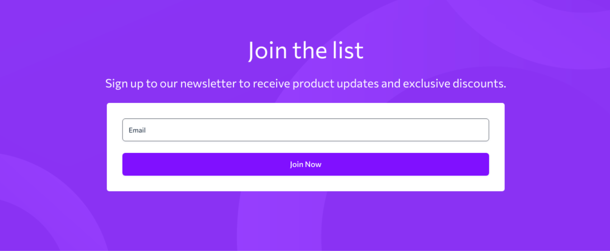
An email signup bar is a small, horizontal subscription form that appears at the top, bottom, or even as a sticky strip on a website. Its purpose is to encourage visitors to enter their email address and join your newsletter, receive offers, or access exclusive updates. Unlike popups, signup bars stay visible without interrupting the browsing experience, making them a subtle but effective way to grow your email list.
They typically include three simple components: a short message or offer, an email input field, and a call-to-action button. Because they take up little space and appear across multiple pages, they help keep your email offer consistently in front of visitors. When designed well—with a clear value proposition, strong contrast, and minimal friction, email signup bars can drive high-quality subscriptions and improve long-term engagement.
Email remains one of the most profitable channels for eCommerce and content-driven businesses. And while popups often get more attention, signup bars provide a subtler, more user-friendly way to collect emails continuously. They don’t interrupt the browsing flow, they can stay visible across pages, and they help you maintain constant exposure for your offer.
Because they are passive and persistent, signup bars often attract more high-intent subscribers, those who choose to engage rather than feel pressured by a popup. This leads to better open rates, higher CTR, and stronger long-term relationships.
Designing an email signup bar that truly converts goes far beyond choosing nice colors or placing a form at the top of your site. Instead, it requires a thoughtful combination of clarity, motivation, trust, and ease of action, all condensed into a small horizontal strip. By understanding how each element contributes to the overall experience, you can craft a signup bar that feels natural, persuasive, and impossible to ignore. Below are the foundational components that shape a high-performing design.
To design a signup bar that converts, you must start by delivering a message that instantly communicates why users should subscribe. Many businesses rely on generic phrases like “Subscribe to our newsletter,” but these lines fail because they don’t tell visitors what's in it for them. A strong signup bar removes ambiguity and highlights a benefit visitors genuinely care about.
Stronger alternatives include:
By shifting from vague to specific value, you immediately give users a compelling reason to take action, helping conversions happen much faster.
Once your value is clear, the next step is reducing friction. A high-converting signup bar must feel effortless, and every extra field you add increases hesitation. Because of this, simplicity is essential, not only for usability but also for boosting completion rates.
The ideal approach is:
If you need additional information like name, preferences, or birthday, you can always collect it later through a welcome email or user profile update. The goal of the signup bar is simply to capture the email as smoothly as possible.
With your form simplified, the design must now help the bar stand out naturally on the page. Since a signup bar competes with navigation links, product images, and banners, visual contrast becomes your ally. Good contrast ensures the bar is immediately noticeable without overwhelming the browsing experience.
Best practices include:
By balancing color, spacing, and typography, you create a visual hierarchy that guides users’ eyes from the message to the input field and finally to the call-to-action button.
To complete the flow, your CTA button must clearly communicate the action users are taking and why it benefits them. A weak CTA can undermine even the best offer, while a strong one pushes users across the finish line.
Effective CTA examples:
Action verbs create momentum and frame the action as something rewarding, increasing the likelihood that users will click.
Even with a strong design and value proposition, many visitors still hesitate to submit their email. This is why trust indicators are essential, they help reassure users that subscribing is safe, straightforward, and worth their time. By easing concerns early, you remove mental barriers that often stop conversions.
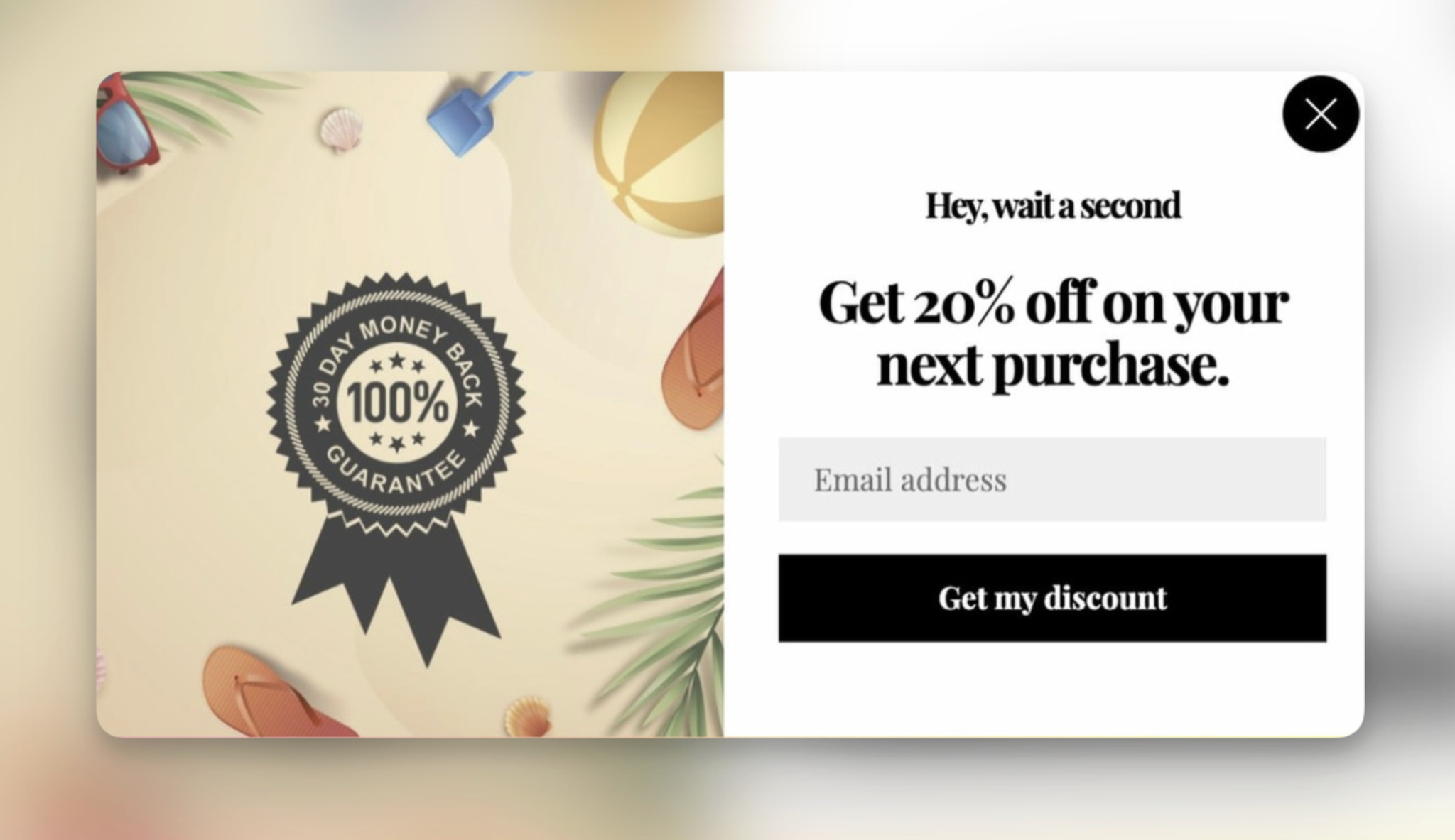
Simple ways to add trust include:
These small elements may seem subtle, but they significantly lower friction and encourage users to share their information confidently.
Placement dramatically affects performance. Your signup bar must appear naturally throughout the browsing journey, without interrupting the experience.
This is the most common and effective placement. A sticky header bar stays visible as the user scrolls, giving them multiple chances to subscribe.
Works best for:
This placement captures more engaged visitors who’ve already browsed and are more open to subscribing.
Works best for:
If a page has a focused goal, like a seasonal sale or new arrival showcase, a custom signup bar can help reinforce the offer.
Works best for:
The copy in your signup bar matters just as much as the design. Because space is limited, clarity and motivation need to work together efficiently.
Follow this guidelines for high-performing copy:
A signup bar is not a place for storytelling, but it’s a place for quick persuasion.
Once the bar is live, refining its details helps you steadily increase conversions.
Experiment with:
Even small adjustments can dramatically impact performance.
If your navigation is cluttered, or your hero banner has multiple calls to action, your signup bar may be overshadowed. Keep nearby elements clean to increase focus.
Mobile users often convert differently. Make sure:
Smooth usability always improves conversion.
Visitors become blind to recurring elements. Updating your copy seasonally or during major promotions keeps the bar relevant and appealing.
A great signup bar is only half the effort. The email sequence triggered afterward must deliver value, confirm expectations, and build trust. This reinforces the promise users saw earlier.
Designing an email signup bar that converts is all about combining clarity, value, and a frictionless user experience. With the right messaging, strong visual contrast, simplified form fields, and strategic placement, your signup bar is not only a design element, but it also becomes a long-term list-building machine.
By testing variations, optimizing for mobile, and reinforcing the promise with a powerful welcome email, you create a seamless subscriber journey that strengthens engagement and boosts future revenue.

