Please select the platform to login


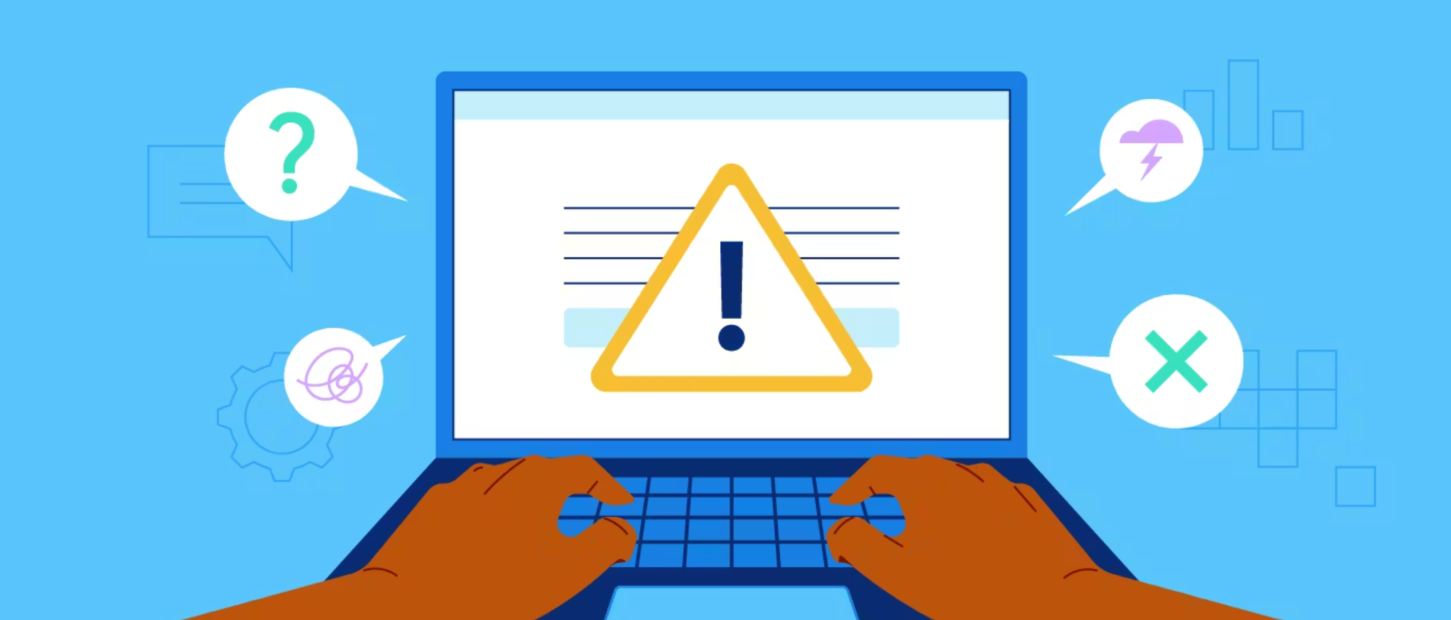
Loading states are unavoidable in digital products, but disengagement doesn’t have to be. When users encounter a loading screen, they’re often at a moment of high intent, whether they’re browsing products, submitting a form, or waiting for checkout confirmation. Poorly designed loading states increase frustration, uncertainty, and abandonment, while thoughtful ones can build trust, manage expectations, and even reinforce your brand. Designing effective loading states is not just about filling empty space, it’s about guiding user psychology during moments of waiting.
In this article, we’ll explore how to design loading states that keep users engaged, reduce perceived wait time, and support conversion-focused experiences.
Loading states act as a bridge between user action and system response. When nothing appears on the screen, users are left wondering whether their action worked, whether the system is broken, or whether they should leave. This uncertainty creates cognitive friction and erodes confidence, especially in eCommerce and transactional flows.
Well-designed loading states reassure users that progress is happening. They provide feedback, maintain momentum, and prevent repeated actions like double-clicking or refreshing. When users feel informed and in control, they are far more likely to stay engaged and complete their task.
Not all loading moments are equal, and your design should reflect the user’s intent at that specific stage. A brief content load during browsing requires different treatment than a high-stakes payment confirmation. When loading states fail to match intent, they feel either over-engineered or insufficient.
For low-intent actions like filtering products or switching tabs, subtle indicators such as skeleton screens or inline loaders work best. For high-intent actions like placing an order or uploading data, clearer progress indicators and reassurance messaging are essential. Aligning loading feedback with intent helps users feel supported rather than interrupted.
Skeleton screens replace blank areas with lightweight placeholders that resemble the final layout. This approach gives users a sense of structure and progress, making the experience feel faster, even if load time remains the same. Unlike spinners, skeletons reduce uncertainty by showing what’s coming next.
Skeleton screens work especially well for content-heavy pages like product listings, articles, or dashboards. They guide the eye, maintain visual continuity, and keep users oriented. When users can anticipate the result, they’re more patient and less likely to abandon the page.
When loading takes more than a couple of seconds, vague indicators are no longer enough. Users want to know how long they’ll be waiting and what’s happening in the background. Progress bars, step-based indicators, or percentage completion help set expectations and reduce anxiety.
Clear progress communication is critical during uploads, checkouts, or data processing. Even approximate indicators are better than none, as they give users a sense of control. When users know the system is working, and roughly how long it will take, they’re far more likely to wait it out.
Loading states are an opportunity to strengthen brand perception instead of feeling like dead time. Thoughtful microcopy, illustrations, or subtle animations can reflect your brand personality while keeping users engaged. However, the key is relevance, decorative elements should never distract or slow down perceived progress.
For eCommerce, loading messages can highlight trust signals, return policies, or value propositions. For example, reminding users of fast shipping or secure payments during checkout loading reinforces confidence. When waiting moments reinforce value, they feel purposeful rather than frustrating.
Users often worry that something has gone wrong during loading, especially after clicking an important CTA. Simple reassurance messages like “Processing your order securely” or “Saving your changes” reduce doubt and prevent repeated actions. This is particularly important for irreversible or sensitive actions.
Loading states should also prevent user errors by temporarily disabling buttons or inputs. Clear visual feedback that an action has been registered reduces the chance of duplicate submissions and system errors. Reassurance combined with prevention creates a smoother, more trustworthy experience.
Nothing erodes trust faster than a loading state with no clear end. Infinite spinners without context make users feel trapped and powerless. If a process may take longer or fail, your loading state should acknowledge that reality.
Consider adding fallback messaging such as “Still working, this may take a bit longer than usual” along with options to retry or cancel. Transparency builds trust, even when performance isn’t ideal. Users are far more forgiving of delays than of silence.
On mobile devices, loading states are even more critical due to smaller screens, variable connections, and higher impatience. Heavy animations or full-screen loaders can feel intrusive and slow. Instead, lightweight indicators and skeleton layouts work best.
Mobile loading states should prioritize clarity and speed perception. Inline loaders, subtle progress indicators, and minimal text help maintain flow without overwhelming the user. Since mobile users are often multitasking, keeping them informed quickly is key to retention.
Effective loading states aren’t designed once and forgotten. User expectations vary depending on context, device, and task complexity. Monitoring drop-offs, rage clicks, and repeated actions during loading moments can reveal friction points you didn’t anticipate.
A/B testing different loading indicators, messages, or layouts can uncover what best maintains engagement. Small changes, like adding a reassurance line or switching from a spinner to a skeleton, can significantly improve completion rates. Continuous refinement ensures your loading states evolve with user needs.
Loading states are more than a technical necessity, they’re a crucial part of the user experience and conversion journey. By aligning loading feedback with user intent, communicating progress clearly, and using wait time to build trust, you can transform moments of delay into moments of reassurance.
When designed thoughtfully, loading states reduce frustration, increase perceived speed, and keep users moving forward. In a world where attention is scarce and patience is limited, well-crafted loading experiences can be the difference between abandonment and engagement.

