Please select the platform to login


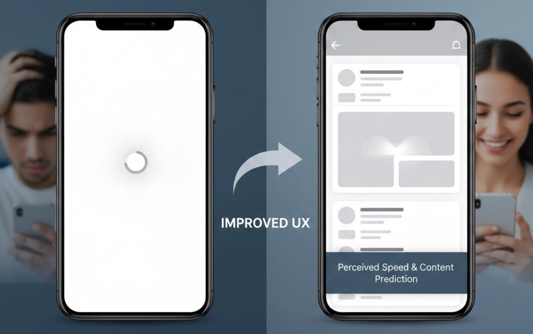
Skeleton screens have become a popular UX pattern for handling loading states, especially in ecommerce and content-heavy applications. Instead of showing spinners or blank spaces, skeleton screens display a lightweight preview of the page layout while content loads. When used correctly, they reduce perceived wait time, keep users oriented, and make interfaces feel faster and more polished.
Below is a practical guide on how to use skeleton screens effectively to improve user experience.
Skeleton screens are placeholder UI elements that mimic the structure of the final content before it fully loads. They typically use neutral shapes, soft gradients, or subtle animations to represent text, images, and buttons. This approach helps users understand what is coming next, even if the actual data is not yet available.
From a psychological perspective, skeleton screens shift the user’s focus from “waiting” to “anticipating.” Instead of feeling blocked, users feel like progress is being made, which reduces frustration and improves overall satisfaction.
Key benefits of skeleton screens:
Skeleton screens work best on pages where users expect structured content, such as product listings, dashboards, blogs, and search results. By matching the layout of the final content, skeleton screens help users mentally prepare for what they are about to see. This makes the transition from loading to loaded content feel almost seamless.
When content appears in familiar shapes, users can quickly scan the page even before data loads. This is especially important for ecommerce category pages or feeds where users rely on visual rhythm to browse efficiently.
As a result, users stay engaged instead of abandoning the page during loading.
Best use cases include:
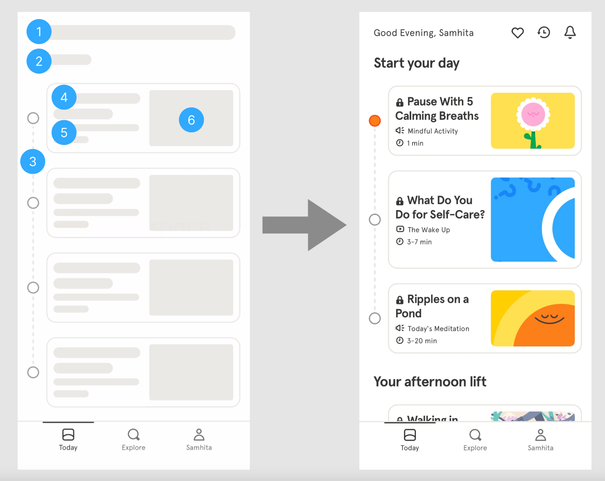
A common mistake is using generic skeleton blocks that do not resemble the final layout. Skeleton screens should closely mirror the real structure, including image sizes, text lengths, and spacing. This consistency helps users build correct expectations and reduces cognitive load.
For example, if a product card includes an image, title, price, and button, the skeleton should reflect those elements in the same order. When the real content replaces the skeleton, the transition feels natural rather than jarring.
This alignment makes the interface feel faster and more intentional.
Best practices for layout matching:
Animation can make skeleton screens feel alive, but too much movement can be distracting. Gentle shimmer effects or soft pulsing gradients work best because they indicate loading without stealing attention. The goal is to reassure users, not entertain them.
Overly flashy animations can increase visual noise and even cause discomfort for some users. Subtle motion keeps the interface calm and professional while still communicating progress.
This approach helps users stay focused on their task while waiting.
Recommended animation tips:
Skeleton screens are most effective when loading takes more than a brief moment. If content loads almost instantly, skeletons can feel unnecessary or even slow things down. In these cases, it’s better to load content directly without placeholders.
UX decisions should always balance effort and payoff. Adding skeleton screens where they are not needed increases complexity without improving experience.
This ensures loading feedback feels appropriate rather than forced.
When to skip skeleton screens:
One major UX advantage of skeleton screens is their ability to prevent layout shifts. By reserving space for content before it loads, skeletons stop elements from jumping around when data arrives. This creates a more stable and predictable interface.
Layout shifts are especially harmful on mobile, where unexpected movement can cause users to tap the wrong element. Skeleton screens reduce these errors and improve usability.
This stability builds trust and confidence in the interface.
How skeleton screens help stability:
Skeleton screens work best when paired with progressive loading strategies. Instead of waiting for all content to load at once, you can replace skeletons section by section as data becomes available. This makes the page feel responsive and alive.
For example, load above-the-fold content first, then continue replacing skeletons below as users scroll. This approach keeps users engaged and reduces bounce rates on slower connections.
The experience feels fluid rather than delayed.
Effective progressive loading strategies:
Like any UX pattern, skeleton screens should be tested with real users and real data. What feels smooth to designers may feel confusing or unnecessary to users. Observing behavior helps you fine-tune timing, animation, and layout accuracy.
User testing can reveal whether skeleton screens truly reduce frustration or simply add visual noise. Data-driven adjustments ensure skeleton screens enhance UX rather than complicate it.
This validation step ensures your design decisions are effective.
What to test and measure:
Skeleton screens are a powerful tool for improving UX when used thoughtfully. By setting clear expectations, reducing perceived wait times, and preventing layout shifts, they make digital experiences feel faster and more refined. The key is to design skeleton screens that closely match real content, stay visually subtle, and appear only when they add real value.
When combined with smart loading strategies and user testing, skeleton screens can transform waiting moments into smooth, engaging experiences that keep users confident and in control.

