Please select the platform to login


Cart abandonment is one of the most frustrating problems for eCommerce businesses. Customers spend time browsing, add items to their cart, and then disappear before completing the purchase. According to studies, the average cart abandonment rate is close to 70%, which means more than half of your potential sales are lost at the very last step. While factors like pricing and shipping fees play a role, store design is often the deciding factor in whether a customer completes or abandons their order.
Good store design goes far beyond making your website look appealing. It directly affects usability, trust, and how easy it is for shoppers to follow through with their decision to buy. By making strategic improvements to your design, you can create a shopping experience that guides customers naturally toward completing their order while eliminating friction and hesitation.
In this article, we’ll break down strategies to help you transform your store into a smooth, trustworthy shopping experience that keeps customers coming back.
The way a store is designed shapes every stage of the customer journey. A confusing layout, slow load times, or cluttered checkout process creates unnecessary obstacles that discourage customers from completing their purchase. Even small details, such as where the checkout button is placed or how product information is displayed, can influence whether a shopper feels confident enough to continue.
Design also plays a psychological role. Clean, minimal layouts reduce stress and decision fatigue, while trust signals like reviews and security badges give reassurance at the critical moment of entering payment details. Mobile-responsive designs make it easier for on-the-go shoppers to complete a purchase without frustration. When a store looks professional, feels easy to navigate, and provides clear cues, customers perceive it as trustworthy and worth finishing the order.
In contrast, poor design creates doubt and friction, leading customers to postpone or abandon the transaction altogether. This is why smart store design is not just cosmetic, but it’s central to reducing cart abandonment.
Below are proven design practices that not only make your store more attractive but also help reduce cart abandonment.
A complicated checkout process frustrates customers and increases the likelihood of abandonment. Every extra field or unnecessary step makes the purchase feel like hard work, and many shoppers will simply give up if it feels too time-consuming.
You can reduce this problem by offering guest checkout, so customers aren’t forced to create an account just to buy a product. Keeping form fields to a minimum also helps, as people are more willing to complete a purchase if they only need to enter essential details like name, address, and payment method. Progress indicators further reassure customers by showing them exactly how many steps remain, reducing anxiety and making the process feel more manageable. When checkout flows are simple, customers feel respected and valued, which increases the likelihood they’ll follow through with their purchase.
Slow-loading websites are one of the top reasons shoppers abandon carts. Even a one-second delay in loading time can make a shopper impatient, and with so many online alternatives, they’ll quickly switch to another store. Mobile shoppers are especially sensitive to delays and poor usability, as small screens make it harder to navigate complicated layouts.

Improving website speed and performance by compressing images, reducing unnecessary scripts, and using a lightweight design ensures that customers don’t face interruptions while shopping. A responsive layout that adapts smoothly to any screen size makes browsing and checking out on mobile devices far more comfortable. Adding features like sticky “Checkout” buttons and thumb-friendly designs makes navigation intuitive, so customers never feel lost or annoyed during their shopping journey. The smoother the experience, the more likely customers are to finish the purchase instead of abandoning it midway.
Trust is one of the most important factors in online shopping. If your store looks unprofessional, lacks visible security features, or doesn’t provide reassurance, customers may fear entering their payment information. This hesitation often leads to last-minute cart abandonment.
You can build trust by displaying visible security badges like 100% refund and return policy, and accepted payment logos. Highlighting money-back guarantees and clear return policies also reassures shoppers that buying from you is safe. Reviews and testimonials further strengthen this trust by showing that other customers have already had good experiences. By embedding these cues directly into your design, you help customers feel secure, which directly reduces abandonment rates.
When customers reach checkout, the design should focus only on helping them complete the transaction. If you clutter this page with popups, banners, or unnecessary navigation, you risk diverting attention away from the final step.
Keeping checkout pages minimal, with plenty of white space and only essential information, helps customers stay focused. The order summary, shipping details, and payment form should be clearly visible without distractions that create confusion. Using bold, high-contrast buttons for the final “Place Order” action ensures there is no doubt about what to do next. When checkout design is clean and distraction-free, customers feel calm and guided, making it much easier to finish the purchase without second thoughts.
Many shoppers abandon carts not because they don’t want the product, but because they think they can return later. Design can address this hesitation by introducing subtle urgency cues that encourage immediate action.
Adding countdown timers for limited-time offers, highlighting low stock availability, or showing shipping cutoffs all signal that waiting may lead to missing out. These elements are especially powerful when placed near the cart or checkout button, where customers are making their final decision. For instance, highlighting that an item is “Almost Sold Out” can make shoppers finalize their purchase instead of delaying. Urgency elements work because they appeal to human psychology: when something feels scarce, customers value it more and are more motivated to complete the transaction.

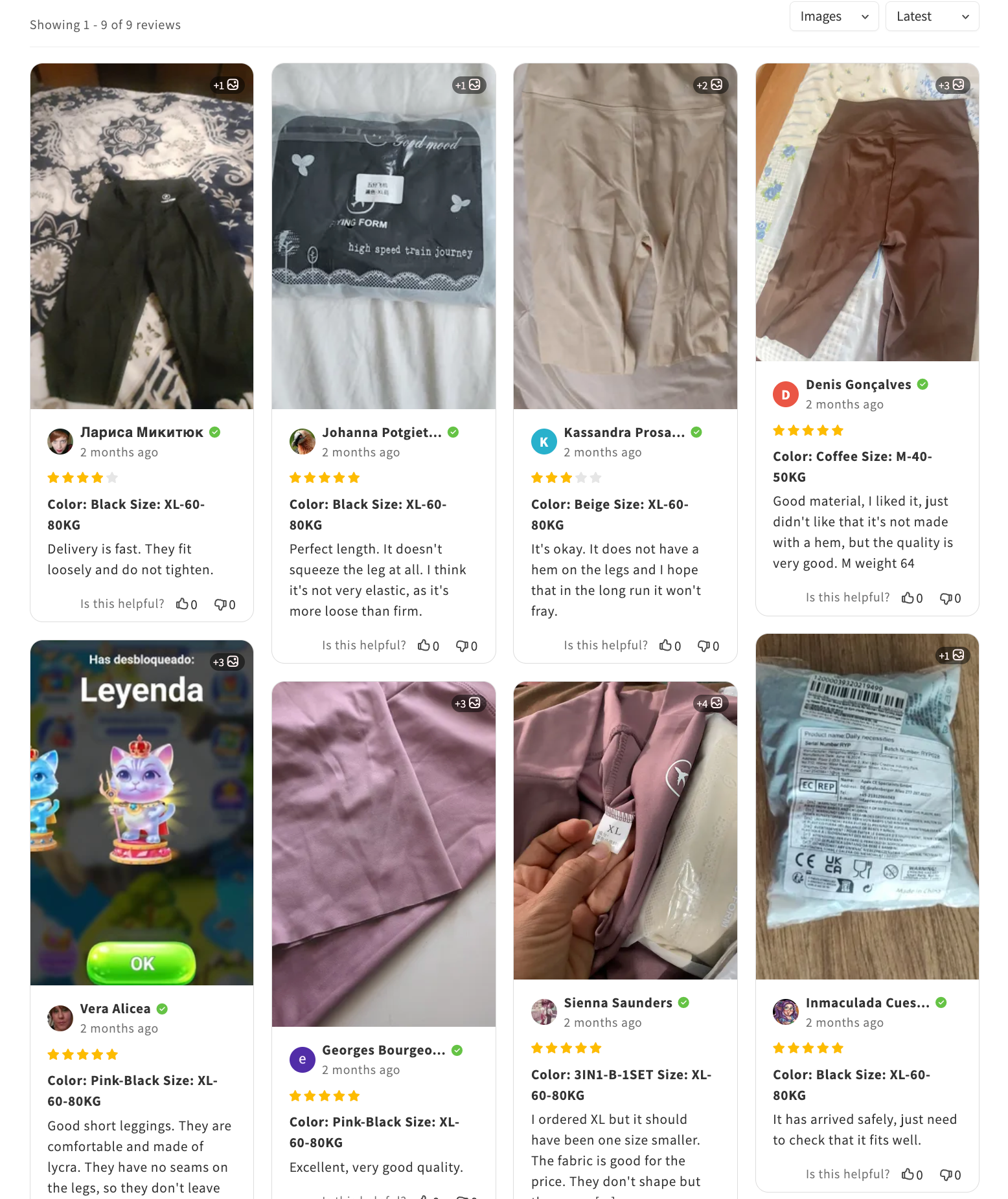
Uncertainty is a major cause of hesitation at checkout. Shoppers often wonder if the product will meet their expectations, if shipping is reliable, or if the quality justifies the price. Social proof in the form of reviews and ratings helps remove this doubt.
Placing reviews not only on product pages but also within the cart and checkout reassures shoppers at every step. Customers who see that others had positive experiences with shipping speed, customer service, or product quality are more likely to trust your store. Many Shopify merchants use Ryviu to showcase star ratings and customer photos inside their cart pages, allowing shoppers to see real-life validation before making a purchase. This approach helps reduce last-minute hesitation and keeps the momentum toward completing the order.
A rigid cart design is another common reason for abandonment. If a customer wants to change a size, color, or quantity and finds that it requires restarting the checkout process, they may simply abandon the cart instead.
Allowing inline editing within the cart makes the process flexible and forgiving. Customers should be able to adjust product details, update totals, or remove items without being redirected. A “Save for Later” option is also useful, as it keeps customers engaged even if they’re not ready to buy everything immediately. When customers feel in control of their cart, they are less likely to abandon it out of frustration and more likely to continue to checkout with confidence.
When a shopper moves to close the tab or leave the site, an exit-intent popup gives you one last opportunity to capture their attention. While intrusive popups can feel spammy, a well-designed and thoughtful popup can successfully recover abandoned carts.
Popups that highlight free shipping, offer a small discount, or remind customers of the items in their cart can be very effective. Including product images in the popup design makes it more personal and harder to ignore. For example, a clothing store added a clean exit-intent popup offering free shipping if the order was completed right away, which encouraged many customers to stay and finalize their purchases. Using exit-intent strategically can transform abandoned carts into completed sales without feeling overly aggressive.
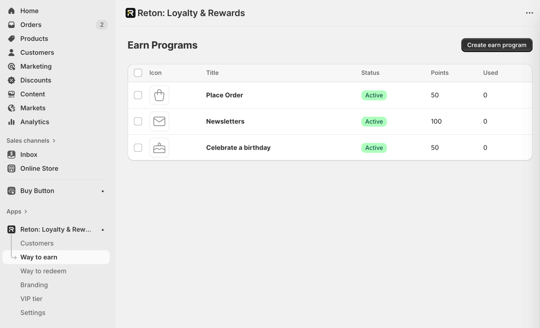
Reducing cart abandonment is about more than just saving one purchase—it’s also about encouraging customers to return in the future. A well-designed store can integrate loyalty and reward systems directly into the shopping journey, making checkout more rewarding.
For example, showing a message like “Complete this purchase to earn 200 points toward your next reward” can tip the balance in favor of completing the order. Integrating progress bars that show how close a customer is to a reward also encourages them to finish. Shopify merchants often use apps like Reton to display loyalty benefits directly within the cart, giving customers an extra reason to complete their order. By designing checkout with retention in mind, you not only reduce abandonment but also build long-term loyalty that increases repeat purchases.
Even with good intentions, many stores make design mistakes that unintentionally push customers away at the final stage of checkout. These are some of the most common pitfalls:
Recognizing and correcting these mistakes is just as important as applying best practices, because even one major design flaw can undo all your other efforts to reduce cart abandonment.
Cart abandonment is not just a pricing or promotion issue, but it’s often a design problem. Every element of your store, from the first click to the final “Place Order” button, shapes whether a customer follows through with their purchase.
By simplifying checkout, optimizing performance, building trust, removing distractions, creating urgency, showcasing reviews, allowing flexible carts, using popups wisely, and designing for loyalty, you can significantly reduce abandonment. The key is to think of design not as decoration, but as a functional tool for guiding customer behavior.
Smart store design doesn’t just save lost sales. It also builds confidence, improves customer satisfaction, and creates long-term relationships. When design makes shopping feel effortless and rewarding, customers have fewer reasons to leave and more reasons to come back. And with tools like Ryviu for reviews and Reton for loyalty rewards, you can naturally weave trust and incentives into that journey, without being pushy or sales-driven.

