Please select the platform to login


A strategically placed Q&A section can play a crucial role in turning hesitant visitors into confident buyers. While product descriptions explain features and benefits, Q&A sections address real concerns that shoppers may not even realize they have until they reach the decision stage. Questions about sizing, compatibility, delivery timelines, or real-world usage often appear right before checkout, and how easily customers can find answers directly affects conversion rates.
However, simply adding a Q&A section is not enough. Its placement on the product page determines whether it actively supports the buying journey or quietly goes unnoticed. Each placement option serves a distinct purpose depending on product complexity, user intent, and page layout. Below are the most effective placement strategies in product pages.
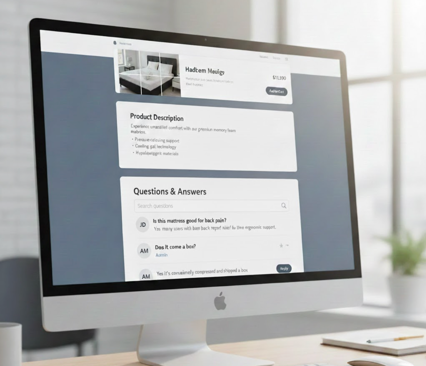
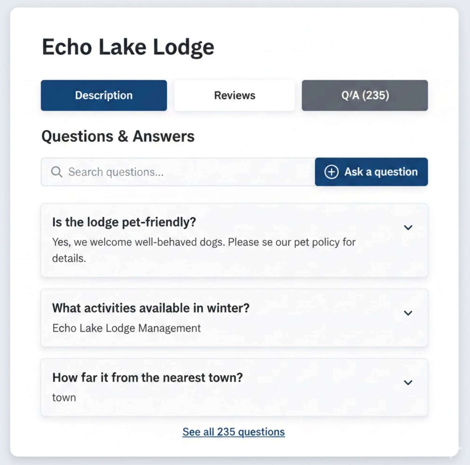
Placing the Q&A section directly below the product description is widely considered the safest and most versatile option. By the time shoppers reach this point, they have already understood what the product is and are now looking to resolve remaining uncertainties before moving forward.
This placement respects the natural flow of information on a product page. Instead of interrupting the main value proposition, the Q&A functions as a supportive layer that answers follow-up questions in context. As a result, users feel guided rather than overwhelmed.
Several practical advantages make this placement especially reliable for most stores:
For most ecommerce businesses, this placement delivers consistent results with minimal risk.
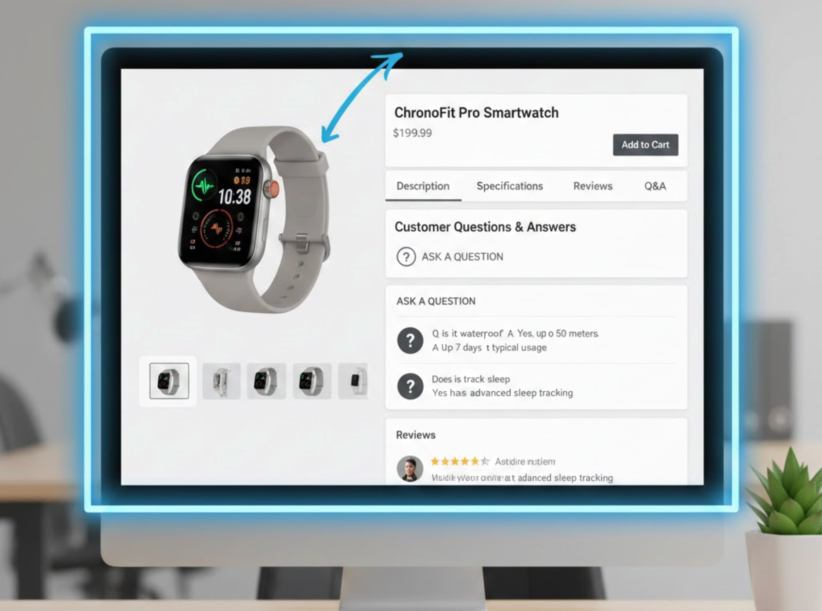
As users scroll further down a product page, their mindset often shifts from learning to validating. This is where reviews play a critical role, and positioning the Q&A section nearby strengthens that validation process.
Reviews provide emotional reassurance through real experiences, while Q&A offers direct, factual clarification. When these two elements are grouped together, they create a strong sense of transparency and credibility, helping shoppers feel more confident in their decision.
Placing Q&A alongside reviews offers several trust-related benefits:
This placement is particularly effective for high-value or high-consideration products where trust heavily influences conversions.
For stores aiming to maintain a clean and organized layout, placing Q&A within a tabbed interface can be an excellent solution. Tabs allow shoppers to choose which information they want to explore without being forced to scroll through long sections.
This structure works especially well for content-heavy product pages. Instead of overwhelming users with information all at once, tabs create a sense of control and efficiency. On mobile devices, this approach can dramatically improve readability and navigation.
A tab-based Q&A setup is most effective under the following conditions:
As long as the Q&A tab is clearly labeled and easy to find, this approach balances elegance with functionality.
Certain products raise critical questions immediately. Items such as electronics, health-related products, subscriptions, or customizable goods often require reassurance before users even begin scrolling.
In these cases, introducing a short Q&A preview above the fold can significantly reduce hesitation. Rather than displaying the full list, highlighting one or two high-impact questions signals transparency and helps users quickly assess whether the product meets their needs.
Early Q&A visibility delivers value in several important ways:
This approach is best reserved for questions that directly influence purchase decisions.
On long or information-rich product pages, even well-placed Q&A sections can become inconvenient to reach. A sticky or floating Q&A button solves this by keeping access available as users scroll.
Rather than forcing information onto the screen, this method offers assistance only when users need it. It’s especially helpful on mobile devices, where scrolling back can interrupt the shopping experience.
When implemented thoughtfully, floating Q&A access provides several usability benefits:
The key is subtlety, this feature should support the experience, not compete with core actions.
No matter where a Q&A section is placed on a product page, its performance ultimately depends on how thoughtfully it is executed. A well-positioned Q&A area can still fail to deliver value if the content is unclear, outdated, or difficult to scan. For this reason, consistency, clarity, and ongoing management are essential to making Q&A sections truly effective.
Beyond placement decisions, focusing on the quality and usability of the Q&A content ensures it continues to support shoppers throughout the buying journey.
There is no single universal answer to the best placement for Q&A sections on product pages. The right choice depends on product type, page structure, and shopper behavior. For most stores, placing Q&A below the product description or near reviews offers the strongest balance of visibility and usability. For complex or high-risk products, early placement or floating access can significantly reduce hesitation.
Ultimately, a thoughtfully placed and well-maintained Q&A section does more than answer questions, it reassures shoppers, builds credibility, and smoothly guides them toward checkout with confidence.

