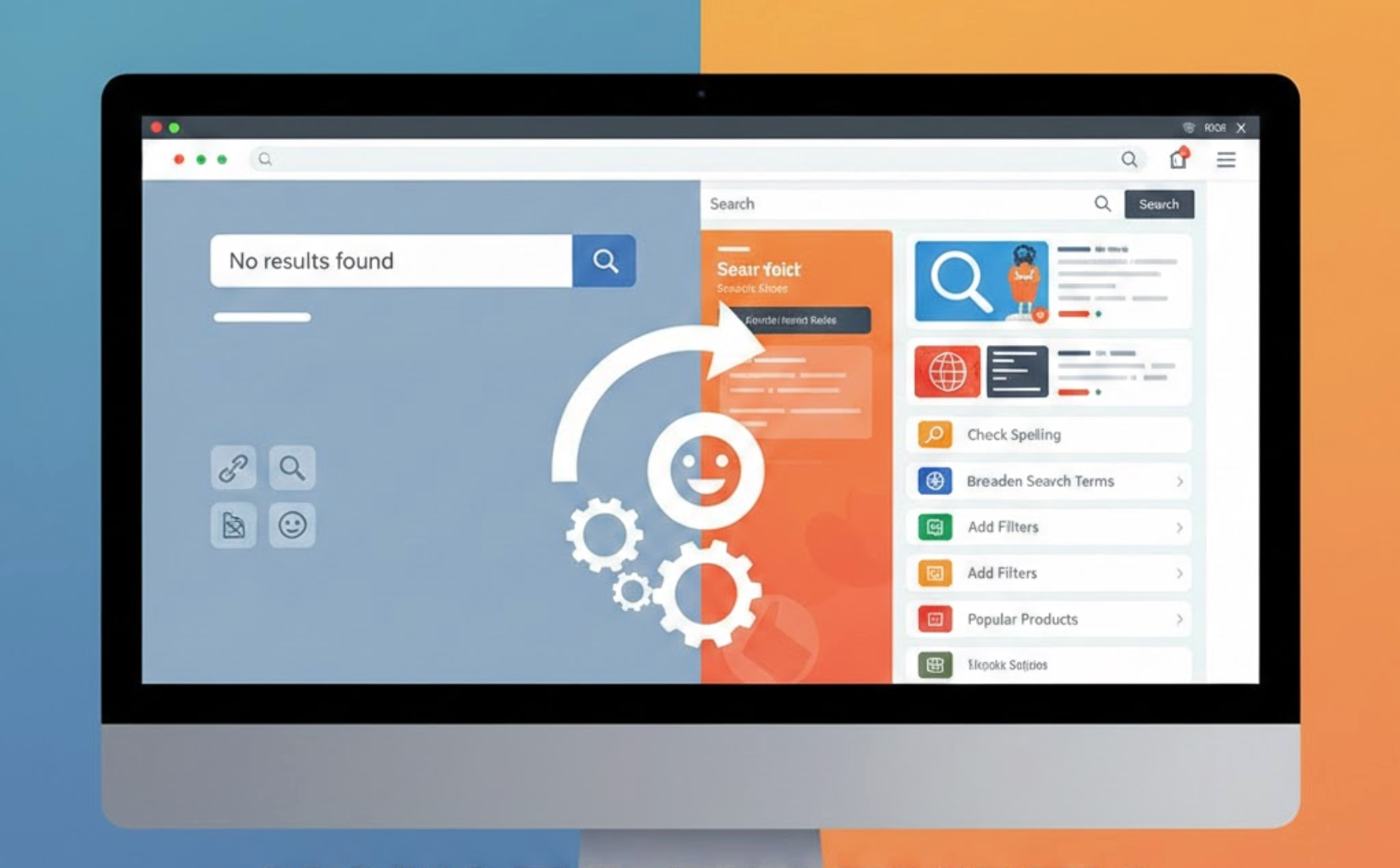
Empty search results pages are one of the most frustrating moments in an eCommerce experience. When shoppers actively search for a product and are met with “No results found,” it creates a hard stop that often leads to abandonment. Instead of treating empty results as a failure, well-designed stores use them as recovery points that guide users back into the shopping journey. This article breaks down why empty search results happen and how to fix them in ways that improve both UX and conversions.
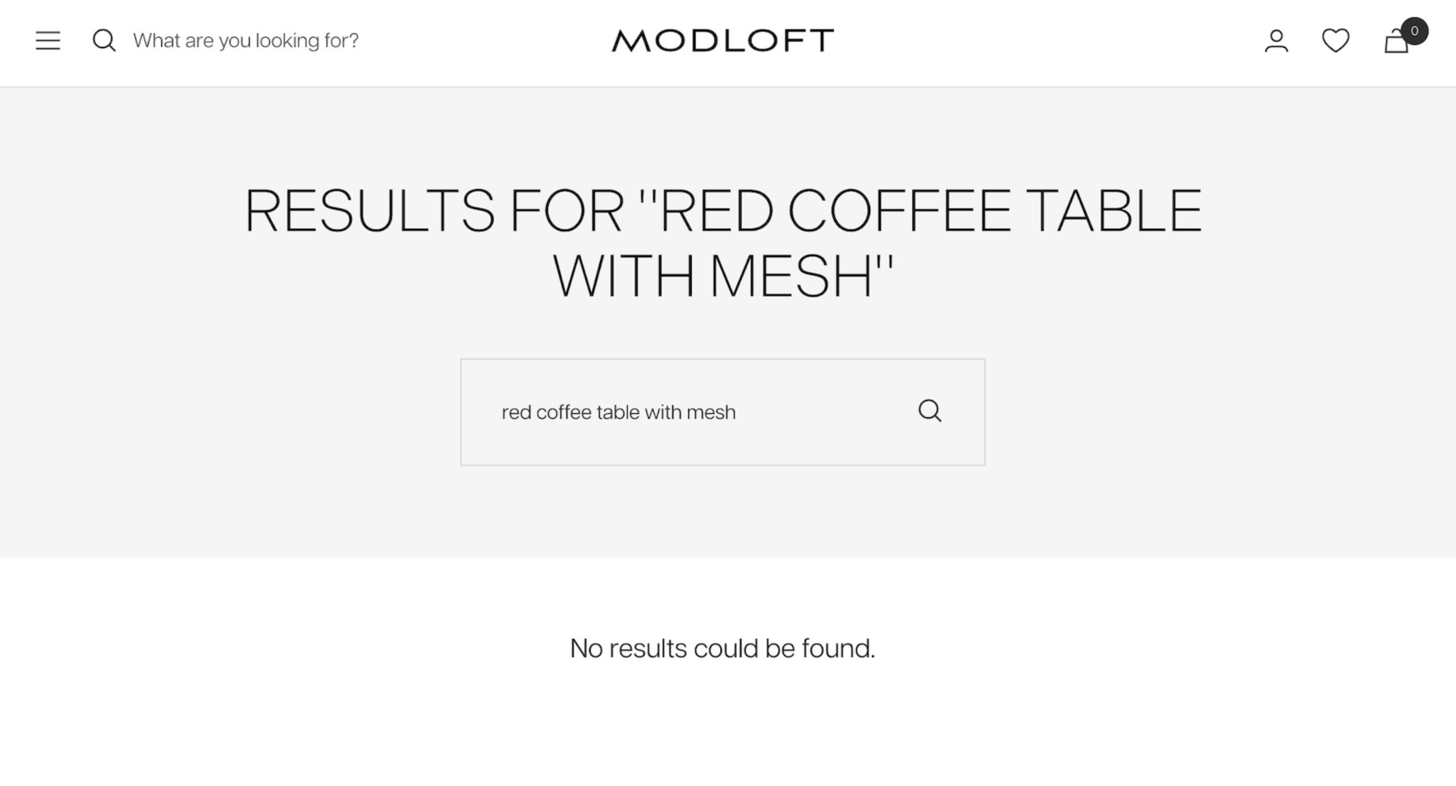
An empty search results page signals a disconnect between what users expect and what your store delivers. Search behavior usually reflects strong intent, meaning shoppers already have a product or solution in mind. When that intent isn’t met, confidence drops and the likelihood of leaving increases.
From a business perspective, empty searches inflate bounce rates and hide valuable customer demand data. Each failed search represents insight into how customers think and what they want to buy. Fixing these pages helps recover lost engagement while revealing opportunities for growth.

Small changes in wording can instantly make users feel understood instead of blocked when their search doesn’t return results. A cold system message often amplifies frustration and makes users feel like they’ve made a mistake. More human, reassuring language keeps the experience supportive and calm.
By acknowledging the situation and offering help, you reduce emotional friction and preserve trust. Users are far more likely to continue exploring when the message feels empathetic rather than technical. This approach keeps the interaction aligned with your brand’s personality.
Small changes in wording can instantly make users feel understood instead of blocked when their search doesn’t return results.
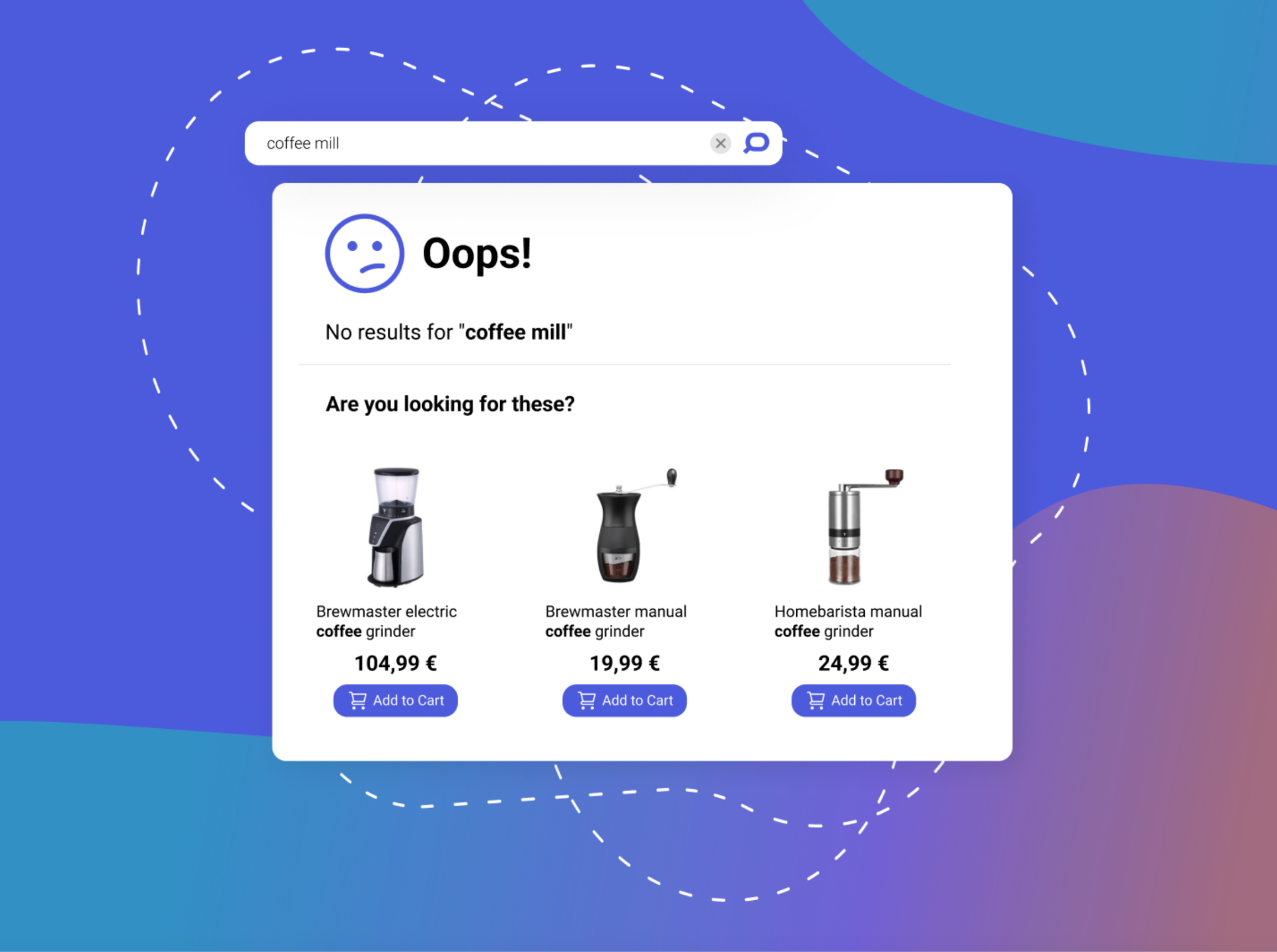
When exact matches fail, offering relevant alternatives helps shoppers stay curious rather than frustrated. Empty result pages should immediately present other options so users don’t feel stuck. Even broad suggestions give them something meaningful to explore.
Showing popular or related items helps users discover products they may not have considered initially. This turns a dead end into a discovery experience and keeps users engaged. The key is relevance, not volume.
When exact matches fail, offering relevant alternatives helps shoppers stay curious rather than frustrated.
Many failed searches happen because users don’t type perfectly, so your search system needs to be forgiving. Typos, pluralization differences, and alternative wording are common, especially on mobile devices. Strict matching makes your store feel rigid and outdated.
By supporting fuzzy matching and synonyms, you dramatically increase successful search outcomes. A flexible search experience feels smarter and more intuitive to users. This improvement alone can eliminate a large percentage of empty results.
Many failed searches happen because users don’t type perfectly, so your search system needs to be forgiving.
Clear navigation paths give users an easy way to continue browsing without starting their journey over. When search fails, users often want to explore broadly instead of retyping queries. Well-placed categories and filters provide that escape route.
Rather than overwhelming users, offer simple, high-level navigation options. These elements help users reorient themselves quickly and regain momentum. A smooth transition from search to browsing reduces frustration and drop-offs.
Clear navigation paths give users an easy way to continue browsing without starting their journey over.
Behind every empty search is a clue about what customers expect to find in your store. These failed queries highlight mismatches between customer language and your product listings. Ignoring them means missing valuable opportunities.
By analyzing no-result searches regularly, you can uncover gaps in inventory, naming, or content. This data can guide product expansion, SEO improvements, and merchandising strategies. Over time, fewer empty searches mean a stronger, more aligned catalog.
Behind every empty search is a clue about what customers expect to find on your store.
A gentle nudge toward other parts of your store can keep users moving forward instead of leaving. When a search doesn’t work, users often need direction, not pressure. Soft calls to action help guide them without adding friction.
Effective CTAs feel helpful and exploratory rather than sales-driven. They reassure users that there’s still value to be found on your site. This keeps engagement high even when intent shifts.
A gentle nudge toward other parts of your store can keep users moving forward instead of leaving.
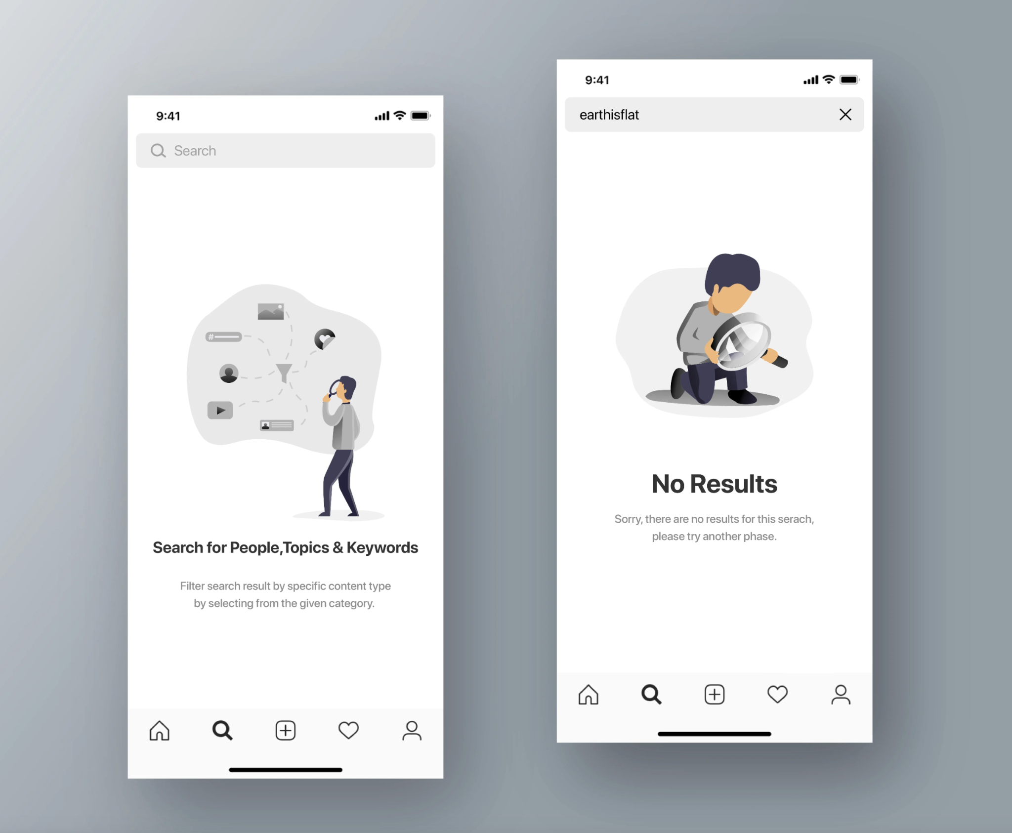
On smaller screens, clarity and simplicity matter even more when a search doesn’t deliver results. Mobile users are more prone to typos and impatience, making empty states especially risky. A cluttered or confusing layout quickly leads to exits.
Design mobile empty search pages with touch-friendly elements and clear visual hierarchy. Prioritize the most helpful suggestions and limit distractions. A well-optimized mobile experience can turn failed searches into successful sessions.
On smaller screens, clarity and simplicity matter even more when a search doesn’t deliver results.
Empty search results pages don’t have to be dead ends. With empathetic messaging, intelligent suggestions, flexible search logic, and clear navigation, they can become powerful engagement touchpoints. Every failed search is an opportunity to guide users toward something valuable.
By treating empty search pages as part of your conversion strategy, you improve user satisfaction and capture more value from high-intent shoppers. In eCommerce, even when users don’t find exactly what they searched for, you can still help them find something worth buying.


Managing reviews in this context is not just about collecting feedback after delivery; it is about shaping the entire experience from purchase to arrival. Done well, it turns waiting into reassurance rather than frustration.
Customers rely heavily on feedback when making quick purchase decisions during limited windows. If reviews are outdated, irrelevant, or missing, conversions can suffer. Managing reviews effectively in this context means preserving trust, maintaining relevance, and maximizing impact—within a much shorter timeframe.
In this article, we’ll break down when each approach works best, how to execute them effectively, and how tools like the Ryviu review app can help you manage responses at scale without losing authenticity.