Please select the platform to login


Your pricing page is one of the most influential pages in your entire product experience. It is not just where users see numbers; it is where hesitation, comparison, trust, and value perception collide. Even users who are highly interested in your product may pause, second-guess themselves, or abandon the page if the pricing structure feels confusing or risky.
Optimizing a pricing page for better plan selection means guiding users toward the right choice with clarity and confidence. Instead of forcing visitors to analyze every feature and price difference on their own, a strong pricing page reduces mental effort, answers unspoken questions, and gently leads users to the plan that best fits their needs. When done correctly, pricing optimization improves conversion rates, reduces churn, and increases customer satisfaction over time.
Pricing pages often become bottlenecks in the conversion funnel. Many users arrive with intent, but intent alone is not enough if uncertainty takes over. Confusing plan differences, unclear value, or fear of making the wrong choice can quickly derail a decision.
An optimized pricing page removes friction by clearly explaining what each plan offers, who it is designed for, and why it costs what it does. It helps users feel in control of the decision rather than pressured into it. This is especially important for subscription-based products, where long-term commitment and recurring payments amplify hesitation.
When users clearly understand your pricing structure, they are more likely to choose a plan that fits their real needs. This leads to higher-quality sign-ups, fewer refunds, and lower support burden caused by customers selecting the wrong plan.
Effective pricing pages begin with a deep understanding of your audience. Plans should reflect real user segments, not internal product logic or feature checklists. When users land on your pricing page, they should immediately recognize which option aligns with their situation.
Clear segmentation usually reflects how users differ in goals, scale, or experience level, making it easier for visitors to instantly recognize where they belong.
When segmentation is intuitive, users spend less time comparing and more time moving forward with confidence.
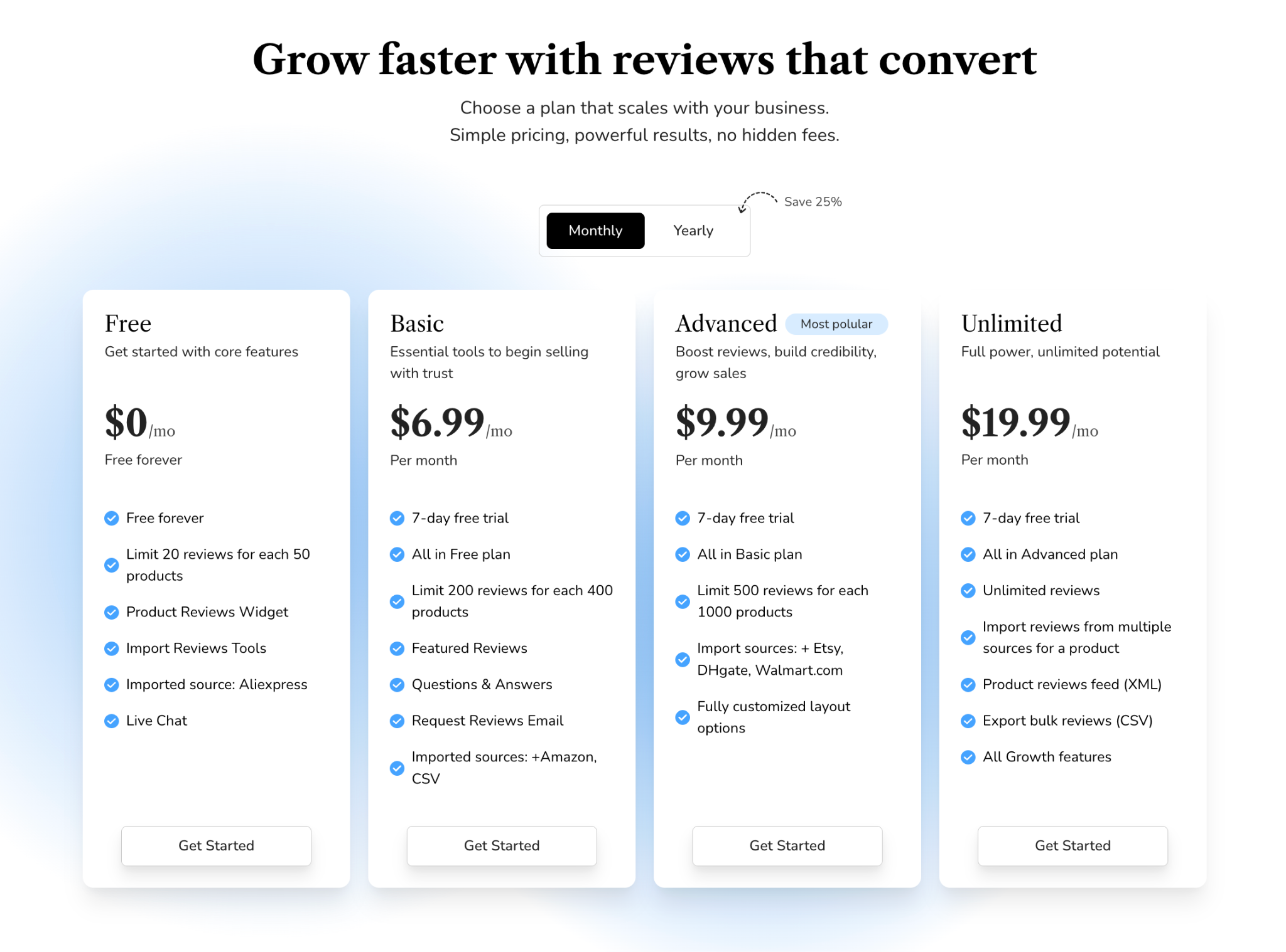
More options do not equal better choice. In fact, too many plans often create decision paralysis. When users are presented with five, six, or even ten pricing tiers, they struggle to understand the meaningful differences between them.
Most successful pricing pages rely on a simple structure that offers enough contrast for comparison without overwhelming users with unnecessary choices.
If your product requires more complexity, consider progressive disclosure through toggles or secondary pages. Reducing plan count makes pricing feel approachable and significantly improves plan selection speed.
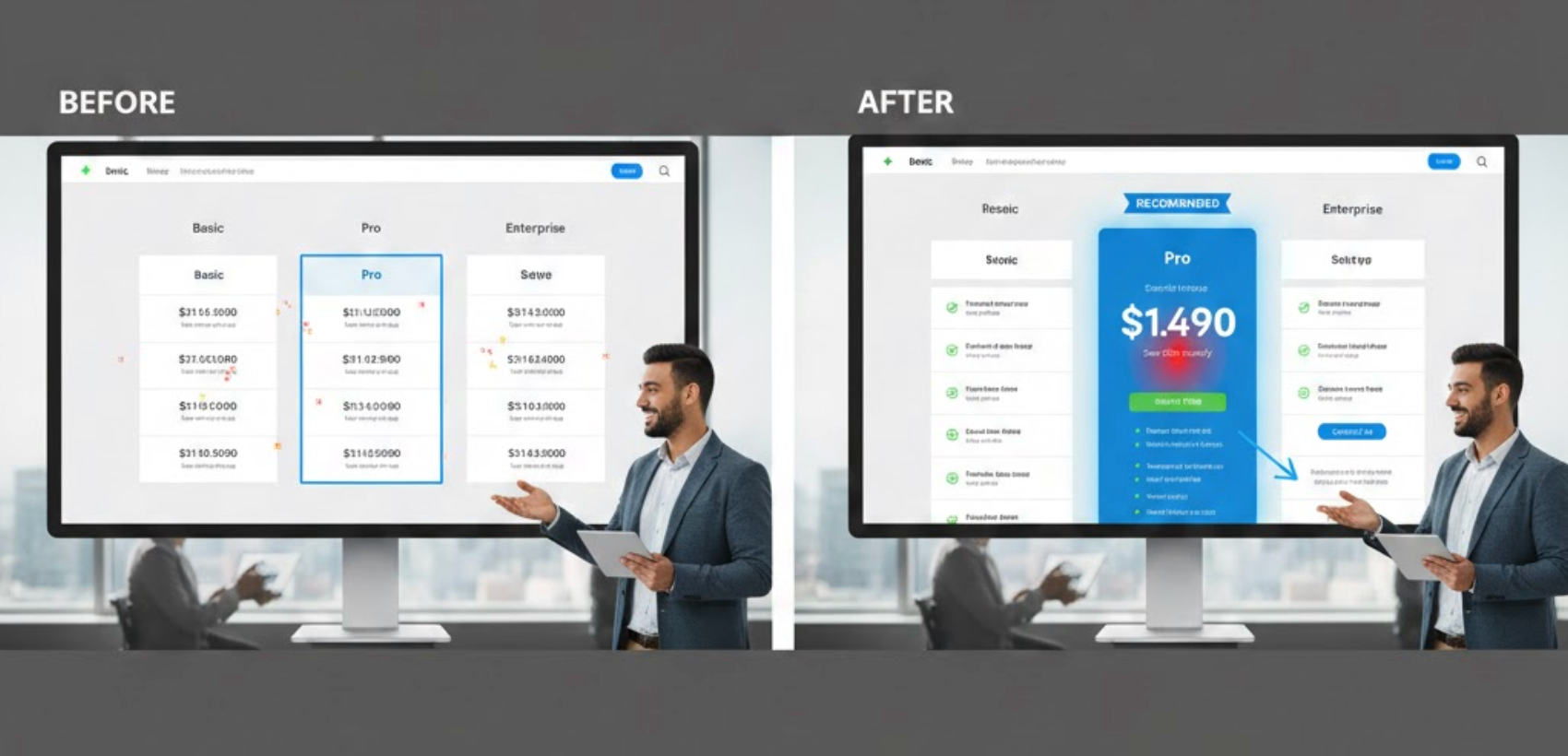
A pricing page should not treat all plans equally from a visual perspective. Your design should subtly guide users toward the plan that delivers the best balance of value and business goals.
Subtle visual cues can quietly steer users toward the plan that offers the best balance between value and decision confidence.
When visual hierarchy aligns with user needs, the page feels supportive rather than pushy.
Numbers alone rarely communicate value. Without context, pricing can feel arbitrary or expensive, even if the product is fairly priced.
Rather than presenting price as a standalone number, effective pricing pages add context that helps users understand what they are actually paying for.
This framing shifts attention from cost to impact, making higher tiers feel more justified.
Users rarely read pricing pages line by line. They scan quickly, looking for differences that explain why one plan costs more than another.
To support fast decision-making, plan differences should be immediately visible without requiring users to read every line of detail.
Clear scannability helps users compare confidently without feeling overwhelmed.
Feature gating should feel logical and fair. Each plan should deliver real value at its price point while encouraging natural upgrades over time.
When feature access is structured thoughtfully, each pricing tier feels like a natural step forward instead of a forced limitation.
This approach preserves trust and encourages long-term growth.
Even when pricing makes sense, fear of commitment can stall decisions. Users worry about being locked in, wasting money, or choosing the wrong option.
To ease hesitation and lower the psychological barrier to entry, pricing pages should actively reassure users at the moment of decision.
Visible reassurance increases confidence and encourages action.
Some users need additional clarification before committing, while others are ready to move forward immediately. Balancing both is essential.
The goal is to offer just enough guidance for users who need clarity, without overwhelming those who are ready to decide.
This layered approach supports different decision styles without clutter.
CTA buttons should align with how much commitment you are asking from the user. Overly aggressive language can increase anxiety, especially for higher-priced plans.
CTA wording should reflect how much commitment you are asking from the user at each pricing tier.
Clear CTAs set expectations and reduce friction.
Social proof reinforces trust, especially at the exact moment users are deciding whether to commit.
Placing the right type of social proof near pricing options reinforces trust exactly when users are deciding whether to move forward.
This reassurance validates the decision and reduces hesitation.
Not all users want the same level of detail. Some prefer a quick choice, while others need deeper validation.
A well-designed pricing page allows users to compare plans at their own pace, offering simplicity first and detail only when requested.
This prevents analysis paralysis while still supporting informed decisions.
Pricing optimization is never a one-time effort. User behavior evolves, and small changes can significantly impact results.
To understand what truly influences plan selection, it’s important to test individual elements and observe how users interact with the page.
Behavioral insights help refine decisions based on evidence, not assumptions.
The most effective pricing pages feel less like sales tools and more like decision guides. They respect the user’s time, intelligence, and concerns while clearly presenting value and options.
By simplifying choices, clarifying differences, reducing risk, and aligning plans with real user needs, you help visitors choose with confidence. Confident choices lead to better conversions, stronger retention, and more satisfied customers.
When your pricing page supports decisions instead of forcing them, better plan selection becomes the natural result.

