Please select the platform to login


Accidental clicks are one of the most underestimated friction points on mobile product pages. While they may seem like minor UX mistakes, repeated mis-taps quickly frustrate users and break shopping momentum. Over time, these small errors reduce trust, increase bounce rates, and quietly hurt conversion performance.
As mobile shopping continues to dominate eCommerce traffic, optimizing for intentional interactions becomes critical. Reducing accidental clicks means designing product pages that align with real thumb behavior, scrolling habits, and attention patterns. The following strategies focus on preventing errors before they happen, rather than fixing them afterward.
Accidental clicks rarely come from user carelessness; they are usually a design failure. Mobile users browse quickly, often with one hand, and frequently while multitasking or distracted. When interfaces demand precision instead of forgiveness, mis-taps become inevitable.
These issues often compound when pages are visually dense or overloaded with interactive elements. Without understanding why accidental clicks happen, teams risk treating symptoms instead of addressing root causes.
To design effective solutions, it’s essential to first recognize the most common behavioral triggers.
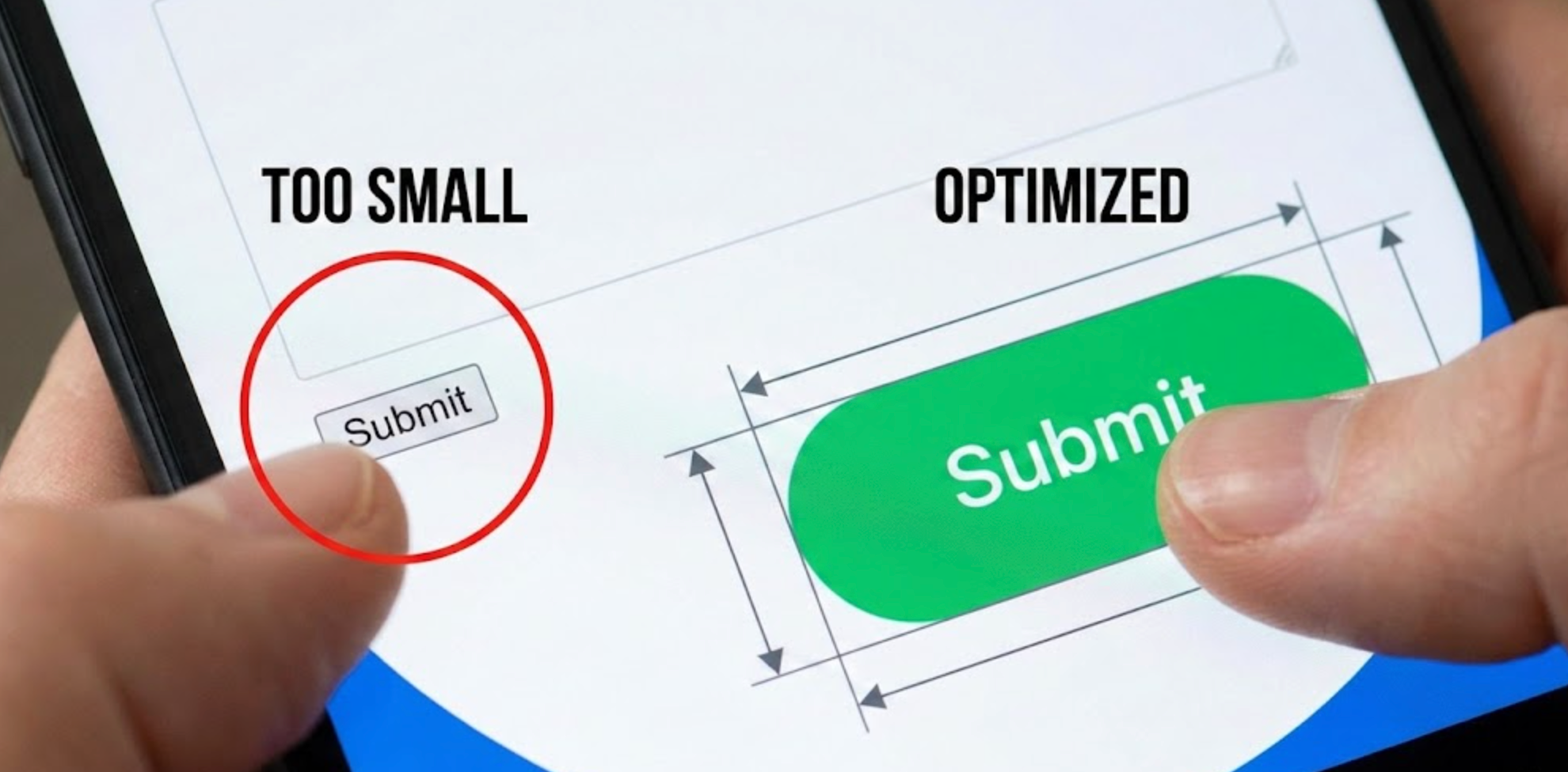
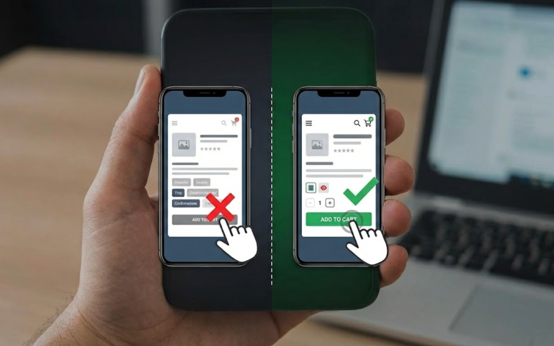
Small buttons may look clean, but they significantly increase error rates on mobile. Users should not need perfect aim to complete basic actions like selecting variants or adding products to cart. Larger tap targets reduce cognitive and physical effort, making interactions feel more natural.
Tap target size also affects accessibility and inclusivity. When buttons are too small, users with larger fingers or motor limitations struggle even more.
For this reason, increasing tap target size is one of the highest-impact mobile UX improvements.
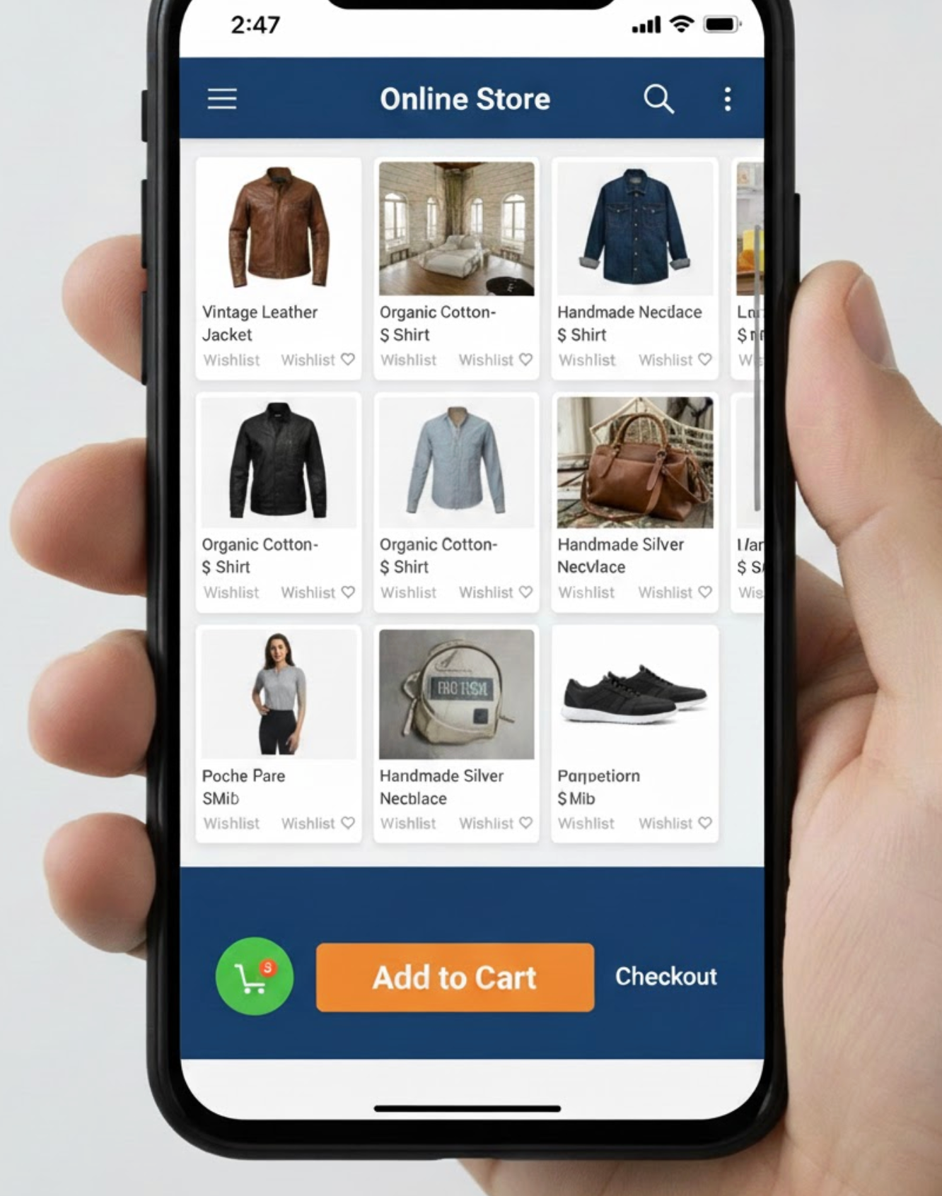
Even well-sized buttons can cause problems if they are placed too close together. Crowded layouts force users to slow down and visually double-check every tap, increasing friction. When spacing is insufficient, accidental clicks become a constant risk.
Spacing also affects perceived clarity and hierarchy. Proper separation helps users understand which actions are distinct and intentional.
Creating breathing room between elements is essential for reducing mobile errors.
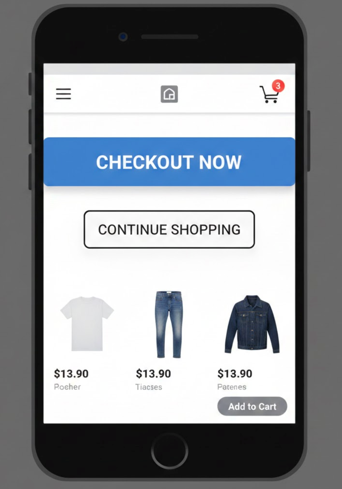
Many accidental clicks happen during scrolling, not intentional tapping. Users swipe naturally as they explore product details, reviews, and images. When actions sit directly in scroll paths, taps are often misinterpreted by the interface.
This problem becomes worse on long product pages with repeated CTAs. Clear separation between scrolling content and actionable zones improves control and predictability.
Designing for scroll behavior helps prevent unintentional engagement.
When too many elements behave like links, users lose confidence in tapping. Decorative icons, labels, or images that unexpectedly trigger actions increase confusion. Predictability is critical to preventing mistakes.
Clickable elements should always communicate intent visually. If users cannot immediately tell what is interactive, accidental clicks are inevitable.
Reducing unnecessary clickability simplifies decision-making.
A weak visual hierarchy forces users to scan and interpret every option. When everything looks equally important, users are more likely to mis-tap. Clear prioritization helps guide attention and intention.
Visual hierarchy also reduces cognitive load. Users instantly understand where to focus and what action matters most.
Establishing hierarchy is key to reducing accidental interaction.
Accidental clicks often occur before the page is fully ready. Layout shifts, slow loading elements, and delayed scripts can move buttons after a user taps. This creates unintended actions and frustration.
Preventing interaction during unstable states improves reliability. Even short delays can protect users from costly errors.
Managing interaction timing is an often-overlooked UX safeguard.
Some actions are more damaging when clicked accidentally. Removing items from cart or triggering instant checkout can disrupt the entire journey. These moments deserve extra protection.
Confirmations should feel helpful, not obstructive. The goal is error prevention, not friction.
Lightweight safeguards maintain flow while reducing regret.
Desktop simulations rarely reveal true mobile issues. Thumb reach, grip changes, and real scrolling habits only emerge on physical devices. Without real-world testing, accidental clicks often go unnoticed.
Observing real users provides insights analytics alone cannot. Behavioral testing exposes invisible friction.
Testing on real devices is essential for meaningful improvements.
Accidental clicks rarely show up as a metric labeled “error.” Instead, they appear indirectly through behavioral anomalies. Identifying these patterns requires interpretation.
Understanding these signals helps teams prioritize fixes. Data-backed insights prevent guesswork.
Measuring behavior completes the optimization loop.
Mobile shoppers should never feel like they need perfect aim to buy a product. Accidental clicks are a sign that the interface is asking too much from users. Great mobile design adapts to human behavior, not the other way around.
By enlarging tap targets, spacing elements properly, and respecting scroll behavior, teams create more forgiving experiences. When users feel in control, confidence replaces hesitation. Designing for intention, not precision, leads to smoother journeys, stronger trust, and higher mobile conversions.

