Please select the platform to login


User-generated content (UGC) is one of the strongest conversion drivers in modern eCommerce. Today’s shoppers crave authenticity more than ever, and nothing builds trust faster than real photos, videos, and experiences shared by customers. However, simply placing UGC somewhere on your website is not enough. The way you structure your UGC gallery, its layout, hierarchy, quality, filters, and shoppable features, determines whether it becomes a conversion engine or just another visual element on the page.
This guide walks you through how to structure UGC galleries in a way that boosts relevance, reduces decision fatigue, and inspires customers to buy with confidence.
A high-performing UGC gallery begins with intentional planning. Instead of uploading random customer photos and hoping visitors engage with them, define the exact outcome you want to achieve. Once you set a clear direction, it becomes much easier to structure the content so every visual supports your conversion goals. With that in mind, here are some practical ways to build your gallery with purpose:
The next step is choosing the right layout. The structure of your gallery influences how users interact with content, and the design should feel natural, organized, and visually stimulating. When your layout flows smoothly, visitors are more likely to stay longer and explore deeper. With that approach in mind, here are layout options that typically perform well:
Not all UGC drives conversions equally. Some visuals tell a stronger story, showcase better lighting, or create more emotional impact. To maximize engagement, you’ll want to feature the most persuasive content first. To do this effectively, consider the following techniques
As your gallery grows, it becomes essential to help users find what they’re looking for quickly. Adding filters makes the experience smoother by giving shoppers control and letting them personalize their journey. To organize your UGC in a user-friendly way, consider incorporating the following filter types:
UGC becomes far more powerful when it’s tied directly to a shopping action. To eliminate friction and guide users toward purchasing, make sure each visual leads seamlessly to the product it features. With a smooth shopping journey in mind, focus on implementing the following best practices:
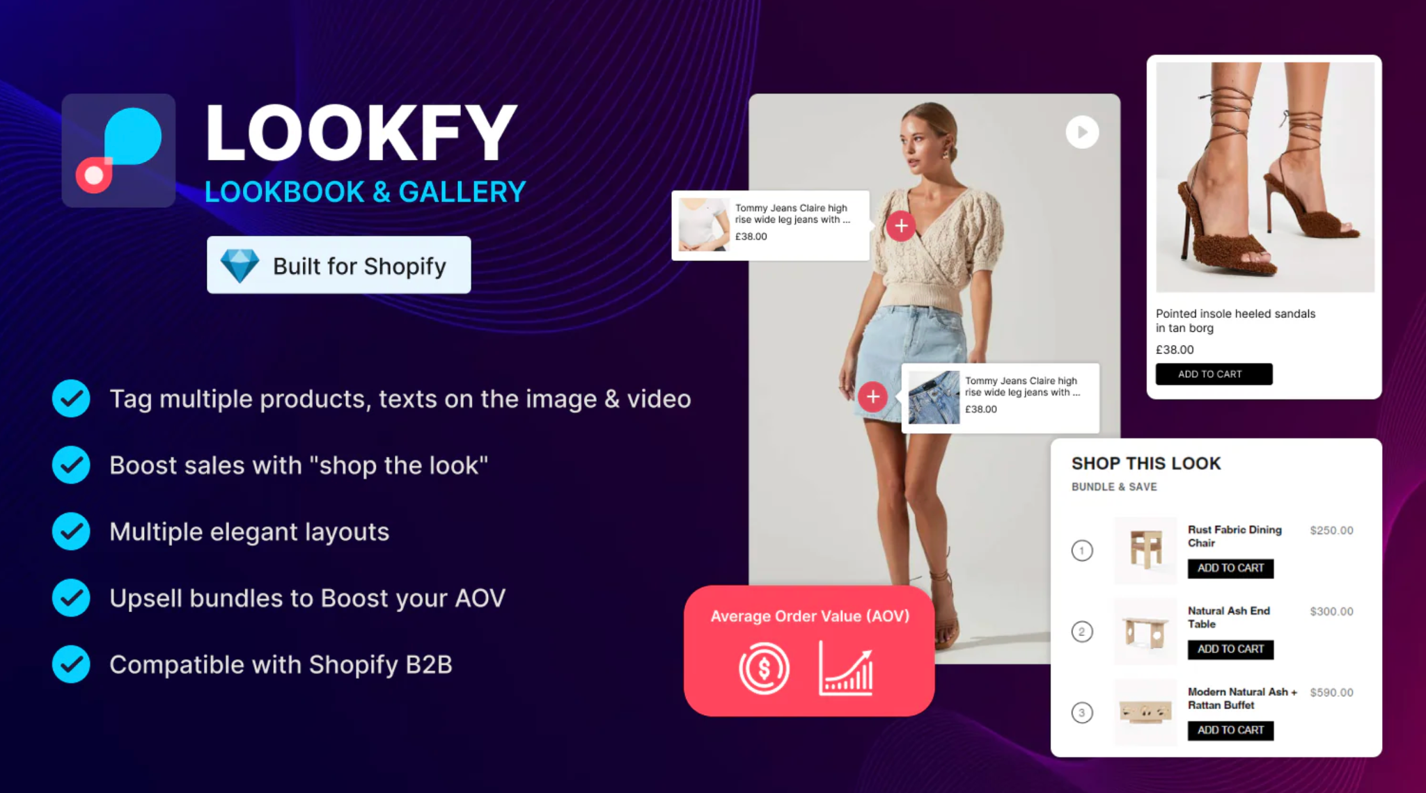
Lookfy supports this especially well by letting you tag products in UGC, build immersive “Shop the Look” layouts, and automatically connect customers to the correct variant.
UGC works best when it answers the unspoken questions customers have before buying. Structuring your gallery around real-life scenarios helps remove uncertainty and makes the purchase decision much easier. To ensure your content resonates deeply, prioritize adding the following types of visuals:
While authenticity is important, too many low-quality visuals can dilute your brand. Keeping your UGC fresh, consistent, and relevant helps create a stronger impression and builds more trust. To manage your gallery efficiently and maximize quality, follow these guidelines:
Creating a great UGC gallery is only part of the strategy, where you place it matters just as much. Thoughtful placement ensures your content appears at key moments in the shopping journey. To maximize visibility and influence the buying process, consider the following high-impact placements:
Even the best gallery needs direction. Adding clear calls to action helps guide shoppers toward the next step and keeps them interacting with your brand. To encourage deeper engagement and more conversions, consider using CTAs such as:
A high-converting UGC gallery is never static. You should always keep an eye on analytics to understand how shoppers behave and where improvements can be made. By monitoring performance regularly, you can make informed decisions and continuously refine your structure. To guide your optimization process, track the following metrics:
A well-structured UGC gallery does far more than showcase customer photos, but it guides shoppers, answers questions, builds immediate trust, and influences confident purchasing decisions. By implementing clear goals, smart layouts, quality filters, shoppable tagging, strong quality control, and strategic placement, you create a UGC environment that feels both authentic and optimized for conversions.
With the right structure and tools, like Lookfy to help you tag products, build shoppable galleries, and create dynamic “Shop the Look” experiences, you turn customer content into a powerful sales asset.

