Please select the platform to login


When customers land on your product page, they expect clarity and convenience. They want to find all the information they need, such as size guides, specifications, shipping details, materials, and reviews, without feeling lost or overwhelmed. That’s where tabs and accordions come in.
These simple yet effective design tools help structure your product information, making it easy for shoppers to explore details at their own pace. By presenting your content in a clear, organized layout, you not only improve readability but also increase trust and conversion rates. In this article, we’ll explore how tabs and accordions work, why they’re important, and how to add them directly within your Shopify theme.
A well-structured product page doesn’t just look better, it performs better. When information is scattered or displayed in one long block of text, shoppers often feel overwhelmed and skip key details. This confusion can lead to hesitation, reduced confidence, and even cart abandonment.
Organizing information into labeled sections, such as Description, Specifications, Shipping Info, and Customer Reviews, helps users find what they need quickly. It reduces scrolling, keeps your design tidy, and allows your most persuasive information (like materials or features) to stand out.
In short, structured content boosts both user experience and sales. Tabs and accordions provide the perfect balance of clarity, accessibility, and aesthetics that modern online shoppers expect.
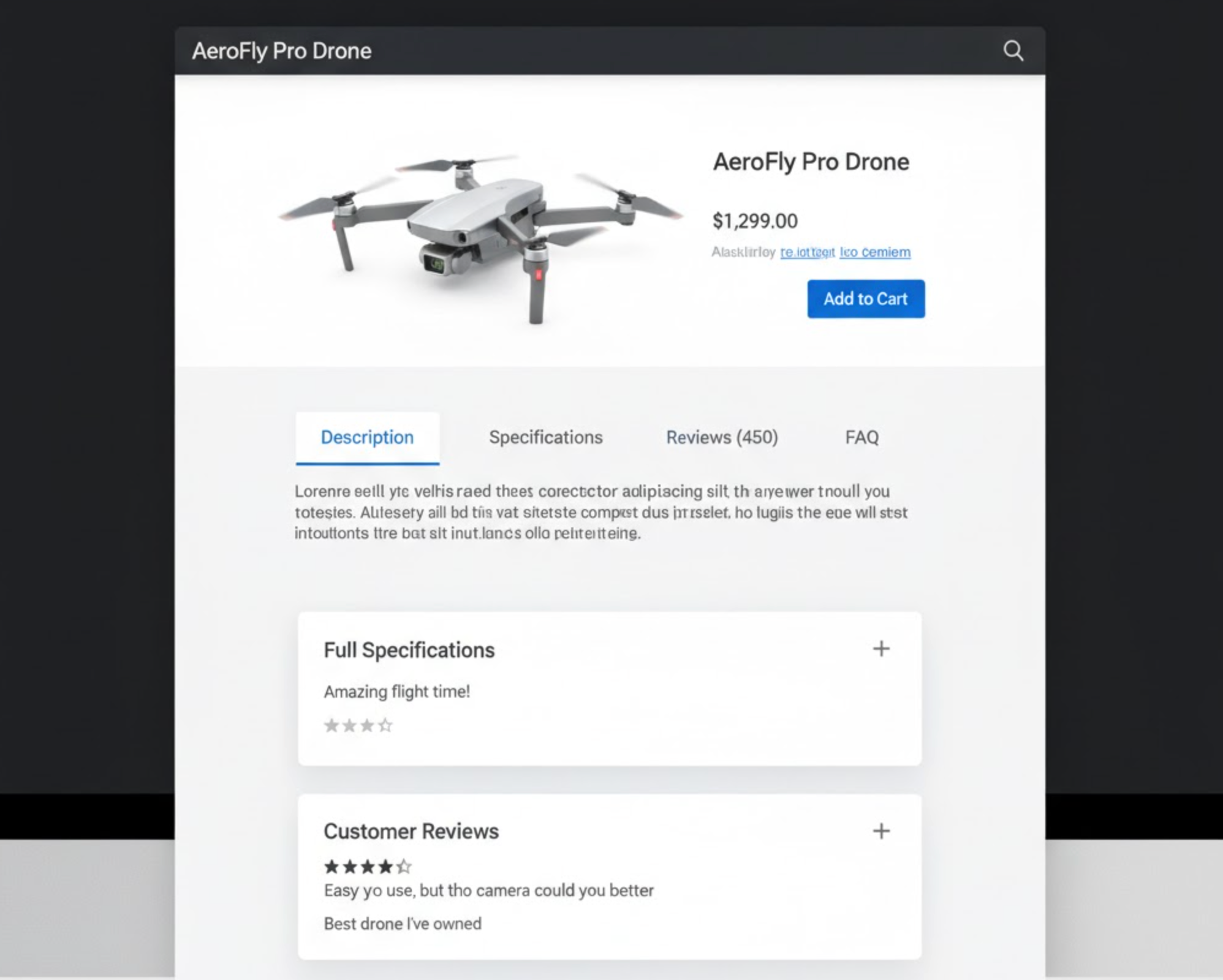
Tabs are a set of clickable labels that divide content into multiple panels. When a user clicks a tab, like “Description,” “Shipping,” or “Reviews”, which specific section’s content becomes visible while hiding the others. Tabs are perfect for showing different categories of information side by side, especially on desktop layouts.
Accordions, by contrast, display information in stacked collapsible panels. Users can expand or collapse each section individually to reveal more details. This format is particularly effective for mobile users or when you need to display longer content, such as FAQs, technical specifications, or policies.
Both tools aim to keep the product page tidy, reduce scrolling, and allow shoppers to focus on what interests them most, resulting in a smoother, more engaging shopping experience.
Instead of overwhelming customers with endless text, tabs and accordions present information in digestible chunks. Shoppers can focus on one section at a time, leading to better comprehension and a more positive experience.
By condensing content into organized sections, your page feels lighter and visually appealing. A clean layout communicates professionalism, which increases trust and credibility, especially important for new or smaller online stores.
Accordions shine on mobile devices. They help users navigate long product descriptions, size charts, or return policies without endless scrolling. Since mobile traffic dominates eCommerce today, optimizing for mobile readability is essential.
Interactive elements like tabs and accordions encourage exploration. Instead of passively skimming, users click and interact, spending more time on your product pages, which can lead to higher conversion rates.
When you use structured sections, it becomes easier for your team to update or manage product details in the future. Each piece of content has its designated place, reducing confusion and editing errors.
Choosing between tabs and accordions depends on your content type, layout, and audience:
A responsive approach that uses tabs on desktop and accordions on mobile often provides the best of both worlds, organized yet adaptable design.
Shopify makes it easy to add tabs and accordions directly within your theme, no coding or additional apps required. Most modern Shopify themes, especially those in the Online Store 2.0 framework for example Dawn, Craft, Sense, Taste, Refresh, and Studio, already include built-in settings for organizing your product details using these elements. Or there are some Shopify premium themes like Prestige, Impulse, and Pipeline offering advanced tab or collapsible content layouts that can be easily adjusted through the theme editor.
Here’s how you can make the most of these features:
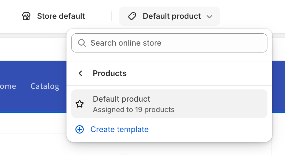
From your Shopify admin dashboard, go to Online Store > Themes. Click Customize next to the theme you want to edit. This will open the theme editor, where you can visually adjust your product page layout.
In the top dropdown menu, choose Products > Default Product (or any specific product template you’ve created). This opens a preview of your product page and displays the sections available for customization.
Scroll through the sidebar to find a section such as Product Information, Tabs, or Collapsible Content. Depending on your theme, you may see options like:
Click on these sections to edit their content and appearance.
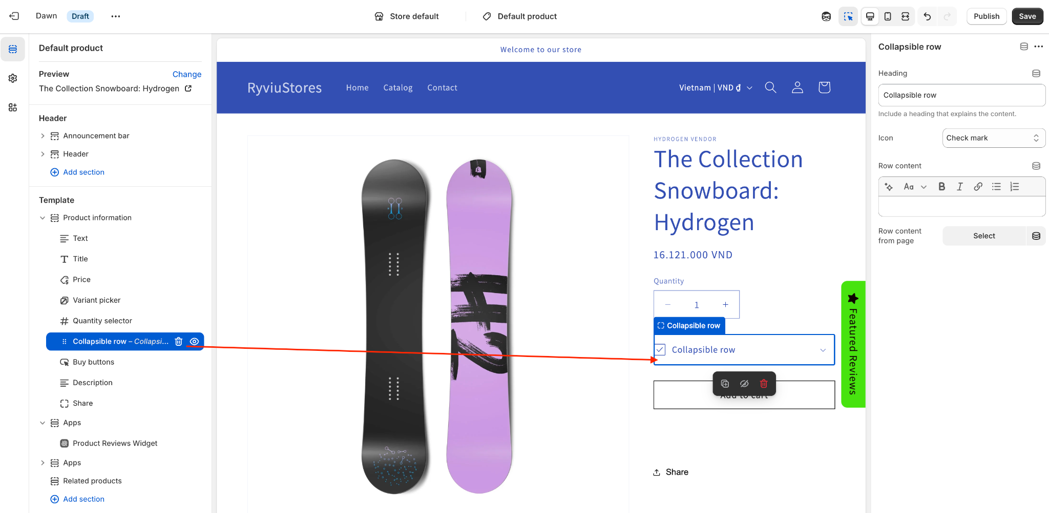
Within these sections, you can add new content blocks, each representing a separate tab or accordion item. Give each one a descriptive title, such as:
Under each heading, add text, images, or even embedded HTML if your theme allows it. Some themes also support rich text formatting, letting you include icons, bullet points, and hyperlinks.
Most themes provide settings to modify how tabs or accordions appear. You can choose between horizontal or vertical tab layouts, adjust spacing, and define whether all accordions are closed by default or if the first one should open automatically.
If your theme supports dynamic sources, you can even pull product-specific information, like metafields or custom attributes, into each tab automatically. This is perfect for managing large catalogs efficiently.
Once you’ve added your tabs or accordions, preview your product page on both desktop and mobile views. Make sure that:
If something feels cluttered, simplify your content or adjust the order of sections until it feels intuitive.
When you’re satisfied, click Save to publish your changes. Your new, organized product layout is now live, offering a cleaner, more engaging shopping experience for your customers.
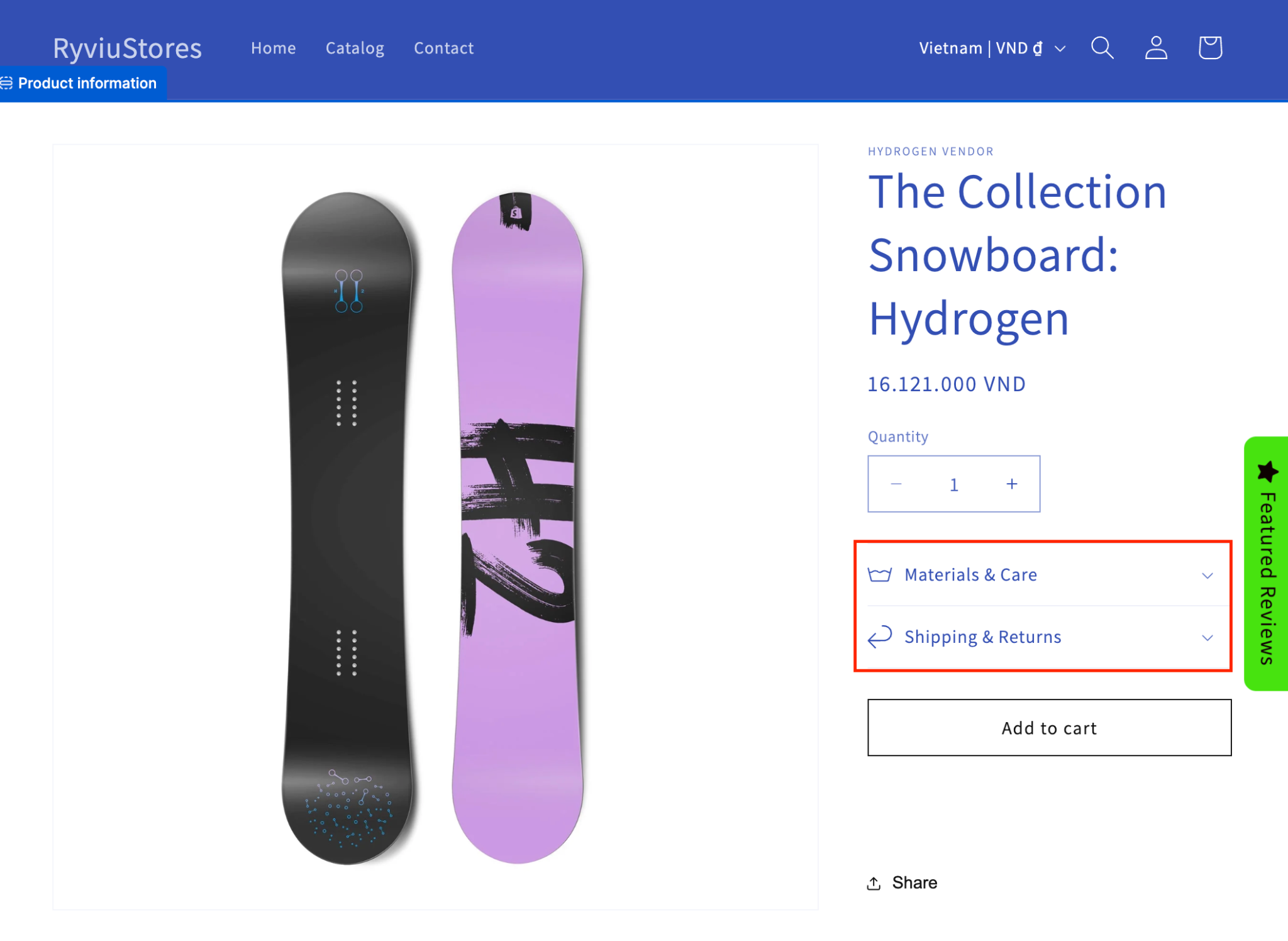
Label sections clearly and group related information together. For example, combine “Materials” and “Care Instructions” or separate “Shipping” from “Returns.” Avoid generic labels like “More Info”, be as descriptive as possible to help users find what they want instantly. And you should display these tabs before the review section as they belong to products’ information.
While tabs and accordions reduce clutter, don’t hide critical details that affect buying decisions. Information like product fit, size options, or shipping times should be easily visible or in the default open tab.
Break long paragraphs into bullet points or short sentences. Include visuals, icons, or highlights where appropriate to help users digest information quickly.
Make sure your tabs and accordions are fully accessible via keyboard navigation and screen readers. Proper ARIA labels, focus states, and semantic HTML structure help ensure all users, including those with disabilities, can interact with your content.
Preview how your product details appear on both desktop and mobile. Tabs often work best on wider screens, while accordions are more effective on narrow ones. A responsive setup ensures a seamless experience for every customer.
Tabs and accordions are subtle yet powerful tools that can transform how customers interact with your product pages. By organizing details clearly and logically, you not only improve the user experience but also guide shoppers toward faster, more confident purchasing decisions.
With Shopify’s built-in theme features, adding tabs or accordions is simple and flexible, you can customize their layout, content, and design without any code. Whether you’re displaying product descriptions, specifications, or shipping details, structuring your content with these elements ensures your pages look clean, professional, and conversion-focused.
In today’s competitive eCommerce landscape, every small improvement to usability counts, and well-organized product details can be the key to turning casual visitors into loyal customers.

