Please select the platform to login


A call-to-action (CTA) is not just a button or a short line of text, but it is the moment where interest turns into action. Whether your goal is to drive sales, capture leads, or encourage sign-ups, CTA copy plays a critical role in guiding users toward the next step. In ecommerce and digital marketing, even a small wording change can lead to noticeable improvements in click-through and conversion rates.
Because users are constantly scanning pages rather than reading every word, CTA copy must work instantly. It needs to be clear, persuasive, and aligned with user intent. In this article, we’ll break down how to write CTA copy that reduces hesitation, communicates value, and ultimately increases conversions.
An effective CTA removes doubt and gives users confidence about what will happen next. Instead of forcing users to guess, strong CTA copy sets clear expectations and highlights immediate value. When users understand both the action and the benefit, they are far more likely to click.
In addition, effective CTAs feel like a natural continuation of the page content rather than an interruption. They support the user’s journey by offering a logical next step. By combining clarity, relevance, and motivation, a well-written CTA becomes a helpful guide rather than a pushy sales message.
To create a CTA copy that helps you convert more sales, you can try the following tips:
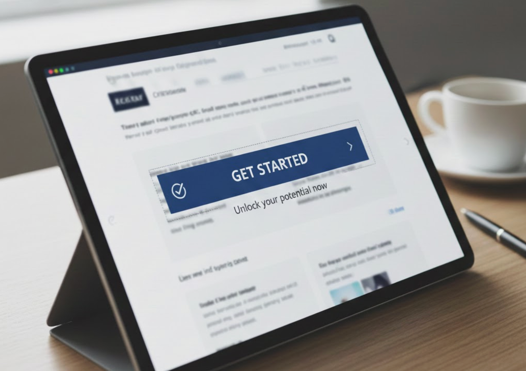
CTA copy should always encourage movement by using clear, action-driven verbs. Words like “Get,” “Start,” “Access,” “Discover,” and “Build” signal progress and make the CTA feel dynamic. This approach helps users visualize themselves taking action, which lowers mental resistance.
Equally important is specificity. A CTA like “Get My Free Guide” is more compelling than “Download,” because it clearly states what the user will receive. When action-oriented language is paired with a specific outcome, users feel more confident clicking because they know exactly what to expect.
While features explain what your product does, benefits explain why users should care. CTA copy that emphasizes benefits directly connects your offer to the user’s goals or problems. This makes the CTA emotionally relevant, not just informational.
For example, instead of saying “View Pricing,” a more benefit-focused CTA might be “Choose a Plan That Fits Your Business.” This subtle shift reframes the action as something helpful and user-centric. When users see immediate value in the CTA, motivation naturally increases.

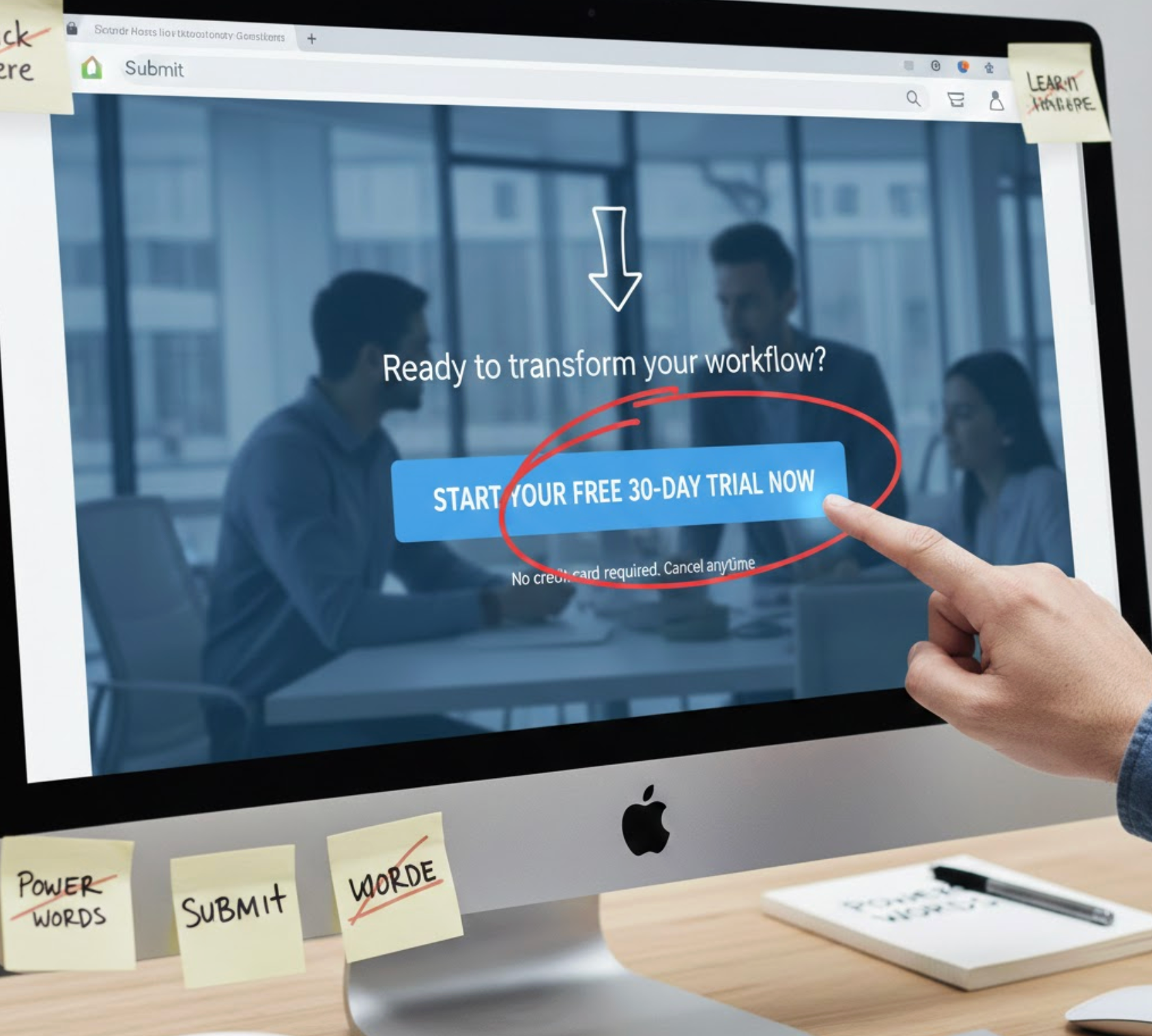
Urgency can be a powerful motivator when used thoughtfully. CTA copy that suggests timely action helps users avoid procrastination and encourages faster decisions. Phrases like “Start Today,” “Limited-Time Offer,” or “Join Before It Ends” gently prompt users to act now rather than later.
That said, urgency should always feel honest and proportional. Overly aggressive language or false scarcity can lead to mistrust and abandonment. The most effective urgency-based CTAs reinforce real value while respecting the user’s decision-making process.
One of the biggest barriers to conversion is fear, fear of commitment, unexpected costs, or complicated processes. CTA copy can proactively address these concerns by including reassurance and transparency. This helps users feel safe moving forward.
For example, adding phrases like “No Credit Card Required,” “Cancel Anytime,” or “100% Free” directly into CTA copy reduces perceived risk. When users feel protected from negative outcomes, they are much more likely to take action without hesitation.
Not all users are ready to buy immediately, which is why CTA copy must align with intent. Visitors in the awareness or consideration stage may respond better to softer CTAs like “Learn More,” “See How It Works,” or “Explore Features.” These options feel educational rather than transactional.
On the other hand, users who are already convinced need direct and decisive CTAs such as “Add to Cart,” “Buy Now,” or “Start My Subscription.” Matching CTA language to user readiness ensures the message feels relevant and supportive instead of rushed or pushy.
Personalization makes CTA copy feel more engaging and human. Simple wording changes—such as using “My” or “Your”, can significantly improve click-through rates by creating a sense of ownership. When users feel that the CTA is tailored to them, engagement naturally increases.
For instance, “View My Cart” feels more personal than “View Cart.” Personalized CTAs can also be dynamic, changing based on browsing behavior or purchase history. These small adjustments help CTAs feel more relevant and timely.
While supporting text can provide context, the CTA itself should remain short and easy to scan. Most high-performing CTAs use between two and six words, ensuring they stand out visually and are instantly understandable. This is especially important for mobile users, who often make decisions quickly.
Avoid clever wordplay or vague phrases that require interpretation. Clear and simple CTA copy ensures users can act without thinking twice. When clarity is prioritized, conversions tend to follow.
Even well-written CTA copy can be improved through testing. A/B testing allows you to compare variations and discover which wording resonates most with your audience. Small changes, such as adding “Free,” switching verbs, or adjusting tone, can lead to meaningful performance gains.
It’s important to test one variable at a time so results are clear and actionable. Over time, continuous testing helps refine CTA copy that consistently supports higher conversions and better user engagement.
Many businesses weaken their conversion potential by using vague or generic CTA copy that provides little context or motivation. When users don’t clearly understand what will happen after clicking, hesitation increases and engagement drops.
To avoid these pitfalls, it’s important to recognize the most common CTA copy mistakes and understand why they negatively impact conversions.
Common CTA mistakes include:
Writing CTA copy that increases conversions requires a balance of clarity, motivation, and empathy. By focusing on action-oriented language, user benefits, reduced friction, and intent-based messaging, you can turn simple CTAs into powerful conversion tools.
Rather than treating CTAs as a final step, view them as an integral part of the user journey. Continuously refine and test your CTA copy, and over time, you’ll create experiences that not only encourage clicks, but confidently guide users toward meaningful action.

