Please select the platform to login


Website navigation plays a crucial role in how easily visitors can find what they’re looking for, and how likely they are to make a purchase. Among the most common navigation styles are mega menus and dropdown menus, both widely used in eCommerce. While they serve the same purpose, organizing links and product categories, their design, layout, and performance can differ dramatically.
This article explores the differences, advantages, and drawbacks of each, helping you decide which is the best fit for your online store.
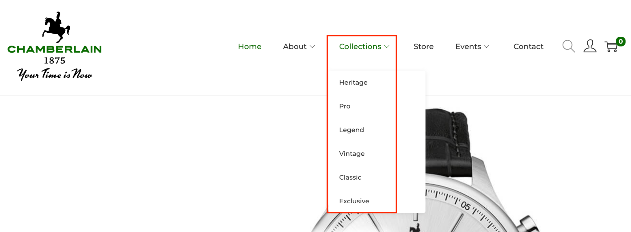
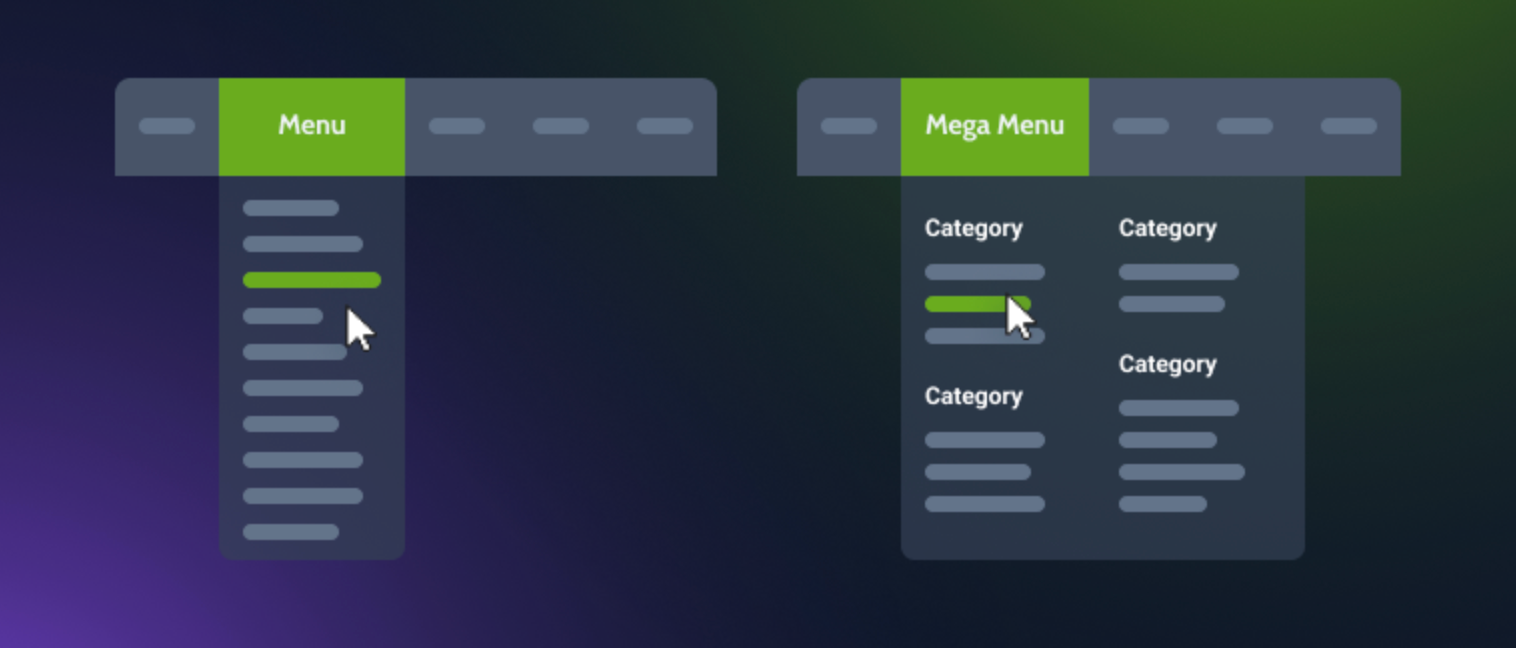
A dropdown menu is a simple navigation style that expands vertically when users hover over or click a main menu item. It typically lists a handful of related links or subcategories in a single column.
For example, when hovering over “Collections” on a watch store, a dropdown may display options like “Heritage,” “Pro,” and “Vintage”, etc.
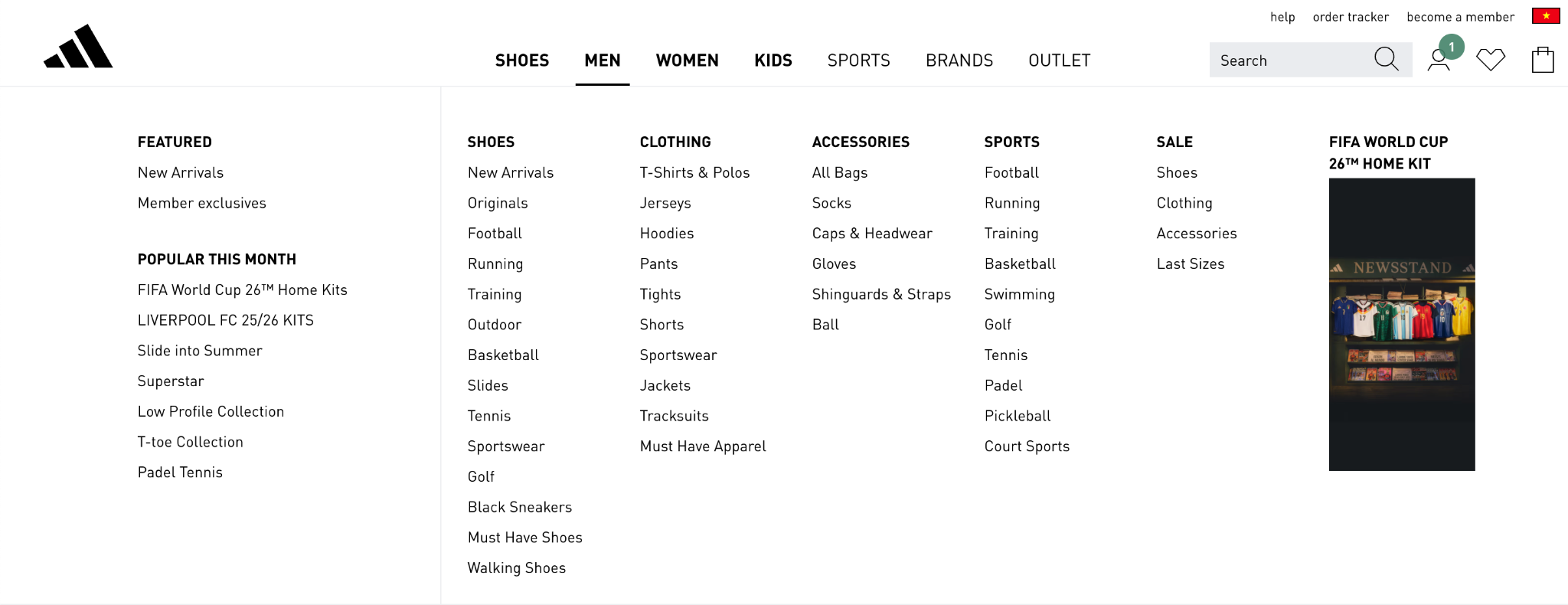
A mega menu is an expanded, multi-column dropdown panel that displays a wide range of links, often grouped by categories, brands, or product types. It can also include visuals like images, icons, or even featured products.
For instance, when hovering over “Shop” on a fashion site, a large panel opens showing categories like “Clothing,” “Footwear,” and “Accessories,” each with sub-links (e.g., “Tops,” “Jeans,” “Sneakers”) and product images.
Menu design determines how easily users can explore your store without feeling overwhelmed. Simpler designs tend to support usability, while advanced layouts allow more creativity and control.
Dropdown menus are straightforward. They present a single column of links that expand neatly when hovered or clicked, making them simple to build and maintain. Because their structure is linear, it’s easier to keep the layout consistent across all pages without needing extra customization.
Mega menus, by contrast, introduce a much richer structure. They can include multiple columns, category headings, icons, and even product images. This complexity allows for greater flexibility but also demands careful organization and visual hierarchy. A cluttered mega menu can quickly turn from helpful to confusing if spacing, grouping, or typography are inconsistent.
In short, dropdown menus prioritize simplicity, while mega menus reward thoughtful design planning with higher visual impact.
Ease of setup can influence how efficiently you manage your store’s navigation, especially as your catalog grows.
Dropdown menus are easy to configure. Most Shopify themes support them natively, requiring only a few clicks in the navigation editor. They rarely need coding knowledge or ongoing adjustments unless categories change. Their simplicity means fewer moving parts, so you can focus on content rather than layout.
Mega menus, on the other hand, require more setup time and a structured approach. You’ll need to plan category groupings, add visuals, and test responsiveness across devices. Updating a mega menu can also be more time-consuming since each change might involve adjusting both text and images.
If speed and convenience are priorities, dropdown menus win. But if you’re ready to invest in a more immersive experience, mega menus offer creative control worth the effort.
Navigation directly shapes how visitors explore your store. A well-designed menu can either simplify the path to products or slow users down with too many options.
Dropdown menus offer a familiar, predictable experience. Users can hover, scan, and click without distraction. They work best for stores with limited categories, ensuring fast access and minimal decision fatigue.
Mega menus, in contrast, create an engaging browsing journey. They reveal multiple sections at once, helping customers visualize your full product range. This format is especially effective for stores with extensive catalogs, as shoppers can discover more without digging through multiple pages. However, poorly organized mega menus can overwhelm first-time visitors.
From a UX standpoint, dropdowns favor speed and clarity, while mega menus enhance exploration and discovery.
As your product catalog expands, your navigation must adapt gracefully. Scalability ensures your menu remains effective even as your offerings multiply.
Dropdown menus work best for compact catalogs. They can quickly become cluttered once you add more than a few categories or sublevels. Too many nested links force users into endless hover chains, which can frustrate them and increase bounce rates.
Mega menus excel in scalability. Their multi-column format allows you to categorize dozens of items logically under clear headings. You can even add promotional banners or featured collections without overwhelming the user. This flexibility makes mega menus a natural fit for growing or multi-category stores.
In essence, dropdowns are great for starting out, but mega menus are built for long-term growth.
Visual appeal influences how professional and inviting your store feels. Navigation elements often define the tone of your design.
Dropdown menus are minimalist by nature. They fit seamlessly into most layouts, maintaining a clean, understated appearance. Because they use plain text and limited styling, they keep attention on the rest of the page content rather than the navigation itself.
Mega menus, conversely, are highly visual. They can integrate product images, icons, and banners to turn navigation into an interactive showcase. This can elevate your brand presentation, making your store look modern and dynamic. However, with great visuals comes great responsibility, overuse of imagery or inconsistent design can quickly cause clutter.
From a visual standpoint, dropdowns complement your design, while mega menus define it. Each supports a different design philosophy depending on your store’s style and goals.
Navigation shouldn’t compromise site performance, especially since speed is vital for SEO and conversions.
Dropdown menus are lightweight. They rely on basic HTML and CSS, meaning they load almost instantly. This makes them ideal for stores targeting fast mobile performance or limited internet environments.
Mega menus, however, may carry more weight due to images, icons, or custom scripts. While modern themes optimize for speed, a poorly optimized mega menu can still slow down page rendering. The solution lies in moderation, using compressed images and lazy loading to balance functionality and performance.
In terms of efficiency, dropdown menus are nearly frictionless, while mega menus require optimization to perform at their best.
The depth of your menu determines how effectively users can access multi-level categories.
Dropdown menus are best for shallow structures, one or two layers at most. Once you add several sublevels, users must hover precisely or click multiple times, which increases frustration, especially on mobile.
Mega menus, on the other hand, are built for depth. They can reveal multiple category levels side by side, allowing customers to view your entire structure at once. This visibility helps reduce clicks and guides users intuitively toward the right section.
If your site hierarchy is simple, dropdowns keep things lean. If it’s complex, mega menus provide clarity without forcing users into multiple navigation steps.
Beyond usability, menus communicate brand personality. Their presentation can subtly reflect whether your brand is minimalist, premium, or dynamic.
Dropdown menus project simplicity and focus. They suit brands that value a refined, distraction-free look, such as boutiques or single-product stores. Their restraint communicates confidence in your core offering.
Mega menus express abundance and variety. They fit brands that celebrate diversity in products, like department stores or fashion labels. With imagery, typography, and structure, they create a sense of energy and richness that smaller menus can’t match.
Ultimately, dropdown menus whisper professionalism, while mega menus announce it. The right choice depends on how you want visitors to feel when they browse your store.
Accessibility ensures every user, including those using keyboards, screen readers, or mobile devices, can navigate your store effortlessly.
Dropdown menus are simpler to make accessible. With proper ARIA labels and focus states, they work smoothly for both mouse and keyboard users. Mobile versions usually convert easily into collapsible accordions, maintaining consistency across devices.
Mega menus require more careful development. Their multiple columns and visuals can confuse screen readers if not structured properly. On mobile, they often transform into nested panels or scrollable sections, which must be tested for usability.
While both can be accessible, dropdowns achieve it more easily. Mega menus need deliberate attention to coding, testing, and responsive adjustments to ensure equal access for all visitors.
Both menu types serve a purpose, but in different contexts. Dropdown menus excel in simplicity, speed, and ease of maintenance, while mega menus dominate in organization, scalability, and visual engagement.
If your store has a limited range of products or a minimalist brand style, dropdown menus will provide the clean efficiency you need. If your store houses a large catalog and you want to highlight collections, brands, or visuals, a mega menu offers the best experience.
Ultimately, your choice should align with your catalog size, brand identity, and customer journey goals. The best menu isn’t about trends, it’s about what helps your customers navigate with clarity and confidence.
A dropdown menu is best for stores with a limited range of products or categories. If your navigation only needs to direct customers to a few key sections, like “Men,” “Women,” “Sale,” and “Contact”, a dropdown keeps things clean and straightforward.
Use dropdown menus when:
Example: A local handmade jewelry store or boutique fashion brand could use dropdowns to maintain a minimalist look and fast navigation.
A mega menu shines in stores with extensive inventories or multiple product categories. It’s ideal for eCommerce giants or growing brands that want to showcase many offerings at once without forcing visitors to click through layers of pages.
Use mega menus when:
Example: A Shopify store selling apparel, footwear, and accessories across multiple collections can benefit from a mega menu that displays all options neatly in one glance.
The choice between a mega menu and a dropdown menu depends on your store size, catalog complexity, and design goals:
In many cases, store owners start with dropdown menus and upgrade to mega menus as their product range grows.
Both mega menus and dropdown menus can create excellent shopping experiences when implemented thoughtfully. Dropdown menus offer simplicity and speed, while mega menus provide a rich, visual, and highly organized experience for larger stores.
Ultimately, the “better” option is the one that aligns with your store’s structure, customer behavior, and growth plans. If you’re expanding your catalog and want to highlight multiple product types, the mega menu is the smarter choice. For smaller, more focused stores, the dropdown menu remains an elegant and practical solution.

