Please select the platform to login


Checkout is the most critical moment in the customer journey. Shoppers have already chosen their products and shown strong intent to buy, yet this is where many conversions are lost. A poorly designed checkout experience introduces friction, confusion, or doubt, causing customers to abandon their carts at the last possible step.
Understanding the most common checkout mistakes helps you identify where users struggle and how to remove barriers that stand between intent and purchase. Below are eight mistakes that frequently lead to failed checkouts, along with practical ways to avoid them.
Requiring users to create an account before checkout introduces friction at the moment when customers are most motivated to buy. Many shoppers are browsing casually, making a one-time purchase, or simply trying to complete an order quickly. Being forced to register adds perceived effort and raises concerns about spam, data storage, or future obligations. This extra step interrupts momentum and can cause hesitation, especially on mobile devices. Over time, this small barrier can significantly reduce overall conversion rates.
The solution is to remove unnecessary commitment while still keeping the option to build long-term relationships.
Long checkout forms make the buying process feel slow and overwhelming. Each additional field increases the amount of mental effort required, especially when users are unsure why certain information is needed. Excessive data collection can also raise privacy concerns, causing users to hesitate or abandon the process entirely. Errors become more likely as form length increases, leading to frustration. Together, these issues create a checkout experience that feels heavier than it should be.
Reducing effort and complexity helps users move through checkout with less resistance.
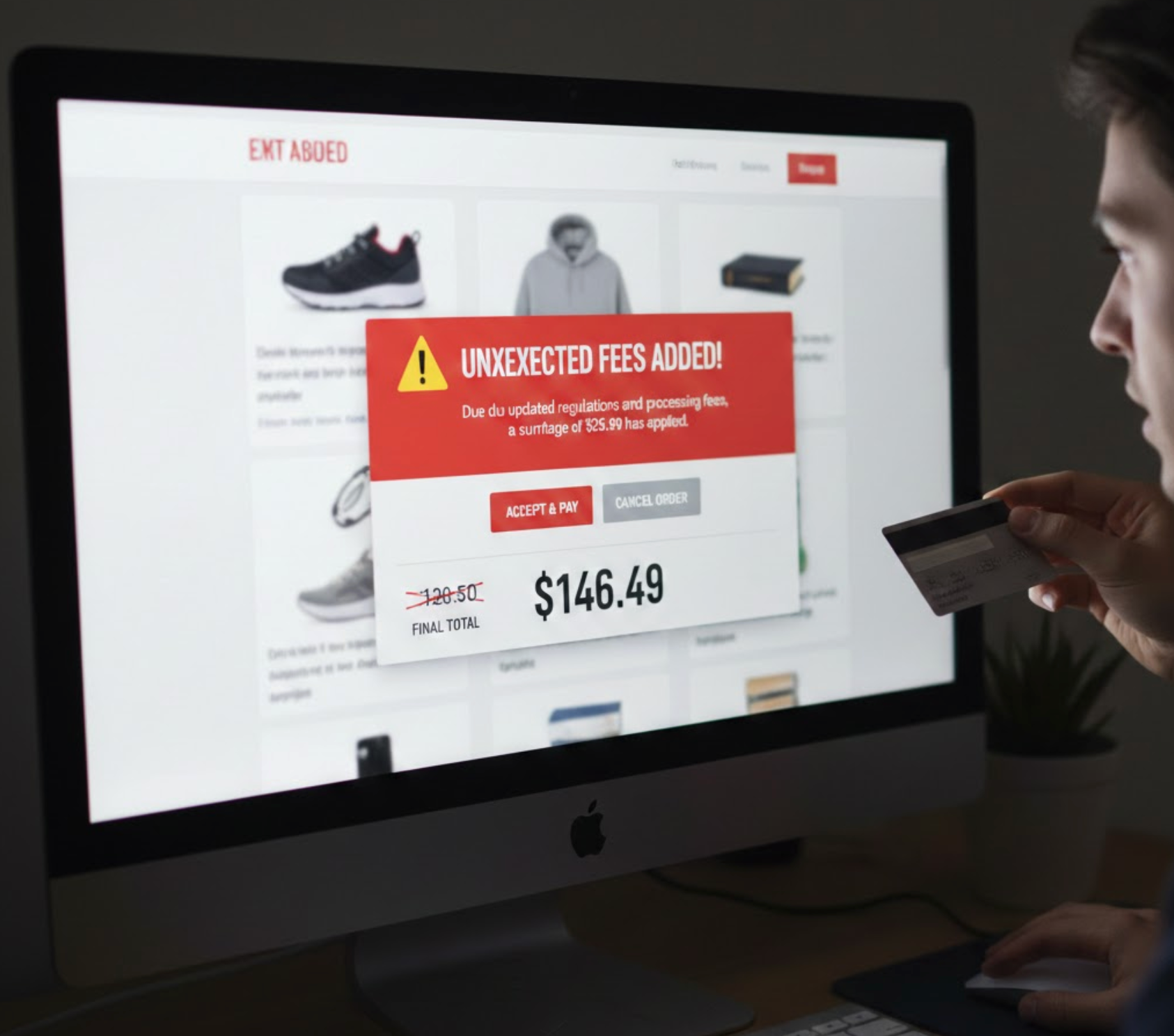
Unexpected fees are one of the most common causes of checkout abandonment. When shipping costs, taxes, or service fees appear late in the process, users feel misled, even if the total price is reasonable. This creates a sudden break in trust at a critical decision point. Shoppers may leave to compare prices or abandon the purchase altogether. The emotional impact of surprise often outweighs the actual cost.
Avoiding this reaction starts with transparency early in the checkout journey.
Payment preferences vary widely, and limiting options can exclude willing buyers. If customers don’t see a payment method they trust or regularly use, they may abandon the purchase rather than adapt. This is especially true for mobile users and international shoppers. A narrow set of payment methods can make your checkout feel outdated or inflexible. Ultimately, it creates unnecessary friction at the final step.
Providing payment flexibility makes checkout feel familiar and convenient.
Mobile users often shop in short sessions and expect fast, effortless interactions. Small buttons, cramped layouts, and excessive typing make checkout feel frustrating on small screens. Slow loading times further amplify impatience and increase abandonment. Even a well-designed desktop checkout can fail if it isn’t optimized for mobile behavior. As mobile traffic grows, this issue becomes increasingly costly.
Designing specifically for mobile users helps eliminate these pain points.
Errors during checkout are unavoidable, but poor messaging makes them far more damaging. Generic messages like “Something went wrong” leave users confused and unsure how to proceed. This uncertainty increases stress and reduces trust in the system. If users believe fixing the issue will take too much effort, they are likely to abandon it. Clear guidance is essential at this fragile moment.
Helping users recover quickly keeps them moving toward completion.

Checkout is where users are most sensitive to security and privacy concerns. If trust signals are missing or unclear, shoppers may hesitate even after deciding to buy. Doubt at this stage can quickly override positive product impressions. A lack of reassurance can make users question whether their data is safe. This hesitation often leads to silent abandonment.
Reinforcing trust at checkout helps users feel secure enough to proceed.
When users don’t know how many steps remain, checkout can feel longer than it actually is. This lack of clarity increases anxiety and impatience. Users may abandon simply because they assume the process is too complex or time-consuming. Even motivated shoppers can lose momentum without clear structure. Perceived effort often matters more than actual effort.
Providing visual guidance helps users stay committed to finishing.
A failed checkout is the result of small friction points that add up. By removing unnecessary steps, improving clarity, and building trust throughout the process, you can dramatically reduce abandonment and increase completed purchases.
Optimizing checkout isn’t about adding more features, but it’s about making the experience feel effortless, predictable, and reassuring. When customers can move smoothly from decision to payment, your checkout becomes a conversion engine rather than a bottleneck.

