Please select the platform to login


Sticky Add to Cart buttons are designed to solve a simple but critical problem in ecommerce: helping shoppers take action at the exact moment they are ready to buy. As product pages become longer and more content-rich, users often scroll far away from the original Add to Cart button. Sticky buttons keep that action visible and reduce unnecessary friction in the buying journey.
However, the effectiveness of a sticky Add to Cart button depends heavily on where and how it is placed. Poor placement can make the button feel intrusive, interrupt product exploration, or even reduce trust. To achieve consistent conversion gains, placement must be intentional, user-centered, and aligned with how shoppers naturally browse product pages.
Before diving into specific placement strategies, it’s important to understand why placement has such a strong influence on conversion rates. Sticky Add to Cart buttons are constantly visible by design, which means they have a stronger psychological impact than standard buttons. When positioned correctly, they reduce effort and guide decision-making. When positioned poorly, they create pressure and distraction.
Placement determines whether the button feels like a helpful reminder or an aggressive sales push. It also affects how users perceive control during the shopping experience. For this reason, every placement decision should be based on supporting the user’s intent rather than forcing a purchase.
With this foundation in mind, the first step is identifying where users naturally interact with the page.
Sticky Add to Cart buttons help shoppers take action without needing to scroll back up the page. As product pages grow longer and more detailed, users often lose sight of the original purchase button. Sticky placement keeps the buying option accessible while maintaining browsing momentum.
To achieve strong results, however, placement must be deliberate and aligned with user behavior rather than added randomly.
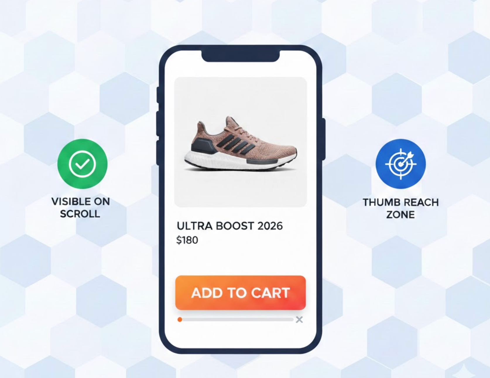
Users naturally interact with certain areas of the screen more than others, especially when scrolling or navigating with one hand. When sticky buttons align with these interaction zones, they feel intuitive instead of disruptive. Poor alignment, on the other hand, forces extra effort and breaks the flow of the shopping experience.
For this reason, placement should follow where users already expect to tap or click.
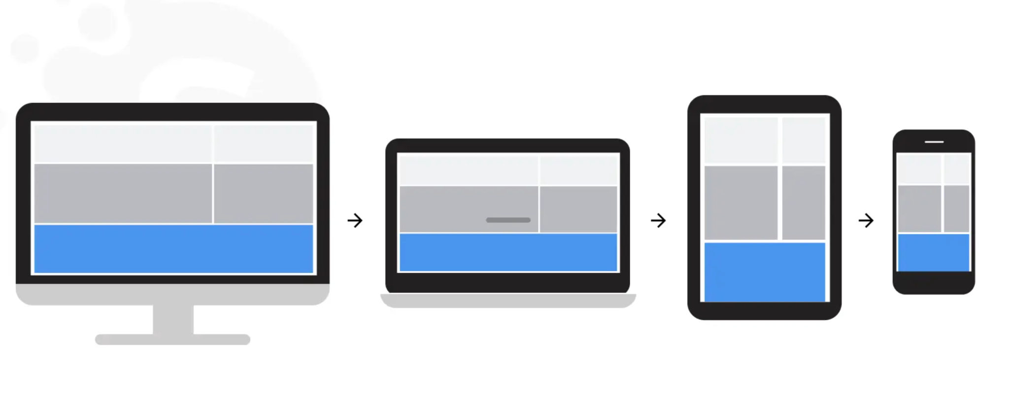
Mobile and desktop users browse product pages in very different ways, which directly affects how sticky elements should behave. Mobile users rely on touch and vertical scrolling, while desktop users scan content more freely across larger screens. Treating both experiences the same often leads to usability issues and reduced conversions.
A device-specific placement strategy ensures the sticky button feels appropriate in every context.
Showing a sticky Add to Cart button too early can feel aggressive and premature. Users typically want time to review product images, pricing, and details before committing to a purchase. Activating the button after engagement respects the decision-making process.
This approach ensures the button reinforces intent instead of creating pressure.
Sticky elements can easily become disruptive if they cover essential information. When key product details are hidden, users feel frustrated and may abandon the page. Proper placement ensures visibility without sacrificing clarity or trust.
Preventing obstruction keeps the shopping experience smooth and frustration-free.
Shoppers often hesitate right before adding an item to the cart. Positioning the sticky button near reassurance elements helps reduce last-second doubt. Contextual placement strengthens confidence at the moment of action.
Supporting information gives users a reason to proceed.
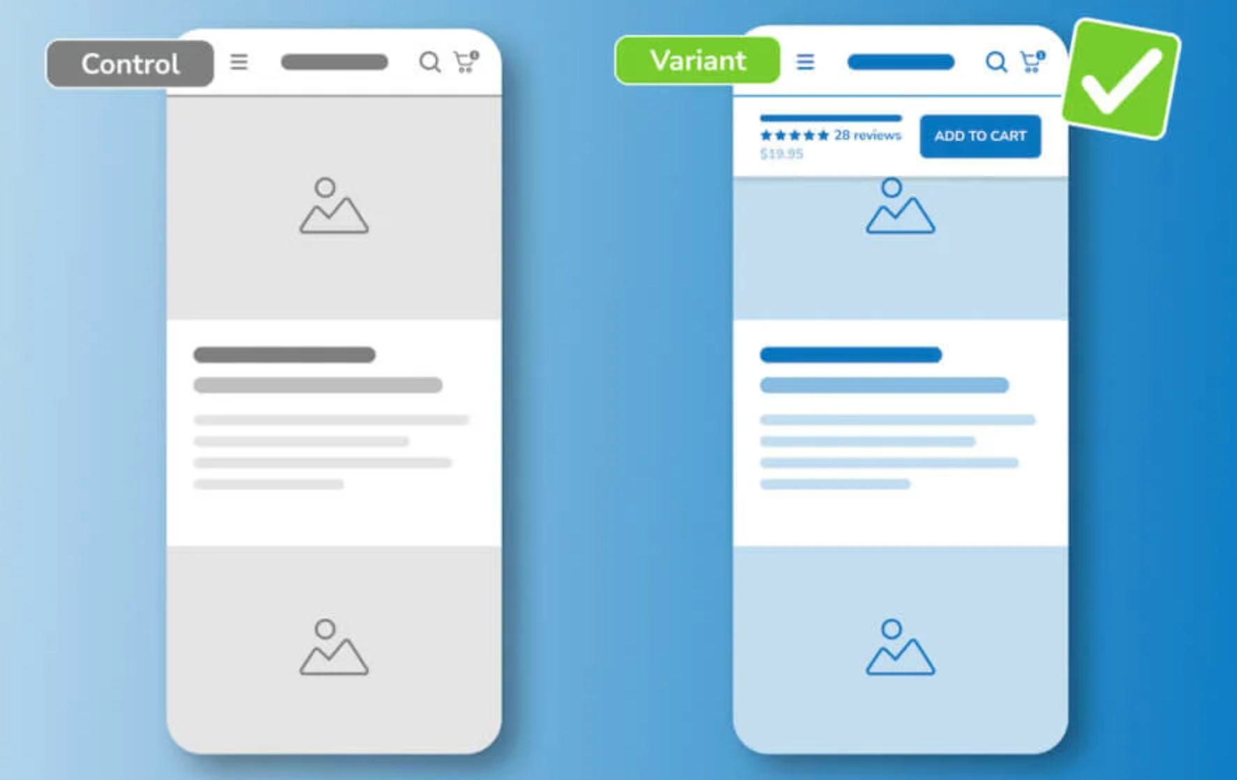
No single placement works best for every store or audience. User behavior varies by product type, traffic source, and device usage. Continuous testing helps identify the most effective configuration over time.
Optimization is an ongoing process rather than a one-time setup.
Sticky Add to Cart buttons can significantly improve conversions when their placement is guided by user behavior rather than design trends. Thoughtful positioning reduces friction, respects the browsing experience, and supports shoppers at the moment they are ready to act. When placed strategically, sticky buttons feel like a helpful shortcut instead of a disruptive sales tactic.
Ultimately, successful placement is about balance. Aligning sticky buttons with natural interaction zones, activating them at the right time, and ensuring they never block critical content creates a smoother path to purchase. By continuously testing and refining placement strategies, eCommerce stores can turn sticky Add to Cart buttons into a reliable driver of long-term conversion growth.

