Please select the platform to login


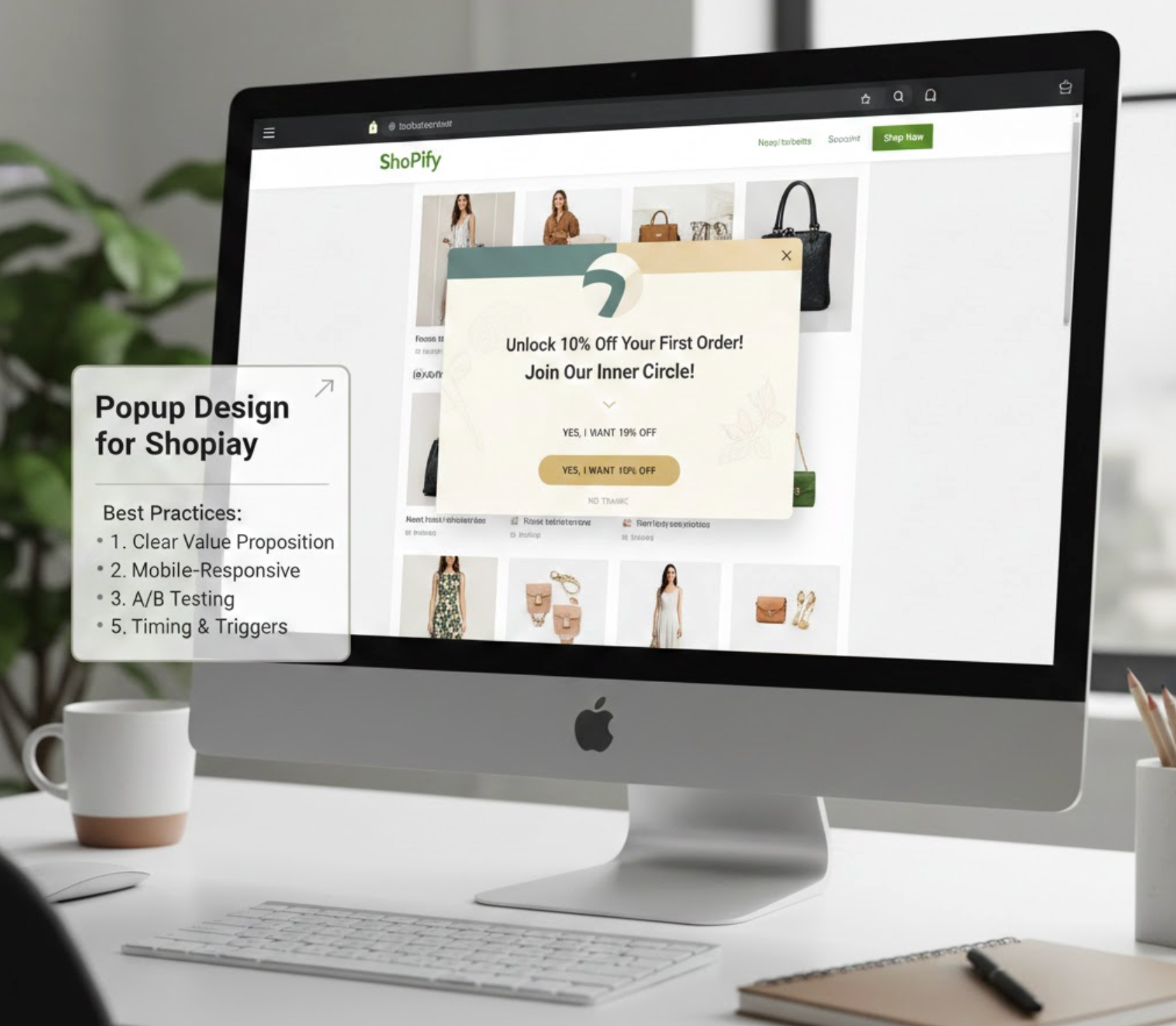
Popups are one of the most powerful on-site conversion tools for Shopify stores. When designed and timed correctly, they can capture leads, recover abandoned visitors, highlight promotions, and guide shoppers toward purchase decisions. However, poorly designed popups can feel intrusive, disrupt the shopping flow, and even drive users away.
This guide explores popup design best practices for Shopify, focusing on how to balance visibility, usability, and conversion performance, without sacrificing customer experience.
A popup is a small overlay window that appears on top of a webpage to deliver a specific message or prompt an action. In Shopify stores, popups are commonly used for:
Unlike static banners, popups demand attention. That makes them effective, but also risky if misused.
Popup success is not just about offering a discount. Design choices directly affect whether shoppers engage or immediately close the popup.
Well-designed popups can:
Poorly designed popups can:
That’s why design and strategy must work together.
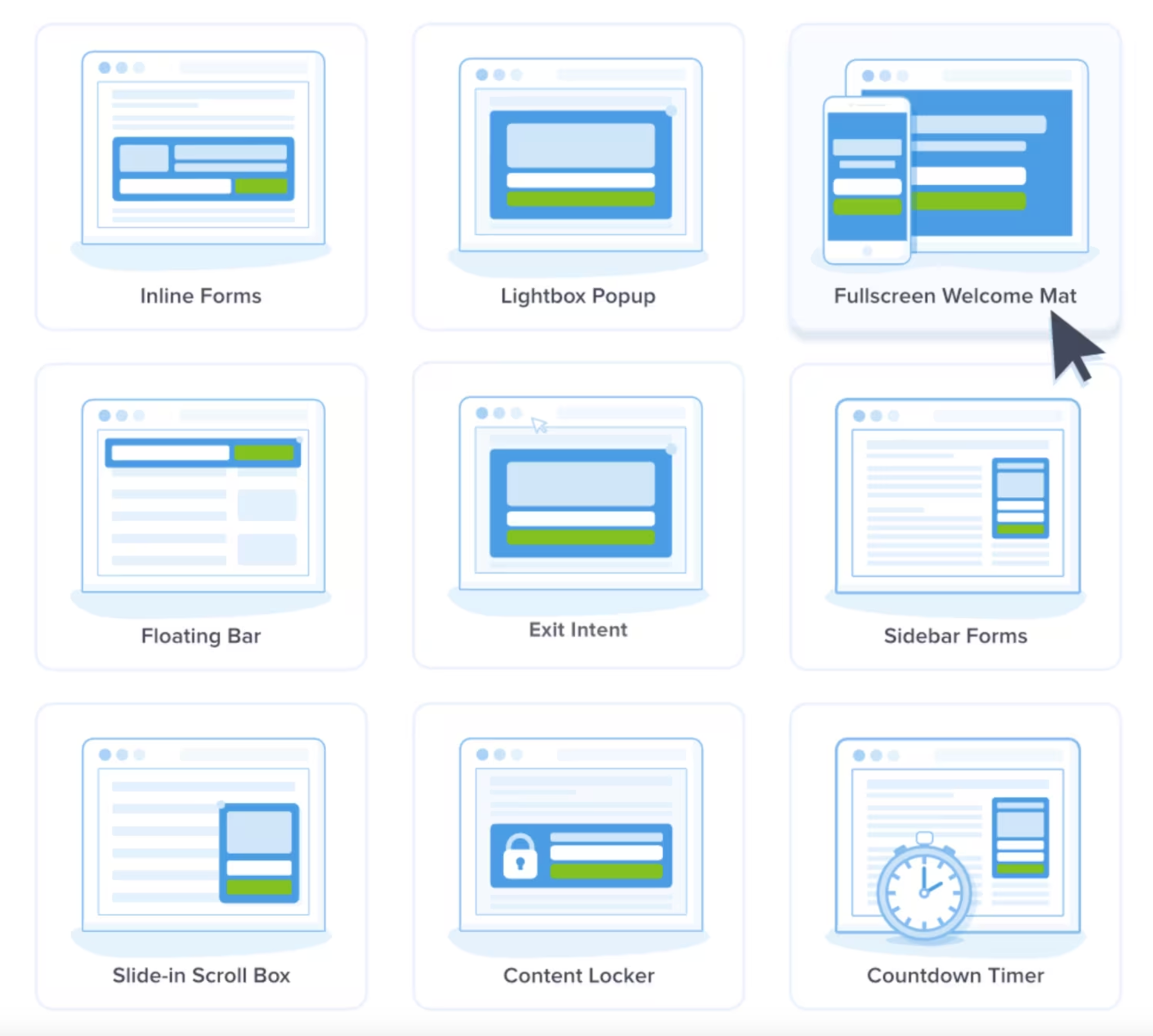
Every popup should be created with a clear purpose in mind. Different popup formats serve different stages of the customer journey and levels of intent. Using the wrong popup type can weaken your message and frustrate users.
To achieve better results, align the popup format with the specific action you want visitors to take.
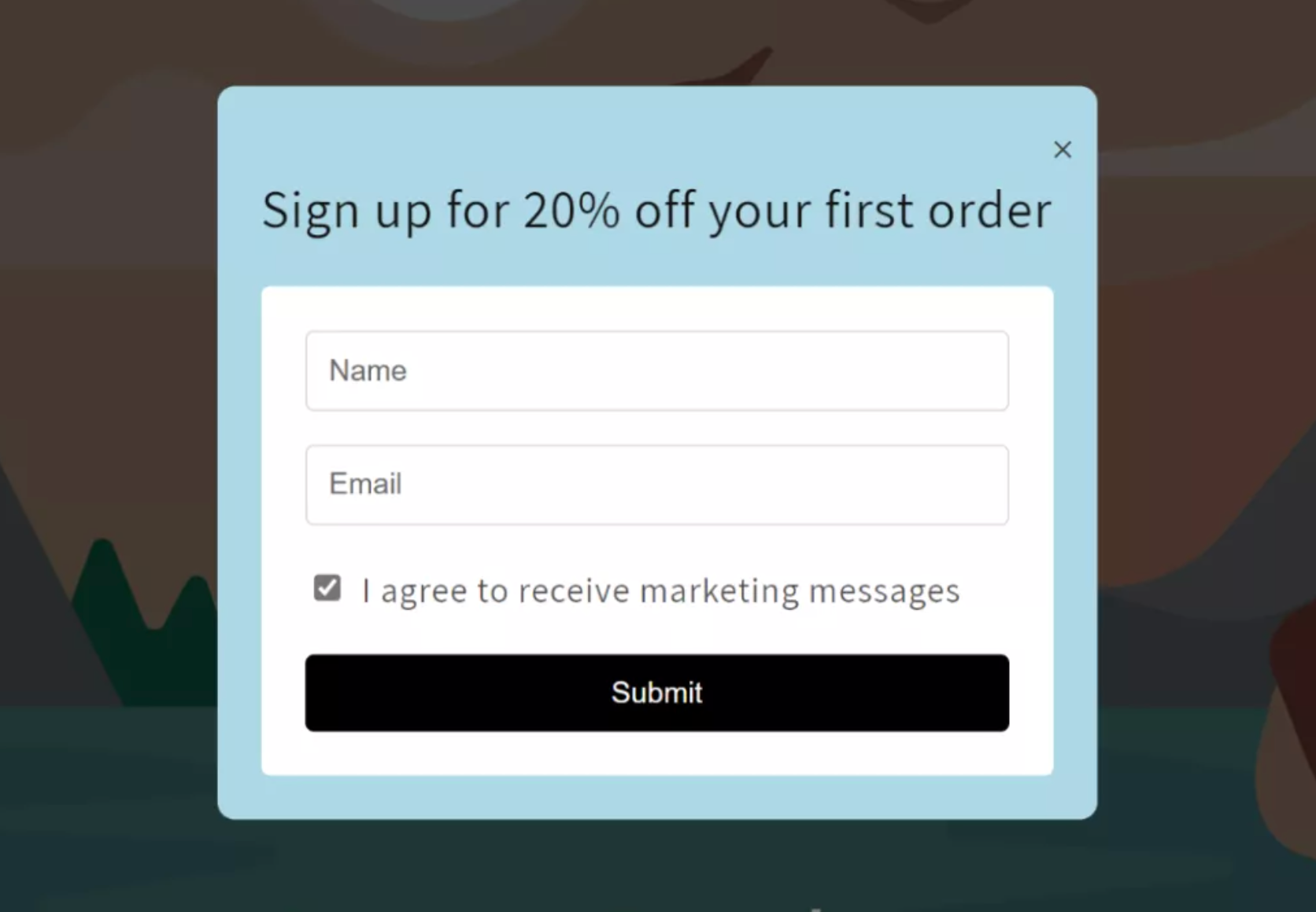
Shoppers make quick decisions, especially when encountering popups. A clear and concise message ensures users understand the offer without effort. Overly long or complex copy often leads to immediate dismissal.
For better engagement, your popup should communicate value within seconds.
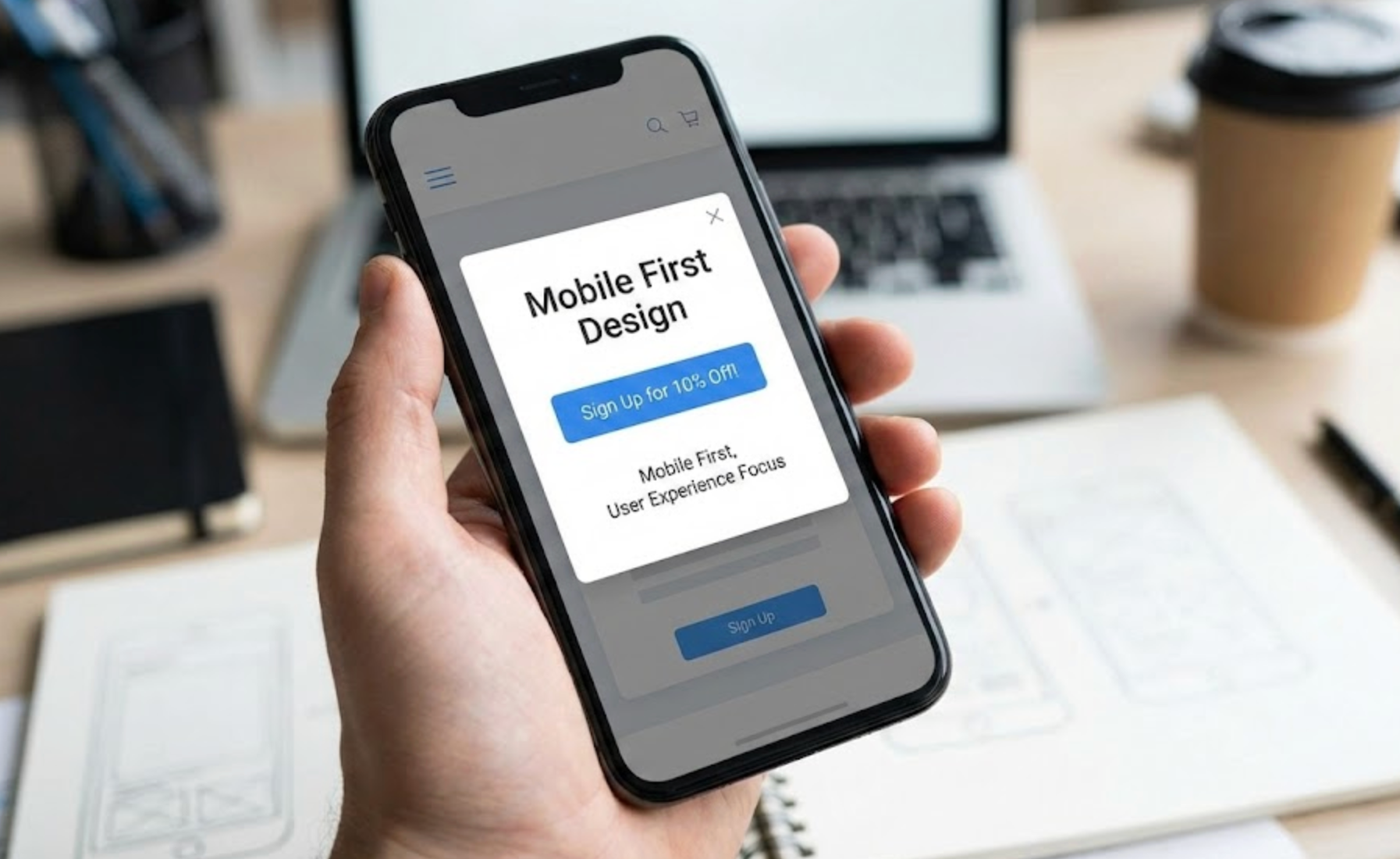
Mobile traffic represents a large portion of Shopify store visitors. Popups that work well on desktop may fail completely on smaller screens. Poor mobile design can cause frustration and increase bounce rates.
To ensure usability, popup design should prioritize mobile experiences from the start.
Popup timing strongly influences how users perceive your store. Interrupting visitors too early can feel aggressive and reduce trust. Well-timed popups feel helpful rather than disruptive.
Instead of forcing attention, allow users to engage before triggering popups.
Visual structure helps users process information quickly. A strong hierarchy guides attention toward the most important elements. Without it, popups feel cluttered and confusing.
To improve readability, design popups with a clear flow from top to bottom.
Users value control over their browsing experience. Making popups difficult to close creates frustration and damages brand perception. A respectful exit option improves overall UX.
When users feel comfortable dismissing a popup, they are more likely to continue browsing.
Personalized popups feel more relevant and less intrusive. Generic messages often fail to connect with diverse audiences. Customization increases engagement without increasing frequency.
By tailoring popups, you can deliver the right message to the right user.
Even well-designed popups can become annoying if overused. Repetition reduces effectiveness and harms user trust. Frequency control ensures popups remain helpful rather than disruptive.
Managing how often popups appear improves long-term engagement.
Optimization should be driven by data rather than assumptions. Small design or copy changes can significantly impact conversion rates. Testing helps identify what truly resonates with your audience.
Continuous experimentation allows popups to improve over time.
Popups should enhance the experience, not slow it down. Performance issues or legal oversights can harm both SEO and trust. Compliance is essential when collecting user data.
A well-implemented popup supports both conversions and credibility.
Effective popup design for Shopify is about balance rather than aggression. When popups are relevant, well-timed, and easy to interact with, they feel like a natural part of the shopping journey. By following these best practices, Shopify merchants can turn popups into powerful conversion tools without sacrificing user experience.

