Please select the platform to login


Understanding how users behave on your website is foundational to optimizing conversions and improving overall user experience. While metrics like time on page, bounce rate, or page views tell part of the story, they often fail to capture how visitors interact with your content visually. This is why scroll maps have become an essential tool for UX designers, marketers, conversion specialists, and content creators.
Scroll maps visualize how far users scroll and what they actually see, giving you a clearer picture of engagement beyond surface analytics. With these insights, you can restructure page layouts, reposition critical elements, and understand user intent with unparalleled clarity. In this expanded guide, we will dive deep into what scroll maps are, how they work, why they matter, and how you can leverage them to build better-performing websites.
Scroll maps are visual heatmaps that show the scrolling behavior of website visitors. They use color gradients, typically red, orange, yellow, and blue, to represent how many users reached different parts of a page. These colors help you instantly understand which parts of your page are seen frequently (hot areas) and which parts are ignored or only viewed by a small percentage of users (cold areas).
But scroll maps do more than show visibility. They tell a story:
For example, you may design a product detail page thinking users will scroll to the specifications at the bottom. But a scroll map might reveal that only 25% of visitors reach that section. This insight alone can lead to a powerful redesign that brings important information higher on the page.
Scroll maps are used across industries, from eCommerce to SaaS, media, hospitality, education, and even government websites, making them one of the most versatile UX analytics tools available.
Scroll maps rely on scripts embedded in your website that track user scrolling behavior. These scripts collect and aggregate data from thousands of sessions, then compile it into an easy-to-read heatmap. To understand scroll maps fully, it helps to break down the mechanics:
Every scroll action is measured in real-time. The script tracks the distance from the top of the page that each user reaches, often expressed in percentages (e.g., 20% scrolled, 50% scrolled, 90% scrolled). These percentages accumulate across all users.
Rather than showing data from only a few individuals, scroll maps compile information across hundreds or thousands of sessions. This creates a statistically reliable representation of user behavior, without the noise of outliers.
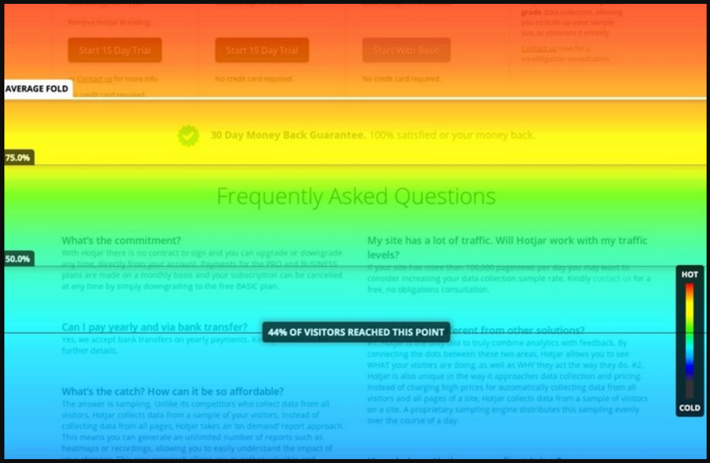
Colors are used strategically:
This gradient format gives you a fast, intuitive interpretation at a glance.
Modern scroll maps consider:
Tools ensure that the heatmap accurately reflects user experience despite these dynamic features.
Scroll maps often separate data by device type: desktop, tablet, and mobile. This matters because scrolling patterns vary significantly between devices, and optimizing only for one can create issues for others.
Scroll maps are invaluable because they go beyond assumptions. They reveal what users actually do, not what you think they do.
Below are expanded reasons why scroll maps are so important:
Many websites assume that visitors read content from top to bottom. But scroll maps often show surprising behavior: users may skim, scroll quickly, or stop at unexpected points. This helps you identify which content areas deserve priority placement.
A sudden drop-off on a page may indicate:
Scroll maps highlight these friction points so you can redesign for smoother flow.
A CTA is only effective if people can see it. Scroll maps show whether your main CTA is buried too far down the page. If visibility is low, you may need to move it higher, repeat it multiple times, or redesign the page for clearer hierarchy.
If most visitors stop reading halfway through a blog post, this signals that:
Insights like these help elevate the quality of your content.
Traditional tools like Google Analytics cannot tell you where users stop reading or why they abandon the page. Scroll maps bridge that gap.
Issues revealed often include:
Better UX means better conversions, and scroll maps are one of the clearest ways to see what users experience on your site.
To interpret scroll maps effectively, focus on these expanded metrics:
This is the first point of the page visible without scrolling. Knowing where most users begin helps you structure your content to make the strongest first impression.
Steep color transitions indicate a sharp drop in engagement. Investigate these areas for:
If users consistently reach the bottom of the page, it means your content is engaging. If not, consider reorganizing key sections or simplifying content.
Hot zones indicate the most seen content, ideal for CTAs, key benefits, or product details.
Cold zones may require optimization or removal.
Some scroll maps show how fast users scroll. Fast scrolling suggests skimming; slow scrolling suggests deep reading.
Scroll maps show what users see, but they don’t reveal the full story behind their actions. Combining them with click maps, move maps, and conversion analytics provides deeper behavioral context. This helps you understand not just visibility, but also interaction and intent.
To make insights even more actionable, you should apply them to structural design.
Scroll maps often highlight sections of the page where engagement suddenly drops. These areas may require repositioning, visual enhancement, or content restructuring. Running A/B tests helps validate whether your changes genuinely improve scrolling behavior.
After optimizing the general layout, you should turn your attention to the topmost section of your page.
The first screen a user sees often determines whether they stay or bounce. Scroll maps help you refine headlines, subheadings, and CTAs to make this section more compelling. A clearer value proposition encourages users to scroll deeper into your content.
Once the top section performs well, evaluate the overall page length and reading flow.
Long or text-heavy pages can overwhelm users and lead to early drop-offs. Scroll maps highlight exactly where this happens, helping you reorganize or compress content. Improving readability keeps users engaged throughout the page.
After improving content clarity, you should identify factors that may interrupt continuous scrolling.
Distractions such as pop-ups, oversized banners, or sticky widgets can cause abrupt scrolling stops. Scroll maps reveal sharp drop-offs that coincide with these interruptions. Removing or redesigning them helps maintain smooth user flow.
With interruptions minimized, your next step is to reposition content based on user engagement patterns.
Scroll maps show which areas of the page users naturally gravitate toward. Use this insight to move critical information, such as benefits, pricing, or CTAs, into sections with the highest visibility. This ensures your most persuasive content gets the attention it deserves.
With content positioned strategically, your scroll map optimization cycle becomes complete and ready for retesting.
Below are expanded explanations of each mistake, with four detailed sentences per idea for clarity and depth.
One common mistake is assuming that sections with low visibility automatically contain poor content. In many cases, users simply found what they needed earlier on the page and had no reason to continue scrolling. This means the content above may have been efficient rather than the lower sections being ineffective. Interpreting cold zones without understanding user intent can lead to unnecessary and counterproductive redesigns.
Another mistake is using scroll maps in isolation, without combining them with other behavioral analytics. Scroll maps show what users see but not how they interact or whether they convert. Without context from click maps or conversion metrics, decisions may be based on incomplete information. This can lead to misaligned optimizations that fail to improve real performance outcomes.
Some teams overlook the fact that users scroll differently on desktop, tablet, and mobile devices. Mobile users tend to scroll farther because screens are smaller, while desktop users may rely more on visible layout sections. If you treat all devices the same, your design changes may benefit one group while hurting another. Device-specific analysis ensures your improvements serve all users equally well.
A surprisingly common mistake is failing to update scroll map analysis after making design modifications. Every change, whether a new hero section, added banner, or restructured content block—affects how users scroll. If you don’t re-check scroll patterns, you risk assuming old insights still apply. Continuous monitoring ensures your layouts evolve in alignment with actual user behavior.
Different types of pages naturally generate different scrolling behaviors, and failing to recognize this can lead to misinterpretation. Blog readers often scroll farther than shoppers on a product page, simply because long-form content invites exploration. Meanwhile, landing pages may have concentrated conversions near the top, making deep scrolling less relevant. Contextualizing scroll map data ensures you evaluate performance with accurate expectations.
Scroll maps are one of the most insightful tools for understanding how users interact with your website. By visualizing scroll behavior, they reveal how effectively your content is structured, whether critical information is being seen, and where users begin to lose interest. These insights empower you to improve content placement, restructure page flow, and create more compelling experiences that keep visitors engaged longer.
When combined with other behavioral tools and analytics, scroll maps become a powerful cornerstone of a data-driven design strategy. Whether you’re fine-tuning a landing page, optimizing product details, or analyzing a long-form article, scroll maps help decode user behavior in ways traditional metrics simply cannot.

