Please select the platform to login


The cart page is one of the most decisive moments in the ecommerce journey. Shoppers who reach this stage have already shown strong purchase intent, yet many still hesitate before completing checkout. This hesitation is rarely about the product itself, yet it’s often about timing. Customers wonder whether they should buy now or come back later, and that delay frequently leads to cart abandonment.
Urgency elements help resolve this uncertainty. When implemented correctly, they give shoppers a clear reason to act immediately without making them feel pressured or manipulated. The goal is not to rush customers, but to remove indecision by clarifying why completing the purchase now is the best choice.
This article explores the most effective urgency elements on the cart page and outlines best practices for using them in a way that feels natural, honest, and conversion-focused.
At the cart stage, shoppers are no longer discovering products, they are validating a decision they are close to making. However, even a small pause can break momentum. Distractions, second thoughts, or the assumption that “I can always buy later” often result in lost sales.
Urgency addresses this exact problem by reframing the decision. Instead of asking whether to buy, shoppers begin to think about when to buy. When urgency is grounded in real value, such as limited availability, delivery timing, or expiring benefits, it provides clarity rather than pressure.
Effective urgency reassures customers that acting now is reasonable and beneficial, not impulsive.
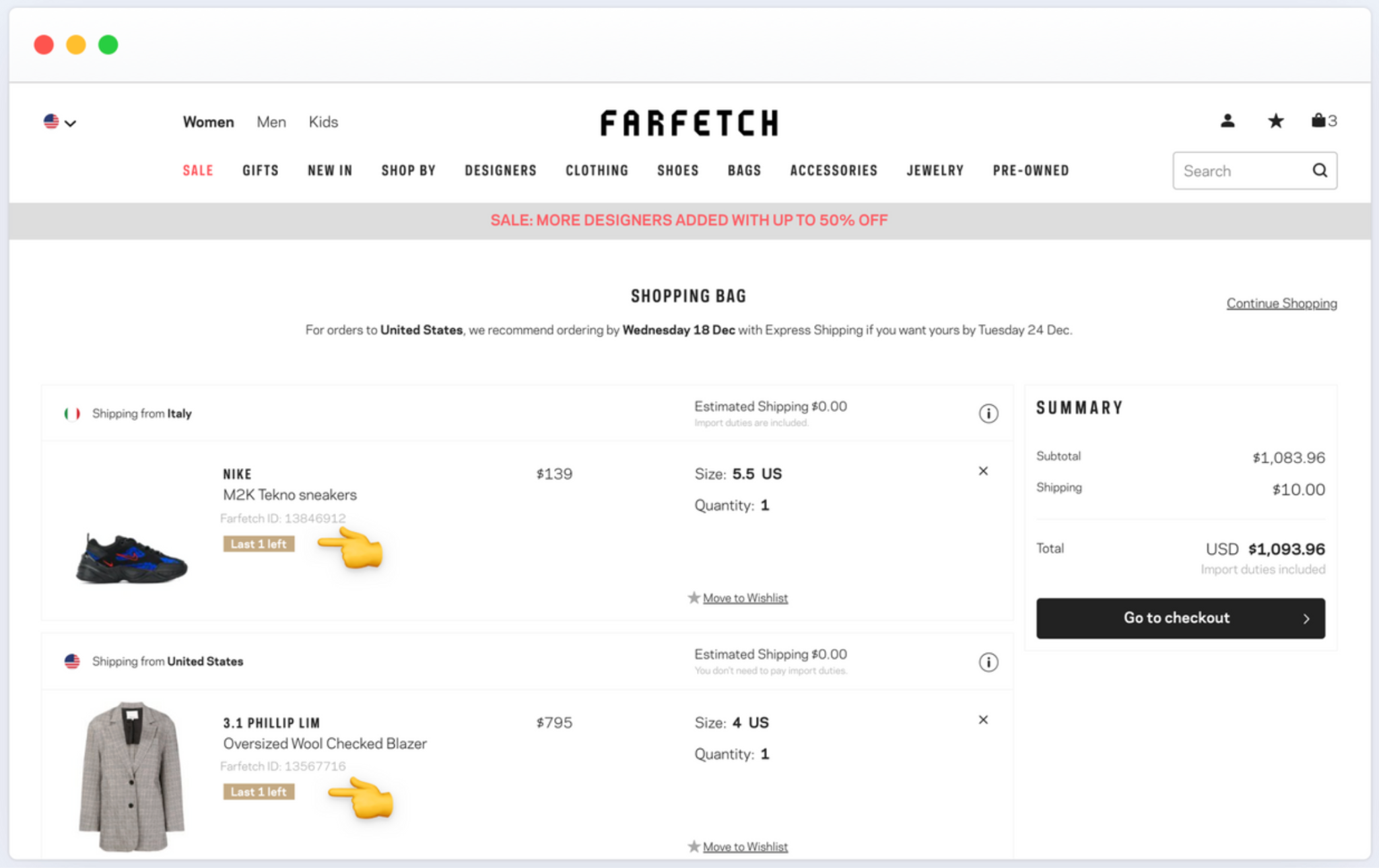
One of the most powerful urgency signals is limited inventory. When shoppers realize that an item in their cart may not be available later, they are more likely to prioritize completing the purchase. This works especially well on the cart page, where the product is already mentally “owned” by the customer.
However, inventory-based urgency must be authentic. Overusing low-stock warnings or displaying them inaccurately can cause skepticism and reduce effectiveness. When shoppers trust the message, scarcity becomes a strong motivator rather than a sales gimmick.
To use stock urgency effectively:
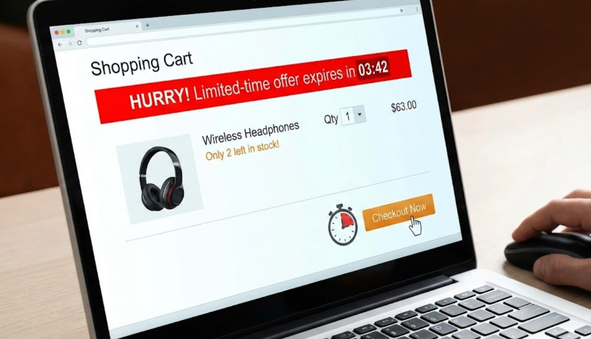
Countdown timers can create a strong sense of momentum when tied to real, time-sensitive benefits. On the cart page, timers work best when they clarify what the shopper gains by acting now, such as a discount, free shipping, or a bonus offer.
The key is transparency. Timers that reset or feel artificial quickly lose credibility. Instead, urgency should feel like helpful information that allows shoppers to make an informed decision.
Best practices for countdown-based urgency include:
Shipping urgency is one of the most customer-friendly urgency elements available. Rather than pushing shoppers emotionally, it appeals to logic and convenience. Messages like “Order within 2 hours to receive it by Friday” help customers connect checkout timing with a concrete outcome.
This type of urgency is especially effective for gift buyers, last-minute shoppers, or customers purchasing time-sensitive items. It shifts the focus from hesitation to logistics, which often accelerates decision-making.
To apply shipping urgency properly:
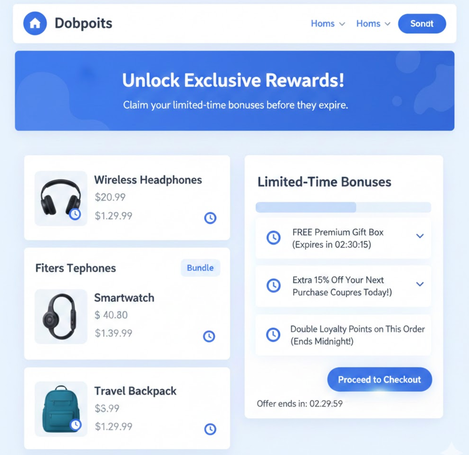
Urgency doesn’t always need to rely on discounts. In many cases, limited-time bonuses feel more positive and less aggressive. By offering something extra for acting now, brands create urgency without lowering the perceived value of the product.
This approach also helps avoid conditioning customers to wait for discounts. Instead, urgency is framed as an opportunity rather than a price reduction.
Examples of effective bonus-based urgency include:
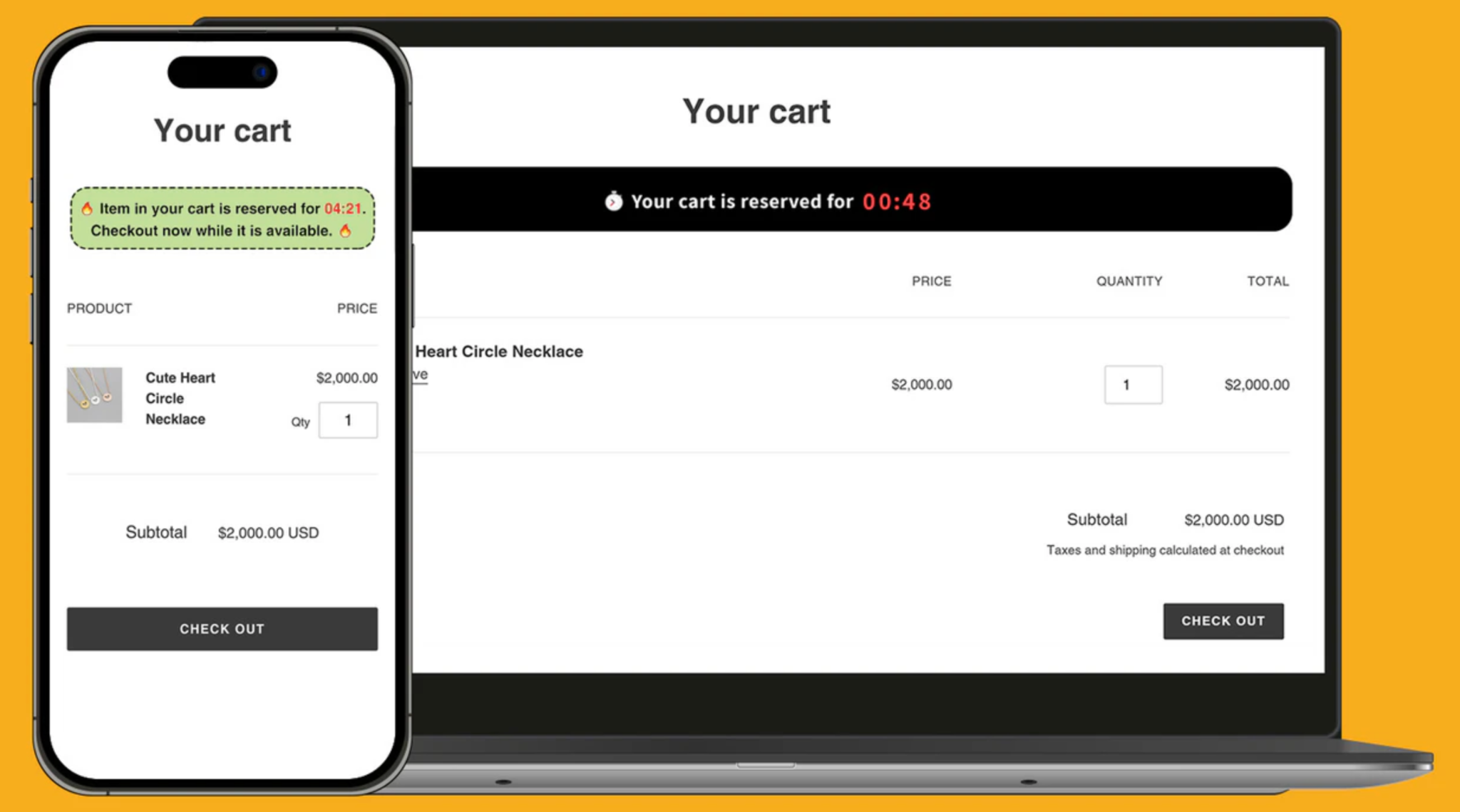
For stores that reserve items in the cart for a limited time, communicating this clearly can add a strong but fair urgency signal. Shoppers understand that holding inventory indefinitely is not guaranteed, especially for popular products.
This type of urgency feels especially natural because it reflects operational reality rather than marketing pressure. It also helps prevent frustration if items sell out while customers delay checkout.
To make cart reservation urgency effective:
Urgency on the cart page plays a crucial role in encouraging customers to complete their purchase instead of delaying the decision. At this stage, shoppers have already shown strong intent, but hesitation can still occur due to distractions, price sensitivity, or second thoughts. When urgency is displayed thoughtfully, it reassures customers that acting now is the right choice without feeling pushy or manipulative. The key is placing urgency signals where they support the checkout flow rather than interrupt it.
To maximize impact, urgency should be positioned strategically and communicated clearly across key cart page elements.
While urgency can be a powerful conversion driver, using it incorrectly can backfire and damage customer trust. Overuse, poor placement, or misleading messages often create pressure rather than motivation. Instead of encouraging action, these mistakes can increase anxiety and lead to cart abandonment.
To ensure urgency works in your favor, it’s important to avoid the following common pitfalls.
Urgency elements play a crucial role in helping shoppers move from intent to action on the cart page. When implemented thoughtfully, they reduce hesitation by clarifying timing, availability, and value, without making customers feel rushed or pressured.
The most effective cart page urgency is grounded in reality: real inventory limits, real delivery timelines, and real incentives. By focusing on clarity and authenticity, brands can create urgency that feels helpful rather than forceful, ultimately leading to higher conversions and a better checkout experience.

