Please select the platform to login


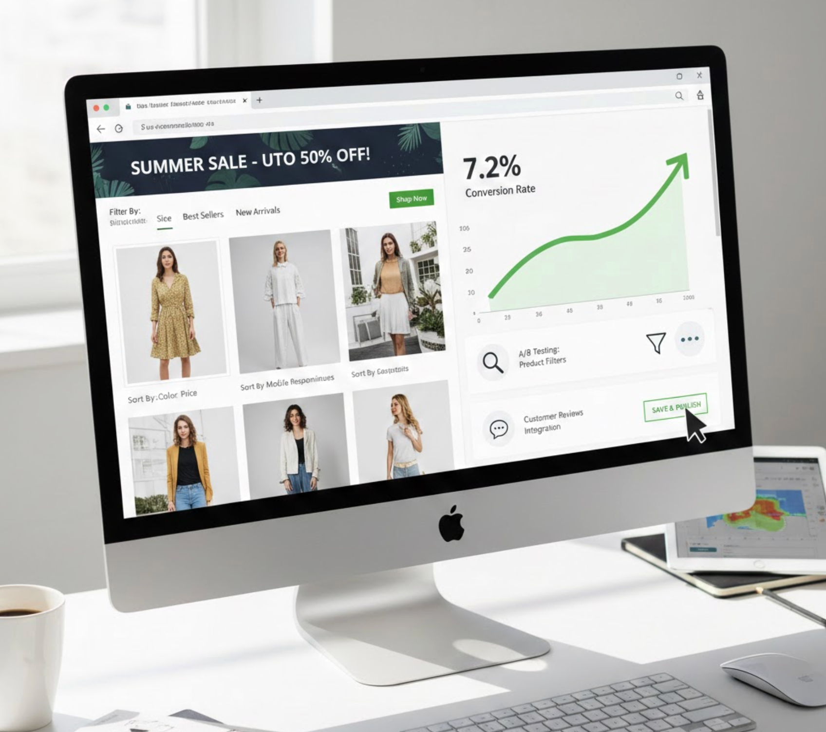
Shopify collection pages are often underestimated when it comes to conversion optimization. Many store owners focus heavily on driving traffic or polishing individual product pages, while overlooking the pages that actually guide shoppers through the buying journey. In reality, collection pages act as decision-making hubs where customers compare options, assess value, and determine whether they want to continue shopping or leave.
When collection pages are optimized properly, they help shoppers move forward with confidence. When they are poorly structured, cluttered, or confusing, they create friction that quietly lowers conversion rates. Understanding how to optimize these pages is essential for turning casual browsers into paying customers.
For most Shopify stores, collection pages are not just secondary pages, but they are often the first meaningful interaction a customer has with your products. Visitors arriving from ads, search engines, or navigation menus typically land on a collection page before viewing any individual item.
Because of this, collection pages shape first impressions and purchasing momentum. A strong collection page builds clarity, trust, and motivation, while a weak one creates doubt and hesitation. In other words, even if your products are excellent, conversions may still suffer if the collection experience does not support the shopper’s decision-making process.
Shoppers rarely browse collection pages slowly or carefully. Instead, they scan the page quickly, looking for visual signals that help them decide where to focus their attention. A well-structured layout makes this process effortless and keeps visitors engaged longer.
To create a layout that naturally guides users forward, several structural elements need to work together:
When the layout feels clean and intentional, shoppers spend less mental energy navigating and more energy evaluating products, an important factor in improving conversion rates.

Collection descriptions are often treated as an SEO requirement rather than a conversion tool. However, for shoppers, a well-written description can reduce uncertainty and provide helpful context about what they are browsing.
Instead of stuffing keywords, collection descriptions should focus on clarity and reassurance. They work best when they explain why the collection exists and what problem it solves for the shopper. A strong description typically includes:
By setting expectations early, collection descriptions help shoppers feel confident exploring further rather than abandoning the page.
The order in which products appear on a collection page directly influences what shoppers click on, and what they ignore. If low-performing or irrelevant products appear first, visitors may assume the entire collection lacks value.
Strategic product sorting ensures that your most appealing items receive the most visibility. Instead of relying on default ordering, consider organizing products in a way that aligns with buyer intent:
By showing your strongest products first, you increase the likelihood that shoppers will click, explore, and eventually convert.
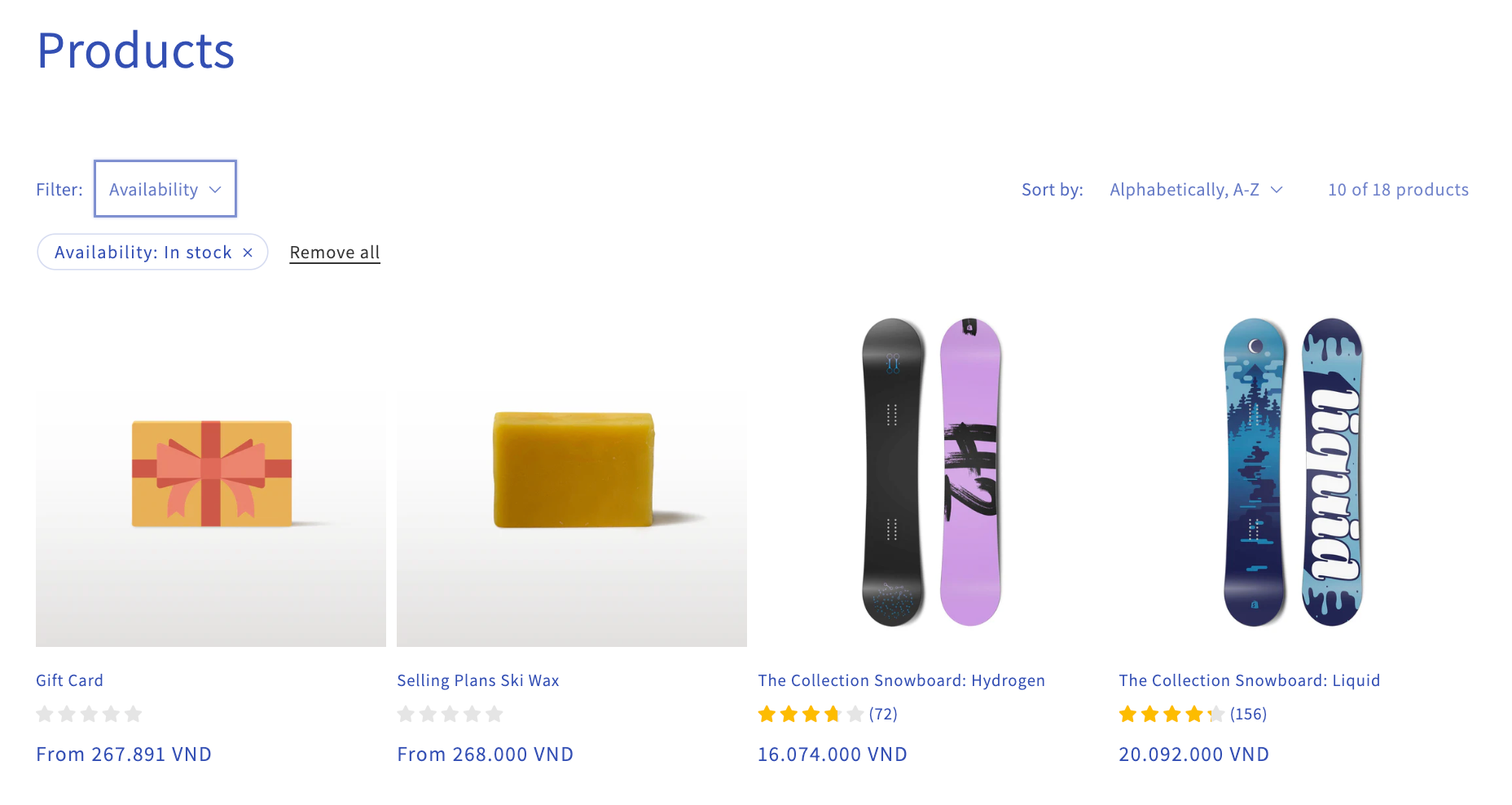
As collections grow larger, browsing without filters becomes overwhelming. Shoppers want to narrow their options quickly, especially when they already have specific preferences in mind.
Effective filtering tools empower users to control their browsing experience and reach relevant products faster. A well-designed filter system typically allows shoppers to refine results by:
When customers can easily find what they are looking for, frustration decreases and conversion likelihood increases.
On collection pages, product thumbnails often matter more than product titles or descriptions. Many shoppers decide whether to click purely based on visuals, especially when scanning quickly on mobile devices.
High-performing collection thumbnails share several common characteristics. To improve clarity and trust at a glance:
Strong thumbnails make products feel more tangible and appealing, encouraging shoppers to move deeper into the store.
Collection pages sit at the browsing stage of the customer journey, which means calls to action should feel supportive rather than aggressive. Overly pushy CTAs can disrupt exploration and create resistance.
Instead, CTAs should gently encourage progression and curiosity. Effective collection page CTAs often:
By aligning CTAs with shopper intent, you make the transition from browsing to buying feel natural and unforced.
Mobile shoppers behave differently from desktop users, yet many collection pages are not optimized with mobile-first thinking. Poor mobile usability can significantly hurt engagement and conversion rates.
To create a smooth mobile experience, collection pages should be designed with simplicity and usability in mind:
A frictionless mobile experience keeps users engaged and prevents drop-offs caused by frustration or slow interaction.
Optimizing collection pages is not a one-time task. Customer behavior, product assortments, and trends change over time, making continuous improvement essential.
To evaluate performance effectively, store owners should monitor key collection-level metrics:
These insights help identify which collections need better layouts, stronger visuals, or clearer product organization.
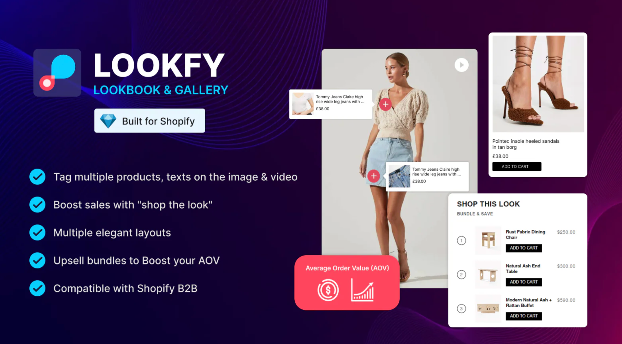
Lookfy enhances Shopify collection pages by transforming them from static product grids into visually guided shopping experiences. Instead of forcing shoppers to imagine how products work together, Lookfy helps them see complete looks and product combinations directly within collections.
One of Lookfy’s biggest advantages is its ability to create visual structure within large collections. By organizing products into shoppable galleries and curated sets, Lookfy helps shoppers understand how items complement each other, which reduces decision fatigue and increases engagement.
Lookfy supports collection page optimization in several impactful ways:
By improving how products are presented and connected, Lookfy helps collection pages guide shoppers more naturally toward higher-value purchases.
Shopify collection pages are powerful conversion drivers when designed with user behavior in mind. By improving layout clarity, navigation, visual presentation, and product discovery, you can significantly influence how shoppers move through your store.
Tools like Lookfy take collection optimization further by turning product lists into curated, shoppable experiences. When collection pages feel intuitive, inspiring, and easy to browse, they stop being passive gateways and start becoming active contributors to revenue growth.

