Please select the platform to login


Modern product pages are far more complex than they once were. Instead of showing only a product title, price, and add-to-cart button, today’s pages must communicate value, reduce uncertainty, and guide users toward confident purchase decisions. To achieve this, product pages often include detailed descriptions, specifications, size charts, FAQs, reviews, shipping policies, and return information, all within a limited visual space.
To organize this growing amount of content, designers typically rely on two interface patterns: accordions and tabs. Both are designed to reduce clutter and improve usability, but they shape user behavior, content visibility, and conversion performance in very different ways. Understanding these differences is essential when deciding which approach works best for your product pages.
Before comparing performance, it’s important to understand how each pattern functions and why it is commonly used in eCommerce design.
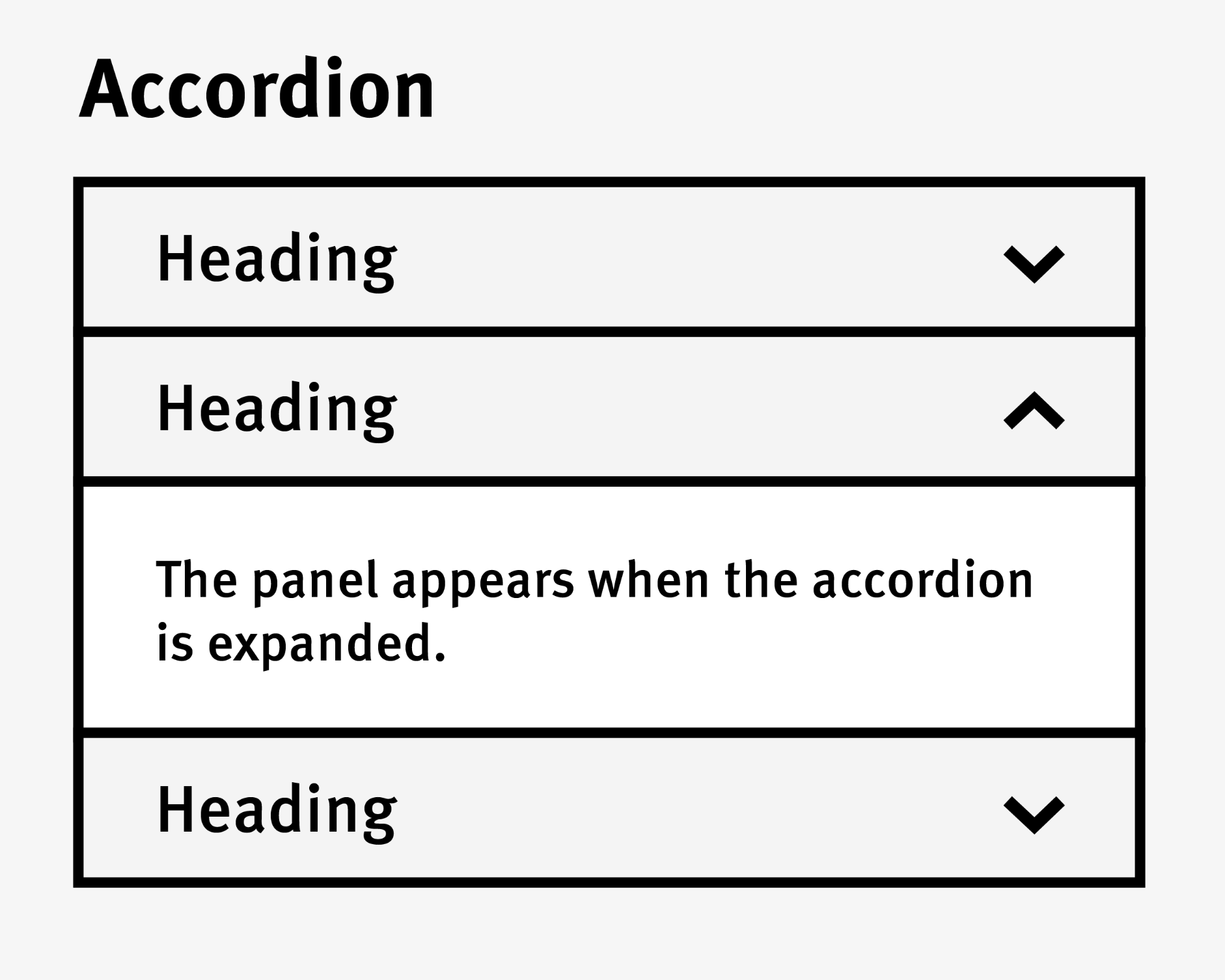
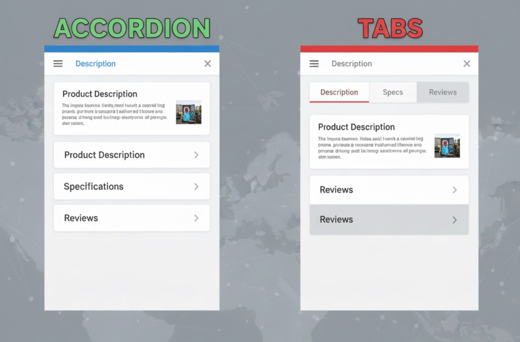
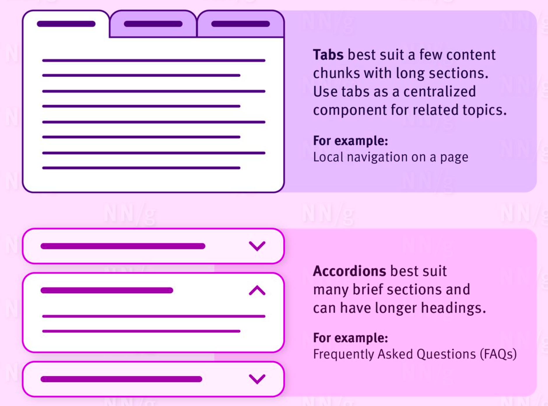
An accordion displays content in vertically stacked sections that users can expand or collapse by clicking on a header. This allows product pages to remain visually clean while still offering access to detailed information when needed.
Accordions are built around the principle of progressive disclosure. Instead of overwhelming users with large blocks of text, they reveal information gradually, helping users stay focused and engaged as they explore the page.
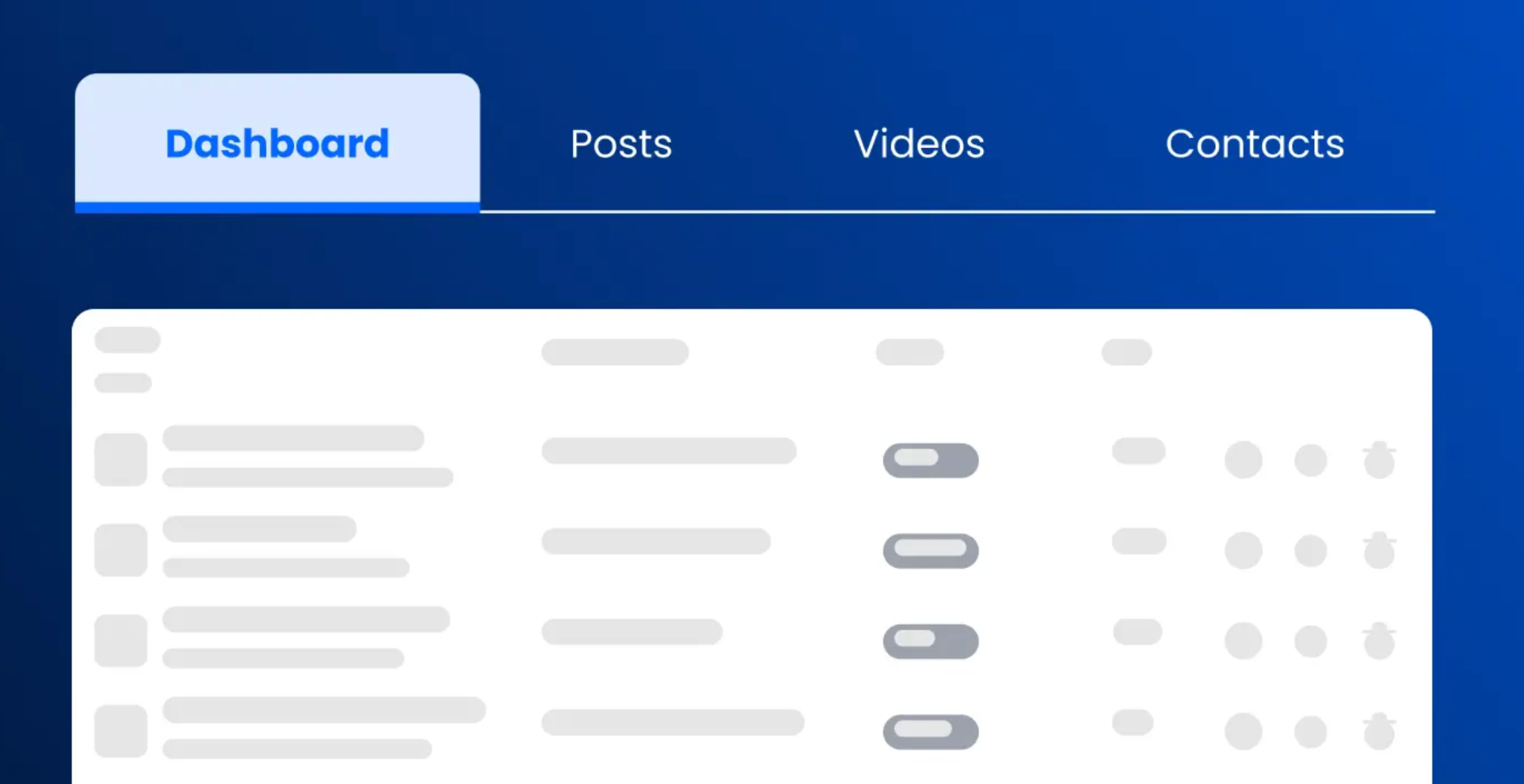
Tabs divide content into clearly labeled panels, with only one panel visible at a time. Users can switch between panels instantly by clicking on tab labels, which usually sit above or beside the content area.
Tabs emphasize structure and organization. They signal that information is grouped into distinct categories, making it easier for users to locate specific details without scrolling extensively.
How users scan and discover content plays a major role in determining which pattern performs better on product pages.
Accordions align naturally with vertical scrolling behavior. Users can skim section headers as they move down the page and expand only the sections that match their interests or concerns.
This approach supports deeper reading and encourages exploration, but it also depends heavily on clear labeling. If headers are vague or poorly written, users may skip important information simply because they don’t realize its value.
Tabs make content categories immediately visible, which reassures users that the information they need is available. A shopper looking for reviews or shipping details can reach those sections instantly with a single click.
However, content hidden behind inactive tabs may be overlooked. If users don’t feel motivated to click through each tab, they may miss information that could influence their buying decision.
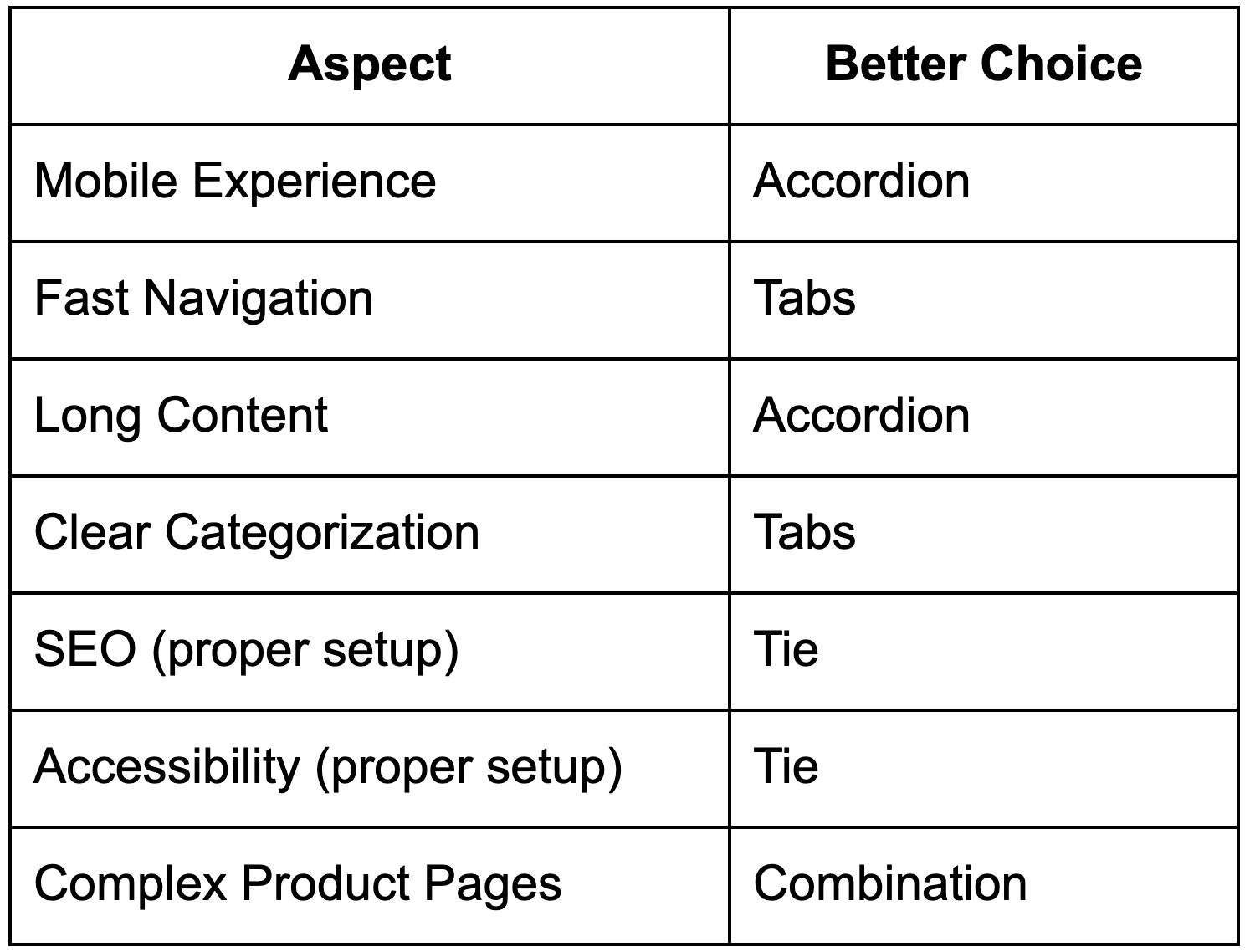
With mobile traffic dominating many eCommerce stores, mobile usability is a critical factor when choosing between accordions and tabs.
Accordions perform exceptionally well on mobile devices. Their vertical structure matches natural scrolling behavior, and expanding or collapsing sections with a tap feels intuitive and effortless.
They also avoid horizontal layout issues, making them more reliable across different screen sizes and devices.
Tabs can still work on mobile, but only when implemented carefully. Horizontal tabs may become cramped, hard to tap, or require extra swiping, which can introduce friction.
To address this, many sites convert tabs into accordions on mobile devices. While effective, this requires consistent design and testing to ensure users are not confused by the change in layout.
Different products require different levels of explanation, and content length has a major impact on which pattern works best.
Accordions are particularly effective for long or technical content such as detailed specifications, care instructions, or compliance information. Users can expand only what they need, reducing cognitive load and keeping the page manageable.
This flexibility makes accordions well-suited for complex products that require thorough explanation before purchase.
Tabs work best when content is concise and evenly distributed. Each tab should feel complete without overwhelming the user with excessive text.
When content within tabs becomes too long, switching back and forth between panels can feel disruptive, especially if users need to compare information across sections.
Product page layouts should align with user intent to support conversions effectively.
Accordions encourage users to explore information gradually. This is especially helpful for first-time visitors who want to learn about a product in depth before committing to a purchase.
However, if key conversion elements, such as shipping details or guarantees, are buried too deeply, some users may leave before finding them.
Tabs are well-suited for users who arrive with a specific goal. Shoppers who want to check reviews or delivery options can access that information immediately, which can speed up decision-making.
The trade-off is that users may ignore secondary tabs, potentially missing information that could increase trust or reduce hesitation.
Search visibility is another important consideration when choosing between accordions and tabs.
Accordion content is typically present in the page’s HTML, making it indexable by search engines. This allows stores to include rich, keyword-focused content without negatively affecting the visual layout.
Problems usually arise only when accordion content is loaded dynamically after user interaction.
Tabs can be just as SEO-friendly when all content loads with the page. However, when tab content is loaded only after a click, search engines may not index it properly, reducing its SEO value.
Accessibility ensures that all users, including those using assistive technologies, can interact with product pages effectively.
Accessible accordions require proper ARIA attributes, keyboard navigation, and clear visual indicators for expanded states. Many default implementations fall short, which can create barriers for some users.
Tabs benefit from well-defined accessibility standards. When implemented correctly, they provide predictable navigation for screen readers and keyboard users.
In both cases, accessibility depends more on implementation quality than on the pattern itself.
From a performance perspective, accordions usually load all content upfront. This ensures immediate access and avoids SEO issues, though it may slightly increase page weight.
Tabs sometimes defer loading content until interaction, which can improve perceived speed but risks hiding content from search engines and assistive technologies if not handled carefully.
Understanding when to use accordions or tabs becomes much easier when you look at how users actually interact with product pages. Different browsing behaviors, content lengths, and device preferences all play a role in determining which layout pattern delivers the best experience. With that in mind, the following use cases highlight where each option tends to perform most effectively.
Accordions and tabs are not rivals, they are complementary tools. The right choice depends on your content length, user behavior, and conversion goals.
Accordions and tabs do not have to be used in isolation, and in many cases, combining both creates a more flexible and user-friendly product page layout. Each pattern serves a different purpose: tabs help users navigate between major content categories, while accordions help organize detailed information within those categories. When used together, they allow product pages to stay visually clean without sacrificing depth or clarity. This approach is especially effective for products with complex or information-heavy content.
By layering these two patterns strategically, you can guide users more smoothly through product information while adapting to different browsing behaviors and devices.
Tabs can separate primary sections such as Description, Specifications, Reviews, and Shipping, making it easy for users to jump directly to the information they care about. This reduces unnecessary scrolling and supports goal-oriented users who arrive with a specific intent. It also helps keep the overall page structure clear and predictable.
Inside each tab, accordions can break down large blocks of information into smaller, more digestible sections. For example, a Specifications tab may include accordions for materials, dimensions, and technical details, allowing users to expand only what’s relevant to them. This keeps the content readable while preventing the page from feeling overwhelming.
On mobile devices, tabs can handle high-level navigation while accordions support vertical scrolling and touch-friendly interaction. This combination ensures content remains accessible and easy to explore, even on smaller screens. As a result, users can move between sections efficiently without losing context or control.
Choosing between accordions and tabs on product pages is not about finding a single “better” option, but about selecting the layout that best supports your content, users, and business goals. Tabs work well when information is clearly segmented and users want quick access to specific sections, while accordions are more effective for managing long, detailed content and supporting a natural scrolling experience, especially on mobile devices. Each pattern solves a different usability challenge, which is why neither should be viewed as a universal solution.
In practice, the strongest product pages often combine both approaches. Using tabs to separate high-level categories and accordions to organize detailed sub-content allows you to maintain clarity without sacrificing depth. By understanding how your customers browse, what information they prioritize, and which devices they use most, you can apply accordions, tabs, or a hybrid layout strategically to create product pages that are easier to navigate, more informative, and more likely to convert.

