Please select the platform to login


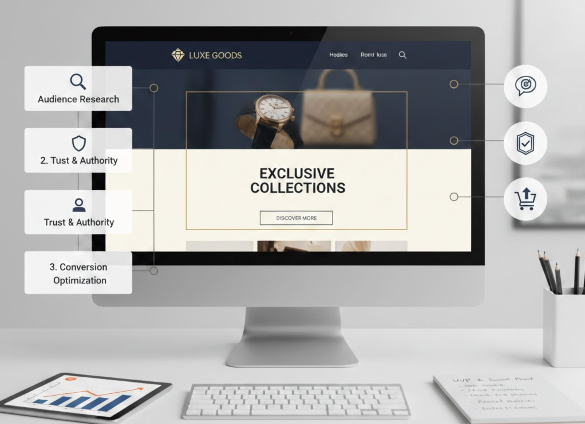
Selling high-ticket products requires a different level of trust, clarity, and persuasion than selling low-ticket items. Customers making larger investments expect a premium buying journey from the moment they land on your page. That’s why your landing page must guide them step by step toward confidence, understanding, and ultimately, conversion.
Below are the best high-ticket landing page design strategies, written in a structured and action-driven format.
A high-ticket hero section must immediately communicate why the product is worth the investment. It should highlight transformation, uniqueness, and long-term value rather than basic features. This opening helps set the premium tone early in the customer journey.
To move users forward, guide them into the next section with a clear, expectation-setting transition.
High-ticket customers need to see and feel the experience before they consider buying. Premium visuals, close-ups, lifestyle shots, and material-focused imagery, communicate craftsmanship and elevate perceived value. Visual storytelling makes the product feel real, desirable, and worth the price.
After establishing visual impact, smoothly transition to deeper trust-building proof.
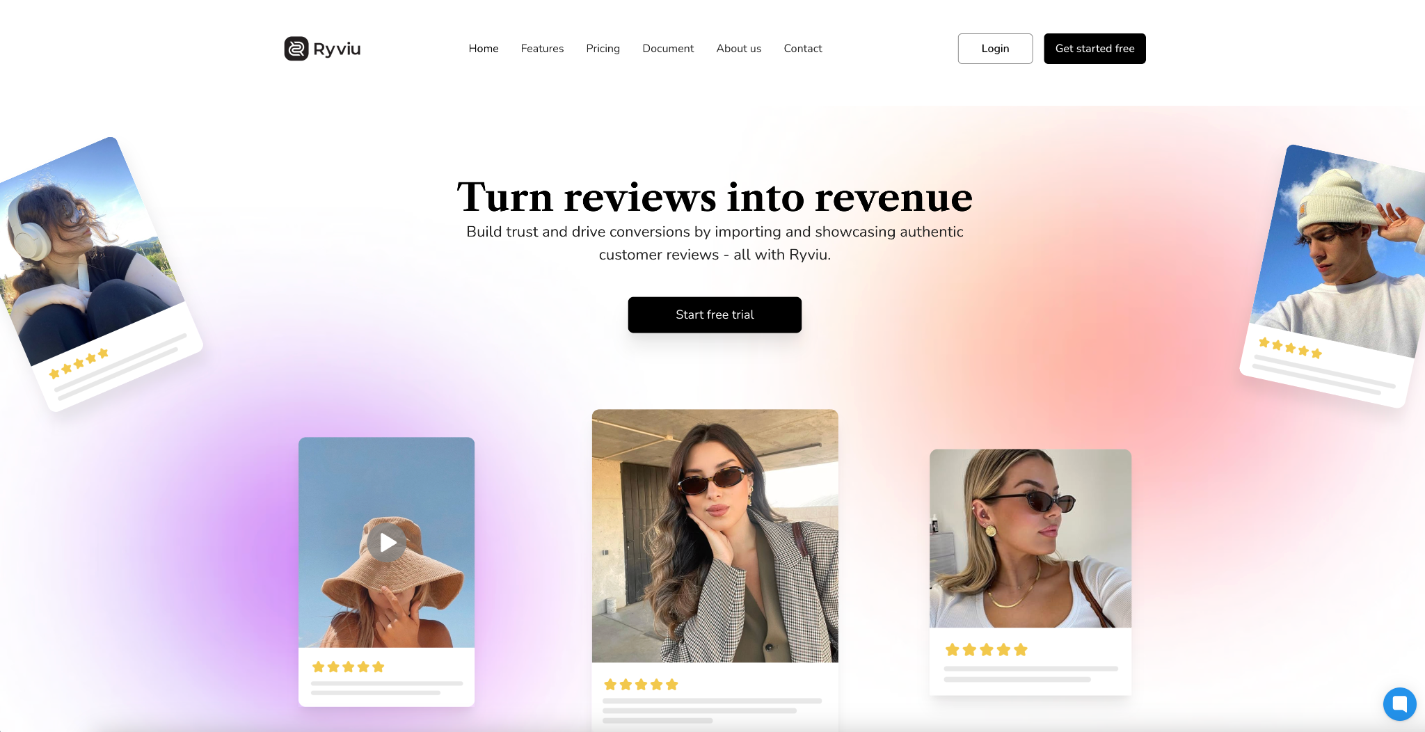
High-ticket buyers expect more than stars, but they want detailed validation. In-depth testimonials, expert endorsements, and customer stories carry strong persuasive weight in premium markets. These proof elements reduce perceived risk and create confidence.
Once trust is built, guide users to understand the product’s deeper benefits.
To simplify this process, you can use Ryviu. This app can work well on both Shopify and WooCommerce, helping you collect and showcase reviews in text, photo, and video form beautifully in your store.
High-ticket shoppers decide emotionally but justify logically. Your benefits section must speak to lifestyle aspirations while presenting measurable value. This blend helps buyers feel the impact while understanding the reasoning behind the premium cost.
With benefits established, lead the user to recognize the fairness of your pricing.
High-ticket pricing always creates hesitation, so you must frame the price as an investment rather than a cost. Breaking down long-term value and offering flexible payment options help buyers justify the decision. When pricing feels fair, fear naturally decreases.
Now that pricing is addressed, smoothly transition into policies that protect the customer.
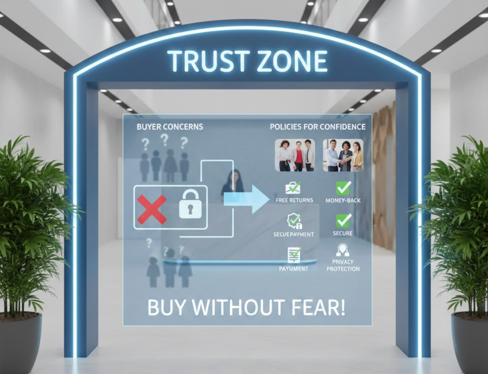
Clear guarantees, warranties, and return policies are essential for high-ticket purchases. These policies reduce risk and make the investment feel protected. Transparent explanations help buyers feel safe and respected.
After lowering risk, move the user into understanding the brand behind the product.
High-ticket buyers want to trust the brand as much as the product. A persuasive founder story or brand mission builds credibility and emotional connection. This personal narrative explains why your product deserves a premium position.
Once your story resonates, guide users toward the final action with well-placed CTAs.
High-ticket landing pages require multiple CTAs because customers need time before deciding. Each CTA should feel like a natural next step rather than a push. Intent-driven wording makes the button feel aligned with the premium positioning.
With CTAs placed, transition users into the final reassurance phase.
High-ticket shoppers have more questions, so your FAQ must address the practical concerns that block conversion. Answering these questions clearly shows that you understand buyer hesitation and respect their decision-making process. This final reassurance helps close the sale.
After the FAQ, guide users into the final decision section smoothly.
A premium product requires a premium digital experience. Slow load times, cluttered layouts, or poor mobile design instantly weaken trust. Clean spacing, fast performance, and intuitive design reassure users that the brand values quality everywhere.
With UX optimized, the landing page becomes a smooth, persuasive, and premium experience.
Designing a high-ticket landing page means guiding users emotionally and logically while building trust at every step. With structured storytelling, premium visuals, strong social proof, and friction-reducing elements, your landing page becomes a persuasive environment where customers feel confident investing in your product.

