Please select the platform to login


Long product pages are often unavoidable when you need to explain features, benefits, use cases, and proof points. The challenge is not page length itself, but how heavy and tiring scrolling feels to users as they move down the page. When scrolling becomes effortful, users lose momentum and disengage before reaching key conversion content.
Reducing scroll friction means designing pages that feel easy, predictable, and rewarding to navigate. Below are practical strategies to help users move smoothly through long product pages without frustration.
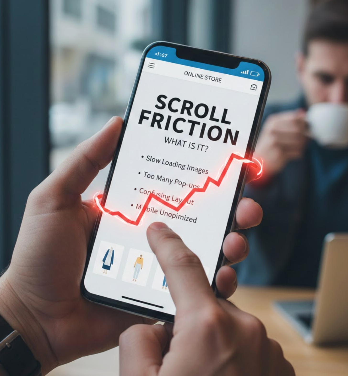
Scroll friction refers to any element on a page that makes vertical navigation feel effortful, confusing, or mentally taxing. It often appears when users encounter dense blocks of text, weak visual hierarchy, inconsistent layouts, or unclear cues that fail to guide them forward. Instead of feeling smoothly led through the content, users must work to understand where they are and what deserves attention next.
This friction isn’t always dramatic or obvious. More often, it shows up as small moments of hesitation, pausing too long, skipping sections, or rapidly scrolling without reading. When users don’t feel oriented or rewarded as they move down the page, they begin to subconsciously question whether continuing is worth their time or effort.
On long product pages, scroll friction has a direct and measurable impact on engagement and conversions. If shoppers can’t quickly understand the structure of the page, anticipate what’s coming next, or see steady progress, their motivation fades. As a result, they may abandon the page before reaching critical elements such as feature explanations, social proof, FAQs, or calls to action.
Reducing scroll friction helps maintain momentum throughout the buying journey. When scrolling feels easy and purposeful, users stay engaged longer, absorb more value, and feel more confident in their decision to move forward.
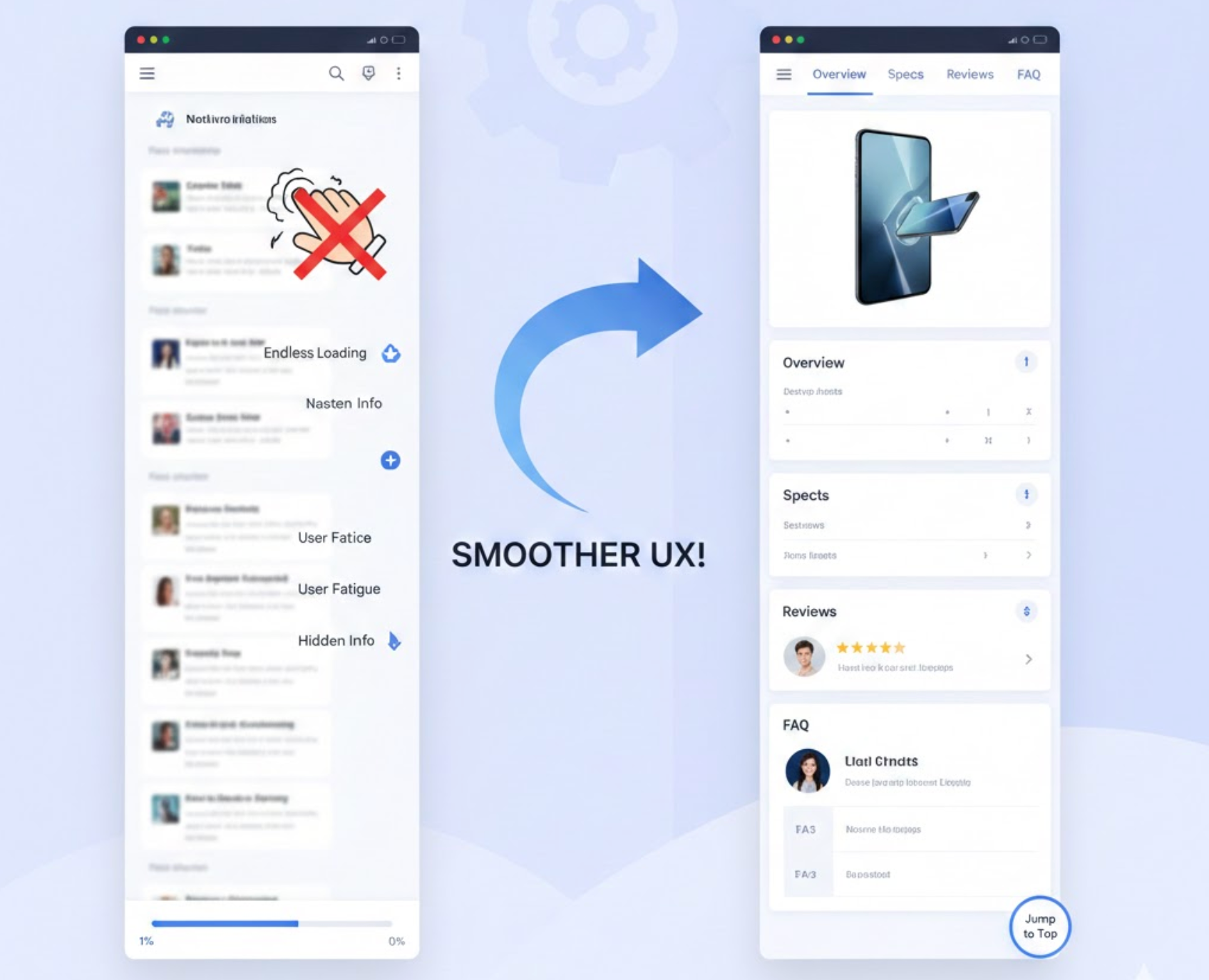
A clear page structure helps users form expectations about what they will see as they scroll. When visitors understand how information is organized, scrolling feels purposeful rather than exploratory. Structure gives users confidence that the page is leading them somewhere meaningful.
Without structure, long pages feel chaotic and mentally exhausting. Users must constantly reorient themselves, which increases cognitive effort and discourages further scrolling. A predictable layout removes this burden and keeps users focused on content, not navigation.
This clarity is created through deliberate organization and consistent patterns.
Visual hierarchy determines how users scan and prioritize information as they scroll. When everything looks the same, users struggle to identify what matters most. Strong hierarchy helps users move quickly while still absorbing key messages.
On long pages, hierarchy also creates a sense of movement and progression. Each new visual cue signals that users are entering a new stage of the story. This makes scrolling feel lighter and more engaging.
To guide attention effectively, visual signals must be intentional and consistent.
One major reason users stop scrolling is the feeling that the page is endless. When users don’t know how much content remains, scrolling feels risky and mentally draining. Visible progress reassures users that their effort is leading toward completion.
Progress indicators reduce uncertainty and increase motivation. When users sense advancement, they are more likely to continue scrolling calmly rather than skimming or abandoning. Even subtle cues can significantly improve perceived ease.
You can create this sense of progress by showing users where they are and what’s left.
Users often decide whether to keep scrolling within the first few seconds. If critical information is buried too far down the page, users may leave before understanding the product’s value. Surfacing essentials early reduces anxiety and builds trust.
Early clarity helps users decide whether the product is relevant to them. Once users feel aligned with the offering, they become more willing to scroll for deeper explanations. This approach respects the user’s time and attention.
To reduce friction, place decision-making information where users expect it.
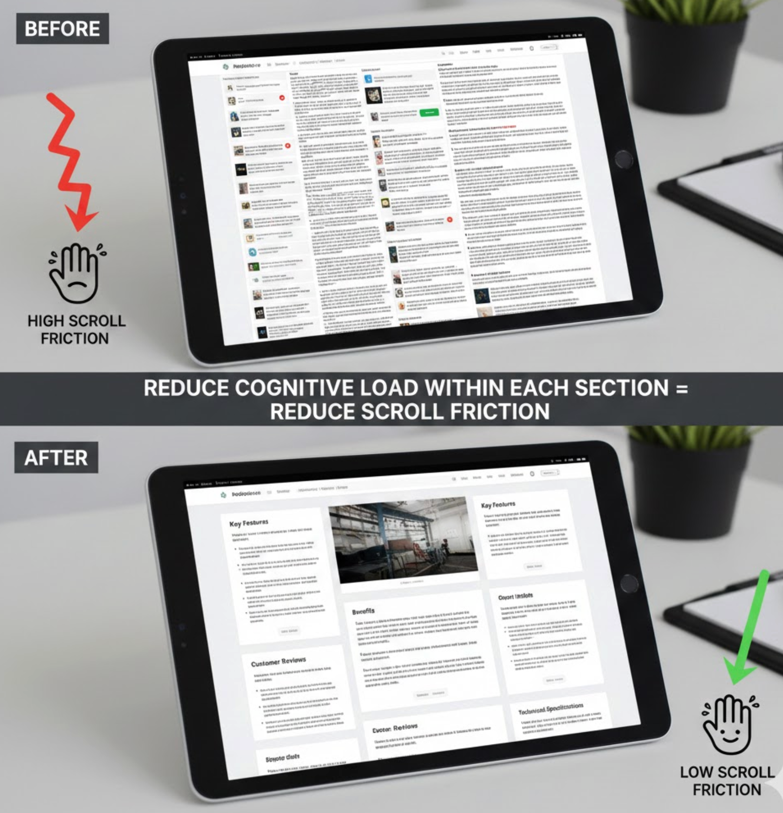
Scroll friction increases when each section feels mentally demanding. Long paragraphs, complex language, or too many ideas at once slow users down. Even motivated users can feel drained when content requires excessive thinking.
Reducing cognitive load makes scrolling feel effortless. When users understand each section quickly, they are more likely to continue with confidence and curiosity. Simplicity does not remove depth, but it improves accessibility.
To keep users moving, each section should be easy to process at a glance.
Long pages can feel restrictive if users must scroll linearly to find information. Providing navigation options restores a sense of control and reduces frustration. When users feel empowered, they are more tolerant of length.
Anchors and jump links also support different browsing behaviors. Some users want to scan, while others want to dive deep. Giving users choice improves satisfaction for both.
This flexibility can be introduced through lightweight navigation elements.

Scrolling without interaction can feel passive and monotonous. Micro-CTAs introduce moments of engagement that re-energize users. These small prompts guide users without pressuring them to convert immediately.
Micro-CTAs also remind users why they’re scrolling. They reinforce value and keep the end goal visible throughout the journey. When used correctly, they enhance flow rather than interrupt it.
These prompts should feel helpful, not sales-driven.
Scroll friction is often amplified on mobile devices. Smaller screens, touch interactions, and limited attention make long pages harder to navigate. What works on desktop may feel exhausting on mobile.
Mobile-friendly design prioritizes comfort and readability. When scrolling feels natural on mobile, users are more likely to stay engaged and reach key sections. This is especially important as mobile traffic continues to dominate.
To reduce friction on mobile, design specifically for vertical flow.
Scroll friction is not always obvious without data. What feels clear to designers may still confuse real users. Behavioral insights help uncover hidden friction points that analytics alone may miss.
By observing how users actually scroll, pause, or abandon, you can refine the experience continuously. Optimization is not a one-time effort, it’s an ongoing process.
Use real user data to guide improvements.
Reducing scroll friction on long product pages is about guiding users, not shortening content. When pages are structured, readable, and predictable, scrolling becomes a natural part of discovery rather than a burden. Each improvement compounds to create a smoother, more confident buying experience.
By focusing on clarity, progress, and user control, you can turn long product pages into engaging journeys that keep users moving, and converting, until the very end.

