Sign up for a free trial and your first 3 months is $1/month. Sign up now
Please select the platform to install
Please select the platform to login

Breadcrumb vs Mega Menu: Which Improves UX More?

Technology
Oct 14, 2025
6M
Alice Pham

Creating a seamless user experience (UX) is one of the biggest challenges for any online store. Shoppers should be able to find what they want quickly, without getting lost or overwhelmed. Two of the most effective navigation tools that help achieve this are breadcrumbs and mega menus.

While both enhance navigation, they do so in different ways. Understanding their strengths, and knowing when to use each, can make a major difference in how users interact with your store. Let’s explore how breadcrumbs and mega menus compare, and which one might improve UX more for your specific site.

Breadcrumb vs Mega Menu: An Overview

What Are Breadcrumbs?

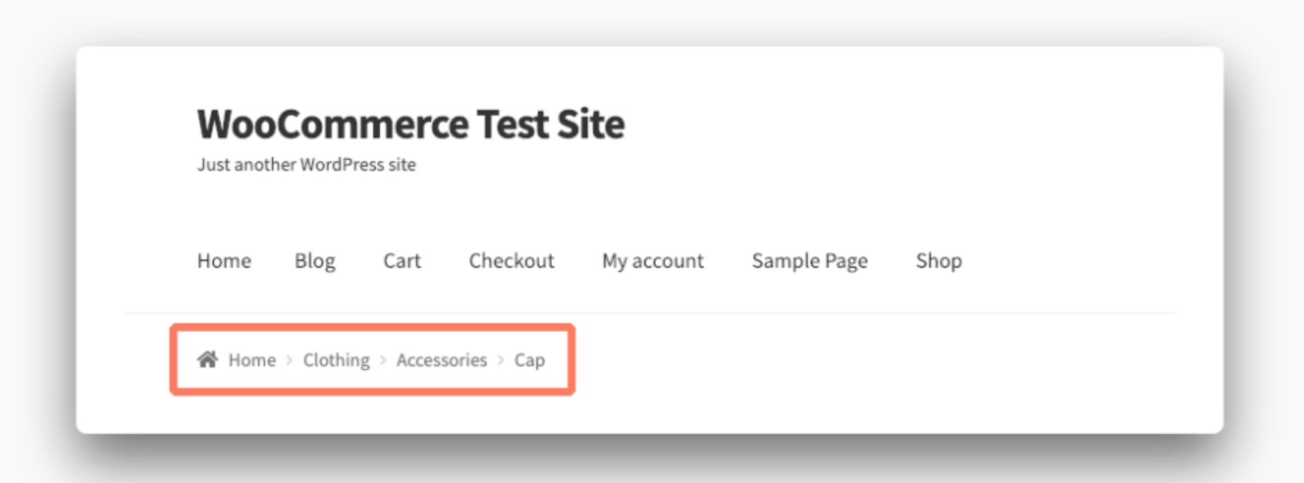
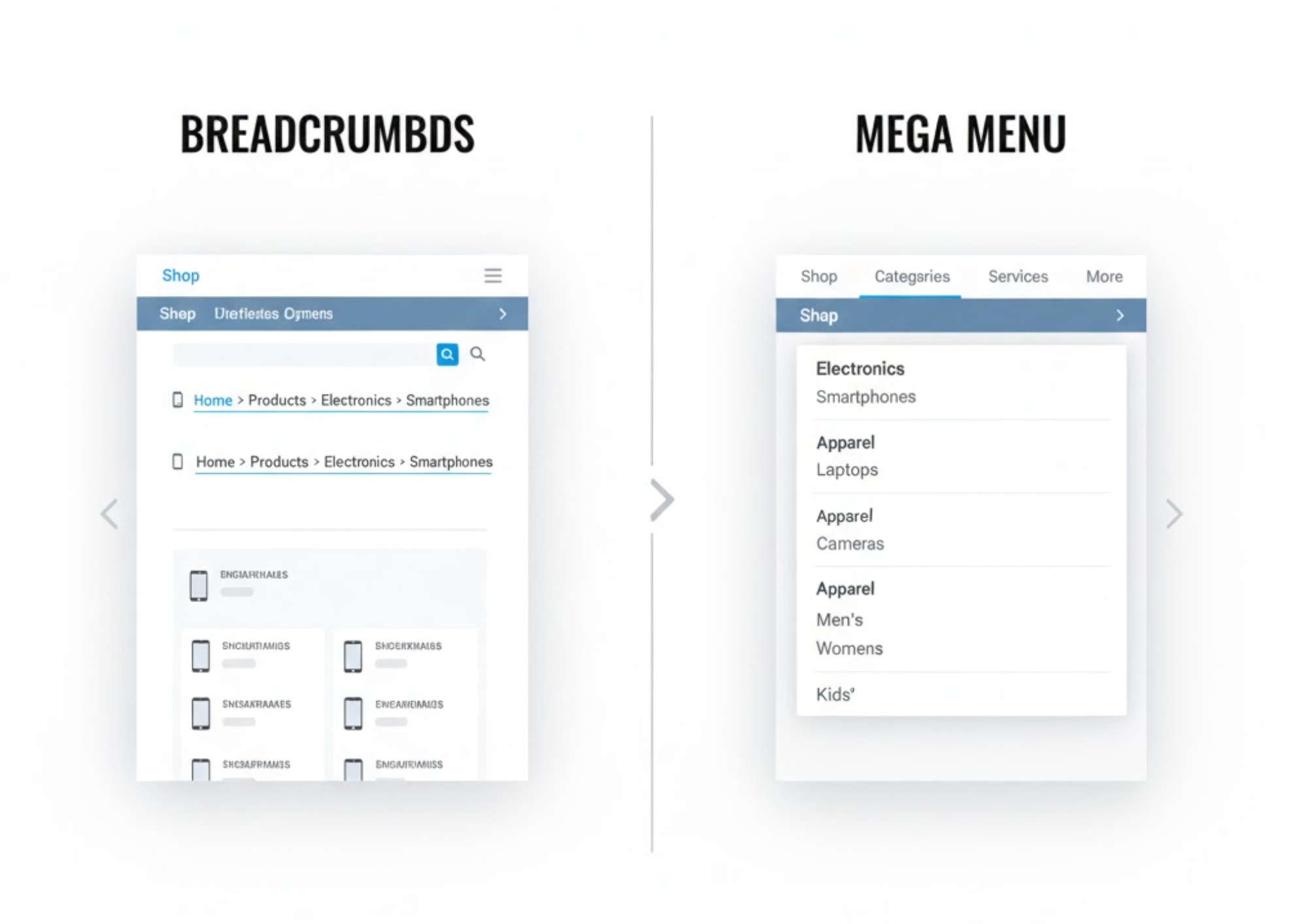
Breadcrumbs are small navigational aids that show users where they are within a website’s hierarchy. Typically displayed near the top of a page, a breadcrumb trail might look like this:

Home > Women’s Clothing > Dresses > Maxi Dresses

Each segment is clickable, allowing users to move backward easily without starting over.

Key Benefits:

  • Improved navigation clarity: Breadcrumbs give users a clear sense of location, helping them understand the structure of your site.
  • Reduced bounce rate: Visitors can move up one or two levels instead of leaving if the current page isn’t what they wanted.
  • SEO advantages: Breadcrumbs enhance internal linking and can appear in Google’s search results, improving visibility and click-through rates.

Breadcrumbs are simple yet powerful. They quietly enhance orientation and usability without taking up much space.

What Is a Mega Menu?

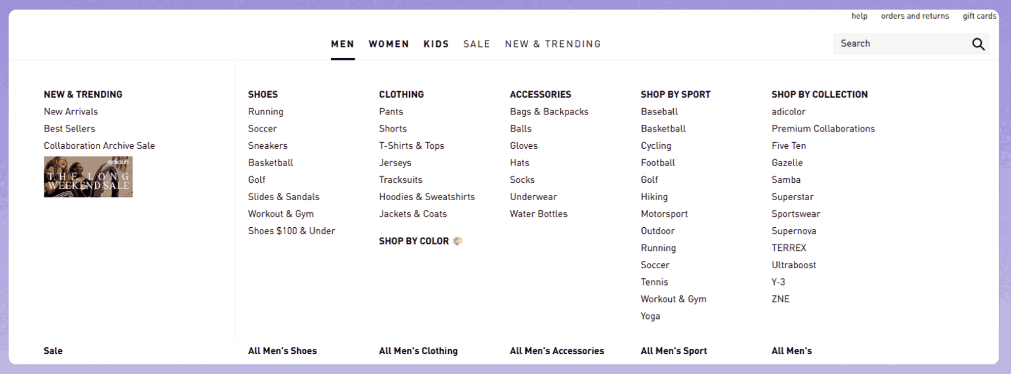
A mega menu is a large, expandable dropdown menu that displays multiple options at once. Instead of showing a single column of links, it opens into a panel that organizes links into categories and subcategories.

You’ve probably seen mega menus on major eCommerce sites like Amazon or Zara. They help users browse large inventories efficiently without clicking through several layers.

Key Benefits:

  • Comprehensive navigation: Users can see the full site structure at a glance, reducing the number of clicks to find specific items.
  • Visual organization: Mega menus can include product images, icons, and even promotional banners to enhance visual appeal.
  • Better discoverability: Highlighting featured categories or top-selling products in the menu encourages more exploration and cross-selling.

Mega menus are ideal for stores with broad product ranges, providing a structured yet immersive browsing experience.

Breadcrumb vs Mega Menu: UX Comparison

While both breadcrumbs and mega menus improve navigation, they serve different purposes within the user journey. Breadcrumbs guide users through the path they’ve taken, while mega menus help them choose where to go next. Understanding how each affects user experience requires looking at several key UX dimensions, from navigation flow and cognitive load to mobile usability and SEO value.

1. Ease of Navigation

Navigation is at the heart of user experience. Users expect to reach what they’re looking for in as few clicks as possible.

  • Breadcrumbs simplify backtracking. Once a visitor lands on a deep product page, breadcrumbs allow them to quickly return to a broader category (e.g., from Running Shoes back to Men’s Footwear or All Shoes) without using the back button or main menu. This enhances orientation and control, especially for visitors entering from external links or search results.
  • Mega menus, on the other hand, excel in forward navigation. They present users with multiple high-level paths right from the homepage, enabling quick exploration across categories. For large online stores with hundreds of SKUs, mega menus reduce friction by letting users access what they want in just one or two clicks.

In essence, breadcrumbs help users navigate backward and stay grounded, while mega menus help them move forward efficiently. Both improve navigation, but in opposite directions.

2. Cognitive Load

Cognitive load refers to how much mental effort users must expend to make decisions while browsing. A good UX design minimizes this effort so users can focus on shopping or reading instead of thinking about “where to go next.”

  • Breadcrumbs lower cognitive load by offering a clear linear structure. They give users context — showing exactly where they are and how they arrived there. This reduces anxiety and prevents disorientation, particularly on large sites with deep category levels.
  • Mega menus can both help and hurt cognitive load. A well-structured mega menu organizes large volumes of information into logical, visually distinct sections, helping users find what they need quickly. However, if it’s overcrowded with links or inconsistent labels, it can overwhelm visitors and create choice paralysis.

The takeaway: breadcrumbs clarify the “where am I?” question, while mega menus clarify the “where can I go?” question. Both are valuable, as long as they’re designed with simplicity and hierarchy in mind.

3. Mobile Usability

Mobile UX is critical today, as most users browse and shop from their phones. However, both navigation types behave differently on small screens.

  • Breadcrumbs translate well to mobile because they take up minimal space. A simple, horizontally scrollable breadcrumb trail can fit neatly under the page header without clutter. It helps mobile users backtrack easily, especially when the browser’s “back” button may lead them off-site.
  • Mega menus are trickier. The large dropdown panels that work beautifully on desktops can become overwhelming or unusable on phones. Designers often replace them with accordion-style expandable menus or hamburger icons, but this adds an extra click and can reduce visibility of options.

For mobile-first stores, a hybrid approach works best, keep breadcrumbs visible for context and simplify the mega menu for fingertip-friendly navigation.

4. Visual Design and Aesthetics

Good UX isn’t just about function; it’s also about form. Navigation elements contribute heavily to a site’s overall design aesthetics and perceived professionalism.

  • Breadcrumbs are subtle and space-efficient. They usually sit quietly above the page title, maintaining a minimalist and clean layout. Their consistency across pages adds a sense of reliability and structure.

  • Mega menus, conversely, are highly visual. They can incorporate icons, product thumbnails, or promotional banners, turning navigation into an engaging, interactive experience. However, this visual richness demands thoughtful balance; too many graphics or inconsistent typography can create clutter and distract from the browsing experience.

From a visual standpoint, breadcrumbs complement the design, while mega menus define it. Each plays a different but equally important role in creating an appealing interface.

5. User Behavior and Engagement

Understanding how users behave helps decide which element drives better engagement.

  • Breadcrumbs support exploratory browsing. When users reach a dead-end page or find a product that’s “close but not quite right,” breadcrumbs let them jump up a level to see related options. This encourages users to stay longer and discover alternatives.
  • Mega menus drive discovery from the very start. They encourage users to explore multiple departments and product categories they might not have considered initially, a key opportunity for cross-selling and upselling.

Together, they support both depth (via breadcrumbs) and breadth (via mega menus) of exploration, creating a balanced browsing journey.

6. SEO and Accessibility

From an SEO and accessibility standpoint, both breadcrumbs and mega menus offer technical and usability benefits when implemented correctly.

  • Breadcrumbs create strong internal link structures, helping search engines understand your site hierarchy and relationships between pages. They often appear in search results as rich snippets, improving click-through rates and visibility. Additionally, they enhance accessibility by offering alternative navigation paths for screen readers.
  • Mega menus, while helpful for users, can pose SEO challenges if overloaded with hundreds of links, diluting link equity and confusing crawlers. However, when structured with clear hierarchy and limited depth, they still help distribute authority efficiently and improve indexation.

In accessibility terms, mega menus must be coded carefully to support keyboard navigation and screen reader compatibility. Breadcrumbs, being simpler, are naturally more accessible and easier to maintain.

7. Performance and Loading Speed

An often-overlooked factor is how each element affects site performance.

  • Breadcrumbs are lightweight. They consist of simple text links and load almost instantly, even on low-speed connections.
  • Mega menus, especially those with rich media like images and animations, can slow down the page if not optimized. Lazy-loading techniques or conditional rendering (loading content only when the user hovers or taps) can mitigate this issue.

Faster navigation improves both UX and SEO, so balancing visual richness with technical performance is key.

Final Comparison Summary

In short, breadcrumbs and mega menus complement each other rather than compete. Breadcrumbs make users feel anchored and confident, while mega menus empower them to explore freely. A well-balanced combination can significantly enhance overall UX, guiding users both across and within your site, smoothly and intuitively.

Breadcrumb vs Mega Menu: When to Use?

When to Use Breadcrumbs?

Breadcrumbs are best suited for websites with deep category hierarchies, such as:

  • eCommerce stores with multiple product levels
  • Blogs or knowledge bases with topic clusters
  • Service websites with layered content structures

They work particularly well when users enter your site through search engines and need to backtrack to higher-level categories without frustration.

When to Use a Mega Menu?

Mega menus shine on websites with broad and diverse content, including:

  • Large eCommerce platforms (e.g., fashion, electronics, or furniture stores)
  • Online marketplaces with numerous departments
  • Corporate or educational sites with multiple sections

They help users explore everything your site offers at a glance, boosting product discovery and engagement.

Can You Use Both?

Yes. Many successful websites use both breadcrumbs and a mega menu together.
A mega menu can help users enter the right section, while breadcrumbs guide them once they’re inside. This combination supports both exploration and orientation, creating a smoother browsing flow overall.

For example, a fashion store might use a mega menu to display all product categories and breadcrumbs to show the user’s path once they’ve navigated to a specific dress or accessory.

Conclusion

So, which improves UX more: breadcrumbs or mega menus?
The answer depends on your website’s structure and user behavior.

  • Use breadcrumbs if your site has deep content levels and you want to enhance orientation and SEO.
  • Use mega menus if your site is large and you want to make browsing intuitive and engaging.

In many cases, the most effective approach is combining both. The mega menu helps users explore your store, while breadcrumbs ensure they never lose their way. Together, they create a frictionless experience that keeps visitors browsing longer and buying more.