Please select the platform to login


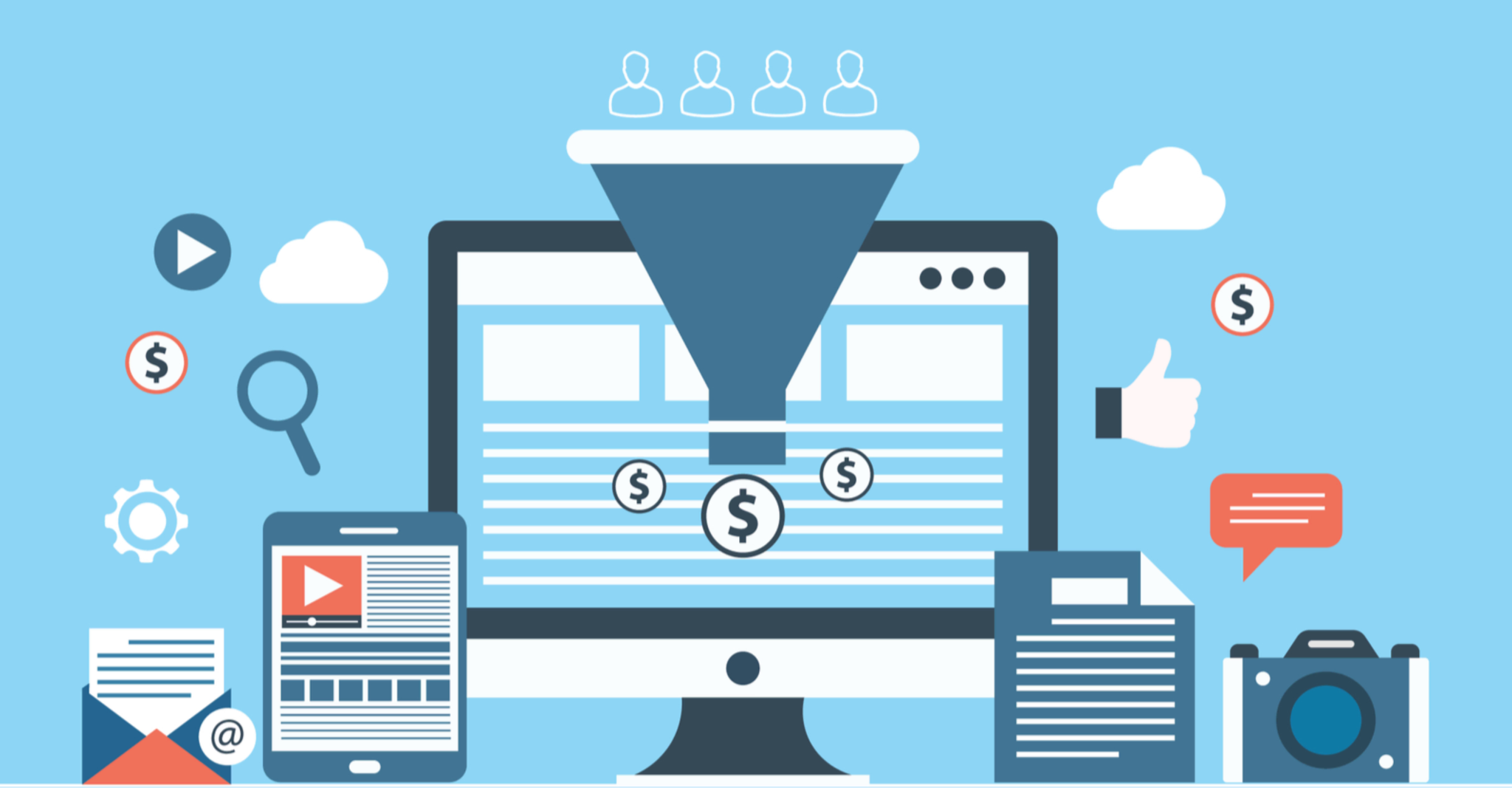
Conversion Rate Optimization (CRO) is the art of turning visitors into customers. While it seems straightforward, many online stores unknowingly sabotage their efforts by making critical mistakes. These errors may look small but can quietly cost you thousands in lost revenue each month. Below are the most common CRO mistakes hurting your sales, plus how to fix them before they drain your growth.

Mobile shopping dominates today’s eCommerce landscape. More than half of buyers browse and purchase directly from smartphones, meaning desktop-first designs are no longer enough. If your store frustrates mobile users, they’ll leave long before checkout.
Fix: Make mobile optimization a top priority. Start by using a mobile-first approach where design choices favor smaller screens before scaling up to desktop. Simplify your navigation menus, reduce image file sizes for faster loading, and ensure all buttons are thumb-friendly. Streamline checkout by minimizing required fields and offering digital wallets like Apple Pay or Google Pay. Testing your store regularly on real devices will help catch issues early and keep mobile conversions strong.
While information is necessary, too much creates paralysis. Cluttered pages overwhelm visitors, forcing them to process too many choices. Instead of guiding them toward purchase, you risk driving them away.
Fix: Focus on clarity and simplicity. Identify the single most important action on each page and design around it. Use concise, benefit-driven copy and visuals that highlight value without overwhelming. Limit pop-ups to carefully timed triggers, such as exit intent or scroll depth, rather than immediate interruptions. By decluttering your design, you guide shoppers with confidence and reduce the risk of decision fatigue.
Shoppers don’t just buy products, but they buy trust. Without the ability to see or test items in person, they rely heavily on other customers’ experiences. Failing to display strong, authentic social proof leaves uncertainty that can kill conversions.
Fix: Make reviews a core part of your product pages. Place ratings and testimonials near the top, where shoppers make purchase decisions. You can use Ryviu to import reviews from trusted sources like AliExpress or Amazon, displaying them with photos and details for added credibility. You can also automatically send request reviews emails after purchase and incentives to grow review volume. The more authentic and visible your reviews, the faster customers will move from interest to purchase.

Your checkout should be frictionless, yet many stores unknowingly build barriers. Every extra field, click, or delay increases the chance of cart abandonment. Instead of securing a sale, you drive customers away at the final step.
Fix: In this case, you should streamline checkout by removing every unnecessary step and always offering guest checkout to avoid forcing registrations. Besides, use auto-fill features to save time and clearly label all fields. You can also offer multiple payment options, including wallets and buy-now-pay-later methods, to reduce hesitation. The simpler and faster your checkout, the fewer carts you’ll lose and the more revenue you’ll retain.
Many businesses fall into the trap of guessing what works. Redesigns, button color changes, or new features may feel like improvements but can unintentionally lower conversions. Without testing, you’re flying blind.
Fix: Embrace data-driven decision-making. Use A/B testing to measure the impact of every significant change, from CTAs to page layouts. Rely on heatmaps and session recordings to see where users drop off. Make incremental changes rather than sweeping overhauls to isolate what works. By testing consistently, you gain clarity and continuously improve your store instead of risking conversions on guesswork.
If visitors can’t quickly understand why your product is worth buying, they’ll leave. A weak or vague value proposition fails to differentiate you from countless competitors. Shoppers need a clear reason to choose your brand.
Fix: Craft a strong, benefit-driven value proposition and make it impossible to miss. Place it prominently at the top of your homepage and product pages. Focus on what makes your brand unique, whether it’s quality, sustainability, speed, or style. Use customer testimonials or guarantees to reinforce your claims. The clearer and stronger your value, the easier it is for shoppers to say “yes.”
CRO doesn’t end at checkout. Many stores make the mistake of treating the sale as the finish line, missing opportunities to grow customer lifetime value. Ignoring post-purchase engagement limits repeat sales and loyalty.
Fix: It’s recommended that you treat post-purchase as the beginning of the relationship. You should optimize your thank-you page to showcase complementary products or exclusive discounts. Follow up with personalized emails that add value, such as product tutorials or style inspiration. You can implement loyalty and rewards programs with apps like Reton, which help customers feel recognized and encouraged to shop again. Strong post-purchase strategies turn one-time buyers into repeat customers.

Online shoppers buy with their eyes. Yet many stores rely on static product shots or generic stock photos, leaving customers uninspired. Without strong visuals, it’s harder for shoppers to imagine owning your product.
Fix: Regarding this issue, you should invest in visuals that inspire confidence and imagination. To increase the visual of lookbooks, you can use multiple high-quality images, lifestyle galleries, and even 3D or AR experiences where possible. By using Lookfy, you can create curated lookbooks, which let shoppers see complete styled outfits or product bundles and purchase them with one click. Visual storytelling not only builds desire but also reduces hesitation by showing exactly how products fit into customers’ lives. A well-designed visual experience can dramatically lift conversions.

Conversion optimization is an ongoing process, not a one-time project. Each mistake above represents lost opportunities, but also untapped potential. By addressing mobile experience, simplifying content, leveraging social proof, streamlining checkout, and strengthening your post-purchase journey, you can significantly increase conversions without spending more on traffic.
To explore more hacks to optimize conversion rate, you can take a look at this article.

