Please select the platform to login


When designing an online store, navigation plays a crucial role in how easily customers can find products and information. The choice between horizontal and vertical navigation can shape the entire user experience. Both layouts have their strengths, and the best option depends on your store’s size, structure, and branding goals. Let’s explore the differences between these two navigation styles and determine which one works best for your eCommerce store.

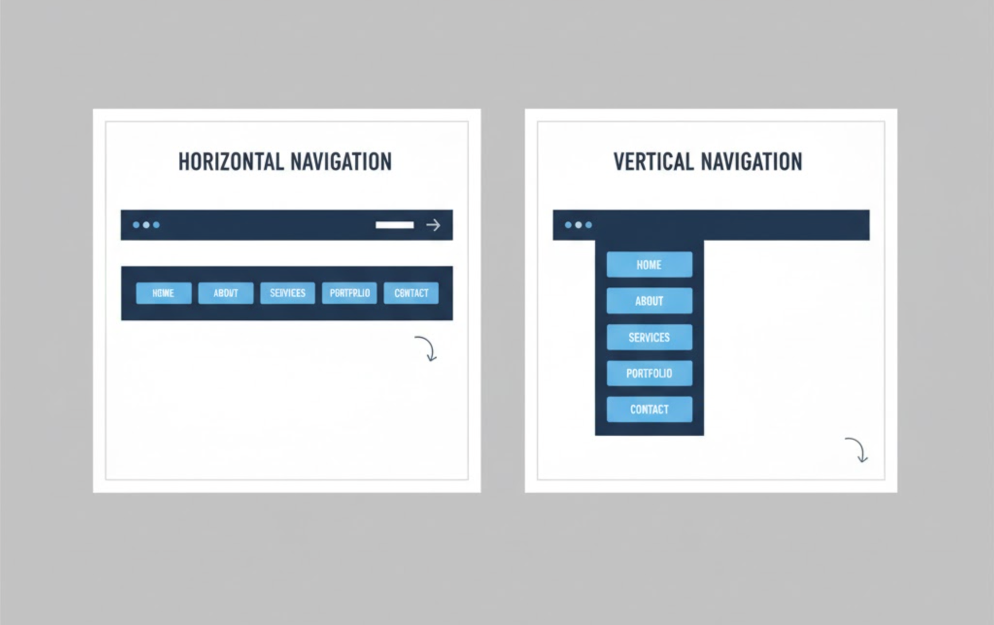
Horizontal navigation typically appears at the top of a website, showcasing the main categories in a single row. It’s the most common type of navigation, especially for online stores with a few primary categories.
Horizontal menus create a clean and familiar browsing experience, helping users quickly scan and move between key sections. They’re ideal for minimalist designs and work well on both desktop and mobile screens.

Vertical navigation runs along the left or right side of a webpage. It provides more room for displaying multiple categories, subcategories, and filters, making it ideal for large or complex eCommerce sites.
Vertical menus are often used in fashion, electronics, or marketplace-style stores where users need to browse through various departments or product types.
Horizontal: Horizontal navigation appears across the top of the webpage, typically just below the header or logo. It presents the main product categories in a single, organized line that users can easily scan. This structure keeps navigation visible but doesn’t interfere with the main content or visuals below.
Vertical: Vertical navigation runs along the left or right side of the page, displaying categories stacked one above another. This structure allows you to include more menu items without overwhelming the layout. It’s especially useful for stores that require multiple layers of navigation, such as filters, departments, or detailed product groupings.
Final Verdict: Horizontal menus work best for clean layouts, while vertical menus are ideal for complex store structures.
Horizontal: Most online shoppers instantly recognize a horizontal navigation bar, as it’s the standard format used on most websites. This familiarity ensures a smooth browsing experience, especially for first-time visitors. Because of its intuitive layout, it reduces the learning curve and keeps users focused on shopping.
Vertical: While vertical menus are less common on modern eCommerce websites, they feel natural for users who enjoy sidebar exploration. Customers used to browsing category-heavy sites, such as Amazon or eBay, often find this format more efficient. It provides a sense of direction for visitors who like to navigate visually down a structured list.
Final Verdict: Horizontal menus win in familiarity, but vertical menus can be equally intuitive for browsing-oriented shoppers.
Horizontal: The horizontal layout offers limited space because all categories must fit into one line. Adding too many items can make the navigation feel crowded or require dropdown menus that reduce readability. It’s suitable for stores that plan to maintain a concise category structure.
Vertical: Vertical menus scale beautifully, supporting dozens of categories and multiple levels of submenus. You can easily expand or collapse sections to manage large inventories efficiently. This makes it the better choice for stores expecting rapid product growth or seasonal collections.
Final Verdict: Vertical navigation is more scalable and future-proof for expanding eCommerce stores.
Horizontal: Horizontal navigation gives websites a modern, balanced look that complements image-heavy designs. It helps maintain a clean aesthetic where visuals take center stage, such as lifestyle imagery or banners. This style is ideal for brands that value minimalism and visual storytelling.
Vertical: Vertical navigation conveys a more functional and information-rich appearance. It provides structure and hierarchy, which is beneficial for stores with detailed product categories. While it might not appear as sleek, it creates a sense of depth and organization that appeals to practical shoppers.
Final Verdict: Horizontal is best for elegant, visual brands; vertical fits stores prioritizing structure and detailed browsing.
Horizontal: This layout suits goal-oriented users who know exactly what they’re looking for. The straightforward design minimizes distractions and keeps shoppers moving efficiently toward specific categories. It supports a streamlined buying experience that encourages fast decision-making.
Vertical: Vertical menus are ideal for discovery-driven shoppers who enjoy browsing and comparing options. With visible subcategories, customers can quickly scan through different sections without extra clicks. This encourages exploration and can lead to increased engagement and longer session times.
Final Verdict: Horizontal suits focused buyers; vertical appeals to shoppers who prefer exploring and discovering products.
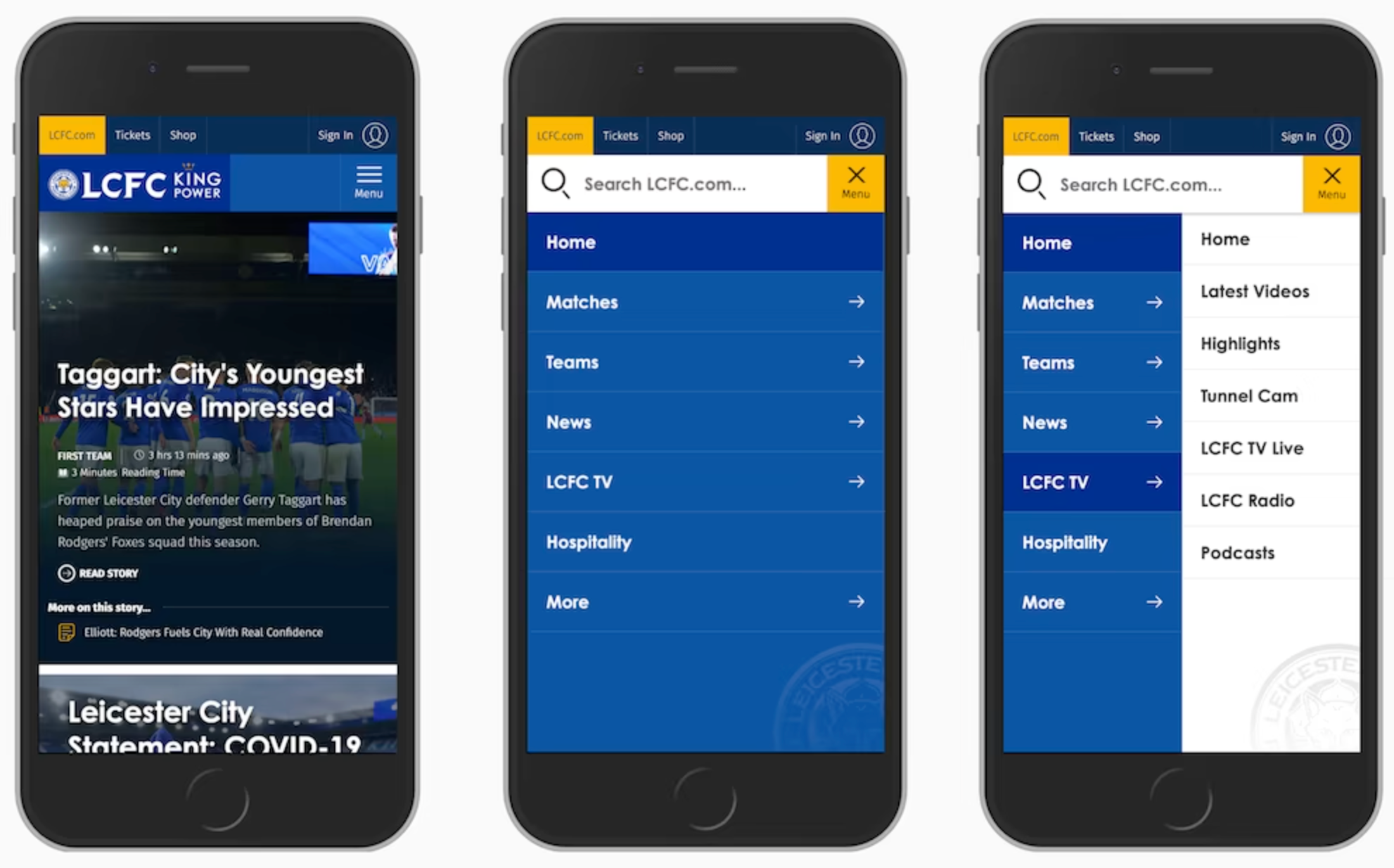
Horizontal: Horizontal menus adapt seamlessly to mobile devices, often transforming into a hamburger menu or slide-down menu. This ensures a clean, uncluttered view that keeps essential navigation accessible with minimal scrolling. It’s a reliable, user-friendly solution that maintains consistency across all screen sizes.
Vertical: Vertical navigation typically converts into a collapsible sidebar or off-canvas drawer on mobile. While this can work well, long lists or deep hierarchies may require excessive scrolling. However, when designed with collapsible sections, it remains a powerful navigation option for mobile commerce.
Final Verdict: Horizontal menus are more naturally mobile-friendly, but vertical menus can perform well with careful optimization.
Horizontal: Horizontal navigation usually displays only the top-level categories, hiding subcategories in dropdown menus. This creates a cleaner interface but can make deeper pages slightly harder to reach. It’s best for stores where most users shop within main categories rather than exploring multiple levels.
Vertical: Vertical navigation provides high visibility for all available categories, subcategories, and filters. It allows customers to see the full scope of your product offerings at once. This format helps reduce clicks and makes it easier to locate specific product types quickly.
Final Verdict: Vertical navigation wins for content visibility and depth, while horizontal prioritizes simplicity and focus.
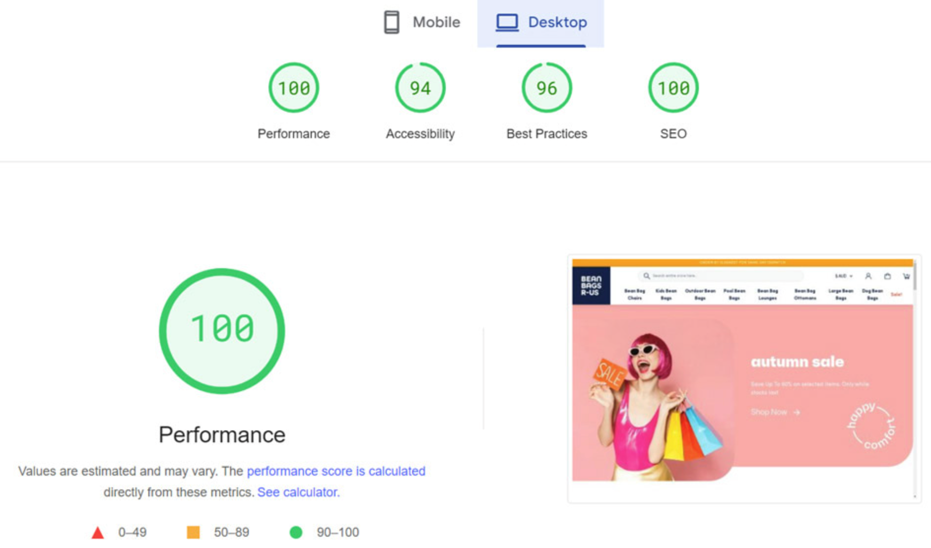
Horizontal: Because horizontal menus typically contain fewer items, they load quickly and perform efficiently. The simple structure requires fewer resources and ensures a consistent user experience across devices. It’s a great choice for stores that want smooth performance and minimal maintenance.
Vertical: Vertical menus may include multiple nested categories, filters, and images, which can slightly affect loading time. However, modern coding techniques and collapsible layouts minimize these performance concerns. With good optimization, vertical navigation can still deliver a fast and responsive experience.
Final Verdict: Horizontal menus have a slight edge in performance, but vertical menus can match them with proper optimization.
Horizontal: This navigation style helps maintain focus on core areas like featured products, best sellers, or promotions. It reduces cognitive overload, guiding customers toward conversion goals with minimal distraction. For visually appealing brands, it enhances storytelling while keeping the path to purchase straightforward.
Vertical: Vertical menus enhance product discovery, allowing customers to explore more items and compare alternatives before purchasing. This deeper engagement can increase the likelihood of upselling and cross-selling. It’s particularly effective for large inventories where product variety influences buying decisions.
Final Verdict: Horizontal navigation supports quick conversions, while vertical navigation drives engagement and discovery-based sales.
Choose horizontal navigation if your store has a limited number of product categories and you prioritize a clean, modern layout. It works especially well for fashion boutiques, lifestyle brands, and small to mid-sized businesses that value simplicity and visual appeal.
This style encourages focused browsing and ensures users are not overwhelmed with too many choices at once. It’s also ideal when combined with dropdowns or a mega menu that organizes subcategories neatly under each main section.
Vertical navigation is best for large online stores or marketplaces with extensive product collections. It provides the flexibility to include many categories and filters without cluttering the layout.
This format is highly effective for user-driven discovery, especially when customers prefer exploring multiple product types. It’s also commonly used in sidebars alongside product filters and search tools, improving navigation depth.
There’s no one-size-fits-all answer, but the best navigation type depends on your store’s needs and user behavior.
For many Shopify and WooCommerce stores, a hybrid approach can work perfectly. You can use horizontal navigation for main categories and vertical navigation for in-page filters or subcategories. This gives customers the best of both worlds, simplicity at first glance and depth when they need it.
No matter which navigation style you choose, these practices can improve usability and conversions:
Both horizontal and vertical navigation can be powerful when designed with your store’s structure and customer journey in mind. Horizontal menus offer clarity and style, while vertical menus deliver depth and functionality.
The key is not just choosing one over the other but implementing a navigation system that aligns with your brand, showcases your products effectively, and guides shoppers effortlessly to checkout.

