Please select the platform to login


Mobile traffic now accounts for the majority of visits on most Shopify stores, yet typography decisions are still often made with desktop users as the primary focus. Among all design elements, font size is one of the most underestimated factors influencing mobile conversions. On small screens, even slight typography missteps can lead to frustration, confusion, and lost sales.
Font size directly affects how users read, scan, and interact with content on mobile devices. When optimized correctly, it enhances clarity, improves usability, and guides shoppers smoothly from product discovery to checkout. When ignored, it becomes a silent conversion killer.

Mobile users experience websites differently than desktop users. Smaller screens, touch-based navigation, and on-the-go browsing habits mean shoppers rely heavily on quick visual cues rather than deep reading. If text appears too small or cramped, users are forced to zoom, squint, or abandon the page altogether.
Unlike desktop shoppers who may tolerate minor inconveniences, mobile users expect instant clarity. Font size plays a critical role in reducing friction, helping users process information faster, and maintaining momentum throughout the shopping journey. In mobile commerce, ease of reading often determines whether a user stays or leaves.
Readability is one of the strongest drivers of user engagement on mobile. When text is easy to read, users naturally spend more time on a page and absorb more information. Conversely, small or dense text increases cognitive load and causes users to disengage quickly.
Proper font sizing enhances engagement by:
On mobile devices, comfortable reading leads to longer sessions, deeper exploration, and higher chances of conversion.
Typography plays a subtle but powerful role in shaping how shoppers perceive a brand, especially on mobile devices. When font sizes are poorly optimized, even high-quality Shopify stores can appear cluttered, unprofessional, or difficult to trust at first glance.
As users scroll through a store, readability directly affects confidence and decision-making, making font size a key contributor to perceived credibility and conversion success.
This is where mobile-optimized review displays become especially important for Shopify stores.
Ryviu helps reinforce trust by presenting reviews in mobile-friendly layouts, ensuring ratings, written feedback and photo reviews remain clear and scannable on small screens. By keeping social proof readable and visually balanced, Ryviu allows shoppers to absorb feedback naturally without zooming or strain.
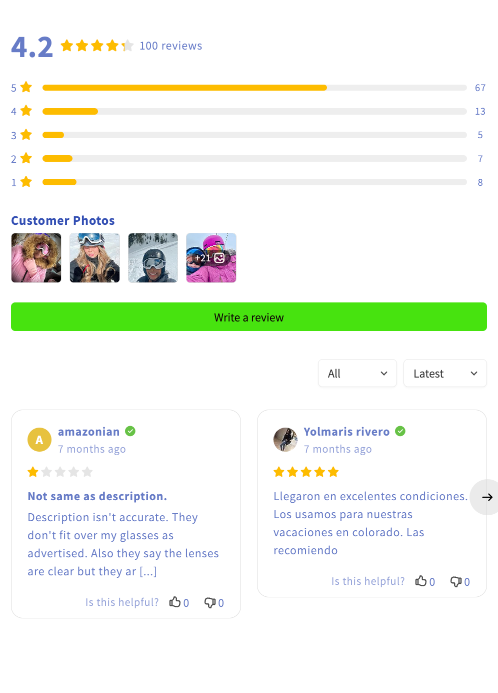
Trust is essential for mobile conversions, particularly near add-to-cart and checkout stages, and combining proper font size choices with readable, well-presented reviews creates a more confident path to purchase.
Every stage of the mobile buying journey depends on readable text. From the first headline a shopper sees to the final confirmation message, font size determines how smoothly users progress through the funnel.
Font size is especially important in:
If users need to slow down to read, conversions slow down with them.
While there is no universal font size that fits every brand, mobile usability research provides reliable ranges that work well across most Shopify themes. The goal is to balance readability with clean visual design.
General mobile-friendly guidelines include:
Testing these sizes on real mobile devices is essential, as font appearance varies by screen size, resolution, and font family.
Font size decisions often affect font usage overall. When merchants rely on multiple font weights or styles to compensate for readability issues, page weight can increase, especially on mobile networks.
A streamlined typography system with optimized font sizes:
Since page speed is directly linked to mobile conversions, typography optimization supports both usability and technical performance.
Font size changes should always be evaluated using performance data. After making adjustments, merchants should track key mobile metrics to understand the real impact.
Important metrics include:
Improvements in readability often translate into better engagement, smoother checkout flows, and higher revenue over time.
Many Shopify merchants underestimate how much typography affects mobile user behavior. Small font size mistakes may seem minor, but on mobile devices they quickly turn into major conversion barriers.
When these issues appear across key pages, they disrupt the shopping flow and reduce user confidence, especially on smaller screens.
Common font size mistakes include:
Improving font size on Shopify starts with adopting a mobile-first mindset rather than scaling down desktop designs. The goal is to create a reading experience that feels natural, effortless, and visually balanced on small screens.
By focusing on clarity and consistency, merchants can guide users smoothly through the mobile shopping journey.
Effective font size optimization strategies include:
Font size choices on Shopify are far more than a visual preference. On mobile devices, they directly influence readability, trust, and conversion behavior. In a mobile-first shopping environment, clear and comfortable text helps users move confidently from browsing to buying.
By treating font size as a core conversion element rather than a minor design detail, Shopify merchants can reduce friction, improve user experience, and significantly boost mobile conversion rates.

