Please select the platform to login


Call-to-action (CTA) buttons are one of the most influential elements on a product page. They guide visitors from interest to action and help transform browsing behavior into measurable results. However, many ecommerce stores struggle to strike the right balance, using too many CTAs can overwhelm users, while too few can leave them uncertain about what to do next.
A well-planned CTA strategy removes friction, clarifies intent, and supports users at every stage of the buying journey. In this article, we’ll explore how many CTAs a product page should have, how to structure them effectively, and how thoughtful CTA placement can directly impact conversion rates.
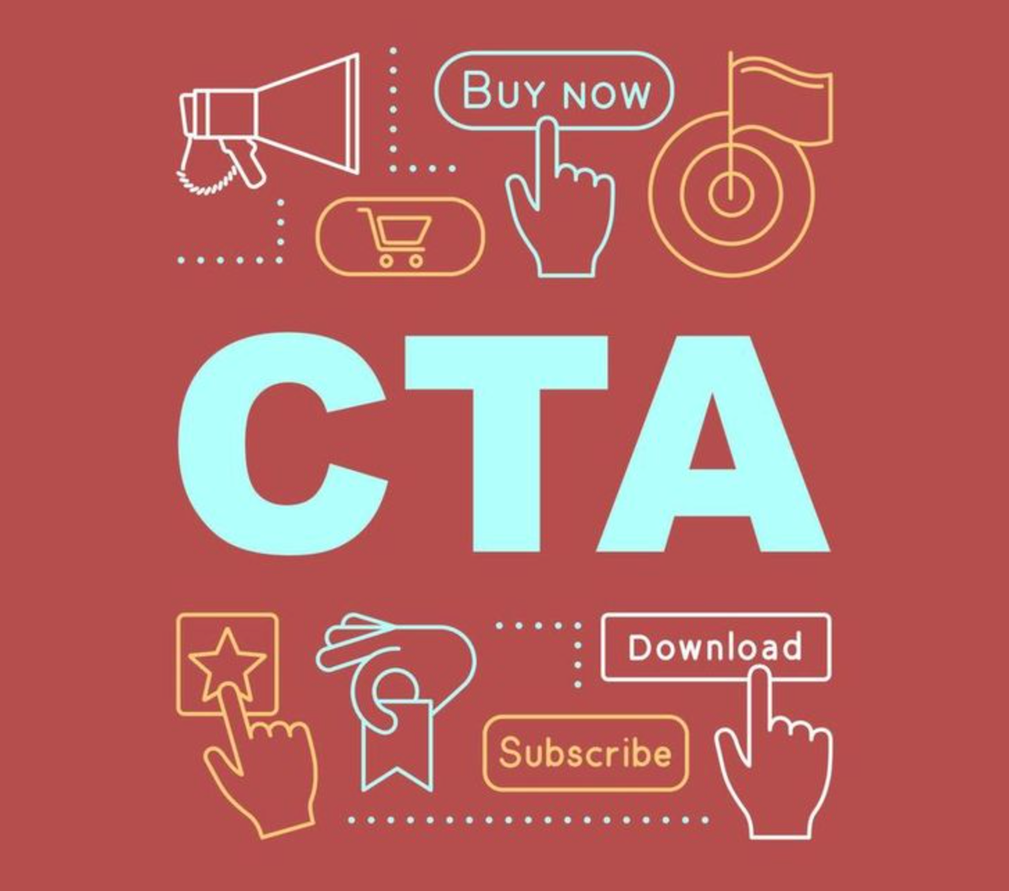
A CTA is any prompt that encourages users to take a specific action, such as adding a product to the cart, saving it for later, or learning more details. On product pages, CTAs act as decision points that help users move forward rather than remain passive. Without clear CTAs, even highly interested shoppers may hesitate or abandon the page.
Product pages often attract visitors with different levels of intent—some are ready to buy, while others are still researching. CTAs help guide each type of user by clearly presenting their next best step, making the experience feel intentional and user-friendly.
Here’s how CTAs directly support product page performance:
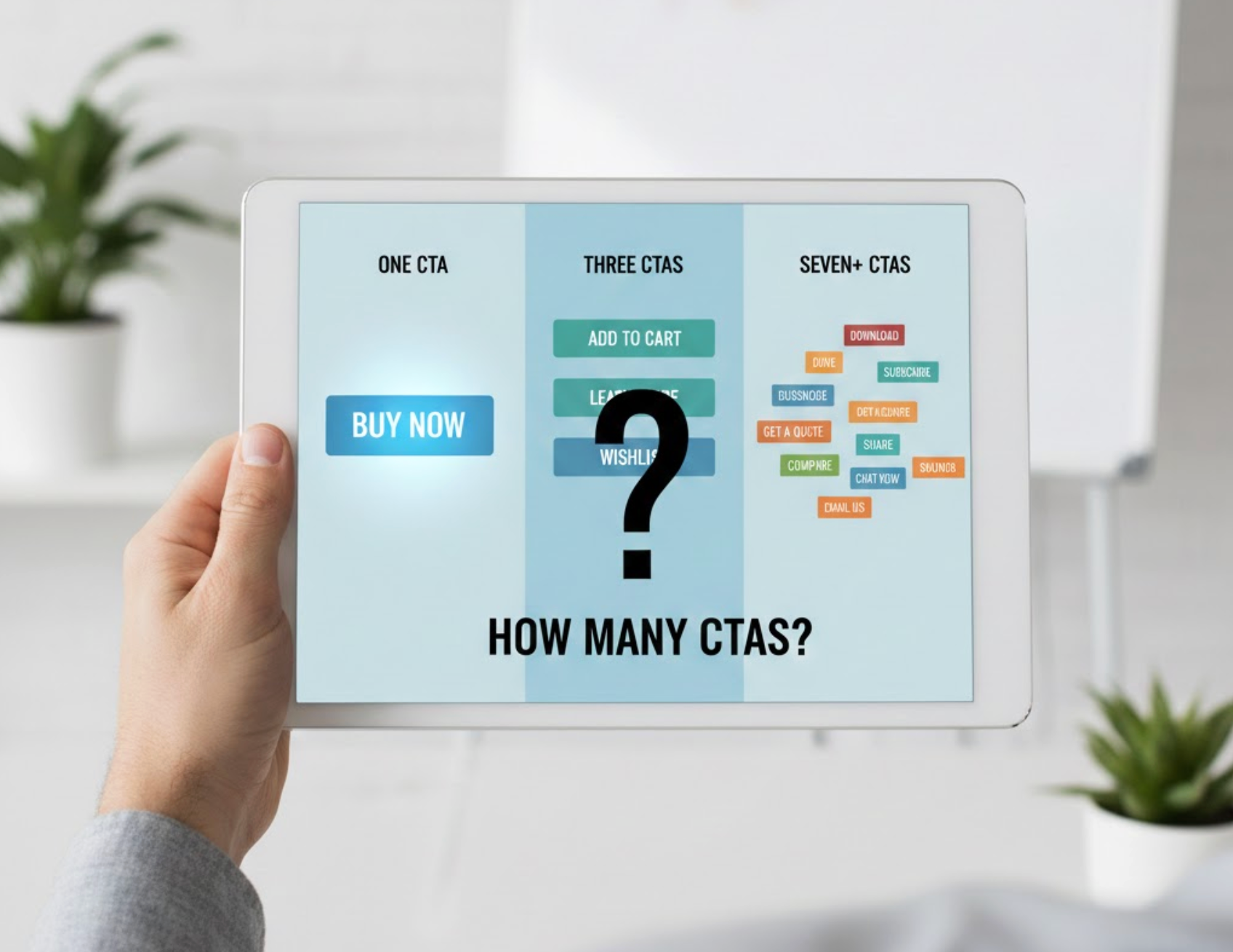
Most high-performing product pages follow a simple yet effective rule: one primary CTA supported by two to three secondary CTAs. This structure keeps the page focused while still offering flexibility for users who are not ready to purchase immediately. Rather than overwhelming shoppers with choices, this approach creates a clear visual and functional hierarchy.
The key is not the number of CTAs, but how intentionally they are placed and differentiated. Each CTA should serve a purpose within the user journey and contribute to moving users closer to conversion.
A well-balanced CTA layout typically includes:
The primary CTA is the most important action on your product page and should represent the end goal, usually purchasing the product. Common examples include “Add to Cart” or “Buy Now.” This CTA should be immediately visible, clearly labeled, and visually distinct from all other elements.
For product pages with long descriptions, reviews, or technical details, repeating the same primary CTA further down the page helps capture conversions when users are ready to act. Repetition reinforces the same goal rather than creating confusion.
To make your primary CTA as effective as possible, focus on these elements:
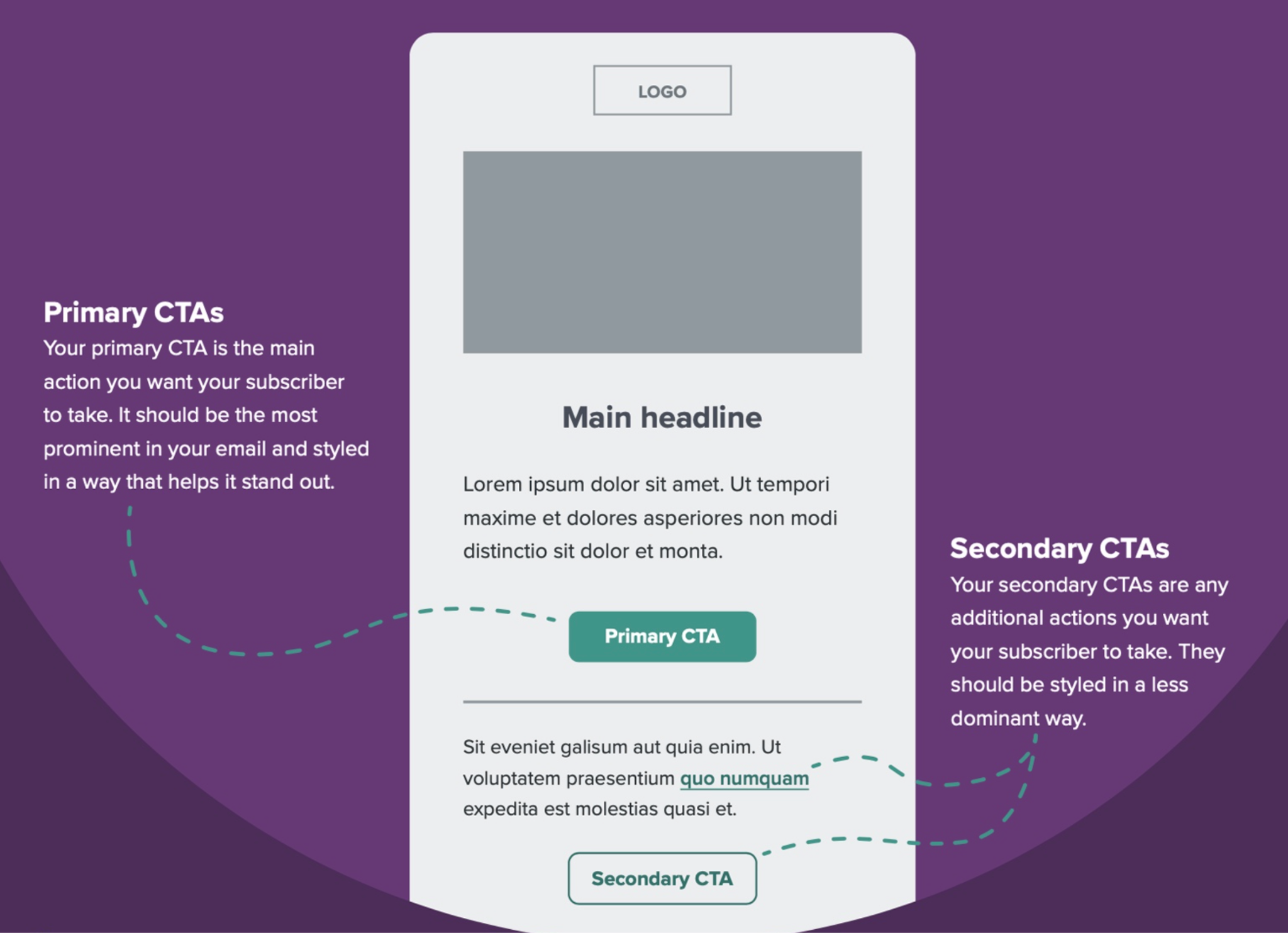
Secondary CTAs provide alternative actions for users who need more time before committing. These CTAs help keep users engaged with the product without forcing an immediate purchase. When used correctly, they can reduce bounce rates and increase return visits.
However, secondary CTAs should never compete visually or contextually with the primary CTA. Their role is to support the decision-making process, not distract from it.
Examples of secondary CTAs that add value without distraction:
Informational CTAs play a critical role in answering questions and reducing purchase anxiety. While they don’t directly trigger conversions, they address common concerns such as shipping, sizing, and returns. When these details are easy to access, shoppers feel more confident completing their purchase.
These CTAs should be subtle and contextually placed near related information to avoid cluttering the page or distracting from the main CTA.
Common informational CTAs that reduce purchase anxiety include:
It’s a common misconception that more CTAs lead to higher conversions. In reality, too many CTAs often create choice overload, making it harder for users to decide what to do. When multiple actions compete for attention, users may delay their decision or leave the page entirely.
Successful product pages prioritize clarity and intent. Each CTA should earn its place by clearly supporting the user journey.
Here’s what usually goes wrong when CTAs are overused:
CTA placement can be just as important as CTA quantity. CTAs should appear where users naturally pause to evaluate information or make decisions. Strategic placement ensures CTAs feel helpful and timely rather than intrusive.
On mobile devices, placement becomes even more critical, as screen space is limited and accessibility affects usability.
Smart placement tactics that improve CTA performance include:
Different products require different CTA strategies. Simple, low-cost products often benefit from fewer CTAs and a faster path to purchase. In contrast, high-ticket or technical products usually need more informational support to build confidence.
Understanding your product’s buying cycle helps determine how many CTAs are necessary and what type they should be.
A practical breakdown by product category looks like this:
Choosing the right number of CTAs requires intention, testing, and a clear understanding of user behavior. Each CTA should move users closer to conversion, either directly or by removing obstacles along the way. Regular optimization helps ensure your CTA strategy evolves with user expectations.
Avoid adding CTAs based on trends alone, focus on what truly supports your customers.
Keep these CTA optimization principles in mind:
So, how many CTAs should a product page have? In most cases, one strong primary CTA supported by two to three well-placed secondary or informational CTAs delivers the best balance between clarity and flexibility. This approach keeps users focused while still addressing different stages of the buying journey.
By maintaining a clear CTA hierarchy, optimizing placement, and aligning CTAs with user intent, you can create product pages that feel intuitive, trustworthy, and designed to convert, without overwhelming your shoppers.

