Please select the platform to login


Scroll depth is one of the most overlooked indicators of user engagement in eCommerce. While many store owners focus on traffic, clicks, or conversion rates, how far shoppers scroll on a product page quietly reveals how interested, and how confident, they really are. One key element that strongly influences this behavior is review placement.
Where customer reviews appear on a page can either encourage users to keep exploring or cause them to stop scrolling altogether. In this article, we’ll explore how review placement affects scroll depth, why it matters for conversion performance, and how to position reviews in a way that naturally guides shoppers through your product page.
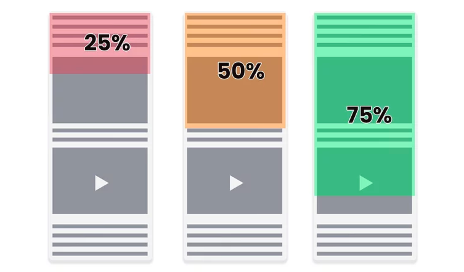
Scroll depth measures how much of a page users actually view, usually tracked at milestones such as 25%, 50%, 75%, and 100%. In eCommerce, it helps uncover whether shoppers are truly engaging with your content or abandoning the page before reaching critical information.
When scroll depth is high, it often suggests that the page layout feels intuitive and worth exploring. In contrast, low scroll depth usually signals friction or missing reassurance early on. In general, strong scroll depth is often associated with:
On the other hand, shallow scrolling commonly points to:
Customer reviews sit at the intersection of trust and engagement, making them especially powerful in shaping how users scroll.
Reviews are different from standard product content. Instead of describing features or specifications, they reflect real experiences, emotions, and outcomes. Shoppers read reviews to validate what they already feel, whether that’s excitement, hesitation, or doubt.
Because of this emotional role, reviews often function as scroll triggers. When placed correctly, they give users a reason to continue moving down the page. When placed poorly, they can disrupt momentum or fail to appear before interest fades.
Understanding how reviews influence scrolling requires looking closely at where they appear and when shoppers encounter them.
On mobile devices, scroll behavior is faster and more instinctive. With limited screen space, users decide very quickly whether a page feels worth continuing.
If reviews appear too early, mobile users may stop scrolling altogether. If they appear too late, users may never reach them. The most effective mobile layouts typically:
Because mobile scrolling is continuous, review placement must align precisely with moments of hesitation.
When reviews are treated as part of the page’s flow rather than a standalone block, they guide users naturally from one section to the next.
Positioned thoughtfully, reviews can:
In this role, reviews quietly influence navigation without relying on buttons or anchors.

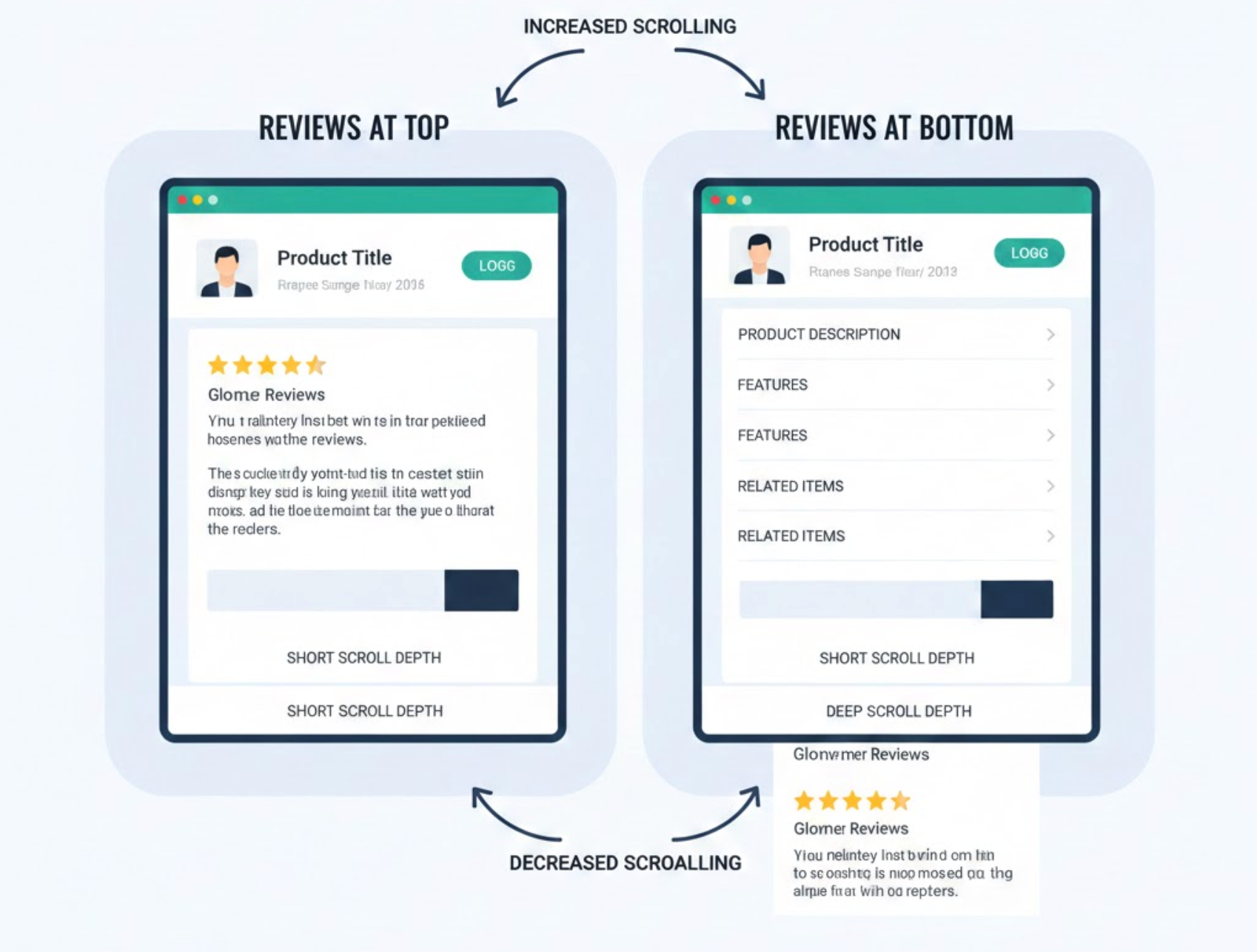
Placing reviews immediately near the top of a product page can seem like a smart trust-building move. However, when reviews appear before users fully understand the product, they can unintentionally shorten the browsing journey.
At this stage, shoppers are still forming context. If reviews appear too soon, users may jump into decision-making mode prematurely, skimming a few comments and then either exiting or adding to cart without exploring further.
This type of placement often leads to:
Instead of guiding exploration, reviews placed too high can compress the experience and limit how much of the page users actually see.
At the other extreme, reviews that sit at the very bottom of a long product page may never be reached at all. By the time users scroll through descriptions, feature lists, and technical details, motivation often starts to drop.
Without encountering social proof early enough, many shoppers lose confidence or interest and leave before reaching the review section. When this happens, reviews fail to serve their purpose—not because of their content, but because of their timing.
This placement commonly results in:
In this case, reviews are positioned too late to influence scrolling behavior or buying decisions.
Mid-page placement is often the most effective position for customer reviews. This is the point where users understand the product but haven’t fully decided whether it’s right for them.
At this moment, uncertainty naturally arises, and reviews provide the reassurance shoppers are looking for. Instead of interrupting the scroll, they renew confidence and encourage users to keep going.
When reviews are introduced mid-page, stores often see:
Placed correctly, reviews become a psychological checkpoint that keeps momentum moving forward.
It’s not just about where reviews appear, but also how they’re introduced. Many high-performing product pages separate review content into two layers: a brief summary near the top and full reviews further down.
This structure works because it subtly sets expectations and creates a destination for users to scroll toward:
This approach preserves early engagement while encouraging deeper scrolling later.
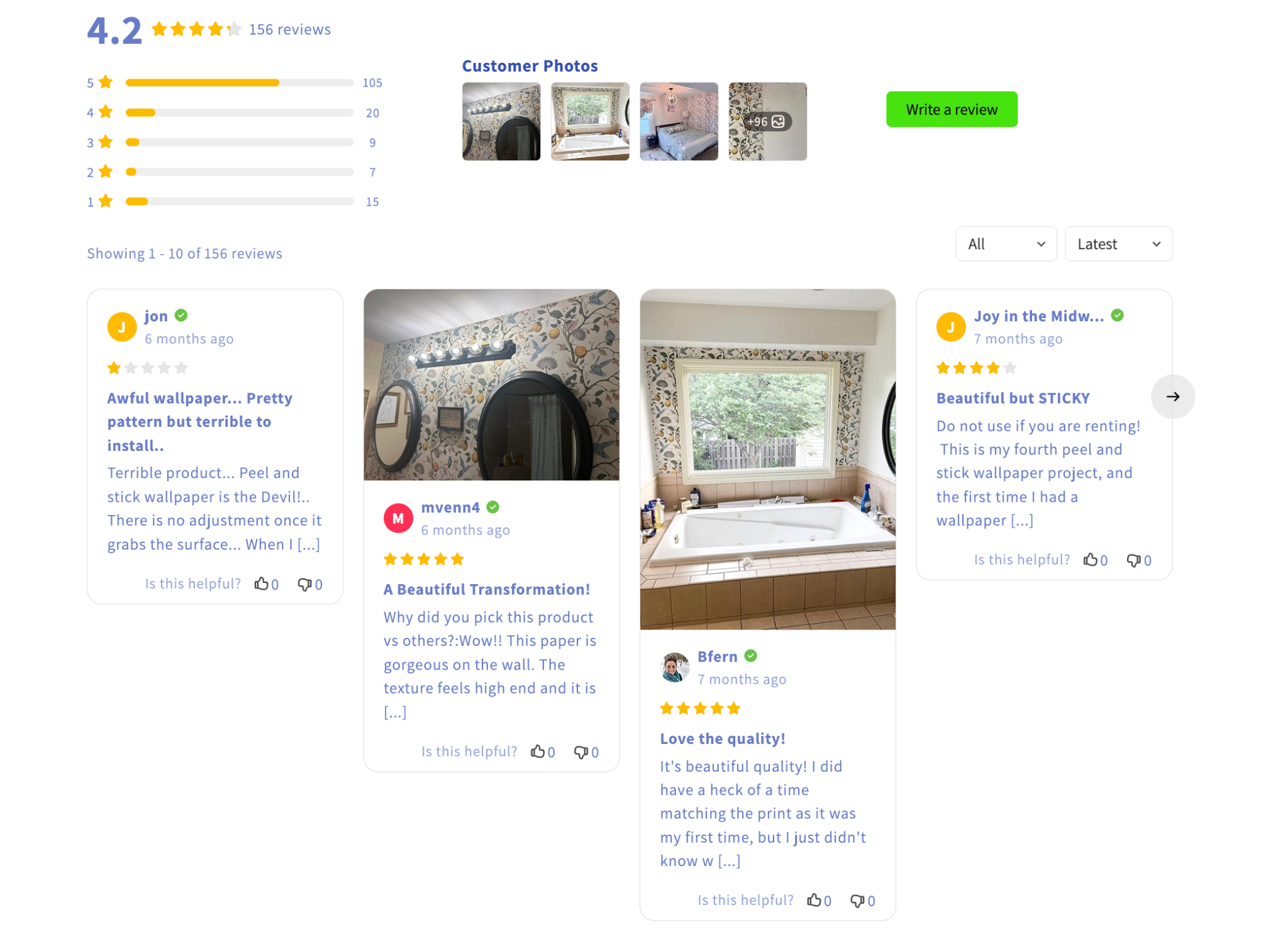
Text-heavy sections can slow users down in the wrong way. Visual reviews—such as customer photos or videos, help break up the page and re-energize attention.
When shoppers encounter visual content, scrolling often becomes more intentional rather than rushed. These moments of pause don’t stop the journey; instead, they refresh interest and encourage users to continue.
Visual reviews are especially effective because they:
As a result, users often scroll deeper after interacting with visual review sections.
To understand the real impact of review placement, it’s important to look beyond conversions alone and examine how users actually move through your product pages. Scroll depth analytics provide valuable insight into whether reviews are encouraging exploration or unintentionally causing users to stop early. By observing how far shoppers scroll and where they slow down or exit, you can identify whether your review sections are helping maintain momentum or breaking it.
Rather than focusing on a single data point, it’s more effective to track several engagement signals together. Key metrics to monitor include:
When these metrics are analyzed together, patterns begin to emerge. For example, a noticeable increase in scroll depth after moving reviews higher on the page often signals improved confidence and curiosity.
A/B testing different review placements, such as shifting reviews from the bottom to the mid-page or adding a review summary above the fold, can quickly highlight what works best for your audience. In many cases, even small layout adjustments lead to measurable changes in scroll behavior within just a few days, making review placement one of the most actionable elements to optimize.
Understanding how review placement affects scroll depth is much easier when you have the right tools in place. This is where a review solution like Ryviu can quietly support better page performance, not by pushing sales, but by giving you flexibility and visibility.
Ryviu allows store owners to control where and how reviews appear on product pages, making it easier to test different placements without redesigning the entire layout. Whether you want to add a compact review summary near the top, place photo reviews mid-page, or highlight social proof before key sections, Ryviu’s customization options help reviews fit naturally into the scroll flow.
More importantly, Ryviu supports visual reviews, including photo and video content, which play a major role in sustaining scroll momentum. These visual elements break up long sections of text and encourage shoppers to pause, engage, and continue scrolling, especially on mobile devices where attention drops quickly.
When combined with scroll depth analytics and A/B testing, Ryviu makes it easier to treat reviews as part of the page journey rather than a static block at the bottom. Instead of simply displaying feedback, reviews become a strategic tool to guide users, reduce hesitation, and keep them moving deeper into the page.
Review placement is ultimately about timing, not just visibility. When reviews appear at the right moment, they don’t end the scroll, they extend it. They answer doubts precisely when those doubts arise.
By positioning reviews strategically and supporting them with summaries and visuals, you can transform scrolling from a passive action into a guided experience. And when users scroll deeper, they don’t just consume more content, they build trust, confidence, and readiness to buy.
In eCommerce, scroll depth tells a story. And where your reviews appear often decides how that story unfolds.

