Please select the platform to login


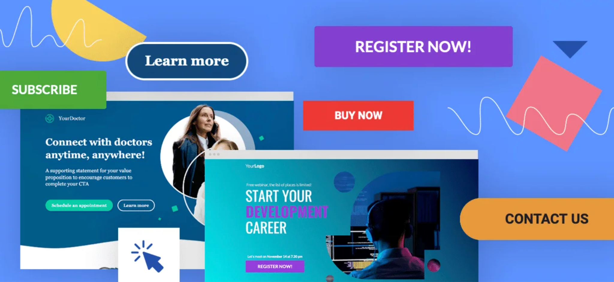
Call-to-action (CTA) buttons are not just visual elements, they are psychological triggers that guide users toward their next decision. Even a well-designed CTA can underperform if the wording does not match what the buyer is thinking or ready to do. When CTA language aligns with buyer intent, interactions feel intuitive rather than forced.
Aligning CTA copy with intent reduces friction, builds trust, and improves conversions across the entire funnel. Instead of pushing every visitor to buy immediately, effective CTAs meet users where they are and move them forward at a comfortable pace.

Buyer intent reflects a user’s mindset and readiness to take action at a given moment. It shows how aware they are of a problem, how much research they’ve done, and how close they are to making a purchase decision.
Not all visitors arrive with the same goal. Some are simply exploring, others are comparing solutions, and some are ready to buy right away. CTA language should adapt to these different stages rather than using one generic message everywhere.
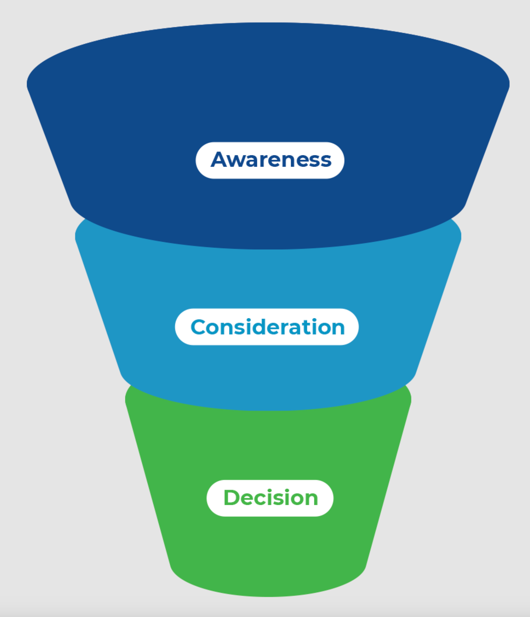
Buyer intent typically falls into three core stages:
Each stage requires a distinct CTA tone, verb choice, and level of commitment.
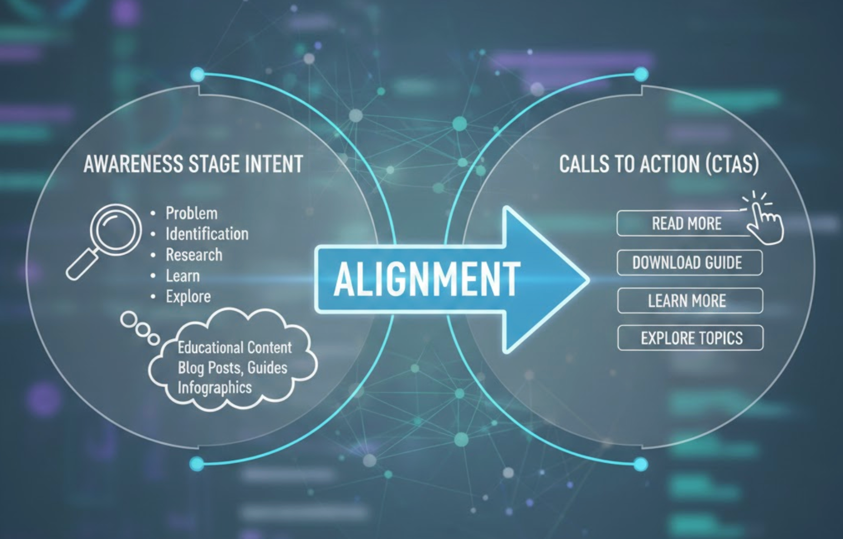
At this early stage, CTA language should invite exploration and learning without asking for commitment, helping users feel comfortable taking the first step. Visitors here are gathering information, not shopping aggressively, so overly sales-focused CTAs can feel intrusive.
Soft, curiosity-driven language encourages engagement while respecting the user’s mindset. The goal is to keep users on the site longer and guide them toward deeper interest.
These CTAs act as gentle entry points rather than conversion triggers, setting the foundation for trust and familiarity.
To support gentle exploration at this stage, CTAs should focus on curiosity and learning, encouraging users to engage without feeling pressured to commit.
Once users start comparing options, CTA copy needs to highlight value and clarity, guiding them toward deeper evaluation and informed decision-making. At this point, visitors understand their problem and are actively assessing potential solutions.
CTAs should emphasize benefits, differentiation, and reassurance rather than broad education. Clear wording helps users feel confident that clicking will move them closer to the right choice.
This is the stage where CTAs support evaluation and reduce uncertainty rather than pushing for an immediate sale.
As users move into evaluation mode, CTA language should clearly signal helpful next steps that make comparison and decision-making easier.
When shoppers are ready to convert, CTA language should be direct and decisive, removing ambiguity and making the next action feel simple and immediate. Users at this stage value speed, clarity, and control.
Vague or overly soft CTAs can create hesitation when buyers are ready to act. Strong action verbs reassure users that they are taking a clear, intentional step forward.
Well-aligned purchase-stage CTAs reduce friction and help close the decision loop quickly.
At the moment of conversion, CTAs need to remove doubt and clearly communicate the action users are about to take.
The effectiveness of a CTA also depends on where it appears, so the language should always reinforce the purpose and expectations of the page itself. Even high-intent CTAs can fail if they feel out of place within the surrounding content.
For example, a blog post should guide users toward learning or exploration, while a product page should support evaluation or action. Mismatched CTAs create confusion and break the user flow.
CTA alignment works best when page intent and user intent meet at the same point.
To keep the experience intuitive, CTA wording should always reflect what users expect to do next based on the page they’re currently viewing.
Subtle behavioral cues can reveal how ready a user is to act, allowing CTA language to adapt dynamically to different levels of intent. These signals help marketers fine-tune messaging without changing layout or design.
Returning visitors, for example, often respond better to stronger CTAs than first-time users. Similarly, users coming from paid ads usually show higher intent than those arriving from top-of-funnel content.
By adjusting CTA language based on behavior, brands can create more personalized and effective user experiences.
By observing how users interact with your site, you can identify key signals that help determine which CTA copy will feel most relevant.
Misaligned CTAs often create unnecessary friction, especially when the language doesn’t match the user’s readiness or expectations. Asking users to “Buy Now” before they understand the value can drive them away instead of converting them.
Another frequent mistake is relying on generic CTAs that fail to communicate value or intent. While they may function technically, they miss the opportunity to guide and reassure users.
Respecting buyer intent means pacing the journey and choosing language that feels supportive rather than pushy.
Being aware of these frequent pitfalls can help prevent friction and ensure your CTAs feel aligned with user expectations.
Because intent can vary by audience and situation, ongoing testing helps uncover which CTA language resonates best at each stage of the journey. Small wording changes can lead to meaningful improvements in engagement and conversions.
A/B testing allows teams to validate assumptions and discover how users actually respond to different CTA tones. Testing should focus on intent alignment rather than just button color or placement.
Optimization is an ongoing process, not a one-time decision.
When refining CTA language, these testing areas provide the most insight into how well your messaging aligns with buyer intent.
Aligning CTA language with buyer intent is one of the most efficient ways to improve conversions without increasing traffic or redesigning your website. When CTAs match what users are ready to do, interactions feel natural and friction disappears.
By understanding intent stages, aligning CTAs with page context, and refining language through testing, you create a smoother and more persuasive customer journey. The right words, used at the right moment, can make all the difference between hesitation and action.

