Please select the platform to login


A cart page is more than just a list of products, yet it’s the final checkpoint before a customer commits to a purchase. At this stage, shoppers are weighing trust, convenience, and value, often making a decision within seconds. A thoughtfully designed cart page removes hesitation, reinforces confidence, and keeps users focused on completing checkout.
For Shopify stores, optimizing the cart page can dramatically reduce abandonment and increase overall revenue. Below are the most important practices to design a high-converting cart page, explained in detail and structured for practical implementation.
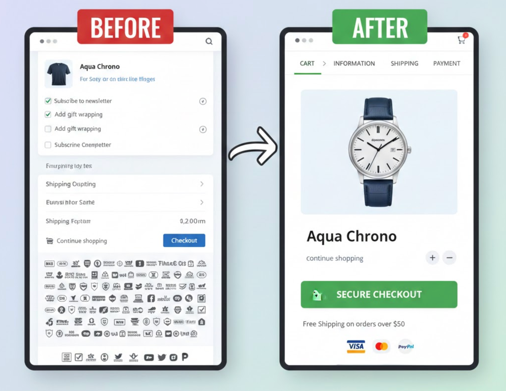
The checkout CTA is the most important element on your cart page because it defines the next step in the buying journey. If customers hesitate or struggle to find where to click next, even strong purchase intent can fade quickly. A clear and visually dominant CTA helps guide users forward with confidence.
To ensure your checkout button effectively drives action, focus on clarity, contrast, and placement:
Unexpected costs are one of the most common reasons shoppers abandon their carts. When customers feel surprised or misled at the final step, trust is immediately broken. A transparent cart page reassures shoppers that there will be no unpleasant surprises later.
By clearly explaining how the total is calculated, you make checkout feel safe and predictable:
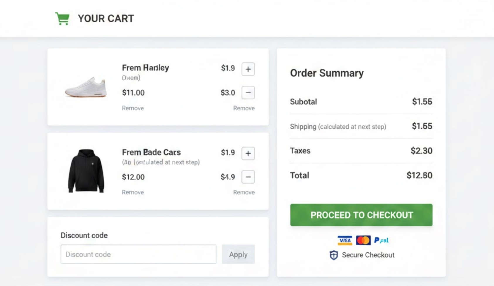
Customers often want to make small adjustments before checking out, especially when comparing quantities or budgets. Forcing them to navigate away from the cart disrupts momentum and increases the chance of abandonment. A flexible, editable cart keeps users in control and engaged.
To create a smooth and frustration-free experience, your cart should support quick changes:
Before committing to payment, shoppers want reassurance that they selected the right products. A confusing or incomplete cart summary can create doubt and lead to last-minute exits. Clear visual confirmation helps customers feel confident in their choices.
By making product details easy to scan, you reduce cognitive load and hesitation:
At the cart stage, trust becomes just as important as convenience. Even if your store is secure, customers need visible cues to feel safe entering payment information. Subtle reassurance can eliminate last-minute doubts.
Strategically placed trust signals help customers move forward with confidence:
Uncertainty around policies often stops customers from completing purchases. Shoppers want to know what happens if the product doesn’t meet expectations or arrives late. Addressing these concerns directly on the cart page reduces hesitation.
By surfacing key policy highlights, you answer objections before they become blockers:
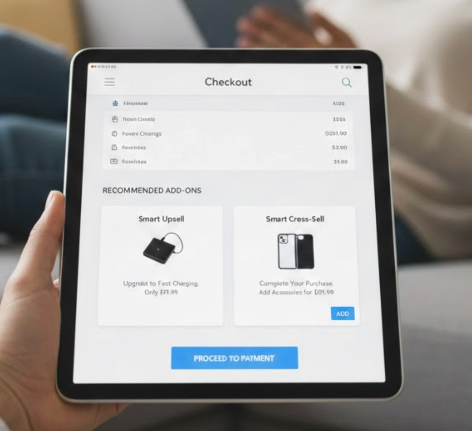
The cart page is an excellent opportunity to increase average order value, but it must be handled carefully. Aggressive upsells can distract from checkout and hurt conversions. Subtle, relevant suggestions feel helpful rather than intrusive.
When implemented correctly, cart upsells enhance, not interrupt, the buying experience:
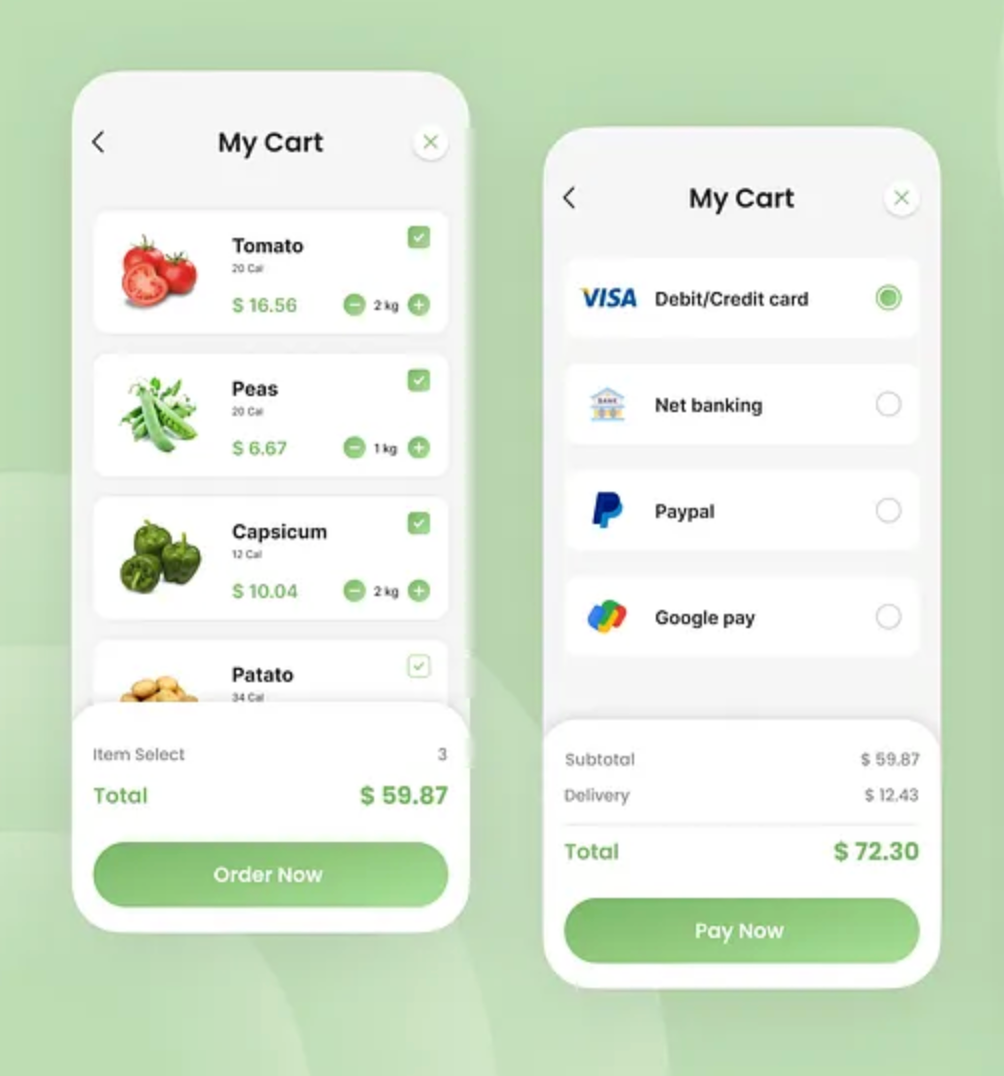
With mobile traffic dominating eCommerce, cart pages must be designed for small screens first. Poor mobile usability quickly leads to abandonment, even when intent is high. Every interaction should feel effortless on touch devices.
Optimizing cart page for mobile ensures consistency and higher conversion rates across devices:
Even a strong cart page can be improved with ongoing testing. Customer behavior changes, and small tweaks can unlock significant gains. Treat your cart page as an evolving asset rather than a finished design.
By testing and analyzing performance, you make data-driven improvements:
A high-converting Shopify cart page removes friction, builds trust, and keeps shoppers focused on completing their purchase. By optimizing CTAs, pricing transparency, cart flexibility, trust signals, and mobile usability, you create a checkout experience that feels effortless and reassuring.
When each element works together seamlessly, your cart page becomes a powerful conversion engine, turning hesitation into action and browsers into buyers.

