Please select the platform to login


In eCommerce, trust is the invisible currency that powers every purchase decision. Shoppers can’t touch, feel, or try your products, so they rely heavily on what they see and how your website makes them feel. Within seconds of landing on your page, visitors subconsciously evaluate whether your brand looks legitimate, professional, and safe to buy from. Designing for trust means intentionally crafting a visual experience that signals reliability, authenticity, and consistency at every interaction.
When done right, a trustworthy design not only convinces users to make their first purchase but also strengthens long-term loyalty, encouraging them to return, recommend, and advocate for your brand.
Visual trust cues influence perception before a single word is read. A polished design instantly communicates that a brand is organized, credible, and customer-focused. On the other hand, poor visuals, like mismatched fonts, broken images, or chaotic layouts, can create uncertainty or suspicion, leading potential buyers to abandon their carts.
Designing for trust goes beyond aesthetics; it’s about reducing friction, creating emotional comfort, and providing clarity in every detail. A trustworthy design makes visitors feel guided rather than manipulated. It assures them that their data is secure, their questions are answered, and their shopping experience is valued. In the crowded online marketplace, that feeling can make all the difference between browsing and buying.
Consistency is one of the most powerful psychological triggers of trust. When your colors, typography, and logo remain consistent across every page, shoppers perceive your business as more stable and reliable. Visual uniformity tells users that your brand pays attention to detail and takes itself seriously. Conversely, inconsistent branding can make your site appear amateurish or disorganized, even if your products are high-quality.
How to apply it:

Your website layout speaks volumes about your professionalism. A cluttered or chaotic page design often signals unreliability and distracts users from your core message. In contrast, a clean, minimal layout communicates control, organization, and transparency, values that encourage trust. The right balance of whitespace, hierarchy, and visual rhythm can subtly guide the user’s eye toward key actions without overwhelming them.
How to apply it:
In online shopping, visuals are the product. Since users can’t physically inspect items, they depend on your imagery to assess quality. Low-resolution or poorly lit photos make shoppers doubt the authenticity of your products and your brand’s professionalism. On the other hand, high-quality, well-styled product photos foster transparency and confidence, helping customers visualize their purchase before checkout.
How to apply it:
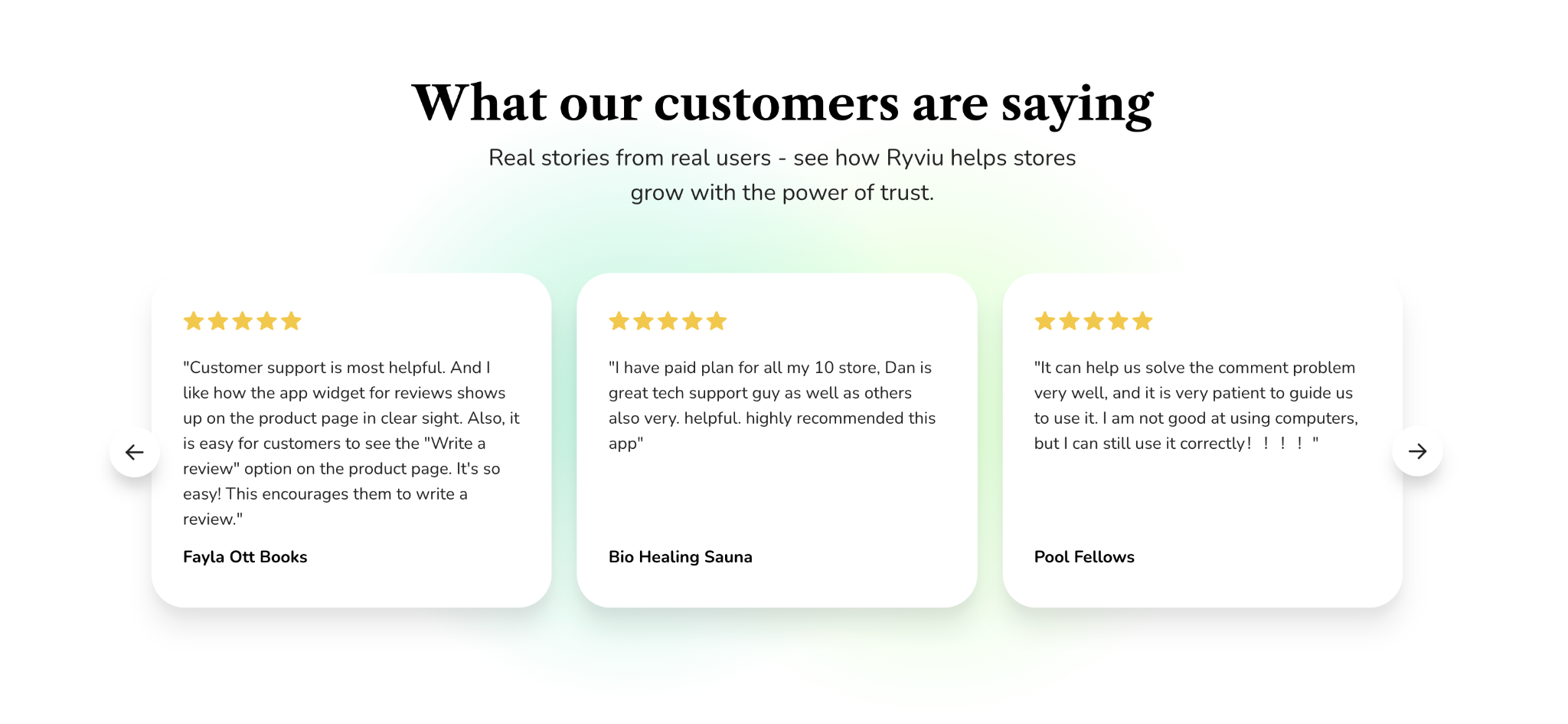
People trust people, not brands. Displaying authentic social proof helps new visitors feel confident that others have had positive experiences with your products. Star ratings, verified reviews, and user-generated photos signal credibility and community validation. The more transparent and detailed these reviews appear, the stronger their impact on buyer confidence.
How to apply it:
Nothing undermines trust faster than hidden costs or hard-to-find details. Transparency in your design and communication shows that you value honesty and respect your customers’ decision-making process. Shoppers want to know exactly what they’re paying for, when it will arrive, and what to do if something goes wrong. Presenting this information clearly reduces uncertainty and builds confidence.
How to apply it:

Even the best design loses credibility if your site feels slow or unsafe. A trustworthy website is one that loads quickly, performs smoothly, and protects user data at every stage of the buying journey. Performance and security are invisible design elements that directly influence how users perceive your brand’s reliability.
How to apply it:
Trust thrives on human connection. Behind every purchase is a customer seeking reassurance that real people stand behind the brand. By adding human elements, like founder stories, team photos, or personalized messages, you make your business feel approachable and relatable. This authenticity builds emotional trust, turning your brand from a faceless entity into a community people want to engage with.
How to apply it:
Designing for trust isn’t about adding flashy visuals, but it’s about removing doubt. Every element on your website, from the layout and typography to the images and testimonials, tells a story about your brand’s integrity. A trustworthy design reassures visitors that your business is professional, transparent, and worthy of their time and money.
By combining consistent branding, authentic visuals, social proof, and a secure, user-friendly experience, you create a digital environment that makes people feel safe to act. Remember, trust doesn’t happen by chance, but it’s built intentionally, one visual cue at a time.

