Please select the platform to login


Online shoppers rarely read every word on an eCommerce page. Instead, they scan, quickly looking for product benefits, prices, trust signals, and actions that help them decide whether to stay or leave. If your page isn’t designed for scanning, even high-quality products and offers can be overlooked. Designing scan-friendly eCommerce pages ensures shoppers find what they need fast, reducing friction and increasing conversions.
This article breaks down why scan-friendly design matters and how to apply it effectively across your eCommerce store.
Most eCommerce visits are goal-driven. Shoppers arrive with specific questions in mind: What is this product? How much does it cost? Can I trust this store? How do I buy it? If these answers aren’t immediately visible, users abandon the page.
Scan-friendly pages reduce cognitive load by structuring content visually rather than relying on long paragraphs. Clear visual hierarchy helps users understand your offer within seconds, which is especially important for mobile shoppers and first-time visitors. When users can scan comfortably, they feel more confident and move faster toward purchase.
Visual hierarchy determines how information is processed the moment a page loads. By controlling size, contrast, spacing, and placement, you signal what deserves immediate attention. Without hierarchy, all elements compete equally, forcing users to slow down and interpret the page manually. This confusion often leads to hesitation, frustration, or early exits.
When hierarchy is clear, scanning users instantly grasp the page’s structure and focus on what matters most.
Headings act as summaries that scanning users rely on to navigate content. Clear headings allow shoppers to understand each section without reading the full text. Overly long or vague headings create uncertainty and break the scanning flow. Well-written headings reduce effort and increase comprehension.
Strong headings guide users naturally from one section to the next.
Large blocks of text feel overwhelming and are difficult to skim. Short paragraphs make content appear lighter and easier to process. Adequate spacing between sections improves visual clarity and reduces cognitive load. This structure helps users stay oriented as they scroll.
By chunking content, you allow shoppers to jump directly to the information they need.
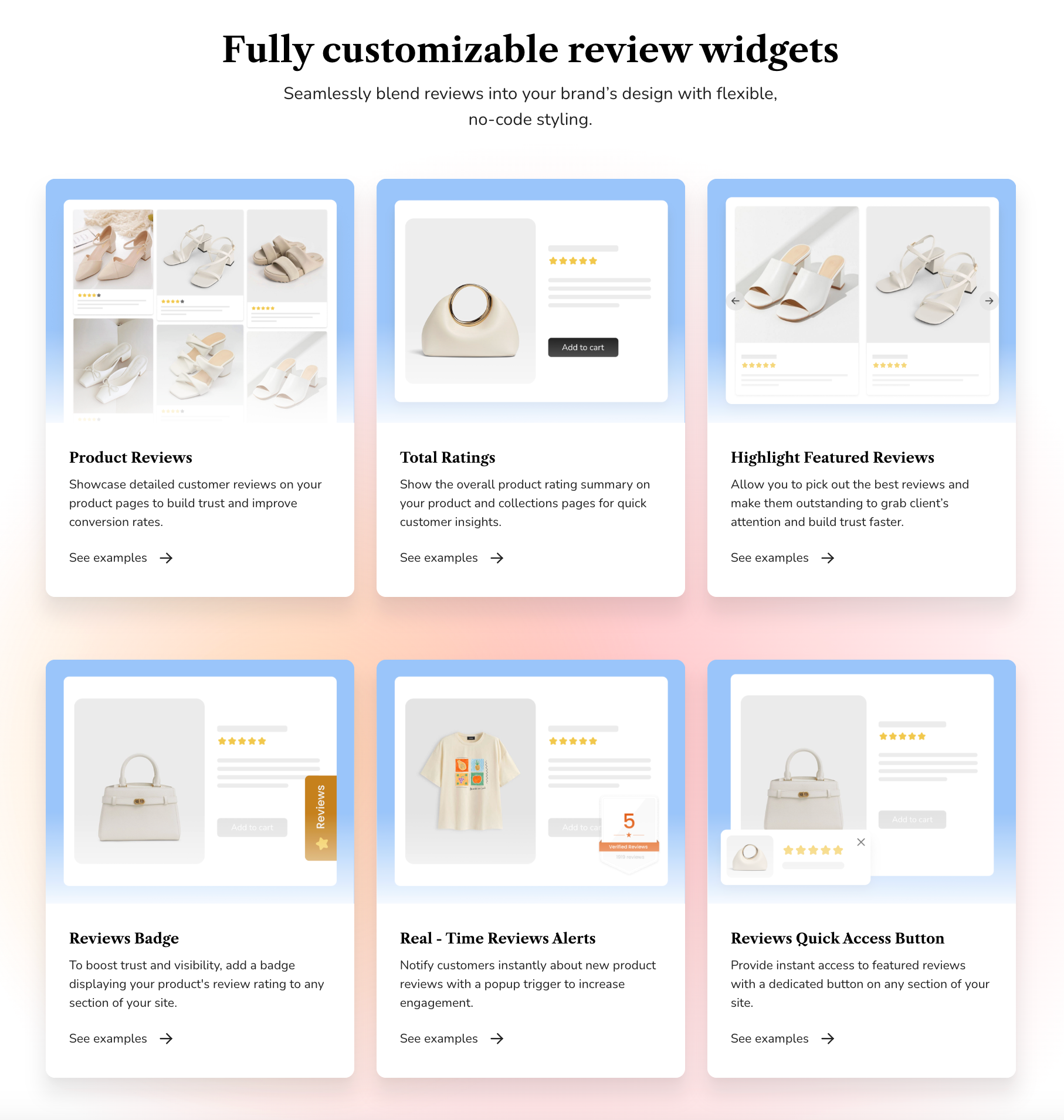
Bullet points transform dense information into digestible highlights. They are especially effective for communicating features, benefits, and technical details quickly. When written clearly, bullets improve understanding without requiring full reading. Poorly structured bullets, however, can feel cluttered or repetitive.
Well-crafted bullet points make scanning faster and comparisons easier.
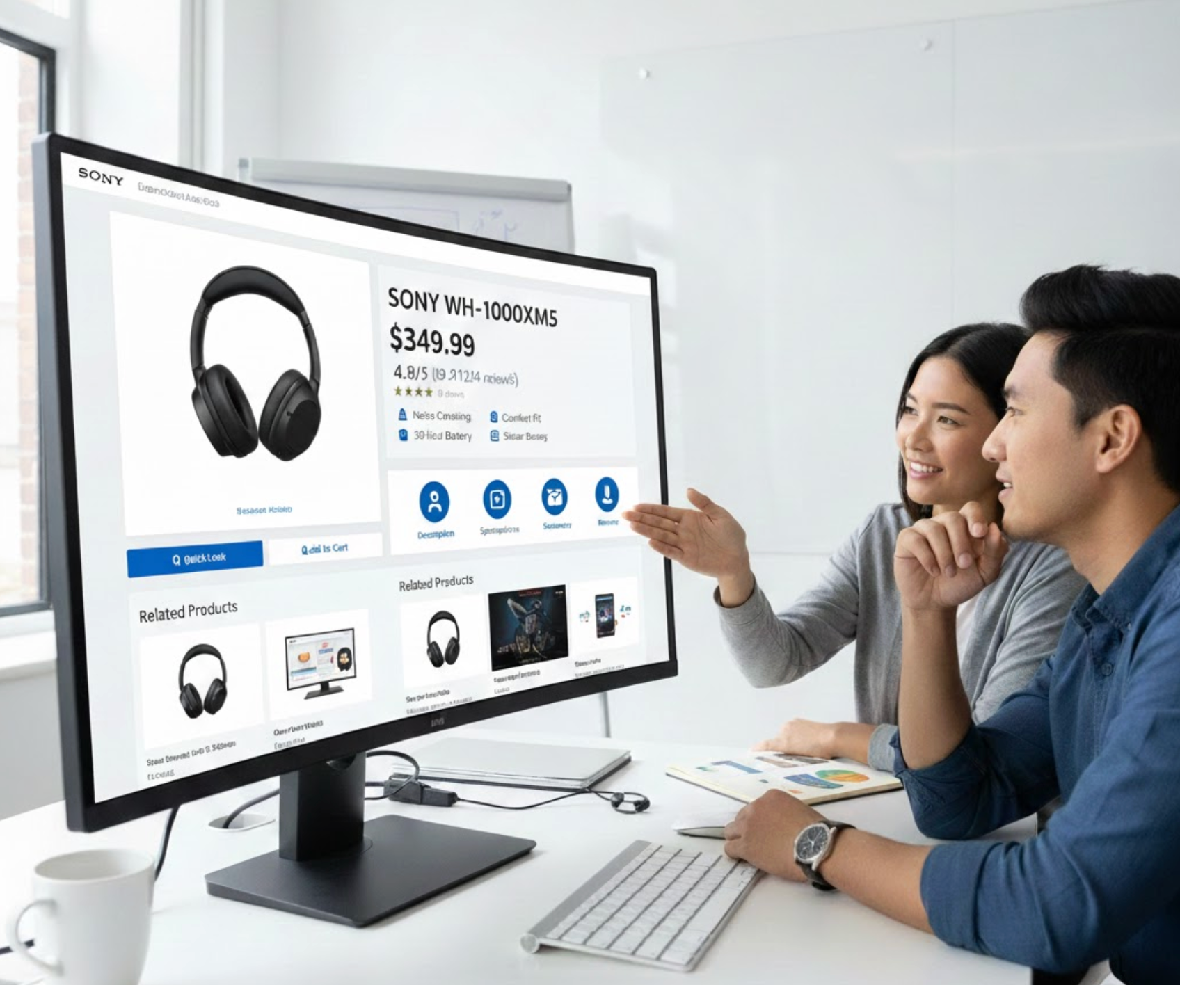
The above-the-fold area shapes the user’s first impression. Shoppers expect to immediately understand what the product is and why it’s valuable. If essential information is missing or unclear, users may leave before scrolling. Strong above-the-fold design builds instant confidence.
A well-optimized top section encourages users to continue scanning the page.
Icons help communicate meaning faster than text alone. They reduce reading effort while adding visual interest to the page. Visual cues such as dividers or highlights also help guide attention across sections. When overused, however, they can become distracting.
Used strategically, icons and cues support smooth scanning without clutter.
Scanning users instinctively look for elements that stand out. Strategic emphasis draws attention to value, urgency, or reassurance points. Over-highlighting reduces impact and makes pages feel chaotic. Balance is essential for effective emphasis.
Intentional highlighting ensures key information is noticed at the right moment.
Typography directly affects readability and comfort. Fonts that are too decorative or tightly spaced slow scanning and cause fatigue. Proper line height and font size improve visual flow and comprehension. Clean typography also enhances perceived professionalism.
Readable text allows users to scan quickly without strain.
Call-to-action buttons should never be hard to find. Scanning users expect the next step to be obvious and intuitive. Poor contrast or unclear labels interrupt momentum. CTA visibility directly impacts conversion rates.
Clear CTAs help users move seamlessly from interest to action.
A logical content flow reduces friction and builds trust. When information appears in a familiar order, users feel more in control. Disorganized layouts force shoppers to search for answers, disrupting scanning behavior. Predictability supports confidence.
Well-structured pages align naturally with how shoppers evaluate products.
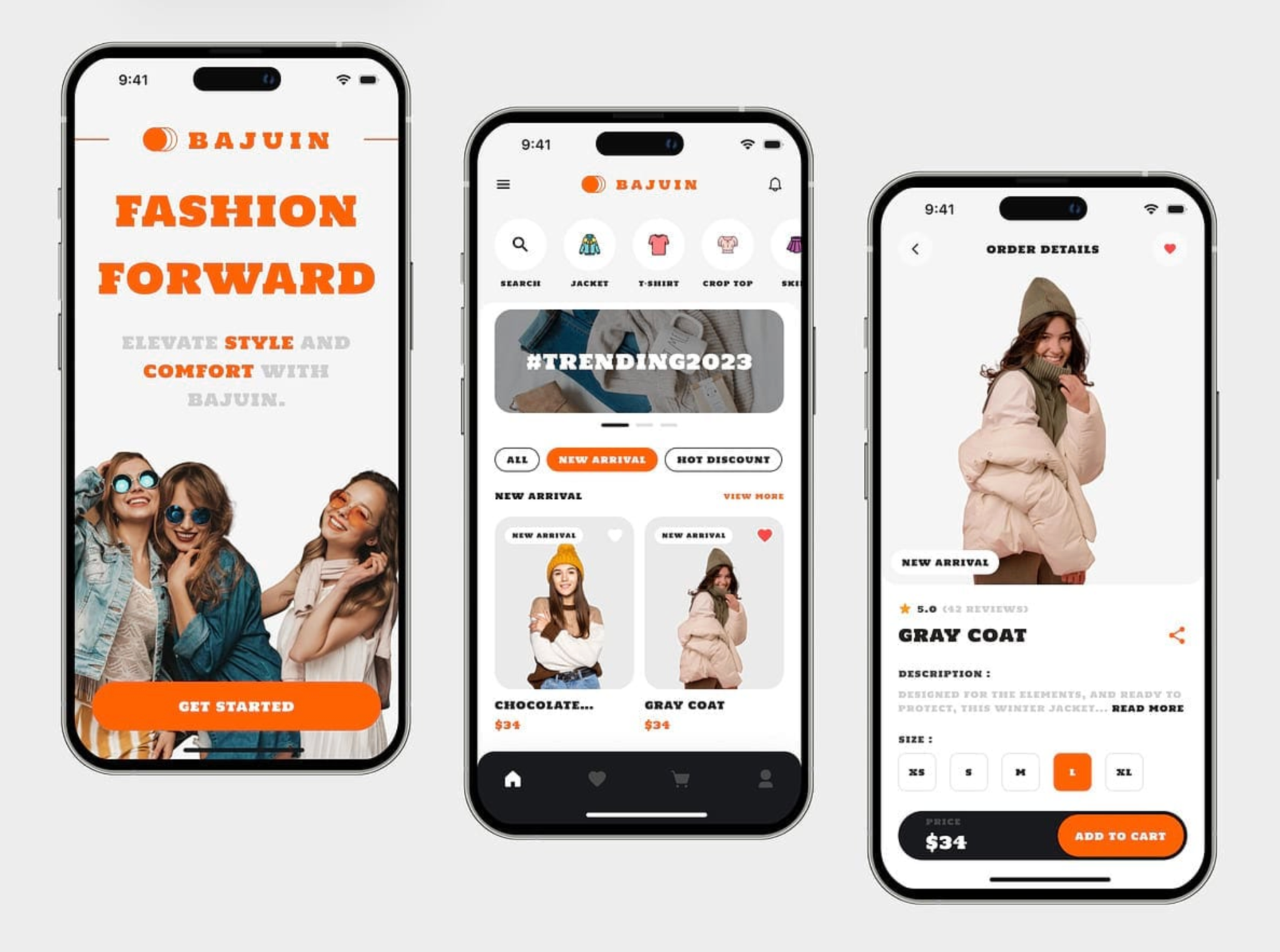
Mobile users scan even faster than desktop users. Smaller screens make clutter and poor spacing more noticeable. If scanning feels difficult on mobile, users abandon quickly. Mobile-first design is no longer optional.
Mobile optimization ensures a consistent scanning experience across devices.
Scan-friendly eCommerce pages respect how users actually behave online. By improving hierarchy, structure, and visual clarity, you reduce effort and increase confidence. When shoppers can scan comfortably, they engage more, trust faster, and convert more often.

