Please select the platform to login


The Add to Cart (ATC) section is one of the most critical areas on any e-commerce site. It’s the point where browsing turns into purchasing, making it a crucial driver of revenue and conversions. A poorly designed ATC section can confuse shoppers or create friction, resulting in cart abandonment. On the other hand, a thoughtfully crafted section builds trust, reduces hesitation, and encourages a seamless shopping experience. Every detail, from button placement to supporting information, matters, especially for mobile users who make up a growing majority of online shoppers. Let’s explore the best practices to make a perfect Add to Cart section.
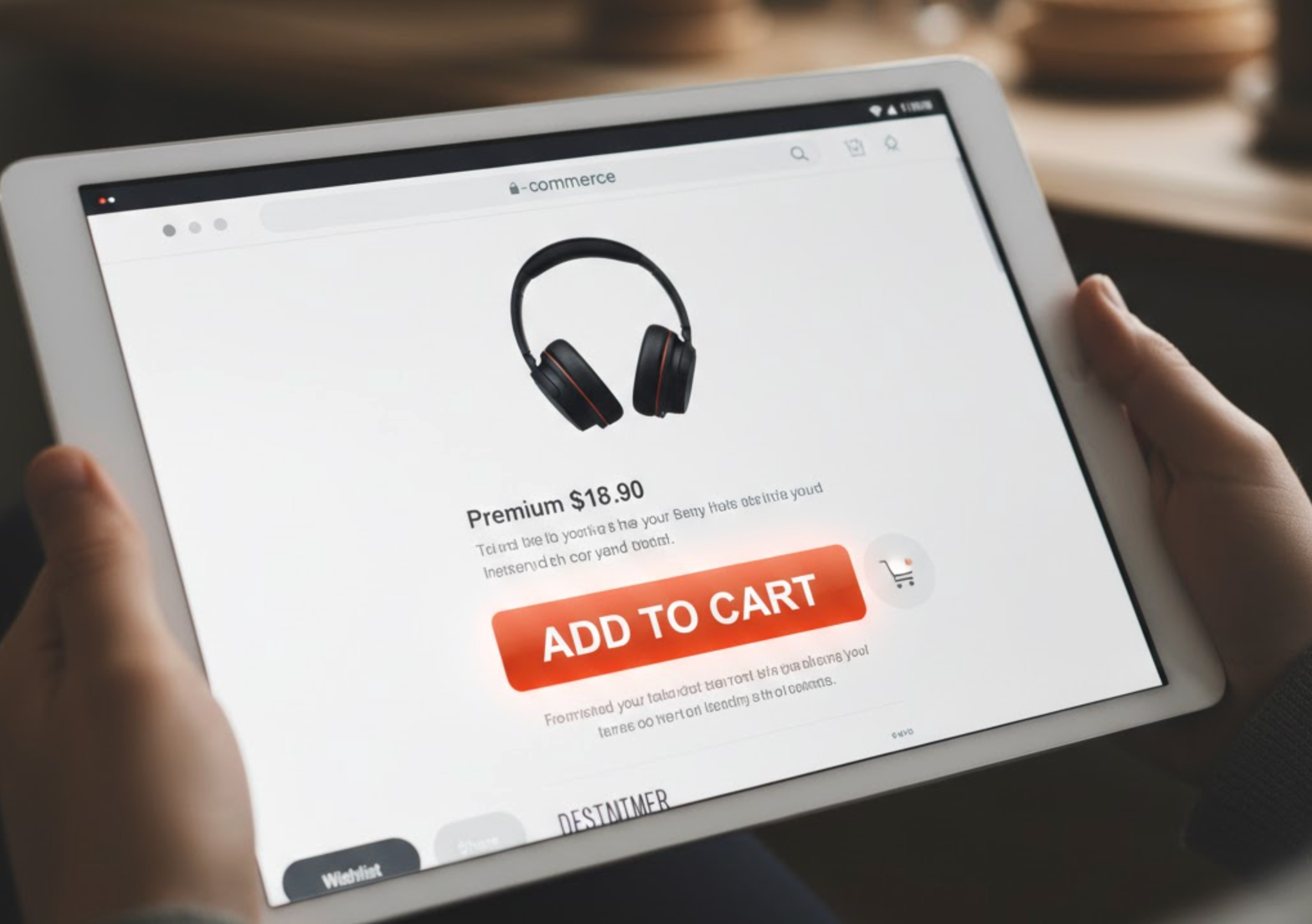
The Add to Cart button is the hero of the section and should immediately grab attention. A well-designed button uses a high-contrast color that stands out from other elements on the page while remaining visually harmonious with your store’s overall theme. It should also be large enough for easy tapping on mobile devices and clearly communicate the action with concise copy like “Add to Cart” or “Buy Now.” Subtle animations, hover effects, or micro-interactions can enhance the sense of responsiveness, making the button feel more clickable and interactive.
To help you implement these principles, consider the following tips:
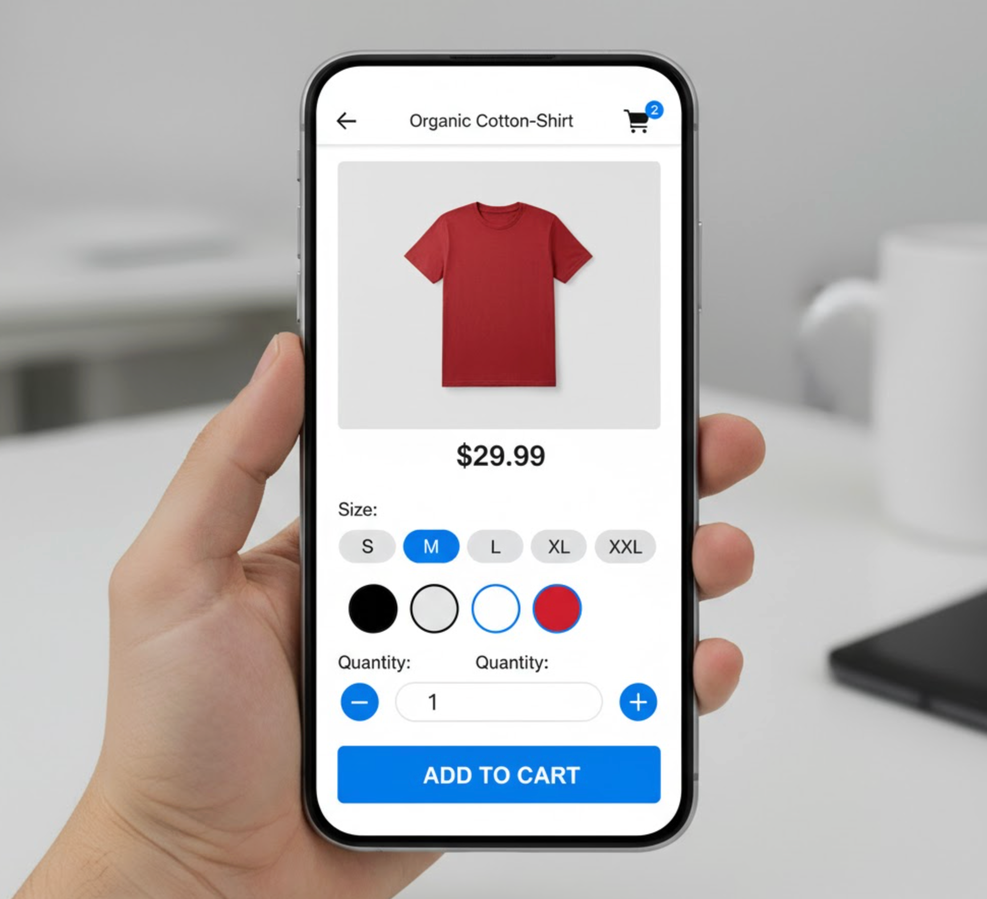
Customers often hesitate if they do not have all the information they need near the ATC section. Displaying key product details such as price, available sizes, colors, stock levels, and shipping options close to the button ensures shoppers do not have to scroll or search elsewhere. By making this information easily digestible, you give buyers confidence that they are making the right choice, which can directly decrease cart abandonment rates.
To make product information more effective, try these strategies:
Allowing customers to select quantity directly in the ATC section improves user convenience and minimizes extra steps. A simple plus/minus button or dropdown ensures shoppers can buy multiple items without leaving the page. Quantity selectors also help avoid confusion during checkout, especially for popular products where customers may want to purchase more than one item.
Here are some ways to optimize quantity selection:
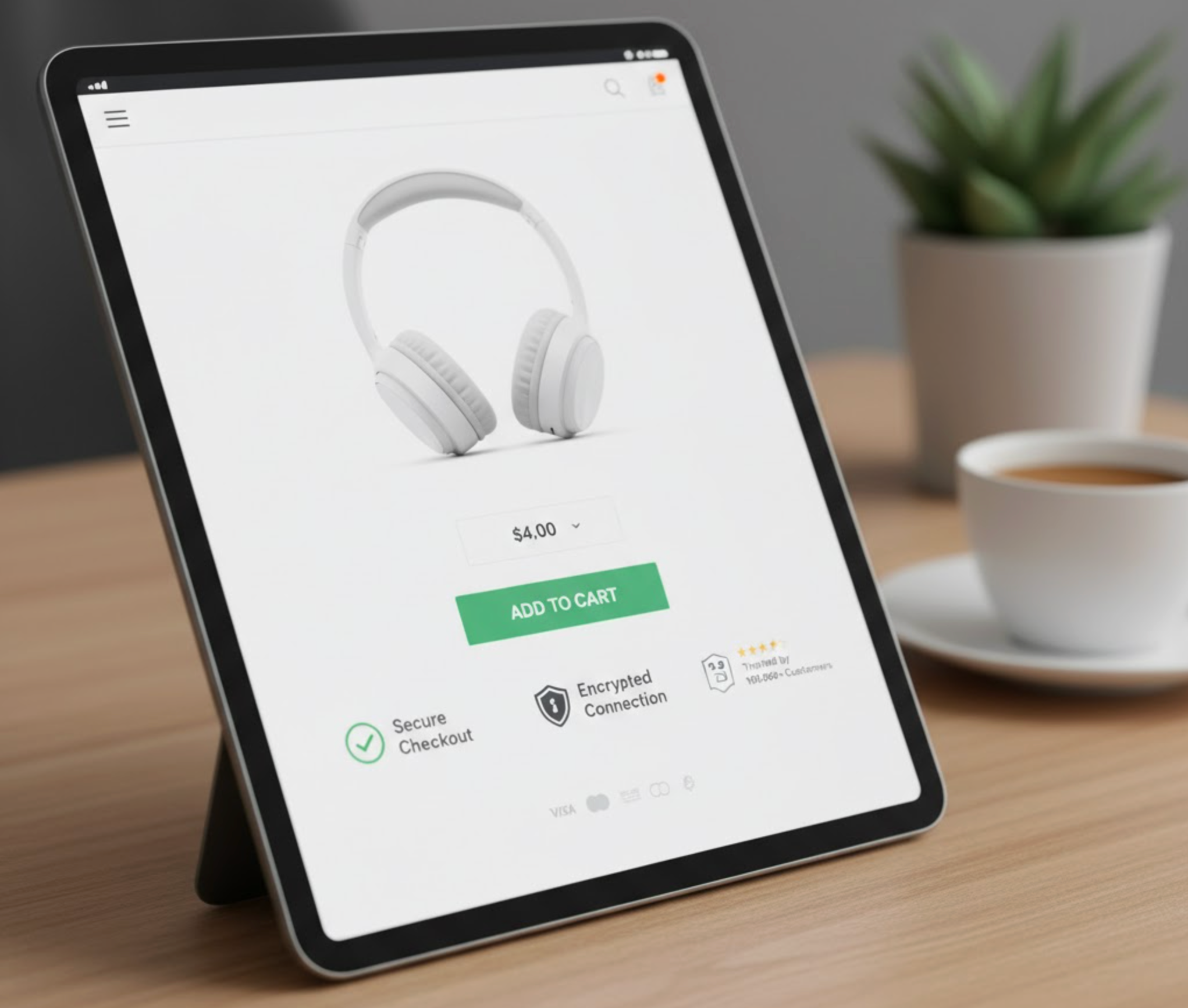
Trust is a major factor in online shopping, and adding trust badges near the ATC section can alleviate hesitation. Elements like secure checkout badges, free shipping notifications, easy return policies, verified reviews, and accepted payment icons signal professionalism and reliability. Even short messages like “30-day returns” or “SSL-secured payments” reassure shoppers that their transaction is safe, which increases the likelihood of completing the purchase.
You can strengthen trust in the following ways:
Not every visitor is ready to buy immediately, so providing secondary actions keeps them engaged. Features like “Add to Wishlist,” “Save for Later,” or “Compare” allow users to interact with your store without leaving the product page empty-handed. These actions maintain engagement and provide opportunities for retargeting through emails or personalized marketing.
Here are some practical tips for alternative actions:
With mobile devices dominating online shopping, a mobile-optimized ATC section is essential. Buttons should be large enough to tap easily, product details must remain legible, and quantity selectors need to function smoothly. Many stores benefit from sticky Add to Cart bars that remain visible as users scroll through product details, ensuring the CTA is always accessible without frustrating the shopper.
To ensure mobile usability, focus on these points:
Instant feedback after clicking Add to Cart confirms the user’s action and reassures them. This could be an animation, a mini-cart popup, a changing button text like “Added!”, or a visual cart update. Immediate feedback prevents confusion and helps shoppers understand that their selection was successful without interrupting the browsing experience.
Consider the following ways to provide effective feedback:
Even a carefully designed ATC section benefits from continuous testing and optimization. A/B testing button colors, placements, copy, and layouts helps identify what resonates most with your audience. Monitor metrics such as click-through rates, cart abandonment rates, and mobile versus desktop performance to refine your approach and maximize conversions over time.
To get the most from your testing efforts, follow these tips:
The Add to Cart section is much more than just a button. It is a strategic conversion point in the shopping journey that combines clarity, usability, trust, and responsiveness to create a seamless, confidence-building experience. By optimizing button design, product information, quantity selectors, trust signals, and mobile usability, you can significantly increase conversions and reduce cart abandonment. Continuous testing and refinement ensure your ATC section keeps up with changing user behaviors and evolving eCommerce trends.

