Please select the platform to login


Mobile wallets like Apple Pay, Google Pay, and Samsung Pay have reshaped how people expect to pay online. For mobile shoppers, wallets promise speed, security, and minimal friction, but many checkout experiences still fail to deliver on that promise. When the checkout UX isn’t optimized for wallet users, even high-intent customers can abandon it at the final step.
Optimizing checkout UX specifically for mobile wallet users is no longer optional. It’s a competitive advantage that directly impacts conversion rates, trust, and repeat purchases. Below, we’ll break down practical, UX-focused strategies to make mobile wallet checkouts truly frictionless.
Mobile wallet users are fundamentally different from traditional card users. They expect checkout to be fast, almost effortless, with as few decisions and inputs as possible. Any extra friction feels amplified on a small screen.
Most wallet users have already stored their payment, shipping, and identity details securely. When your checkout forces them to re-enter information or navigate unnecessary steps, it breaks the core value proposition of using a wallet in the first place. This mismatch often leads to frustration rather than completion.
To optimize UX, your checkout should align with these expectations:
Once you understand this mindset, every UX decision becomes clearer and more intentional.
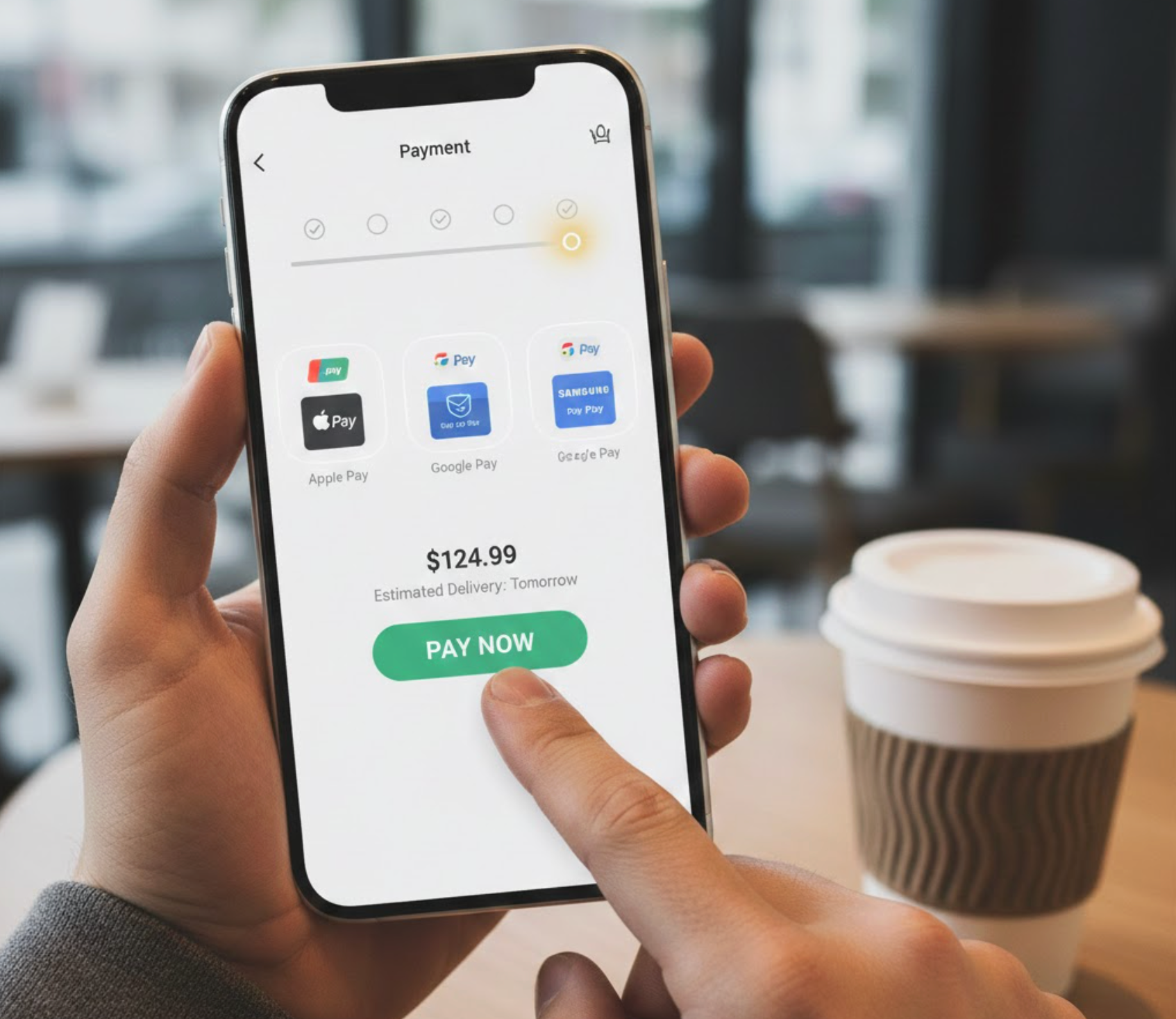
One of the biggest mistakes stores make is hiding mobile wallet options too late in the checkout process. If users don’t immediately see Apple Pay or Google Pay, they may assume it’s not supported and default to slower payment methods, or leave altogether.
Wallet buttons should be visible as early as possible, ideally:
Early visibility reduces cognitive load and sets expectations before users invest time filling out forms. It also creates a “fast lane” perception, signaling that checkout will be quick and painless.
A clear, recognizable wallet button reassures users that their preferred payment method is supported and optimized, not treated as an afterthought.

For mobile wallet users, the ideal checkout feels almost invisible. Once they select a wallet, the rest of the process should collapse into a single confirmation step whenever possible.
This means minimizing intermediate screens, progress indicators, and redundant confirmations. Every extra tap increases the chance of hesitation, distraction, or drop-off, especially on mobile devices.
Key UX principles for wallet-first flows include:
When done right, the entire checkout can feel faster than scrolling a social feed, which is exactly the experience wallet users expect.
On mobile devices, ergonomics matter as much as visuals. Wallet buttons placed too high or too low on the screen can cause friction, especially for one-handed users.
Wallet actions should sit within the natural thumb zone, typically in the lower-middle area of the screen. This makes it easy for users to tap, confirm, and authenticate without adjusting their grip or attention.
Additionally, wallet buttons should:
Good placement reduces physical friction, which often goes unnoticed, but plays a major role in mobile conversion rates.
Once a user selects a mobile wallet, the checkout experience should narrow its focus. Any unnecessary elements, upsells, banners, navigation links, can pull attention away from completion.
Mobile wallet checkout works best when it feels like a protected, focused flow. This reinforces trust and minimizes the chance of accidental exits or second-guessing.
To create a distraction-free environment:
The goal is simple: once users choose a wallet, help them finish as quickly and confidently as possible.
Mobile wallets are already trusted payment methods, but users still subconsciously look for reassurance, especially when checking out on a new store. The challenge is reinforcing trust without slowing the experience down.
Instead of long explanations or security popups, rely on subtle signals:
Biometric authentication (Face ID, fingerprint) already does most of the trust-building work. Your UX should support it quietly, not compete with it.
Even optimized checkouts occasionally run into issues, network errors, unsupported wallets, or validation problems. How these errors are handled can determine whether users retry or abandon completely.
Error messages for wallet users should be:
For example, instead of “Payment failed,” explain whether the issue is connectivity, authorization, or wallet compatibility. Clear guidance keeps users engaged and reduces frustration at a critical moment.
A common mistake is testing checkout UX as a single flow without isolating wallet behavior. Mobile wallet users interact differently, move faster, and abandon for different reasons.
You should analyze wallet-specific metrics such as:
By separating wallet UX testing from traditional checkout optimization, you can identify friction points that would otherwise remain hidden. Small tweaks, like button placement or step reduction, often yield outsized gains for wallet users.
Optimizing checkout UX for mobile wallet users isn’t about adding another payment option, yet it’s about rethinking checkout around speed, trust, and simplicity. Wallet users are telling you what they want through their behavior: fewer steps, fewer decisions, and instant confirmation.
When mobile wallet flows are designed intentionally, they elevate the entire brand experience. Stores that treat wallets as a first-class checkout option will win over modern mobile shoppers, reduce friction at scale, and turn high-intent moments into completed purchases.
In a mobile-first world, the fastest checkout is often the one users barely notice at all.

