Please select the platform to login


Understanding how users move through your online store is one of the most valuable ways to uncover what truly affects your conversions. Many store owners rely heavily on surface-level metrics, such as traffic volume, bounce rate, or even session duration, but these numbers rarely tell the whole story. What matters most is how visitors navigate your site, what motivates them to progress to the next step, and what causes them to leave the journey before completing a purchase.
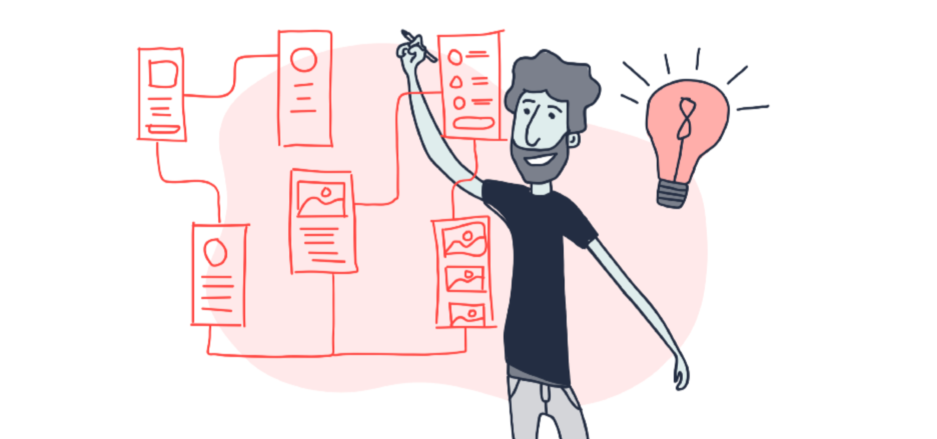
This is where user flow analysis becomes essential. User flow gives you a visual map of customer behavior, showing every step they take, the pages they visit, the interactions they make, and the exact stage where they drop off. Once you gain visibility into these movement patterns, you can identify friction points and optimize the customer journey with confidence. Instead of guessing why your conversion rate isn’t higher, you get a clear, narrative-style picture of what users experience, and what gets in their way.
In this detailed guide, you’ll learn what user flow is, why it matters, the best tools to track it, and a step-by-step framework to uncover bottlenecks and improve store performance in a systematic, data-driven way.
User flow represents the sequence of actions a visitor takes from the moment they land on your website until the moment they complete a goal, whether that goal is making a purchase, signing up, viewing multiple products, or engaging with your content. It captures every touchpoint and transition between pages, making it easier to understand the user’s mindset as they navigate through your store.
In the context of an eCommerce business, a typical user flow might look like:
Because every customer’s journey is slightly different, user flow gives you a holistic view of these paths. It helps you see how diverse behaviors converge, diverge, and ultimately impact your conversion performance.
This concept is important because customers don’t always follow the path you expect. Some users jump between sections, some abandon pages quickly due to confusion, and others return to the same page multiple times before making a decision. Tracking user flow allows you to interpret all these behaviors in context, giving you deeper insight into where the journey succeeds or breaks down.
Many store owners optimize their websites through intuition or temporary trends, but user flow gives you concrete data to guide decision-making. By visualizing how actual customers behave, you uncover insights that can significantly improve conversions and user experience.
Tracking user flow clearly exposes the exact step where users exit the journey. This helps you move away from vague assumptions and directly target the source of user frustration. For example, if many visitors abandon the journey after viewing a product, you can investigate whether the page lacks social proof, has unclear descriptions, or loads too slowly.
Instead of optimizing every part of your store, user flow helps you understand which pages influence conversions most. This allows you to concentrate your time and resources on fixes that deliver measurable improvements. For example, reducing drop-offs on a cart page can often deliver far stronger results than enhancing less visited pages.
User flow helps you understand the larger narrative of how customers interact with your store. This broader perspective encourages you to optimize not just individual pages but also how they connect. Improving navigation, reducing friction between steps, and adding clearer guidance becomes easier once you understand the entire journey.
You might believe that users follow a linear path—from homepage to product to checkout—but user flow often reveals unexpected behavior patterns. These discoveries provide valuable opportunities to refine your store layout, simplify pathways, or rearrange your navigational structure.
User flow insights also highlight differences between mobile and desktop behavior. This is important because user intent, interaction patterns, and expectations vary by device. For example, mobile visitors may drop off during checkout if the form layout isn’t optimized for smaller screens.
By tracking user flow, you gain the clarity needed to make informed decisions and create a smoother, more profitable shopping experience.
To uncover meaningful insights, you need the right tools. Each platform provides unique features that help you visualize user journeys, analyze interactions, and identify bottlenecks with precision. Below are the most popular tools, along with why they matter.
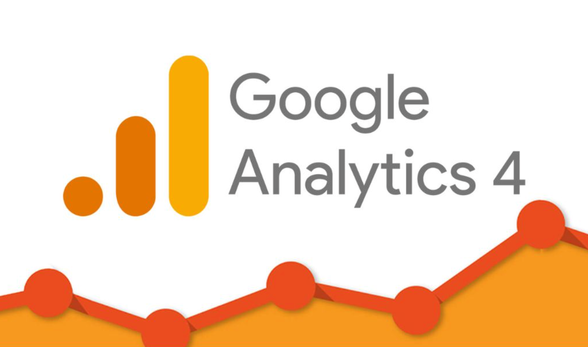
GA4’s “Path Exploration” feature allows you to map out how users move between events and pages. Because GA4 is event-based, you can track detailed actions like clicks, scrolls, or cart updates. This makes it easier to understand how users progress, where they hesitate, and which actions drive conversions.
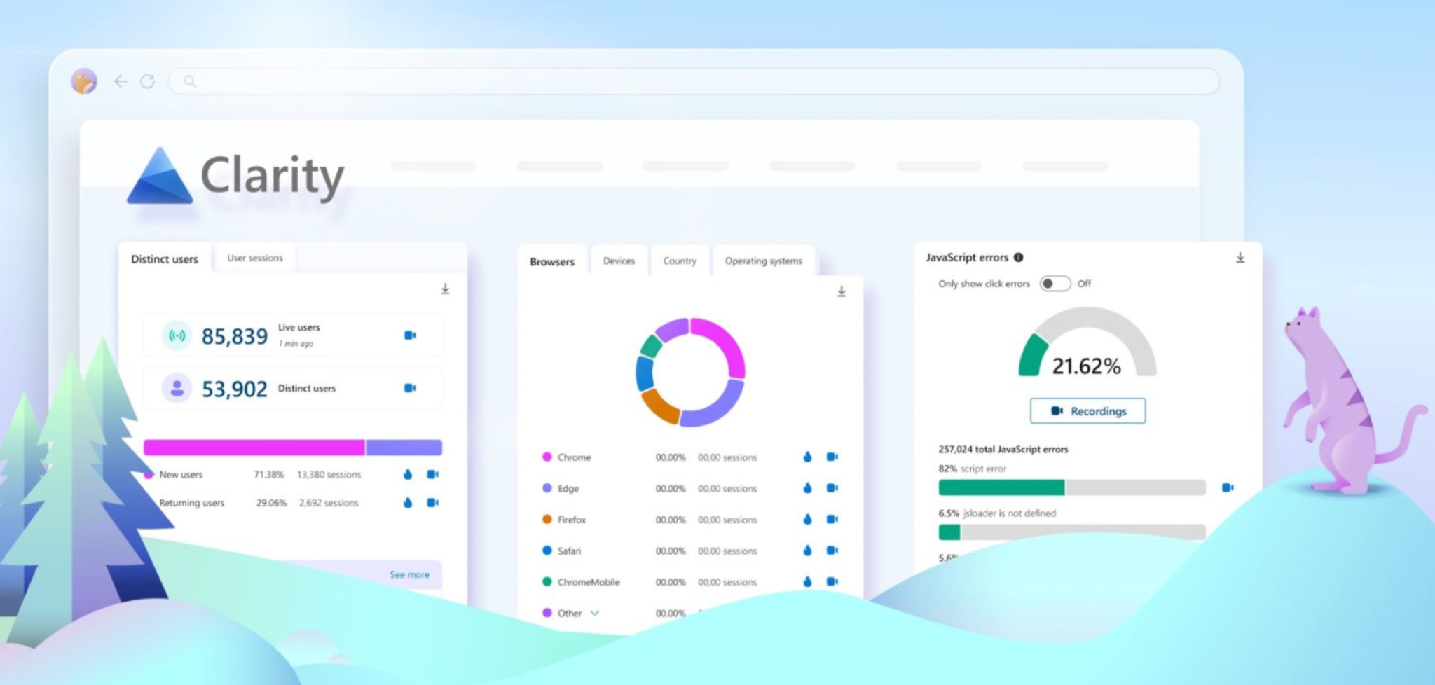
Clarity is especially useful because it pairs user flow insights with heatmaps and session recordings. This combination lets you observe not just the steps users take but also the behavior behind those steps, such as rage clicks, hesitation, or scrolling patterns.
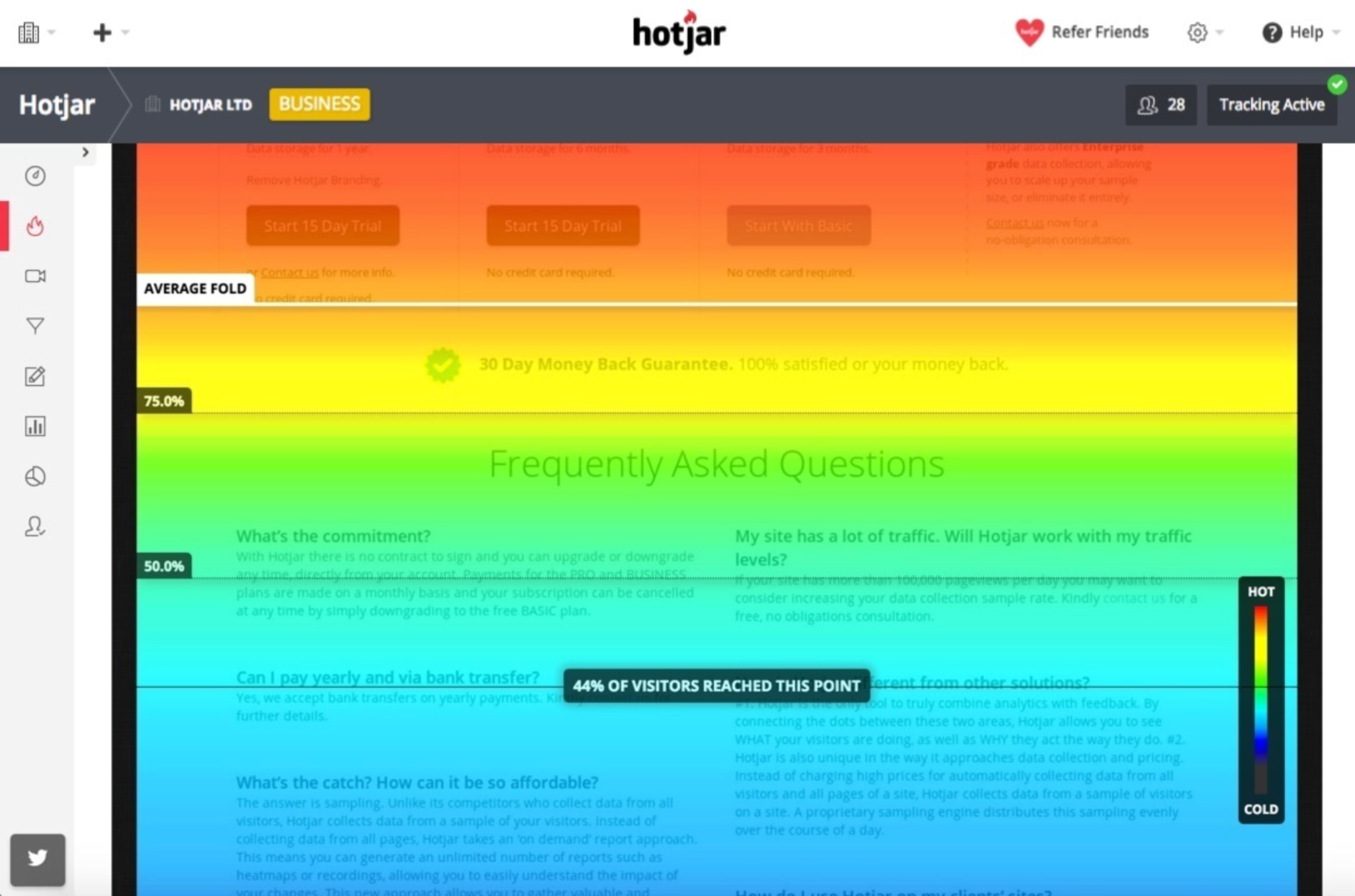
Hotjar focuses heavily on visual behavior analytics. Its Funnels and Behavior features allow you to interpret user paths alongside real-time interactions. It’s ideal if you're looking for a more intuitive, user-friendly interface for studying movement patterns and user frustration points.
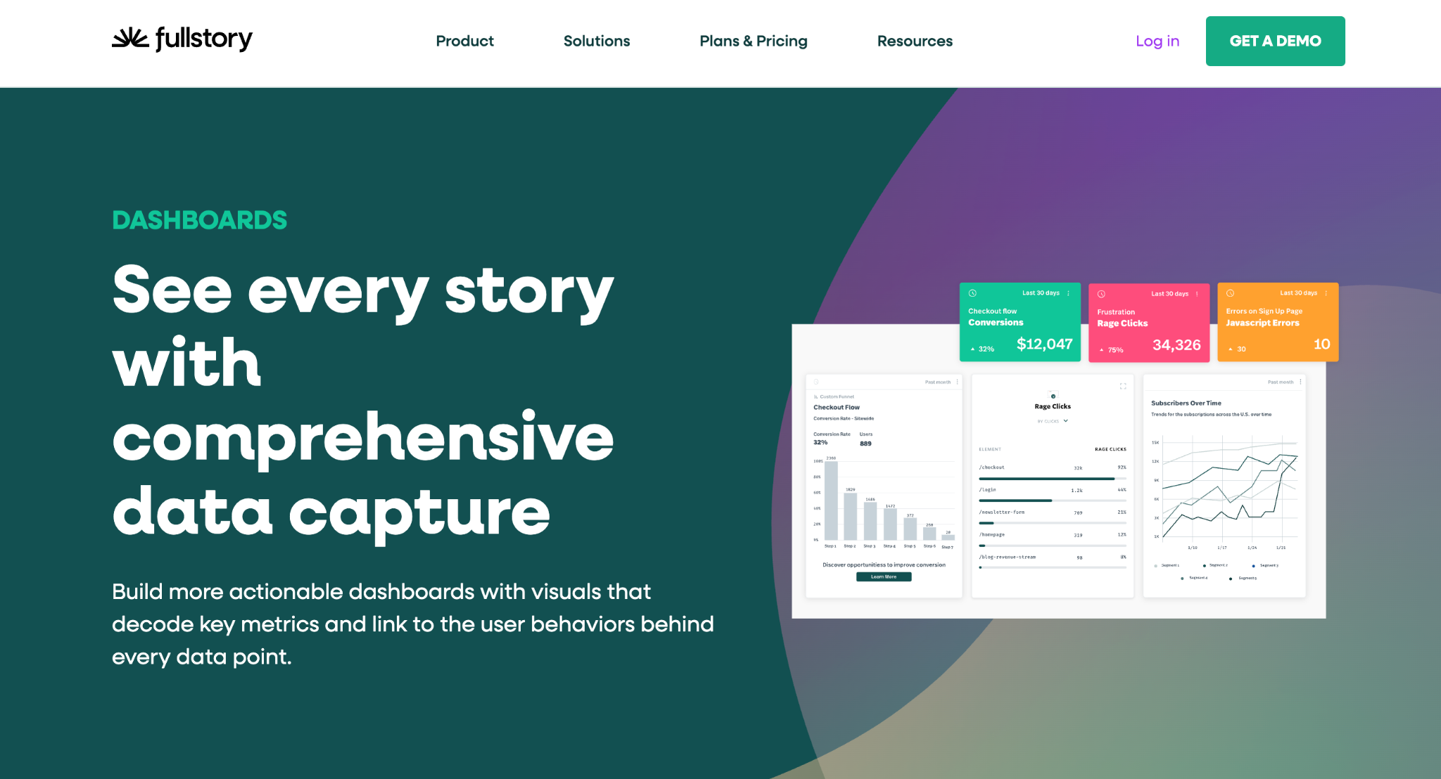
FullStory offers more advanced journey mapping and powerful search features that help you identify very specific behavioral patterns. It’s particularly effective for stores with larger traffic volumes or more complex customer journeys.
Using a combination of these tools allows you to gather both quantitative data (the what) and qualitative insights (the why), giving you a clearer understanding of how to optimize your store flow.
Tracking user flow requires more than opening a tool and looking at diagrams. To extract meaningful insights, you need to follow a structured approach. Below is a step-by-step workflow that guides you from setup to optimization.
Before diving into analytics, start by identifying the most important user journeys in your store. These could be:
Defining these paths ensures you focus on journeys that have the greatest impact on your goals. When you know exactly which flows matter most, your analysis becomes more precise and productive.
User flow reports are only as accurate as the events you track. In GA4 or similar tools, ensure you track:
Each event acts as a step in your flow, allowing you to reconstruct the user journey with high accuracy. The more precise your event setup, the more reliable your insights will be.
Once your events are working, it’s time to dive into user flow reports. These visuals help you understand:
As you study the flow, look for patterns that indicate friction or confusion. This is often where conversion bottlenecks arise.
User flow behavior differs significantly between devices. Mobile users may face more friction due to navigation limitations, button placement, or slower page loads. Desktop users, in contrast, may move faster through pages but require more detailed information.
By comparing flows across devices, you can identify where each segment struggles and optimize accordingly.
User flow visualizes the path. Heatmaps and recordings reveal what happens within that path.
Combining these two insights helps you:
Together, these tools create a complete picture that leads to more accurate decisions.
Conversion bottlenecks often show up as recurring patterns in your flow reports:
Look for steps with the largest user drop-offs or steps requiring excessive clicks. These are prime opportunities for optimization.
Once bottlenecks become clear, it’s time to refine your store experience. You might:
Each improvement should directly target a friction point identified through your user flow analysis.
Once changes are live, revisit your user flow reports. Compare before-and-after behavior to confirm whether your adjustments improved conversions. If bottlenecks persist, continue refining the experience. User flow optimization is continuous, ensuring your store remains efficient as user behavior evolves.
Recognizing patterns in user flow helps you diagnose issues faster. Some common red flags include:
This often signals weak product pages, either lacking trust elements, missing critical details, or offering poor visual presentation.
This usually reveals friction such as unexpected fees, slow loading, or excessive required fields.
Looping indicates confusion, users may be unable to find essential information or may not understand what action to take next.
Checkout exits typically point to problems like long forms, poor mobile layout, or a lack of preferred payment methods.
These patterns help you not only uncover bottlenecks but also prioritize which ones require immediate attention.
Once you understand user movement and identify friction points, applying best practices helps you create a smoother, more intuitive journey.
Keep your menus structured, remove unnecessary items, and help users reach product pages in fewer clicks.
Avoid overwhelming visitors with too many choices or overly complex layouts. Simplicity helps guide users naturally toward conversion.
Use clear, action-driven CTAs with strong placement so users know exactly what step to take next.
A consistent design helps users instantly recognize patterns on your site, making it easier to move through each step.
Faster load times reduce bounce rates and prevent drop-offs during critical conversion steps.
Let users know about shipping fees, return policies, or delivery times upfront to build trust and reduce surprises.
Tracking user flow is one of the most effective ways to uncover hidden friction, understand user behavior, and increase conversions. By visualizing the journey customers take, from entry to purchase, you gain powerful insights into what motivates them, what confuses them, and what prevents them from completing their goals.
When combined with tools like heatmaps, session recordings, and event-based analytics, user flow gives you a complete understanding of your store’s performance. This turns guesswork into clarity, allowing you to make confident decisions that directly improve user experience and revenue.

