Please select the platform to login


Video has become one of the most powerful storytelling formats in modern e-commerce. Shoppers expect immersive, dynamic experiences that help them understand products quickly and feel emotionally connected to a brand. Static collection banners can communicate only a single moment, but video offers movement, texture, and narrative, all within seconds. Because of this, more online stores are adopting video collection banners to capture attention and elevate the customer journey.
A strong video banner can do more than look appealing. It can guide shoppers deeper into the catalog, set the tone for the entire collection, and clearly communicate what the customer should expect from the products. When implemented correctly, video banners can significantly boost engagement, session duration, and even conversion rates.
Unlike static images, which rely heavily on one carefully captured pose or angle, videos introduce motion and storytelling. Movement naturally draws the human eye, prompting shoppers to pause and take in the visuals. This moment of curiosity is often enough to encourage visitors to continue scrolling, explore products, and engage more actively with the page.
Additionally, video conveys a deeper sense of realism. It can illustrate scale, demonstrate product usage, and establish mood much more effectively than a still photo. For collections that rely heavily on lifestyle, texture, or behavior, such as fashion, beauty, home decor, or fitness gear, video offers an accurate representation that builds trust.
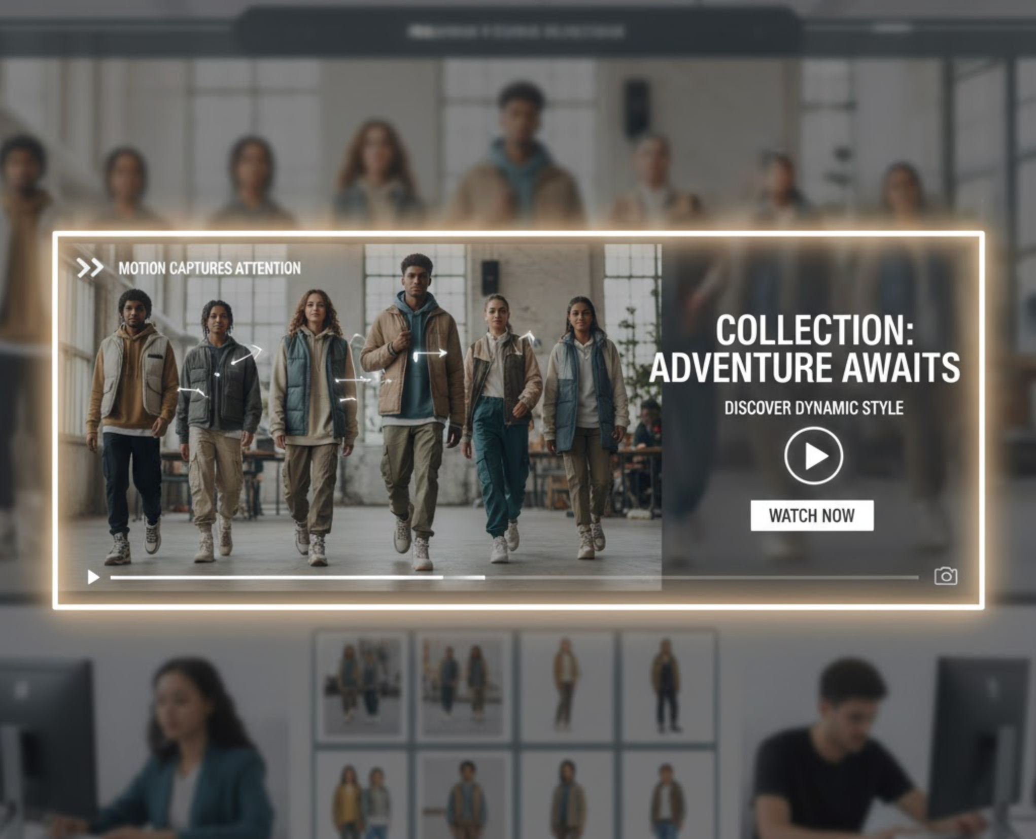
The video's movement captures attention instantly. When a visitor lands on your collection page, the video becomes the focal point, pulling them into the shopping experience. This instant engagement increases the likelihood that they will scroll, browse, and explore the products further.
Video lets you demonstrate how products behave in real-world scenarios. Fabrics fluttering in motion, electronics being used, or home decor viewed under natural lighting, all of these visual cues help shoppers make faster and more confident decisions.
A video banner is the perfect space to communicate tone, lifestyle, or brand identity. Whether your brand is minimal, bold, luxury, or adventurous, a well-produced video helps reinforce your values and create a consistent emotional experience across all touchpoints.
When the initial banner inspires shoppers, they tend to stay longer and explore more products. Longer engagement usually leads to decreased bounce rates and higher chances of adding items to cart.
Video immediately elevates the visual appeal of your storefront. Shoppers perceive stores with dynamic visual content as more modern, professional, and trustworthy, especially when the video is crisp and well-made.
Seasonal collections come alive through video, sunlit beach scenes for summer, cozy textures for winter, or warm earthy tones for autumn. This helps set the mood immediately.
Video can illustrate aspirational moments that match your brand’s lifestyle narrative. This is especially powerful for fashion, fitness, and outdoor collections.
Video banners help elevate perceived value. For premium items, customers expect a polished experience, and video contributes to that sophistication.
Some collections need movement or usage demonstration to make sense, such as kitchen tools, beauty products, tech gadgets, and sports equipment. A short clip in the banner can instantly show how the product fits into daily life.
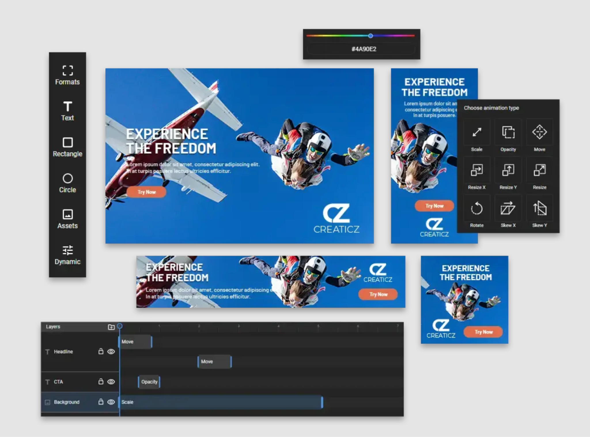
Aim for a video between 5–10 seconds long. Short clips load faster, loop better, and keep shoppers focused on the collection rather than the banner itself.
The banner is a prominent part of your page, so poor-quality video will harm brand credibility. Make sure lighting is consistent, motion is smooth, and the subject is well-framed.
A seamless loop creates the illusion of continuous movement, which feels natural and reduces distractions. Hard cuts or abrupt transitions can feel unprofessional.
Use optimized formats such as MP4, MOV, or WebM depending on your theme’s requirements. Compress the file properly so that it loads quickly without losing quality.
Your video should feel like an extension of your brand. For example, a luxury brand may use slow, elegant clips, while an activewear brand may use dynamic shots with energetic movement.
Avoid overly generic stock footage. The video should enhance the shopper’s understanding of the collection rather than distract with irrelevant visuals.
There are several ways to add video banners depending on your theme, technical skills, and customization needs. Below is an expanded guide to help you choose the best method.
Many modern e-commerce themes, especially those built for platforms like Shopify OS2.0, include native options for video banners.
Here’s how this usually works:
This method is the easiest and most stable since the theme handles responsiveness, sizing, and layout.
If your theme does not support video banners, adding custom code gives you complete control. The general steps include:
This method offers flexibility but requires more technical knowledge.
There are many page builders like PageFly, Shogun, or GemPages allow you to construct fully custom collection headers.
With these tools:
This is a great option if you need flexibility without editing code manually.
Proper hosting affects speed and compatibility. Best practices include:
Designing a video banner is not just about inserting a video, but it’s about creating an experience that guides shoppers deeper into the page. Below are expanded best practices for maximum impact.
Since the video has motion, too much text becomes overwhelming. Keep your message concise—usually a short headline and a brief subheading. The goal is to let the video provide atmosphere while the text provides clarity.
Readability is essential. Use overlays, semi-transparent backgrounds, or consistent lighting in the video to ensure your text stands out. A banner that looks beautiful but unreadable fails its purpose.
Horizontal videos often crop heavily on mobile screens. Ensure the main subject stays centered or choose a clip that works well in various aspect ratios. Testing across multiple devices helps avoid awkward cropping.
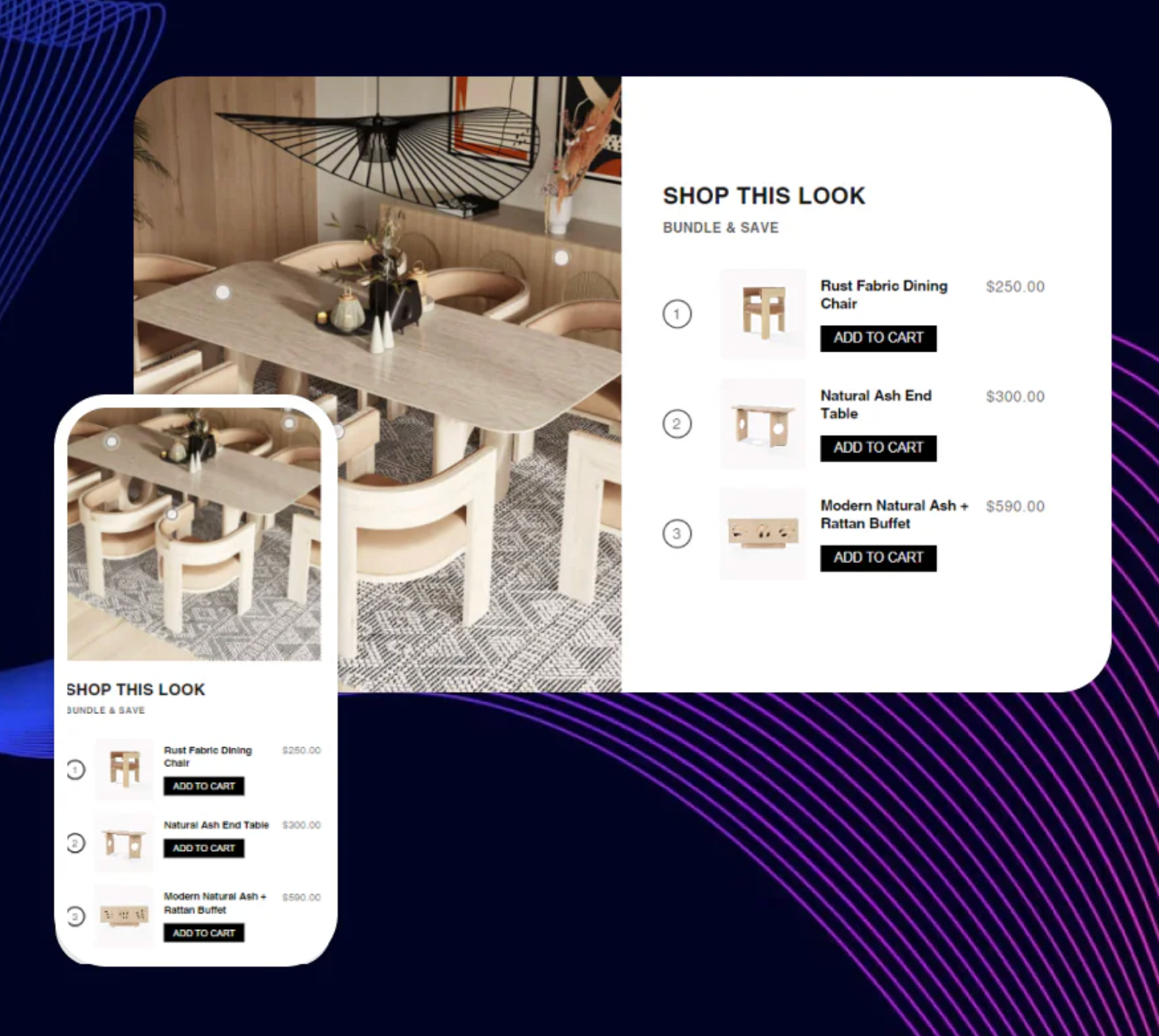
The banner should inspire action, not just look aesthetic. Position a prominent CTA or product grid right below it to invite users to start browsing immediately. For example:
Heavy videos slow your site, and slow sites lose customers. Use compression tools to reduce file size while maintaining clarity. A video banner should load almost instantly.
Autoplay videos must be muted to prevent negative user experiences. Sound is unnecessary for collection banners and may cause visitors to bounce instantly.
Track performance before and after adding the video. Important metrics include:
If your metrics improve, you know the banner is working. If not, test new video styles or shorten the length.
Fast-paced or overly busy videos can distract visitors. Choose clips with smooth, slow movements that enhance the shopping journey instead of overwhelming it.
Video collection banners are one of the most effective ways to bring life, emotion, and storytelling to your eCommerce store. When implemented with high-quality visuals, fast loading, and thoughtful design, video banners have the power to significantly boost engagement and conversions. They help customers understand your products quickly, connect emotionally with your brand, and feel inspired to explore more.
Whether you are showcasing a seasonal theme, a lifestyle-driven line, or a premium collection, video adds the depth and personality that modern online shoppers expect.

