Please select the platform to login


In the world of branding and digital design, the visual style you choose can significantly influence how customers perceive your business. Your design choices affect usability, emotional appeal, brand recognition, and long-term engagement. Two of the most popular, yet opposite, approaches are minimalist and maximalist design. Each style offers distinct advantages and challenges, and the best choice depends on your brand personality, target audience, and business goals. This article explores both minimalist and maximalist styles in detail and compares them across essential branding and user-experience factors.
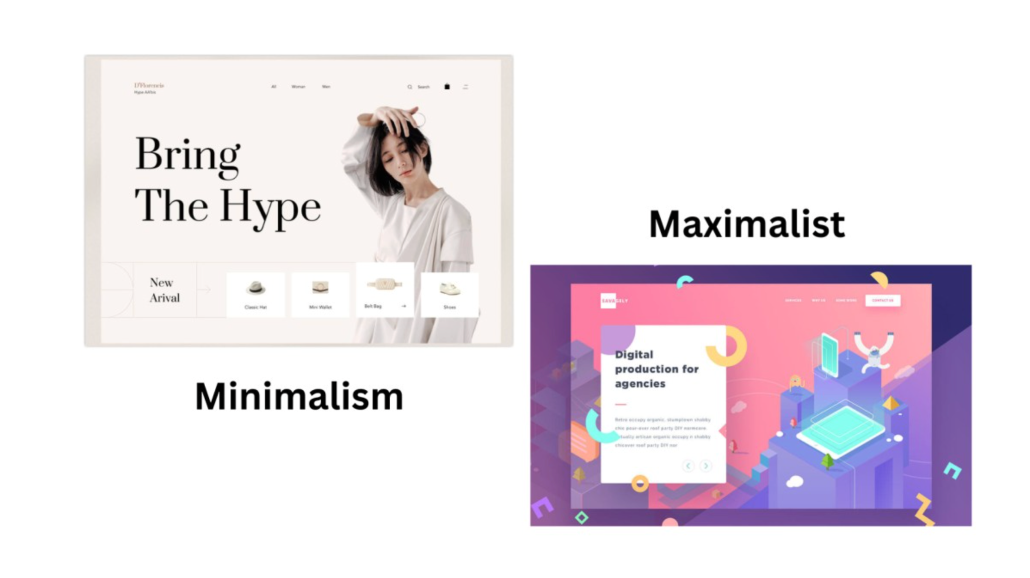
Minimalist design focuses on simplicity, clarity, and intention. It uses clean layouts, ample white space, subtle colors, and straightforward typography. Instead of crowding the screen with decorative elements, minimalism highlights only what is essential. This approach reduces cognitive load, improves navigation, and creates a calm, refined visual experience. Minimalism is commonly used by premium brands, tech companies, lifestyle products, and service-based businesses that value modernity and professionalism.
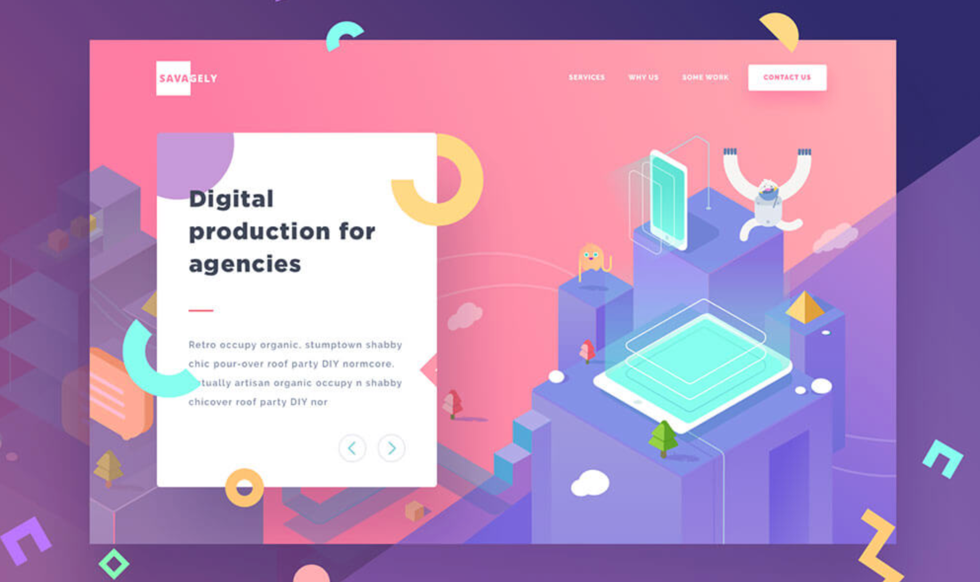
Maximalist design takes an expressive, bold, and abundant approach. It features rich color palettes, decorative typography, layered textures, and visually impactful compositions. Maximalism prioritizes personality and emotional appeal, creating memorable experiences that stand out. This style is common among fashion brands, lifestyle companies, creative industries, and businesses targeting youthful or artistic audiences.
Minimalist design prioritizes simplicity by removing anything that doesn’t serve a clear purpose. It embraces clean spaces, limited elements, and an overall sense of calm. The focus is on stripping visuals down to their essentials so users can navigate or understand the content effortlessly.
Maximalist design, on the other hand, intentionally embraces complexity. It layers multiple visual elements, patterns, textures, images, and bold typography, to create a rich, expressive look. Instead of trying to calm the viewer, maximalism aims to energize them through variety and visual impact.
Minimalist color palettes are typically limited and understated. Designers often use neutrals or soft tones to create balance and clarity, ensuring that no single element overwhelms the viewer. The restraint in color helps maintain a refined, orderly aesthetic.
In contrast, maximalist design celebrates vibrant and diverse color palettes. Brands using this style often experiment with bright combinations, high contrast, and unconventional mixes. Color becomes a storytelling tool that conveys personality, excitement, and boldness.
Minimalist design emphasizes generous open space. White space isn’t “empty”; it is a key element that guides the user’s eyes, improves readability, and creates a sense of luxury or focus. Every gap is intentional and serves to highlight what remains.
Maximalist design treats space very differently. Instead of open areas, it fills the canvas with layers of visual interest, whether it’s images, illustrations, decorative shapes, or dynamic patterns. Space becomes an opportunity for expression, not separation.
Minimalist typography relies on clean, simple fonts. Sans-serif typefaces are common, and designers often limit themselves to one or two font styles. The goal is clarity, elegance, and readability without distraction.
Maximalist typography embraces variety and personality. Multiple font styles, bold lettering, ornate scripts, and oversized type can all appear together. Typography becomes a visual feature rather than just a communication tool.
Minimalist design evokes feelings of calmness, clarity, and sophistication. By reducing noise, it creates a sense of trust and professionalism, qualities that many premium or modern brands value.
Maximalist design generates emotion through excitement and intensity. It often feels bold, expressive, and full of character. Brands use this to create memorable impressions or connect with audiences who appreciate creativity and uniqueness.
Minimalist design communicates messages directly and efficiently. It removes distractions so the message stands out clearly on its own. This approach is especially effective when a brand wants to appear modern, disciplined, or high-end.
Maximalist design conveys messages through personality and storytelling. Instead of showing “just enough,” it embraces visual richness to express the brand’s identity. The message becomes intertwined with creativity, culture, and experience.
Many brands successfully combine both styles. You can use a minimalist layout while incorporating maximalist accents, such as bold hero sections, textured backgrounds, or expressive typography. This hybrid approach brings clarity and personality together without overwhelming users.
Both minimalist and maximalist design offer powerful opportunities to define your brand identity. Minimalism excels in clarity, usability, and professionalism, while maximalism shines in personality, emotion, and memorability. The right choice depends on your audience, your industry, and the message you want to communicate. By understanding the unique strengths of each approach, you can choose a design direction that not only enhances your brand but also creates a meaningful and lasting impact on your users.

